Take a look at my work here: https://t.co/aMlZNptyc5
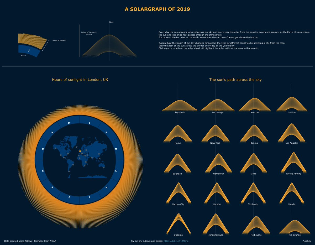
I turned the Alteryx workflow into an app that can be used to generate solar elevation, and sunrise and sunset times for a chosen location, which you can try here: https://t.co/zPVojxVbMz
@dataschooluk@VizWizBI@Datajedininja
I'm looking for a new analytics role if you are hiring or know someone is looking to hire, please reach out.
Here's my Tableau public profile: https://t.co/pmpxVvEBUY and my GitHub page: https://t.co/1OYvxRJTER
Sorting out the #datafam filled maps - a thread:
I'm doing everything i can to make this as simple as possible to implement.
Web Mercator does not work for maps of population.
Raw numbers do not work on filled maps.
Making a viz doing these things is meaningless.
(1/n)
This tweet has massively changed the way I look not only at numbers on maps but also figures that relate to people or populations in general. Particularly useful in the current climate
My version of this week's #makeovermonday looking at the impact of Australia's homelessness services over the past few years.
Take a look at my interactive viz here: https://t.co/JP26jvXHtP
@TriMyData@CharlieHTableau
I had a lot of fun creating this @tableau viz using data from https://t.co/rU9e8UKbSp on empires throughout history, which I found through this week's https://t.co/IQqjCeFv8x newsletter
Explore the viz on @tableaupublic here: https://t.co/SNHtbiamhq
@genetis@tableau Have you tried changing the mark type to Gantt and creating a calculated field with the value -1 and dragging that to the size pill with the aggregation set to average?