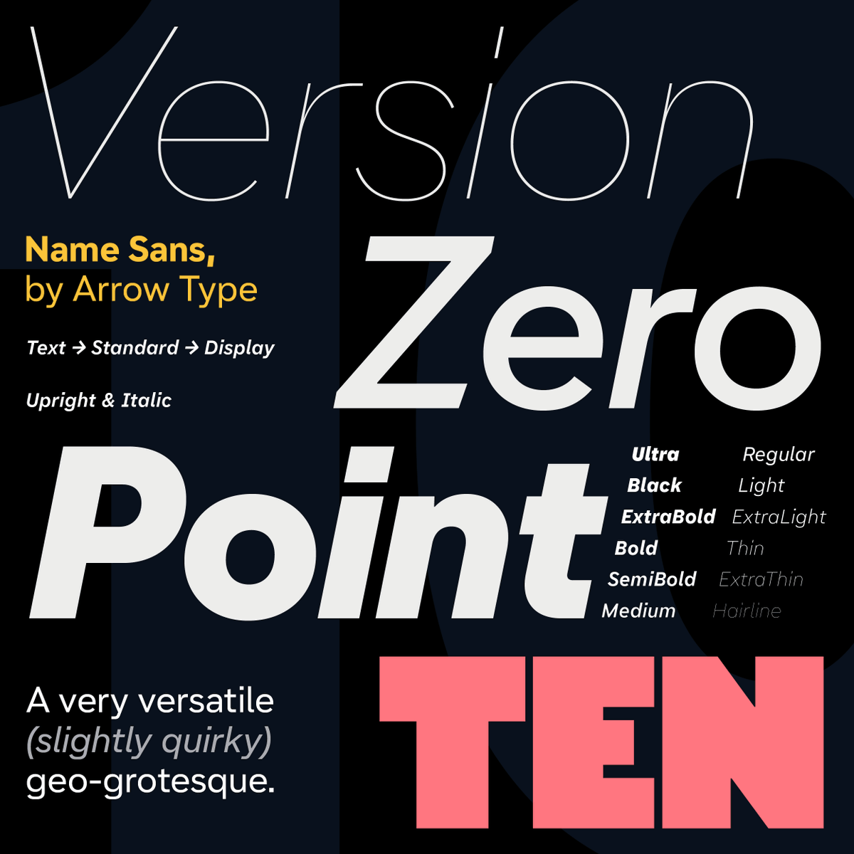
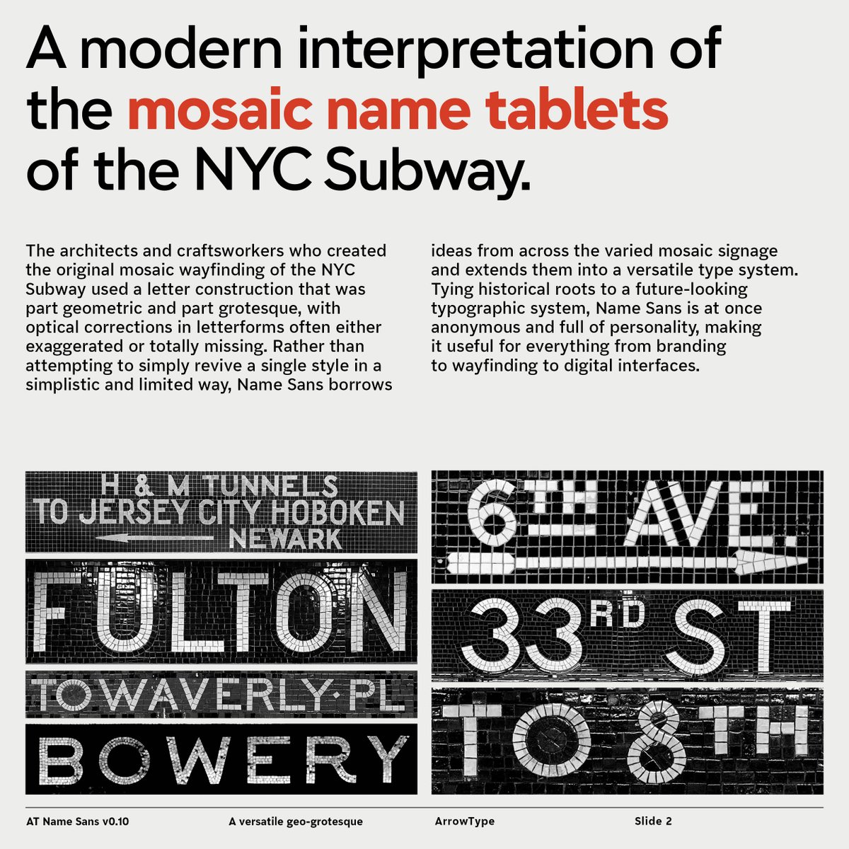
After years of work and literally thousands of iterations, I’ve finally published a full Version 1.0 of Name Sans, an extensive type family inspired by the gorgeous mosaic name tablets of the NYC Subway.
Read more about it on my ✨new website✨:
https://t.co/OuzReVvd35
Variable font support is now available in #Affinity 2.5 (beta)! Join our #beta program to access the latest pre-release build, test drive #WhatsNew and share your feedback with us – we would love to hear what you think! Sign up at https://t.co/ZmtPcSp6Zv
@jesi_rgb@FonsMans Thanks, Jesús!
Hey Fons, I’d be happy to help out if it makes sense. Shoot me an email if you’d be interested! Info on my website:
https://t.co/3SgeWkgVvc
@nan_xyz_@EvaSilvertant @beastsofengland @herzbergdesign Haha, thanks! I should have recognized the thumbnail of NaN Success, but I was scanning too quickly.
I’m going to blame Elon for this one. 😅
@nan_xyz_@EvaSilvertant @beastsofengland @herzbergdesign GAH! Twitter cut off the original tweet in ellipses, so I missed your name. :( Y’all are absolutely some of my favorites, too! Seriously inspirational fonts, tech, and design.
Check out this animation by @jesi_rgb (Jesús Rascón).
Built with AT Name Sans, @coldtypexyz, and @cavalry__app, and original music by Jesús.
P.S. if you’re looking to animate your own logos, fonts, infographics... you should reach out to Jesús. He has some skills!
5️⃣ TYPO : Name Mono (@ArrowType) est une interprétation numérique des tablettes de noms en mosaïque du métro de New York. J’aime tout particulièrement l’italic.
https://t.co/hfLoN6z4Zr
It has been such a treat to see AT Name Sans in the beautiful graphics created for the 2023 AIGA Conference from the early announcements up through the in-person events this past weekend!
📢 The 2023 #AIGADesignConf Schedule is here! Curious what you can expect at the 2023 AIGA Design Conference in NYC? View the new schedule overview in order to plan your travel and browse the unique tours and workshops offered this year >> https://t.co/VngI54c2BT
After years of work and literally thousands of iterations, I’ve finally published a full Version 1.0 of Name Sans, an extensive type family inspired by the gorgeous mosaic name tablets of the NYC Subway.
Read more about it on my ✨new website✨:
https://t.co/OuzReVvd35
@LIGHT_STOMACH@futurefonts Haha, yes, I love those alts! They were original going to be the default, but that can get distracting in some contexts. But, when they work, I love them!
@newgeographer2@futurefonts Sorry for my delayed response here. Sure, feel free to grab some trial fonts and give it a go!
I’m not on this site much these days, so please shoot me an email (address on my website) if you have any questions.
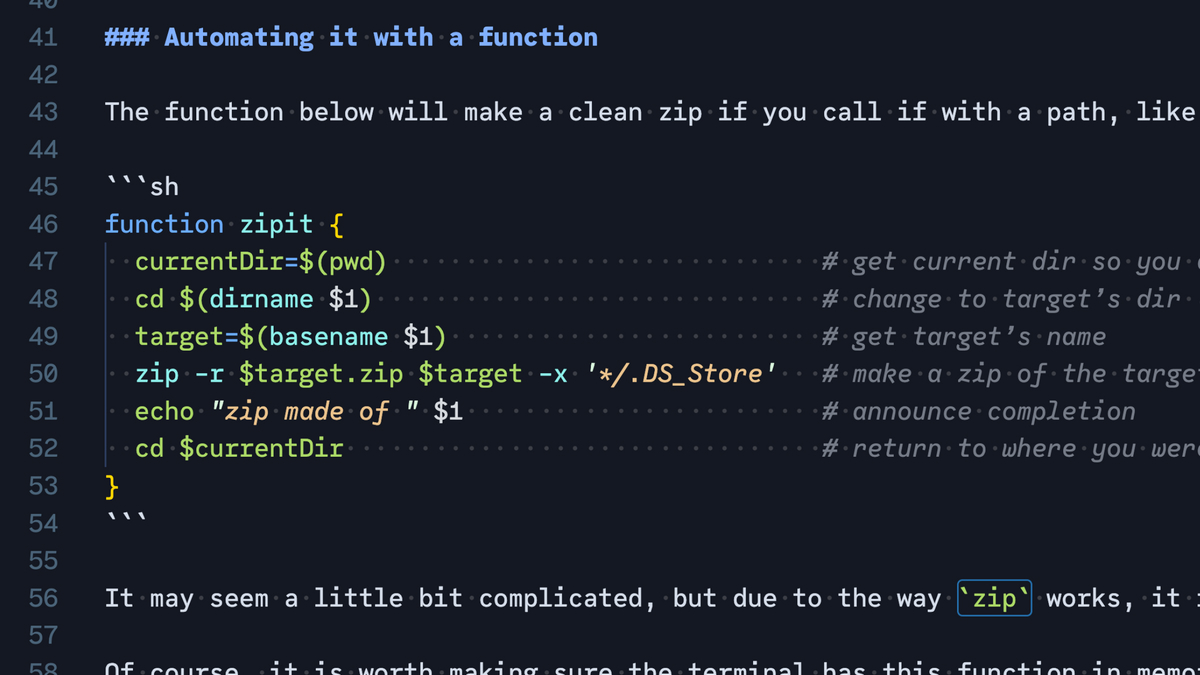
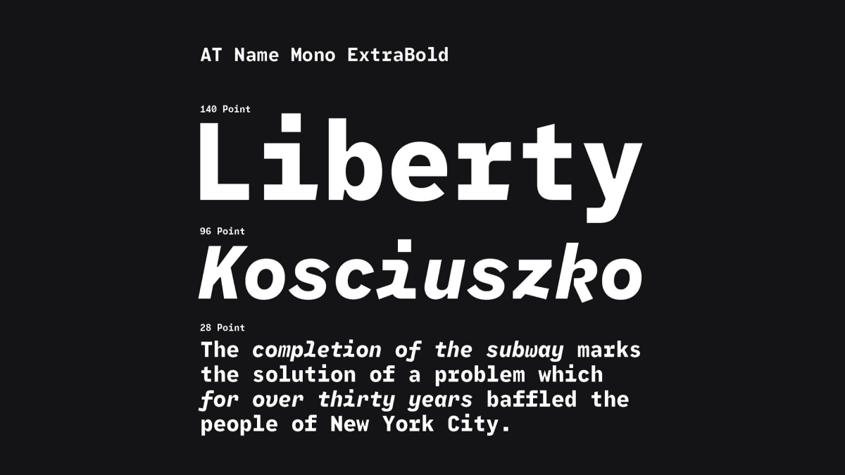
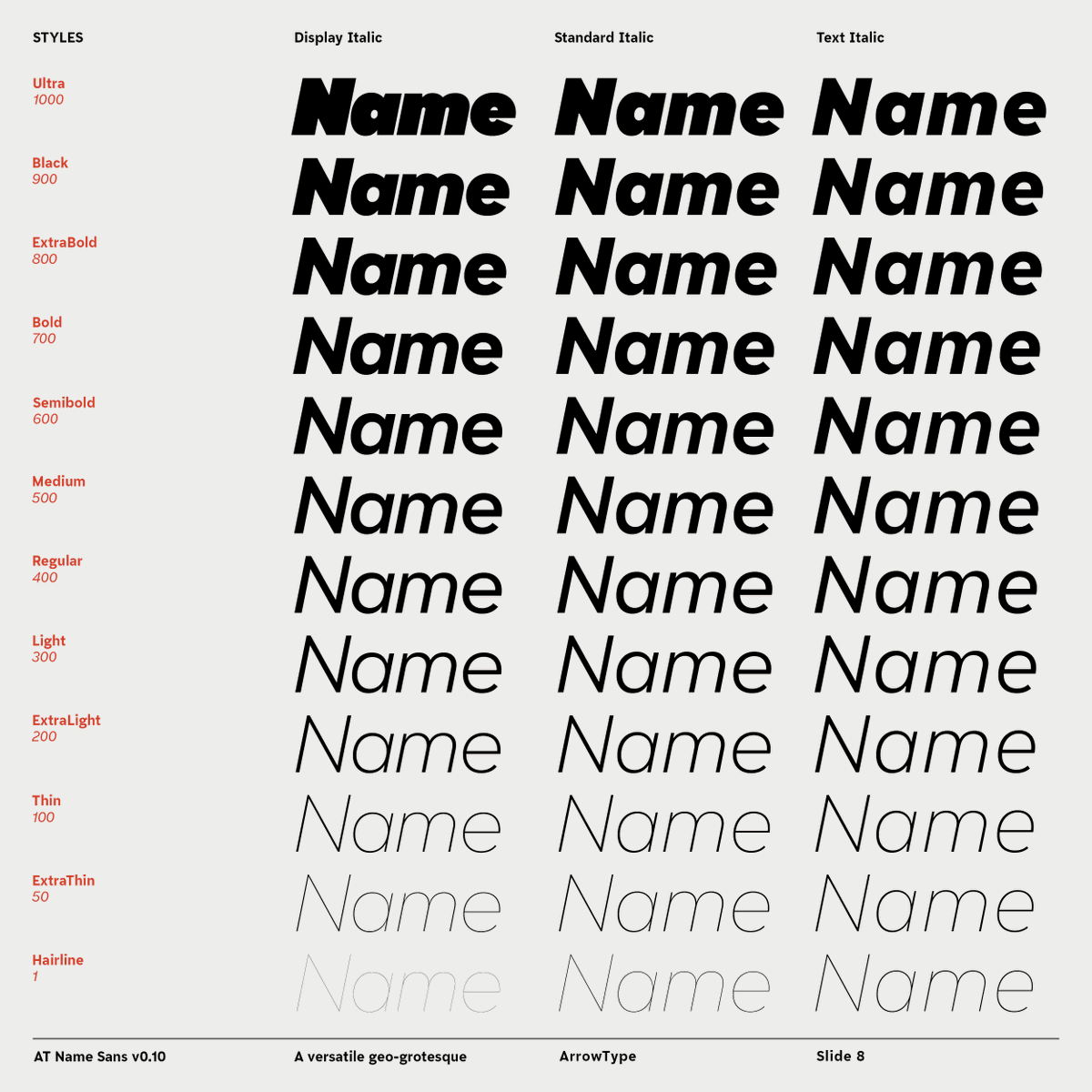
Name Sans v0.10 is now released on @futurefonts! I had originally intended to release v1.0 by now, but... I keep finding more things to improve. Still, I’ve made a bunch of significant improvements, and I wanted to make them available! Read more about it:
https://t.co/4mOvO5ZWzP