Python bite-sized tips, tailored for atmosci, but generally can be applied for datasci too!
See Substack link for copy-pastable code and/or email subscription.
HoloViz has completed its Chan Zuckerberg Initiative’s Essential Open Source for Science program grant, enhancing Bokeh and HoloViz for neuroscience and biomedical research. I imagine many of these demos could be applied to other fields as well!
Read 👉 https://t.co/UmBdldVgvQ
⚡️ HoloViews 1.20 out now with major speed boost for large datasets! Plus...
📊 ImageStack: Visualize 3D datasets
🔍 Interactive pop-ups for data exploration
🧠 Subcoordinate-y, great for EEG analysis
📏 Precise measurement with scalebars
Blog ⬇️ https://t.co/27eKSxHM0X
1/🧵
Rx caught my attention a year ago for making Python expressions reactive.
https://t.co/kceroNbvaV
After getting tangled in accessors, I gave it another go this year—and it’s surprisingly simple and powerful once the concepts click so I decided to share my learnings in this blog!
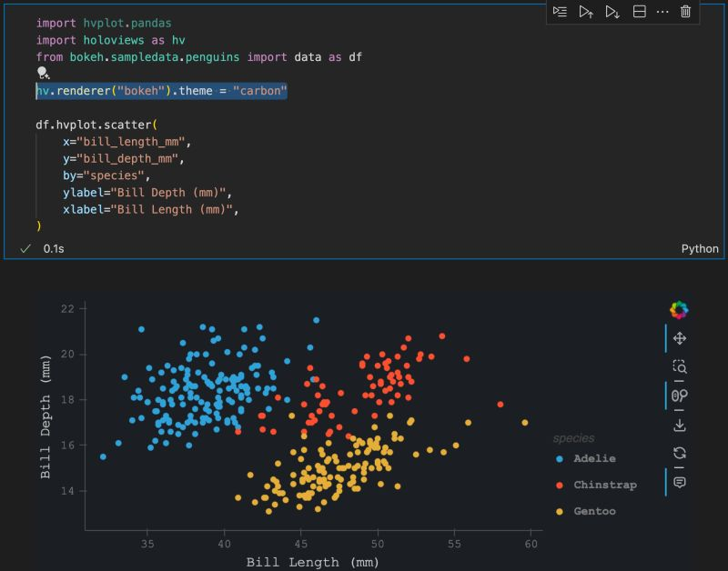
Did you know you can use built-in themes for hvPlot? The 'carbon' theme is my favorite since it matches the look of my IDE, but it requires pip install 'bokeh>=3.5.2' to use it.
Other themes are available too: https://t.co/zHJHK2rlD9
Create your own: https://t.co/0dVHBgVTiZ
Now that LLMs are able to run entirely on client side, I ported over my matplotlib tweaker app and made a few upgrades! Try it over at PyCafe; no API key needed! https://t.co/8NtUQkzgjJ
I demo some use cases for LLMs with hvPlot & @Panel_org
I got to use the the popup feature that was released in HoloViews>=1.19 too!
https://t.co/xPZploelyM
In our latest blog post, we explore the landscape of Python web frameworks. Whether you're interested in data dashboards, interactive applications, or exploring ML interfaces, we compare popular frameworks like Streamlit, Dash, Flask, and more. https://t.co/os02TgDAaS
Super excited for Panel 1.5.0 supporting client-side LLMs, meaning:
- No server dependency
- Data remains on your device
- Offline access (once cached)
That's just one highlight of many: https://t.co/PSrk0sga8g
Big thanks to https://t.co/yZVFCGmEaa!
Wow just discovered an amazing package: xarray-spatial.
Still trying to fully wrap my head around it, but my understanding is that you can do geopandas-like (or I guess spatial) operations on it, such as proximity, but in a raster fashion--and *fast*!
https://t.co/5tSzoguUJS
Did you know you can link selections with HoloViews / hvPlot plots easily?
Here, I link a map of Hurricane Katrina & Harvey with a couple scatter plots and make a few selections.
After, you can filter the original dataset based on your selection for further processing!
#python
Whenever there's a list of Python data viz packages, hvPlot rarely gets mentioned.
Here, hvPlot applies datashader to 100000 points simply by setting `rasterize=True`, but when it's zoomed in, it shows the individual points, thanks to `resample_when=1000`!
Q: How do I make the data viz look good?
A: You can start with a good looking font.
Let's elaborate.
Font type in data viz really has one job:
~ it's got to be easy to read❗
Generally, we've got two font families:
▪ Serif
▪ Sans Serif
What's the difference between them?
The fonts from Serif family have decorative lines/strokes attached to the main body of a letter. This is a classical look that you would often see in the books.
Sans Serif don't have those decorative elements and therefore are plainer.
Which one should I choose?
Sans Serif.
This font family has been commonly used across the Internet and in all sorts of design (poster/leaflets/ads) for many years. People are familiar with them and this makes them easy to process.
One thing you must be aware of that the fonts come in many styles, e.g.:
▪ wide
▪ condensed/narrow
▪ bold, etc.
But going with the regular style is almost always a good choice❗
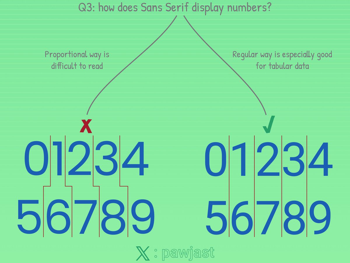
What about the numbers?
Even if you go with Sans Serif, you want to ensure the numbers are displayed properly. And properly means they have the same size. This makes them easier to read, especially when you present a tabular data.
Are there any exceptions?
There are always exceptions!
Depending on the look you're after you might want to mix the styles a bit.
It's generally OK to e.g.:
▪ use Serif for the titles or headers of the annotations
▪ or use Sans Serif everywhere but make titles/headers bold
Where would I get the fonts from?
🔗 fonts(dot)google(dot)com is a great place to start.
Any font recommendations that tick all of the boxes?
▪ Roboto
▪ Lato
▪ Open Sans
Finally, see below some examples:
Thank you for reading👍!
HoloViews will soon support *customizable* popups on tap, or selection, by simply defining a `popup` callback, and it can display anything that Panel can render--which means floating panes of HoloViews' plots, pandas DataFrames, Panel panes & widgets, and much much more!
#python
Created streamjoy.HtmlStream https://t.co/7kkhgfmSUw, turning images into @Panel_org Tabs & Player. No server is required; share it with others like a mp4 file!
It's now released in StreamJoy 0.0.7, alongside support for Polars, use with fsspec, docs revamp, and more
#python
Drag a slider to explore data over time on a map--then, subset a region on the map to get an regional averaged timeseries with @HoloViews!
Cross sections too: https://t.co/R3KPlzf9P8
It's easy to create *interactive* cross sections of an n-D dataset thru HoloViews: `new_plot = DynamicMap(callback, streams=[PolyDraw()])`
https://t.co/R3KPlzeBZA
This guide builds up to these interactive viz--copy-pastable checkpoints too!
#python#dataviz#metpy#xarray
Animate 348 images in just 14 secs with StreamJoy! v0.0.2 fixes `Paused`, allowing you to freeze the animation whenever and however long you want!
Check out the recipes to see how this was created:
https://t.co/RbGYWV6v8W
#python#matplotlib#animation#gif#mp4#notai :)