Ich hätt ja noch eine andere Karte zu den Klimabonus-Klassen überlegt, da mE ein gutes Beispiel zum Thema Bevölkerung und Landkarten (von der Farbwahl nicht zu sprechen), aber ok, war die Innenpolitik halt schneller. Anyhow:
@bricker@GeoInfoNL Thanks for sharing! Even though you found tile maps have (even) stronger emotive properties, we still 💖 cartograms. With our @qgis plugin it’s super easy to create them: https://t.co/umpxLozvX8
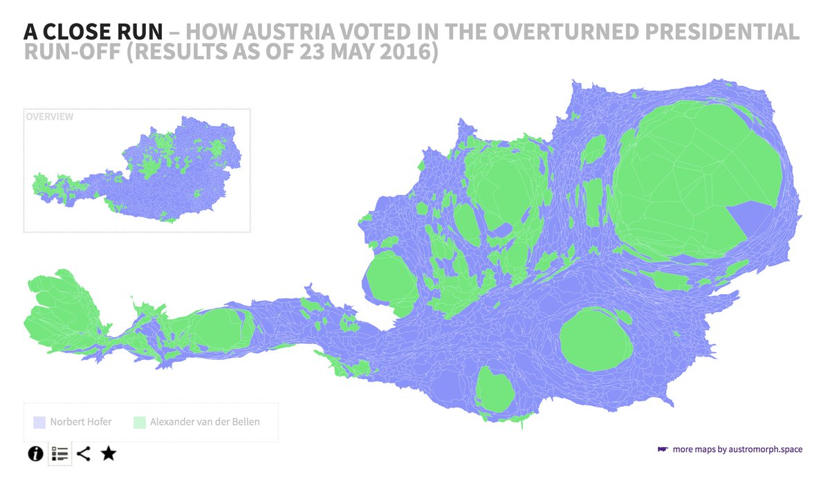
@ArminWolf Und so sah die politische Landkarte der Gemeinden Österreichs 2016 gewichtet nach Bevölkerung (Anzahl der Wahlberechtigten) aus.
online map #bpw16 ➡️ https://t.co/acZsKq42vp
Changes in the political landscape of #Vienna: 2015 and 2020 elections – district by district.
#wien2015 vs #wien2020
winning party plus 2nd place
city council ⬅️🗳️➡️ district council
#30DayMapChallenge Day 29: Experimental
Experimenting what different projections from the https://t.co/hbOHn9krAX package do to a simple map of Austria (without any adjustments)
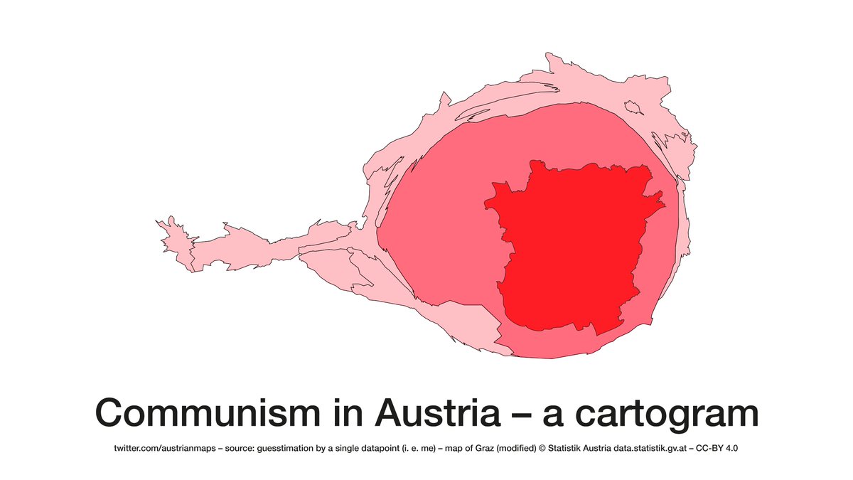
How big is the Austria city of Graz when it comes to regional elections (that happen to be today)? Find out yourself: https://t.co/wFJRuQfWcr
#30DayMapChallenge Day 23: population.
Thx @metropop_eu for the tip
Final results of the 2019 Austrian General Election at the scale of municipalities (and districts of Vienna) – re-sized by number of eligible voters >> https://t.co/fdr4Jh1V3i
#nrw19
#Austria's updated political landscape #nrw19
Preliminary 2019 General Election results (w/o postal votes) – mapped by municipalities, re-sized by electorate > https://t.co/lZ4LBjnFj3
#Austria's updated political landscape #nrw19
Preliminary 2019 General Election results (w/o postal votes) – mapped by municipalities, re-sized by electorate > https://t.co/lZ4LBjnFj3
Great to see our #austromorph cartogram in the current issue of @archplusnet accompanying Andreas Rumpfhuber’s analysis of spatial representation and structures of the populist right in #Austria
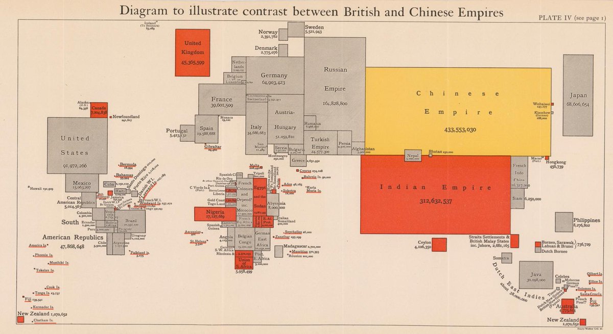
Global population cartogram from 1916 by LG Curtis highlighting the British and Chinese Empire.
The author emphasises that "the collapse of the British Empire (...) would convulse the whole fabric of human society." https://t.co/OMhlef338e | via @philip_thai@baskerhel
Persons with higher education qualifications, aged 15+, as % of total population of same age.
First on a normal coropleth map and then on a population cartogram. Neither of them is optimal to deliver the message on their own, but an animation is quite helpful.
Data: @THLorg