Something is coming... Built with Vanilla JavaScript & @threejs. Inspirations: "Grass / Exponential Height Fog" by @iced_coffee_dev, "Shader in Screen" by @XorDev ported from FragCoord.
Respect ✊🏾
Worship (Al-'Ibadah) is a comprehensive term covering everything that Allah loves and is pleased with - whether saying, or actions, outward and inward.
Whoever addresses the ibadah to anyone besides Allah is committing a major shirk regardless of him knowing that it is a ibadah or not, as long as he intends to do this action.
Narrated by ʿAdī ibn Ḥātim (may Allah be pleased with him):
He heard the Prophet ﷺ reciting the verse:
“They have taken their rabbis and their monks as lords besides Allah”
(At-Tawbah 9:31).
I said to him, “Indeed, we do not worship them.”
He said, “Do they not make unlawful what Allah has made lawful, and you consider it unlawful? And do they not make lawful what Allah has made unlawful, and you consider it lawful?”
I replied, “Yes.”
He said, “That is their worship of them.”
Narrated by Aḥmad and at-Tirmidhī, who graded it ḥasan.
I no longer look at quick trends as something I need to jump on right away.
Not because I’m lazy and want to keep doing whatever worked yesterday. Not because of arrogance or the usual “what a childish trend” eye-roll.
I stopped squeezing myself into trends because it’s the fastest way to produce safe but mediocre work.
The client will smile, colleagues will pat me on the back with “great job” … and then, a year or two later, that design feels more outdated than a beveled Web 2.0 “Download Now!” button.
Everyone is talking about Airbnb’s new 3D icons. They might have kicked off a fresh wave of skeuomorphism, but that wasn’t trend-chasing. Airbnb shaped them around its own design philosophy that reached this state after many years of transformation.
Pure authenticity, and people can feel it. That authenticity spilled over to the rest of the industry.
But if Microsoft (or anyone else) rolls out a look-alike icon set tomorrow, it won’t automatically move the needle. It’s obvious their version wouldn’t come from the same thoughtful internal transformation that led to Airbnb’s outcome.
What I do like to focus on is the “why” behind these shifts in design trends.
✦ But before digging into the “why,” here’s what pushed me to change. Early in my career, I pitched 3D illustrations to a client and my entire rationale was: “Revolut and Microsoft are doing it, this is the hot look right now!” Predictably, the idea fell flat. Deep down I knew that was a weak argument, but I had no stronger story to tell. That failure sent me back to basics, determined to understand the real forces behind every design movement.
Back to finding an answer… let’s look at pivotal moments in graphic design of the 20th century.
Watch the pendulum swing:
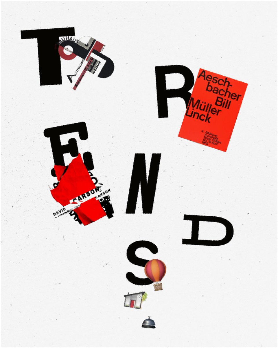
✦ First, the 1950s International Typographic Style: Helvetica, rigid grids, perfect neutrality, became corporate standard as a result of post-war rethinking and rebuilding. After a decade of copy-paste annual reports, grid-fatigue set in.
✦ The mid-’70s “New Wave” Swiss crew: Willi Kunz, Wolfgang Weingart, and friends, kept the grid but bent it: angled columns, mixed weights, unexpected spacing. Order met personality, but that was not scalable enough to be supported as a long-lasting movement.
✦ Cue the early ’90s grunge era: David Carson’s distressed type and broken layouts blew up the grid entirely, embracing raw texture just as desktop publishing made chaos cheap and easy. A welcome jolt, until overstimulation and lack of control drove everyone back to cleaner systems once again.
That’s the cycle: geometric minimalism → expressive remix → total rebellion → reset. Every phase tires our eyes, triggers its opposite, and the pendulum keeps moving.
Knowing the fatigue curve helps anticipate the next swing instead of chasing yesterday’s trend.
P.S. Do you think we’re witnessing a new wave of skeuomorphism?
We’ve been designing for humans.
But what if we aren't anymore?
For decades, design had one goal: make human-machine interaction easier. We moved from cryptic command lines to graphical UIs, then to mobile apps.
But now, something big is happening.
AI agents are taking over.
✦ They don’t browse, read, or experience the web like we do.
✦ They search, decide, and act—on our behalf.
Now, we design for AI Agents that bypass UI.
What happens to UI?
If AI books flights, fills forms, and orders groceries without a webpage or app—does UI even matter?
Like command lines faded with graphical UIs, could interfaces shift from human-centric to AI-driven, leaving only raw data, APIs, and machine-readable structures?
But here’s the thing:
UI isn’t disappearing—It’s evolving.
Yes, AI handles more tasks, but it only gives what we ask for. What about when we don’t know what we need until we see it?
Humans process 80%+ of information visually. We don’t just read—we scan, compare, and interpret patterns instantly.
If vision dominates:
✦ Text still matters → so typography matters.
✦ Structure still matters → so layout and composition matter.
Won’t AI design everything?
AI can generate layouts, automate templates, and handle basic design—but it won’t replace designers. It creates two design tiers:
→ AI-generated interfaces = fast, functional, mass-produced.
→ Crafted design = nuanced, emotional, high-end.
Great design is about function and feeling. And feeling? That’s human.
What’s next for designers?
We’re shaping AI-human interactions, not just screens.
That means:
→ Some interfaces will be AI-driven, automated, and minimal.
→ Some will remain complex for deep control.
→ Some will be hybrids—AI assists, but users fine-tune.
The real question: How will designers evolve with AI? Let’s discuss. 👇
7 Years at Awwwards—if it’s taught me anything, it’s this:
The best design tells a story—or it dies.
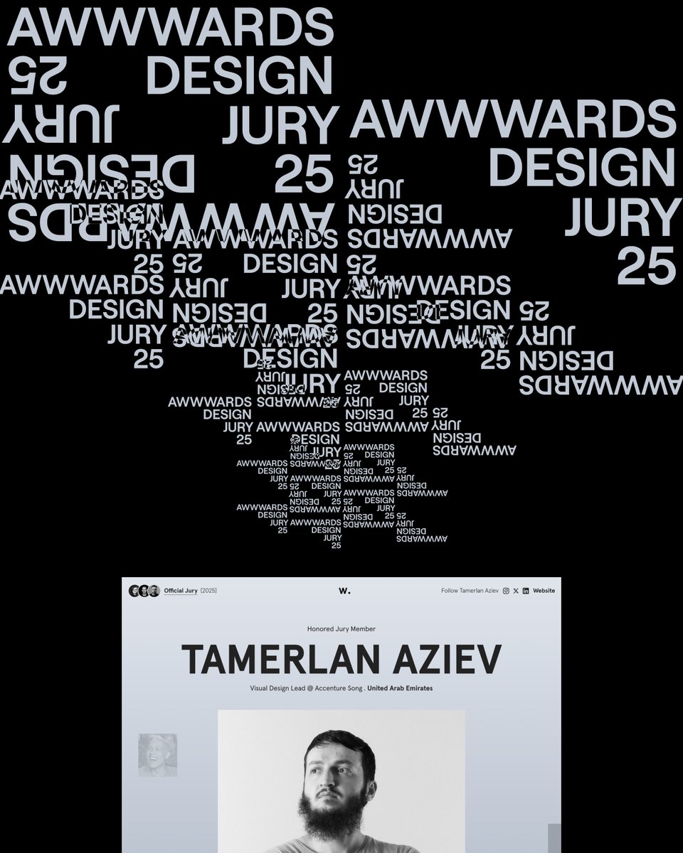
I’m honored to be selected as an @awwwards Design Jury member for the 8th consecutive year, and while it’s tempting to list out “design trends of 2025,” I’ve come to realize something a bit more interesting:
Most designs are forgettable.
Not because they’re bad. Not because they’re ugly. But because they don’t make us feel anything.
Here’s the thing: Our brains don’t take action based on facts. They take action based on story. It’s not a “nice extra” in design. It’s the difference between a site that gets scrolled past and one that changes minds.
So what’s the pattern? What makes a digital experience stick?
✦ Story is the real UX:
You’re not designing for clicks—you’re designing for decisions. And decisions are made through emotion, not logic.
✦ Perfect design is forgettable:
The most effective work isn’t always pixel-perfect. It’s bold, it’s clear, and it has something to say.
✦ Design is persuasion:
A clean UI is great. A UI that guides people through a meaningful journey? That’s the goal.
This is why storytelling isn’t decoration—it’s the entire foundation of good design. Every element, every transition, every choice should serve a purpose: pulling the user deeper into the experience, making them feel like they belong, and guiding them toward action.
Because if your design doesn’t tell a story?
It dies.
Excited for another year of exploring what makes digital experiences truly unforgettable.
P.S: What’s one design that made you feel something?
Discover how to rethink space and composition in design to break free from generic layouts. In this video, we’ll dive deep into advanced techniques for interactive screens, helping you create layouts that truly stand out.
https://t.co/LYfQMQdBYm
The secret battle in interactive layouts:
Form vs. Space. But most designers focus on...
"Form", with only a few utilizing "Space".
There are two fundamental approaches when designing interactive layouts:
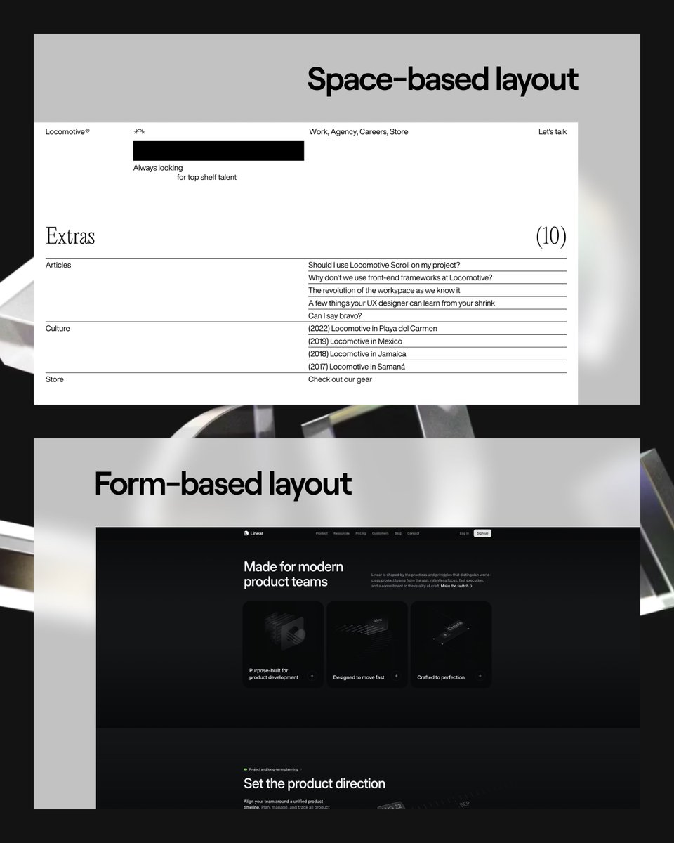
✦ The Form-Based Approach:
This is the mainstream method. It’s about filling the screen with neatly designed elements—think Bento Grid layouts, cards, visuals, 3D elements.
It requires pixel-perfect execution, but less thinking about how elements breathe. Because cards have limited space, form-based websites often use a fixed-width grid, resulting in large empty areas (“ears”) on both sides.
✦ The Space-Based Approach:
This is about shaping the layout through negative space. Instead of focusing on elements, you design around the gaps. It’s fast to sketch, but demands deep thinking about negative space, proportions, imaginary lines and hierarchy.
Both have their place.
✦ Form-based layouts thrive in mobile interfaces, where screen real estate is limited, and every pixel counts.
✦ Space-based layouts shine in desktop experiences, where you have the luxury of negative space to guide focus, prevent clutter, and create breathing room for content.
The problem?
→ Most designers default to form-based thinking, even when they shouldn’t.
→ Great interactive design isn’t about what you put in—it’s about what you leave out.
→ Think of it like architecture. Buildings don’t shape cities—the space between them does.
→ Think of it like typography. Letters don’t define legibility—the space between them does.
And now, think of layout. Your design isn’t just the elements on the screen—it’s the space that connects them.
So, how do you use this?
✦ When working on mobile:
Embrace form—Bento grids, vertical storytelling with a bit of white space play in vertical, clear visual hierarchy based on standard Gestalt principles: Proximity (clear inner and outer space), Closure (think of cards), Continuation (e.g. horizontal list of cards that go outside of screen).
✦ When designing for desktop:
Take advantage of space when the project allows it—use width strategically. The Figure-Ground Gestalt Principle is your best ally here. With the abundance of extra space on desktop, you can either guide users effectively or leave them feeling lost.
The point is clear, "Master both" approaches, and you’ll never struggle with layout again.
PS: Do you think designers underestimate the power of "Space"? Let’s discuss!
@martinsomerfeld Thanks Martin for sharing your feedback! I was about to forget X as platform to share as I got zero engagement lol but you got me back. Stay tuned for more stuff.
@Green_Birds_ @MMetaphysician@Haqiqatjou Ask that question to Imam Muslim rahimahuLlah who included that hadeeth in his Saheeh.
I think you are confusing Athari creed which is what salaf used to be upon with something else. Laymen of nowadays are deferent from laymen of early times.
@Green_Birds_ @MMetaphysician@Haqiqatjou Then, she was brought and the Prophet said, “Where is Allah?” She said, “In heaven.” The Prophet said, “Who am I?” She said, “You are the Messenger of Allah.” The Prophet said, “Free her, for she is a believer.”
Source: Ṣaḥīḥ Muslim 537
@Green_Birds_ @MMetaphysician@Haqiqatjou Mua’wiyah ibn al-Hakam reported: I said, “O Messenger of Allah, I have a servant-girl whom I slapped.” That upset the Messenger of Allah, peace and blessings be upon him. I said to him, “Shall I emancipate her?” The Prophet said, “Bring her to me.”