As a product manager in the field of AI/ML, it's crucial to have a strong grasp of key concepts
This knowledge will help you navigate the industry with confidence and make informed decisions.
Here are 15 important terms with examples from popular products👇
@FonsMans I think it depends of where you are designing. For example, if you are working in a company that has no design culture and the stakeholders are always giving suggestions, it is hard to deal with.
SUMMARY
Here were the 4 key steps we took at Google Maps to simplify the design and scale for the future:
1. Deconstruct all content, features, and functionality
2. Reframe around people and their use cases
3. Explore ways to reconstruct the product
4. Scale for the future
In 2007, I was 1 of 2 designers on Google Maps.
The app was growing like wildfire.
But it was becoming a cluttered mess — new features were being shoved into every pixel.
Here’s the 4-step process we used to redesign Google Maps into one of the most loved apps in the world: 🧵
–––
But first, it’s important to understand it is normal to build a product based on the underlying technical structure.
In 2005, Google Maps queried one of three databases for any search:
• Maps data
• Local business data
• Directions data
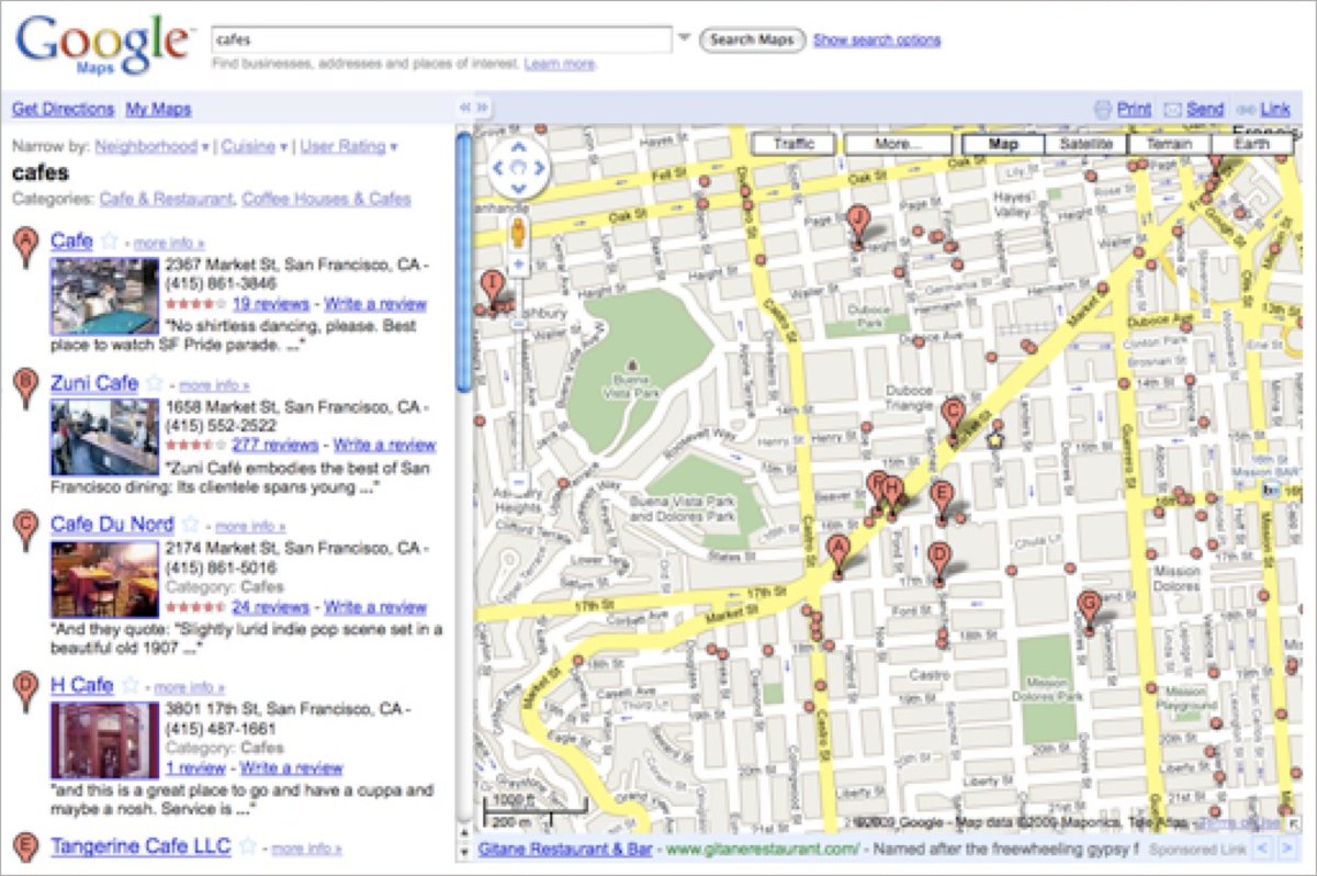
Not surprisingly, the first version of the website had three tabs, one for each of these databases: Maps, Local Search, Directions.
–––
By 2007, Google Maps still wasn’t the dominant mapping application.
But it had hit PMF, its user base was growing quickly, and we were rapidly adding new content and features like:
• Satellite and Terrain views
• Streetview, 3D buildings, Traffic
• Editable map data, Reviews, Photos
• Transit Data
We were wedging new features into any space we could find in the UI.
It became clear the user experience was suffering and the product was growing increasingly complicated.
At that time, our VP, Marissa Mayer likened Google Maps to a Christmas tree that we kept adding more and more ornaments to until it started to fall over…
We tried many different ways to rearrange the UI to accommodate new features.
Eventually we had to step back and rethink Google Maps based on what we knew was working, what brought people to the product, and what we believed the future might look like.
–––
These were the 4 key steps we took to simplify the design of Google Maps to be the intuitive, durable, much-loved product that 1B people still use today:
1. Deconstruct
We wrote down all of the product’s current and upcoming content, features, and functionality and loosely grouped them into categories:
• Core features — The most common tasks people came to do (search, get directions, find businesses)
• Aspirational use cases — Tasks we wanted people to start doing (adding their own content, correcting inaccurate information, using Maps to explore new places, etc.)
• Global actions — Actions that impacted the entire page (print, share, save, etc.)
• Use case specific actions — Actions that were relevant only within a specific use case (eg while getting directions, being able to drag a route or add a destination)
• Related features — Things that weren’t a part of Google Maps at the time, but existed and were closely related. (eg transit information, business searches on https://t.co/M0Af8Qy8uQ)
–––
2. Reframe
We leveraged a combination of user research, business goals, and our own intuition to make the product better, simpler, and scalable over time. We focused on understanding:
• What brought people to the product
• How they navigated through the product
• What was working well
• What flows were confusing
• What things were missing
• What information was valuable when
• What functionality was redundant
We emerged with several key points:
• “Searching” was the most pivotal task in Maps
• Searching addresses, businesses, parks, mountains, cities, etc could all be thought of as searching for “places”
• Getting directions was important, but rarely happened between two specific addresses. Directions searches usually had a known start or end point, like home or work. It was also more intuitive to be able to search for directions by a place name e.g., Carmel Library rather than having to look up the address first.
• It was strategically important for people to be able to contribute content to Google Maps and to be able to explore the world around them.
–––
3. Reconstruct
Based on what we learned, we then explored ways to reshape the product.
We held these general usability principles in mind:
• Entry points to core use cases should be prominent
• Flows within core use cases should be intuitive
• Common actions, interactions, and views should be consistent
• Contextual actions should be accessible when relevant
This is one exploration of clustering tasks and connecting relevant content:
Our explorations of how to reconstruct the site around people’s needs and flows led to several key design changes:
• There would be only one search box for everything
• Directions would live as a secondary feature
• Other features would appear in context (eg, transit became a mode within directions)
–––
4. Scale for the future
This was 2007. We knew the product would continue to evolve, the information set would grow exponentially, and the feature set would continue to expand.
But by focusing on key use cases and folding information in to the UI where it was relevant, we created a framework to support future growth.
16 years later, Google Maps has continued to evolve, yet is still a simple, intuitive, much-loved product that 1B people use around the globe.
For more on design, follow @elizlaraki
Aujourd’hui, où des banlieues brûlent à nouveau, je voudrais parler des "Zéro-Un".
Même si c’est vieux, et pourtant très actuel à Mantes ou Vénissieux; même si cela me fait toujours un peu mal.
C’était dans les années 60 – 70. La croissance économique battait🧵⤵️
@BugsDabby@maevamattei9@WhatsupYoann@papeeyohn Mes faits sont clairs, ils n’ont pas résolus l’enquête. Tu ne le comprends ou non ce sont les faits. Donc pas la peine de devenir condescendant sans aucune raison, à moins qu’il y est aussi une raison pour ça ?
#Config2023 launches bridge the gap between design and development, all in Figma.
→ Dev Mode, a new space for developers
→ Variables
→ Advanced prototyping
→ Auto layout updates
→ Font picker
→ File browser redesign
Plus, we previewed the future of Figma with AI and announced the acquisition of @diagram. https://t.co/RB3qHFSSPz
@Figma vient de publier une série de vidéos pour apprendre à construire un design system solide et pérenne.
C’est très bien foutu, et chaque étape est expliquée avec précision, sans s’éterniser.
https://t.co/xOvWFBbgkM
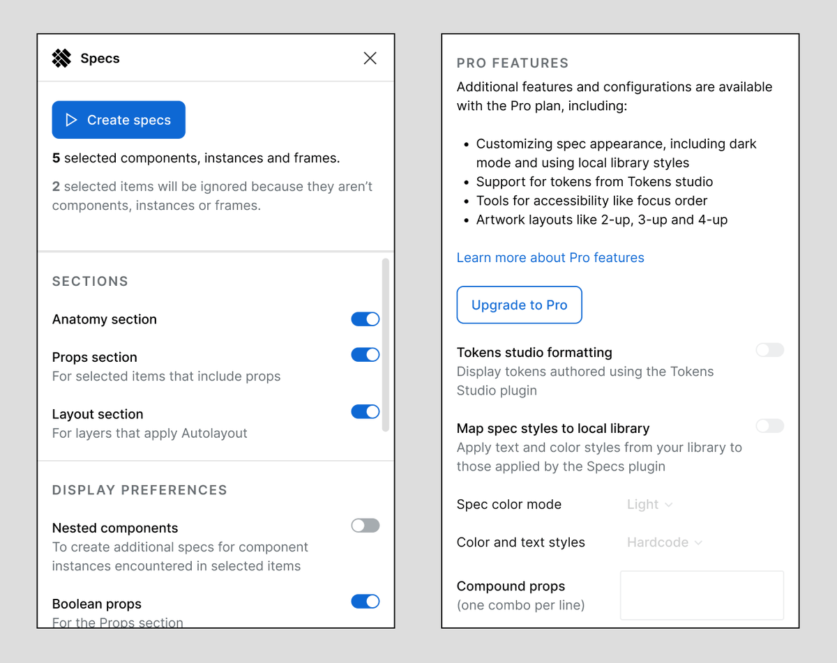
Available starting today, you can upgrade your use of the EightShapes Specs plugin to display Tokens Studio tokens within Anatomy, Props and Layout sections. Enjoy!
https://t.co/qfI5g6o2tK
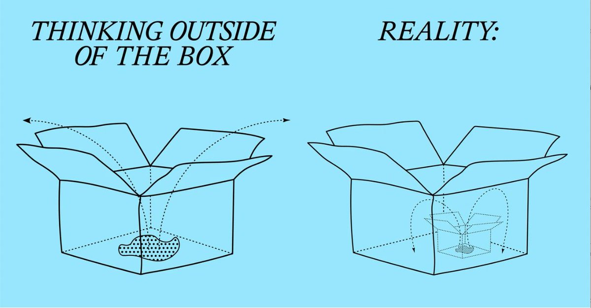
I like this illustration from It's Nice That's article "The Test of Time" (https://t.co/SGEnKHuqKd).
I like it because it supports my belief that people never actually think outside the box. There's always a bigger box.
Cummings Razor:
When confused by politicians' decision-making, remind yourself of this tweet.
They rarely use metrics or dashboards to guide decisions like CEO's.
Instead, they react to random news stories each day.
(h/t @balajis)
I'm working on a Figma UI for the Specs plugin and wondering IF folks would pay for Pro features and if so, how much? There'd still be _some_ configurations available without Pro.