Combining design and technology, we create fonts that perform. Across borders, across touchpoints. Type+Tech® is our expertise. Black[Foundry] is our name.
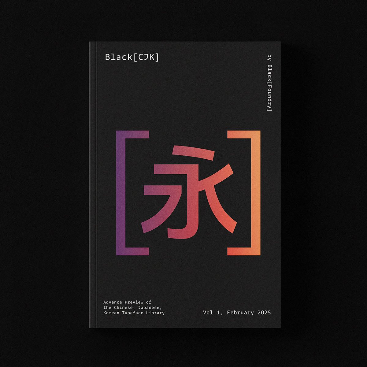
After introducing our Arabic catalog, we are excited to share a sneak peek of our CJK font library, featuring Chinese, Japanese, and Korean typefaces currently in development.
Link 👇
https://t.co/ffIyQdy652
Black[Foundry] is closing its doors after a decade of designing & engineering multiscript fonts. The catalog lives on with The Type Founders @thetypefounders, while Jérémie Hornus continues bespoke type design via U+ Type → https://t.co/IIciiU6x7J — a bright new chapter begins.
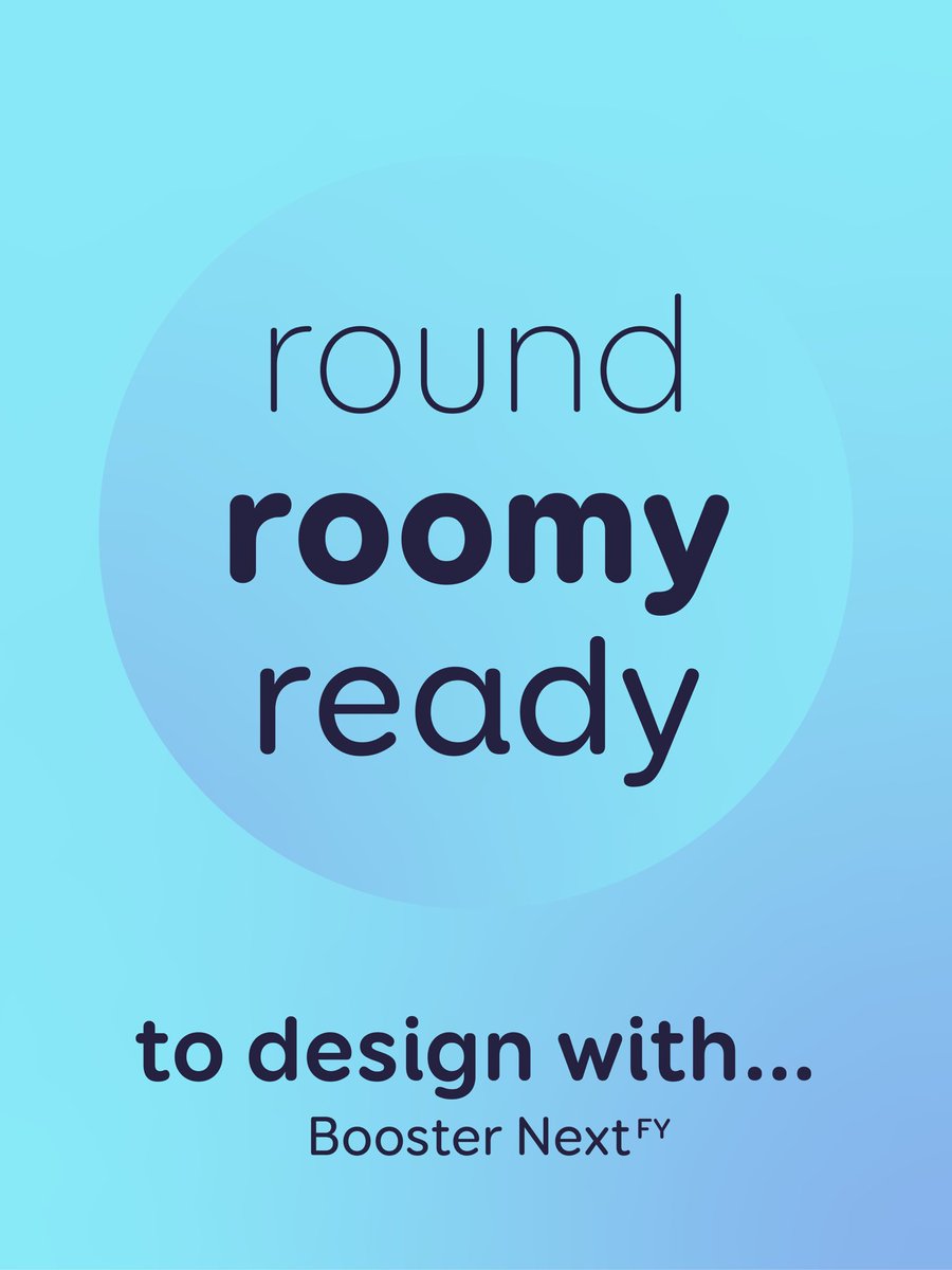
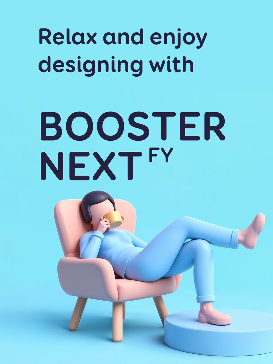
Take a break, but keep designing.
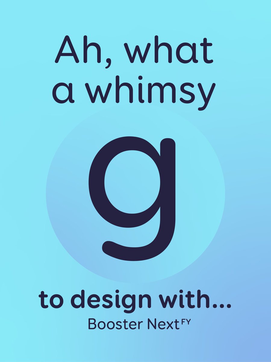
With Booster Next FY, creativity flows effortlessly: smooth curves, friendly vibes, and a touch of boldness just where you need it.
Relax. Create. Repeat.
https://t.co/ZN0U29SUvY
We updated our Black[Arabic] catalog, adding more insight on our font Vesterbro Arabic, which is now released and available in our retail library! Discover our Arabic fonts now
https://t.co/oWH9jO5dui
Askr & Embla, two alpha fonts in perfect contrast. Strength meets finesse. Structure meets expression. Discover their story on our website.
https://t.co/jp1PiZ5y4L
Meet Vesterbro Arabic! An extension of the beloved Vesterbro family, it carries the same warmth and expressiveness into Arabic script. Designed by Hirbod Lotfian, it balances contrast, elegance, and fluidity—perfect for branding, editorial, and more.
https://t.co/1rgmbg2Vip
Excited to launch Vesterbro Arabic!
Designed by Hirbod Lotfian , it brings the expressive charm of Vesterbro to Arabic script, blending contrast & calligraphic elegance. A perfect fit for branding, editorial & more. Explore it now!
https://t.co/1rgmbg2Vip
Say hello to Vesterbro Arabic! A seamless blend of contrast, fluidity & tradition designed for Arabic, Persian, Urdu & Kurdish. Now available on our website.
https://t.co/1rgmbg2Vip
🔊🎶Discover the Grtsk Sequencer: a tool blending typography & music. Transform the Grtsk font into a musical instrument with weight, width, & slant variations. Auto-randomize melodies or customize your own. Export, share, and keep creating! Have fun 🤩
https://t.co/SvYIpHf2Oe
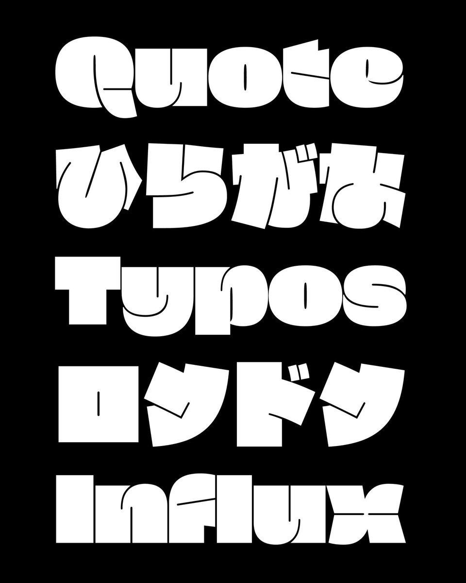
Checkout the Japanese Kana of Fat, from our East Asian font collection, designed by Yuxin Li.
Fat is the embodiment of boldness in the world of display fonts! Every glyph is so incredibly fat that it captures attention instantly.
https://t.co/ffIyQdyDUA
After introducing our Arabic catalog, we are excited to share a sneak peek of our CJK font library, featuring Chinese, Japanese, and Korean typefaces currently in development.
Link 👇
https://t.co/ffIyQdy652
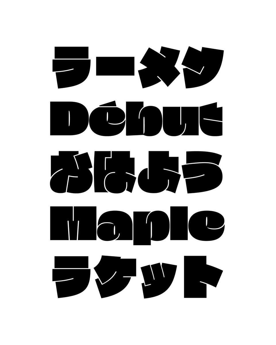
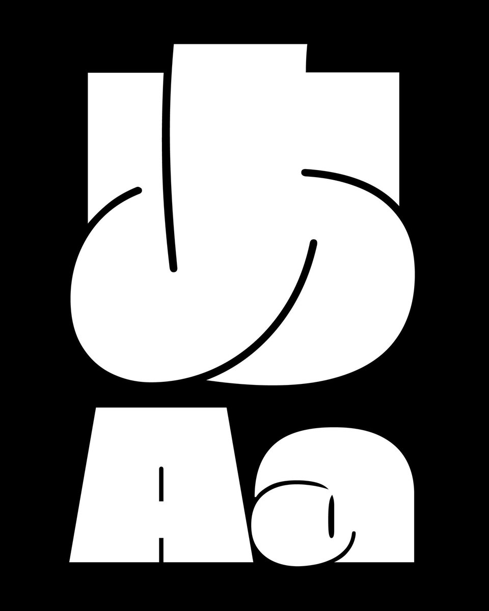
Introducing Arcadio, a Latin-Chinese type family in our East Asian font collection.
Explore more about Arcadio, as well as our other East Asian fonts currently under development, in our Black[CJK] catalogue on our website.
https://t.co/ffIyQdy652
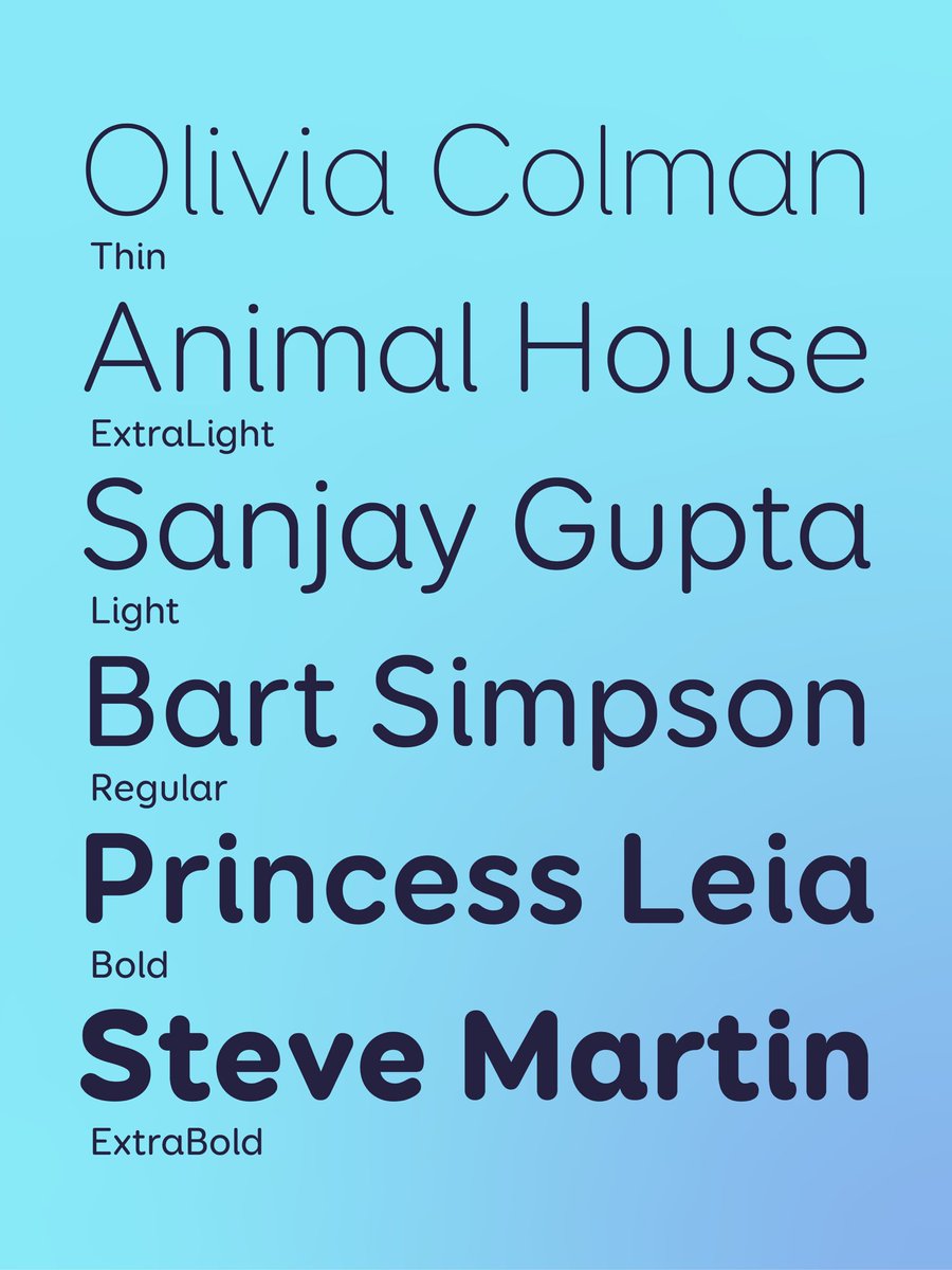
Pushing boundaries, Close up.
Highlighting the letters swapping when Mono with grid visiblility.
3 axes of variation:
Monospaced ↔ Proportional
Normal ↔ Extended Swashes
Light ↔ ExtraBold
Thanks @Fontra_xyz
Here’s a quick preview of Vesterbro in Chinese and Japanese writing systems.
Explore more of our East Asian fonts in the CJK section of our website.
https://t.co/ffIyQdy652


![blackfoundry's tweet photo. Introducing Arcadio, a Latin-Chinese type family in our East Asian font collection.
Explore more about Arcadio, as well as our other East Asian fonts currently under development, in our Black[CJK] catalogue on our website.
https://t.co/ffIyQdy652 https://t.co/uQxAI4lmbP](https://pbs.twimg.com/media/GkkOOVNW4A0xiO2.jpg)
![blackfoundry's tweet photo. Introducing Arcadio, a Latin-Chinese type family in our East Asian font collection.
Explore more about Arcadio, as well as our other East Asian fonts currently under development, in our Black[CJK] catalogue on our website.
https://t.co/ffIyQdy652 https://t.co/uQxAI4lmbP](https://pbs.twimg.com/media/GkkOOVMW4AMXGjN.jpg)


![blackfoundry's tweet photo. Black[Foundry] is closing its doors after a decade of designing & engineering multiscript fonts. The catalog lives on with The Type Founders @thetypefounders, while Jérémie Hornus continues bespoke type design via U+ Type → https://t.co/IIciiU6x7J — a bright new chapter begins. https://t.co/0vupoKq3uD](https://pbs.twimg.com/media/G09_Ka_WAAAiOlF.jpg)


![blackfoundry's tweet photo. Introducing Arcadio, a Latin-Chinese type family in our East Asian font collection.
Explore more about Arcadio, as well as our other East Asian fonts currently under development, in our Black[CJK] catalogue on our website.
https://t.co/ffIyQdy652 https://t.co/uQxAI4lmbP](https://pbs.twimg.com/media/GkkOOVQW4Acve-4.jpg)


![wolphtype's tweet photo. 🔡お知らせ
弊社Black[Foundry]にて、CJKチームが開発中の書体などを掲載しているCJK見本帳を公開し、私が昨年より制作を始めているVesterbro Kanaも収録されております。
CJK、ラテン問わずカスタムフォントのご相談も受けておりますので、ぜひご覧ください! https://t.co/qyPHt2lyaE](https://pbs.twimg.com/media/GkJPQybWcAAow7t.jpg)


