@claudeai What stands out to me in this is the inability to understand ductus, i.e. the path of the pen when forming the shapes. This is most obvious in the g and y, where the lack of understanding of path reversal produces this odd kink between top and bottom.
Short article, republishing a text I wrote for ISType in 2015, considering how we understand emergent properties, in type as in birds.
https://t.co/koap9iUmHs
@mdileep@Chandu1302 It’s possible to integrate glyph colour with GSUB operations, so a fun idea would be to contextually cycle or pseudo-randomise the colouring, so that the same letter shape gets different colours depending on preceding and/or following letters.
@mdileep@VeevenV@telugology@ADarbha18980@fonts_kumar I think this is something that needs to be preceded by some kind of specification, or multiple specifications*, that identifies the features that should be differentiated by distinct colours.
*e.g. for Telugu text, for Sanskrit text, for Pali text...
@mdileep@VeevenV@telugology@ADarbha18980@fonts_kumar I don’t really do fancy display typefaces, so my own interest would be in possible pedagogical uses. I can imagine something like a colourised Tiro Telugu font could be useful to help someone learning to read the script, e.g. by highlighting the vowel part(s) of a ligature.
@Konkanist Note: this contextual substitution works correctly in HarfBuzz shaping environments, but not in Apple’s CoreText environment. Investigating.
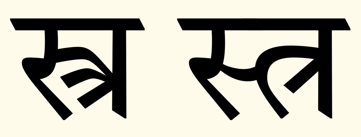
@Konkanist We use this traditional form in our fonts, but if a user wants to force a half form rendering then we contextually substitute the variant form of –tra that connects more aesthetically and doesn’t look disjointed. Think like a scribe, not like a typewriter.
I have written up a @harfbuzz issue regarding support of jihvāmūlīya and upadhmānīya, including recommendations for handling the currently script-ambiguous Vedic Extension characters.
https://t.co/gV6dgGNRMj
@Konkanist @a_srinidhi I don’t know where that shape come from, but in general Schegel’s type is really weird. I have a copy of Antpn Boller’s Sanskrit grammar from 1847, and it contains some of the oddest Devanagari shapes I have ever seen excepting those in Diderot’s encyclopedia.
New update to the Tiro Builder tool, fixing an issue with hinting in CFF fonts instantiated from CFF2 variable build streams.
Just finished testing it on a collection of complex Indic fonts build on-the-fly from multiple sources, which still feels magic.
https://t.co/xIEk02OCyg
Marwari ḍa is an outlier in the Devanagari script, having its stem connection to the head stroke on the left rather than on the right or centered.
Wondering if the positioning in the second row might be appropriate, and if anyone has examples to support either positioning?
@dwarkesh_sp This is full of inaccuracies. Mainz was a major trading hub on the Rhine. It was not illegal for lay people to read or own Bibles. Most of Gutenberg’s initial print run was presubscribed and sold out immediately. His de facto bankruptcy was due to capital debt, not poor sales.
@xomoc@JimMcMurtry01 I’ve written about the typography of First Nations alphabets in the context of the Skeena Indigenous font family.
https://t.co/t4irgiGkMU
@xomoc@JimMcMurtry01 In general, there is a strong sense of ownership of these alphabets within BC indigenous language communities, even though they were initially developed with linguists. And I say *with* linguists rather than by linguists, because indigenous speakers were active participants.