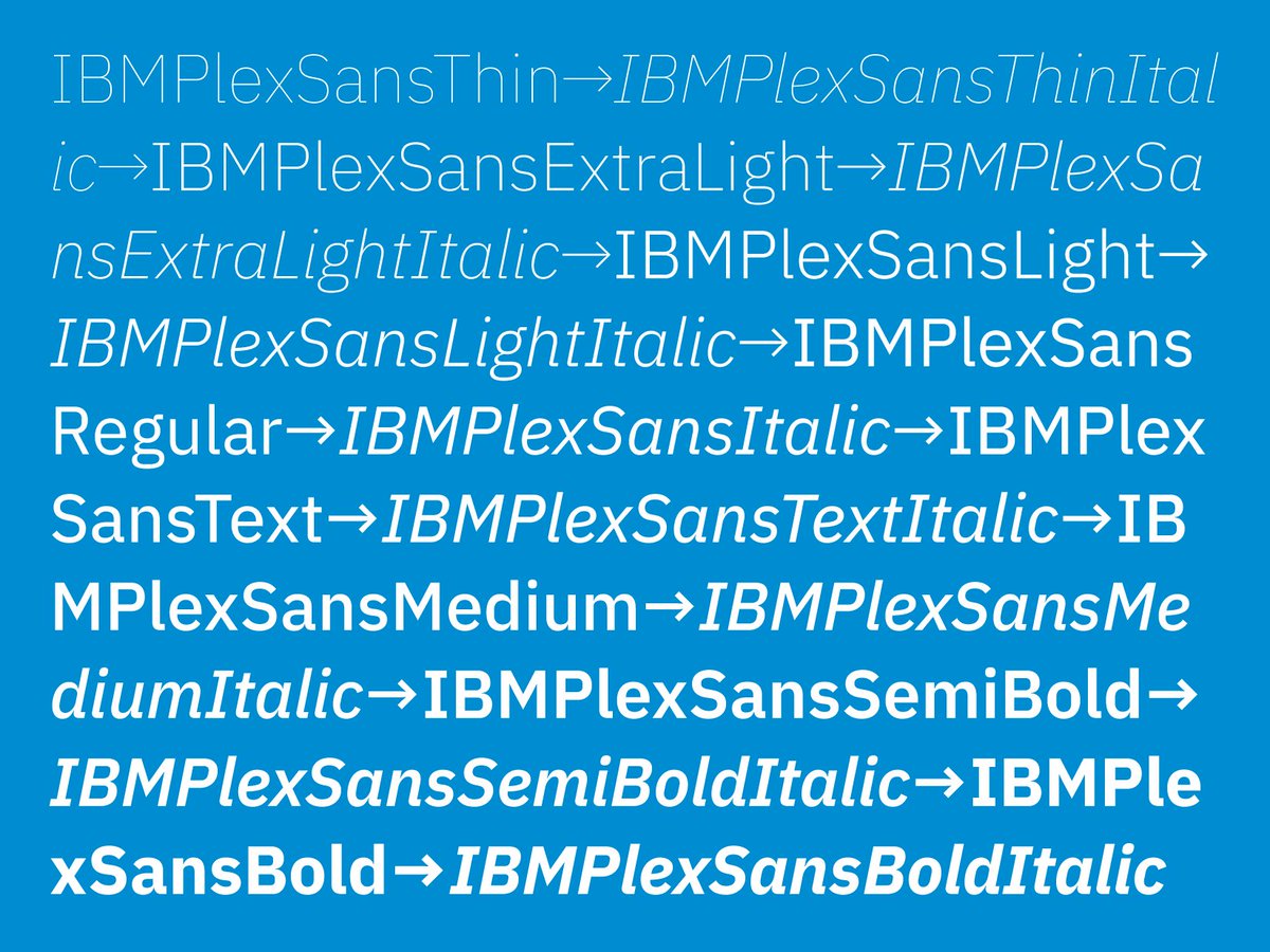
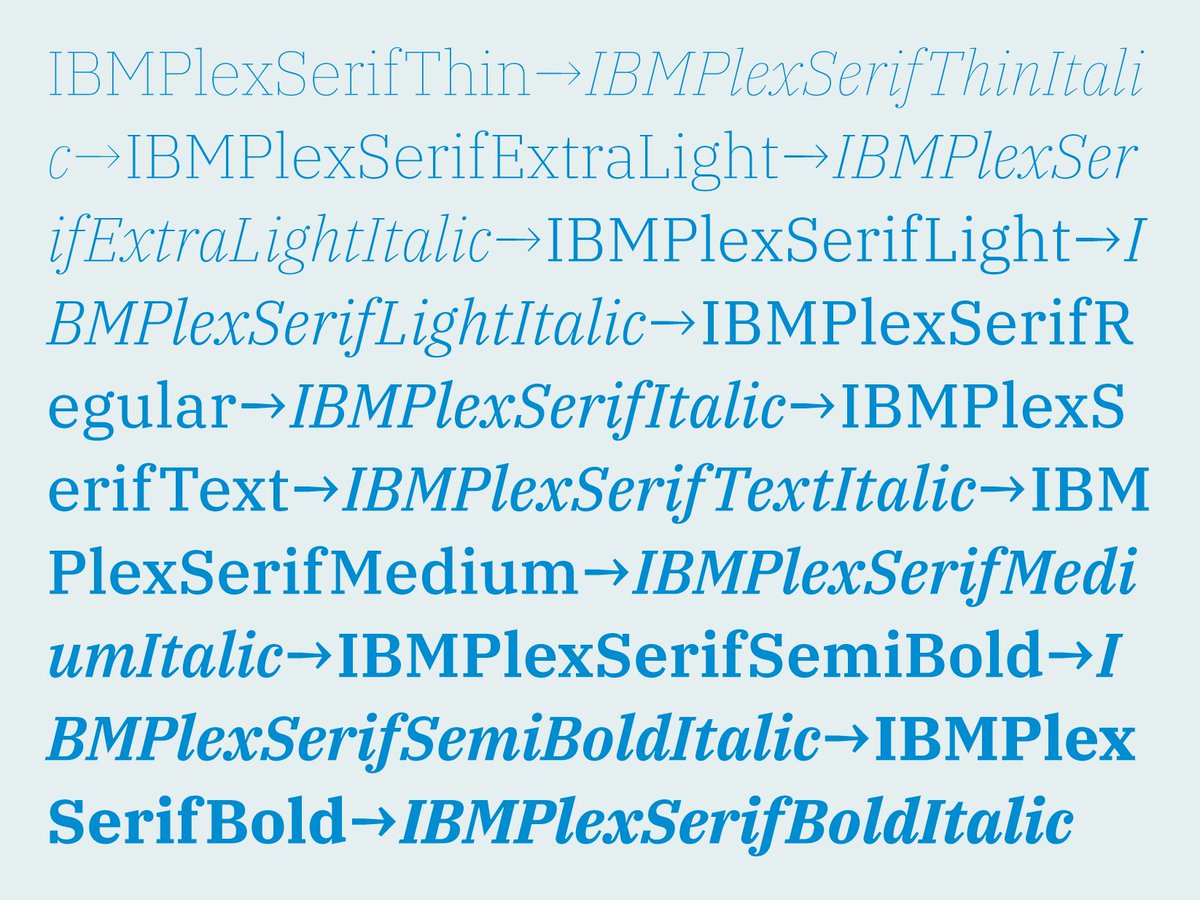
NEW WORK – Please meet IBM Plex, the new open source typeface family we developed for @IBM in collaboration with @mikeabbink.
IBM Plex comes in Sans, Mono and Serif versions. All in 8 weights with accompanying italics.
https://t.co/B4dAsFbGJm
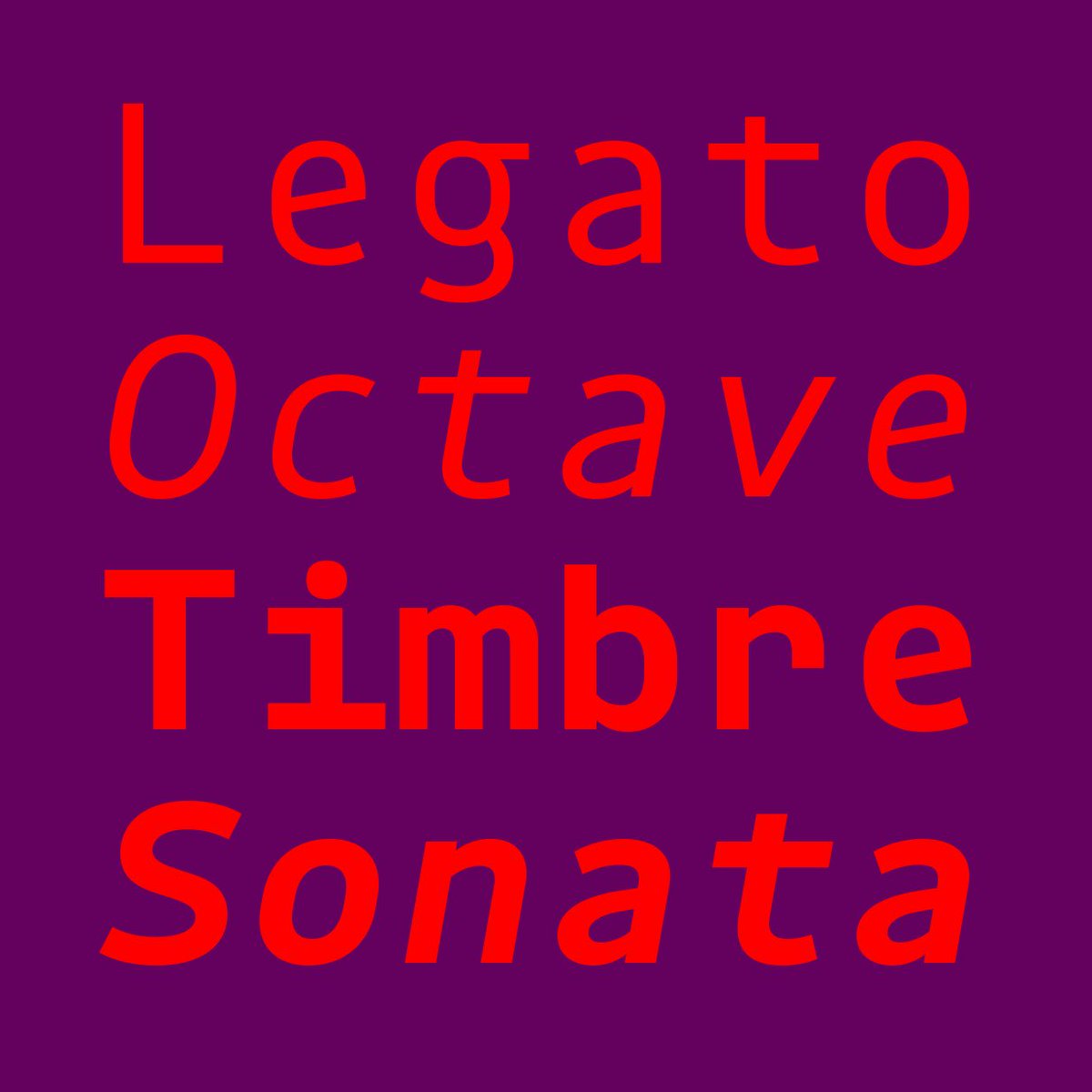
NEW RELEASE — Rigby Mono!
Our small Rigby type family got a little larger: now also available in a monospaced variant that makes monospaced text extra personable. Nevertheless, Rigby is still not overwhelming you with a confusing number of styles.
https://t.co/6UHUOGVkXa
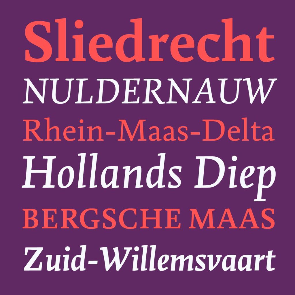
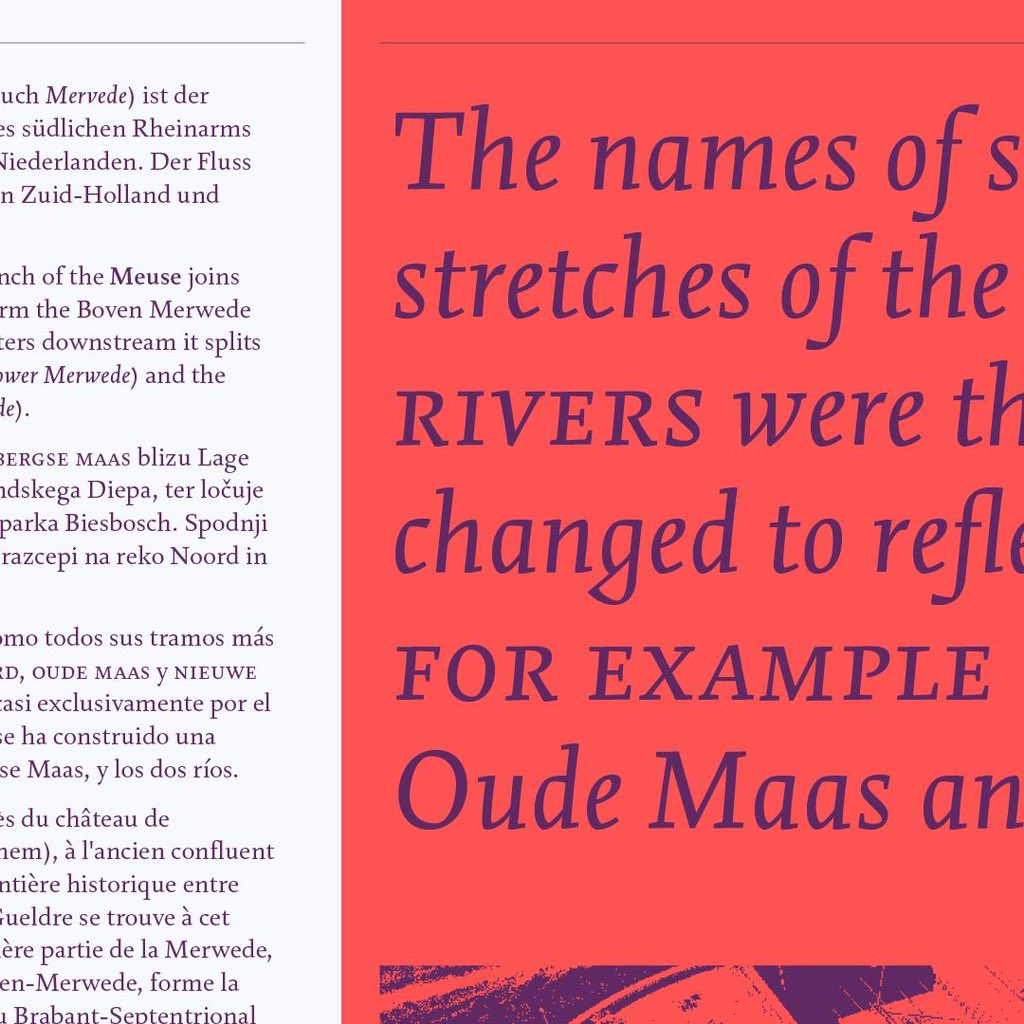
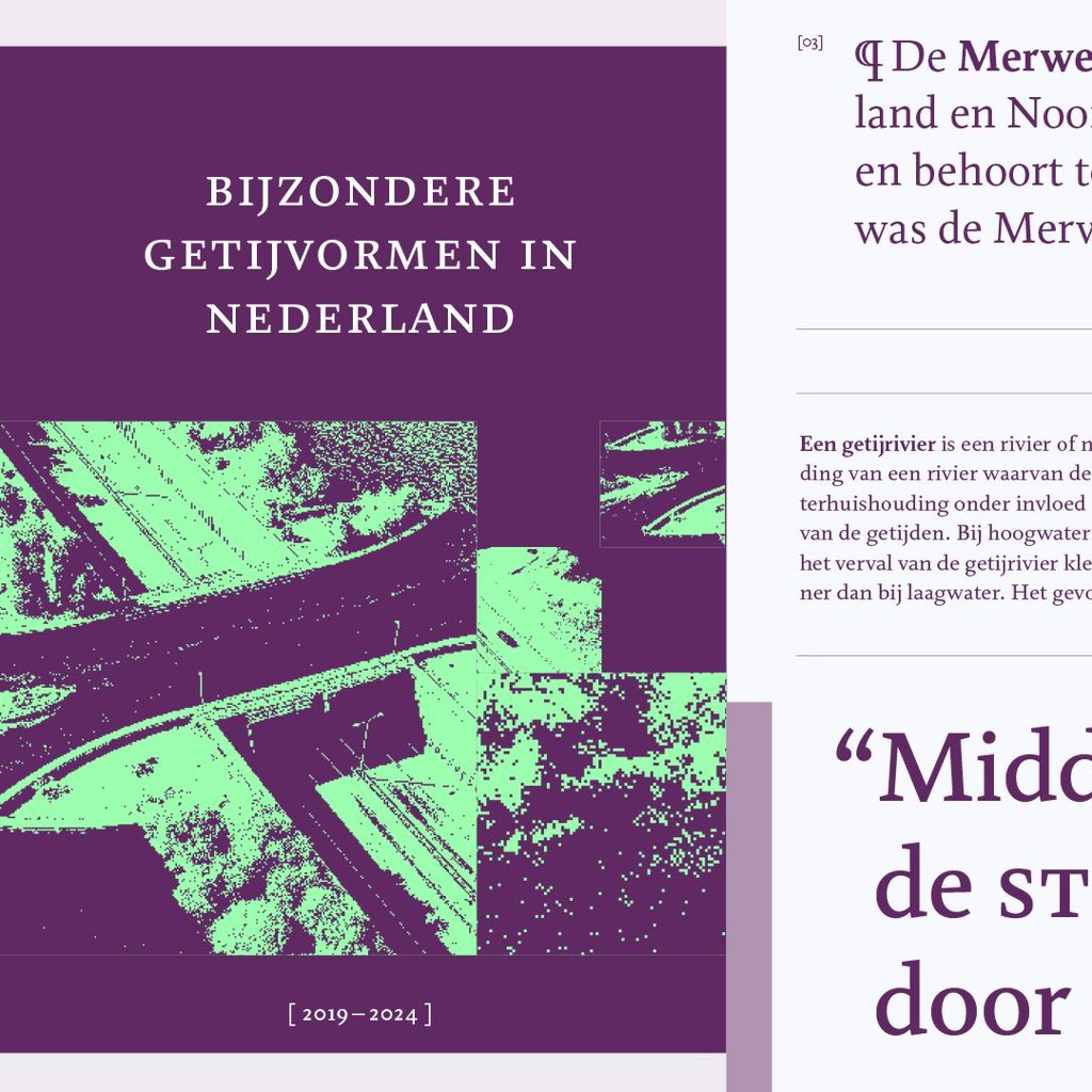
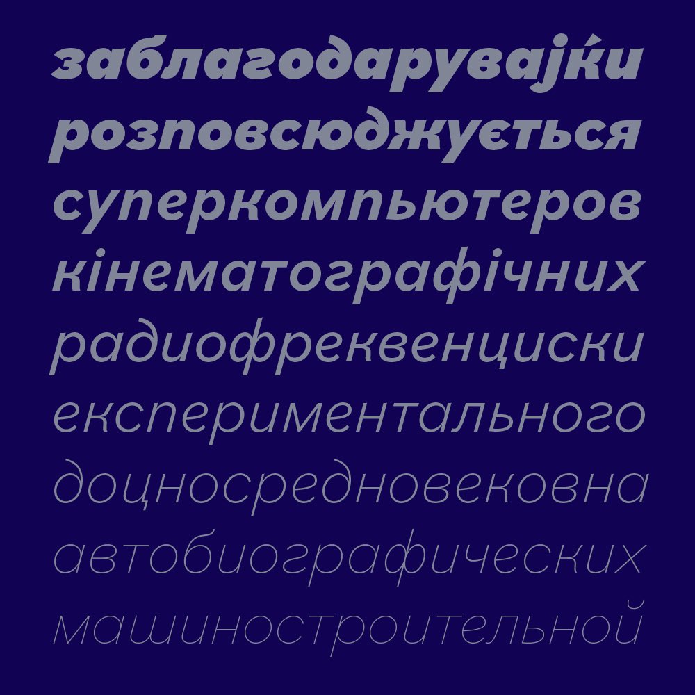
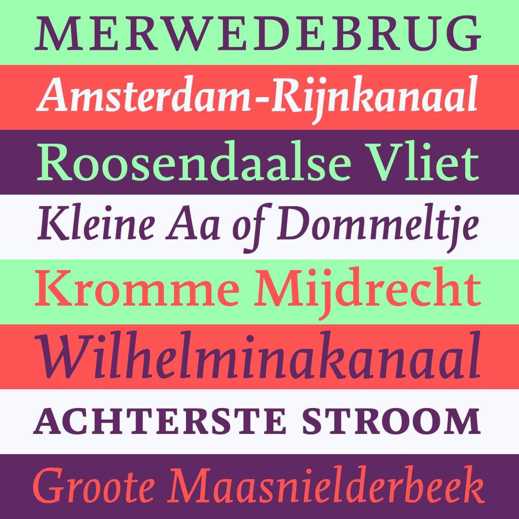
NEW: Merwede from @boldmonday is a charming text workhorse inspired not only by early Renaissance typefaces and other notable historical text styles, but also by calligraphy, with a rich set of OpenType features and a full range of musical chord symbols.
https://t.co/u6LwFMN1vw
NEW RELEASE — Merwede by Titus Schulz
Merwede by Titus Schulz is a new extensive text typeface – in four weights plus italics – with a pleasant rhythm that allows readers to effortlessly immerse themselves in any given text.
https://t.co/qzgl6MXkZb
🎉 16 Years ago Bold Monday was founded! To celebrate our anniversary, you will receive an extra 16% discount on all items in our webshop for the next 16 days! Use voucher code "BoldMonday16years". Cheers!
https://t.co/g81moSExIa
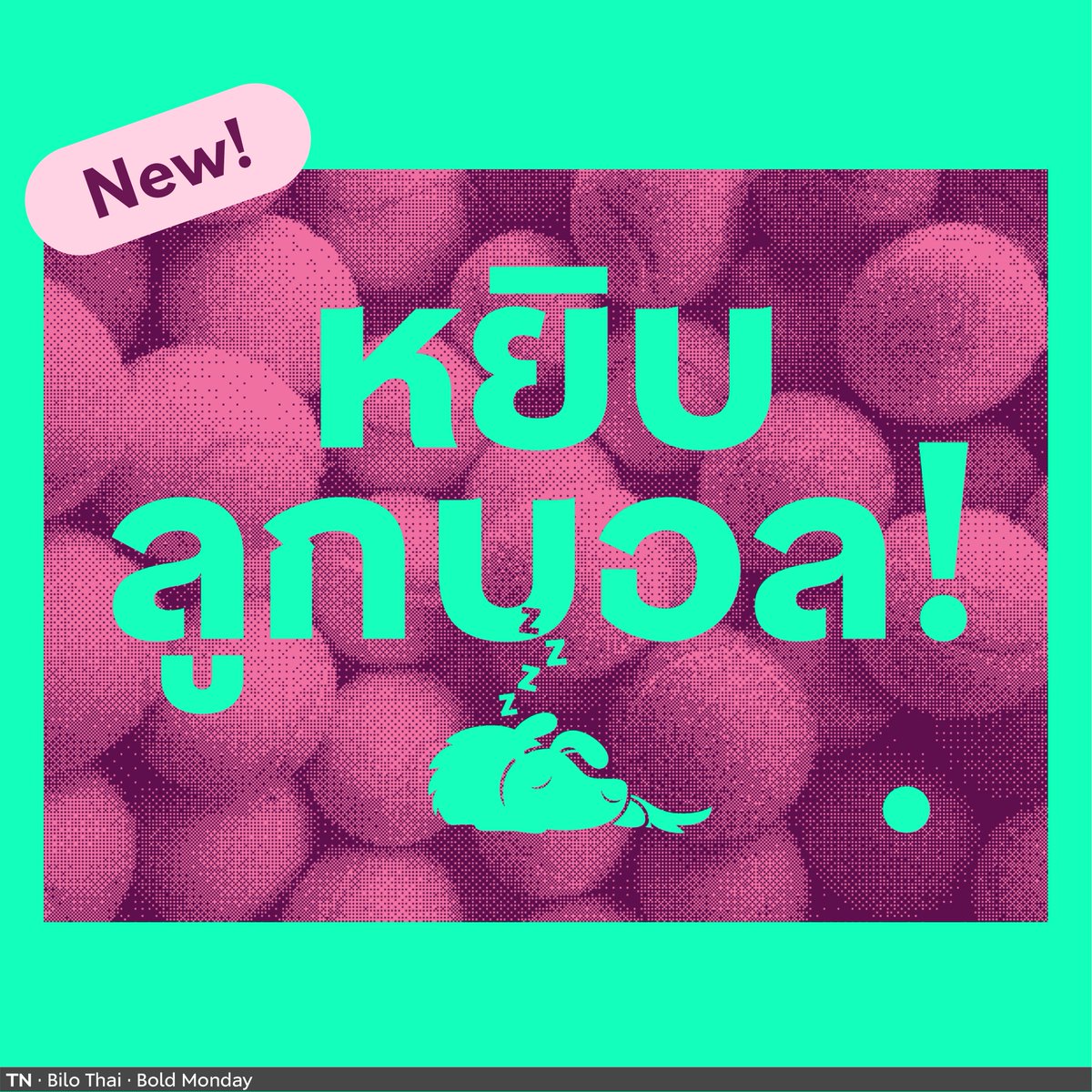
👉NEW FONT
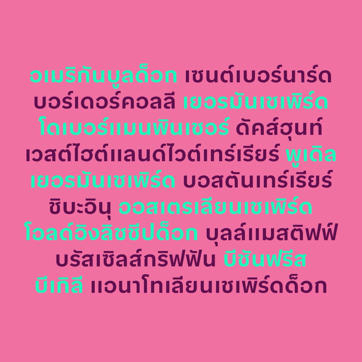
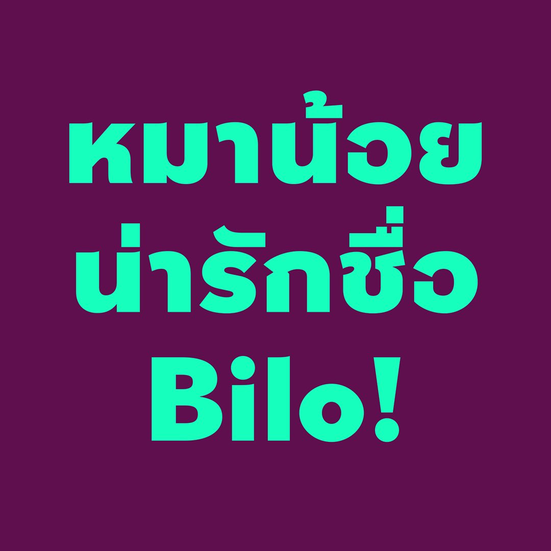
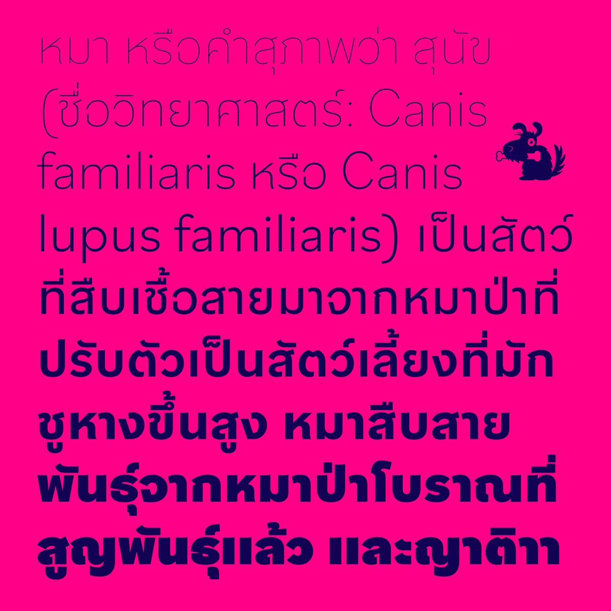
Bilo Thai by @boldmonday captures the playful yet versatile tone of its Latin counterpart. This modern, loopless face includes unique details, pointy-eared terminals, and wide, round shapes. License Bilo Thai here https://t.co/srhN7wZPZY.
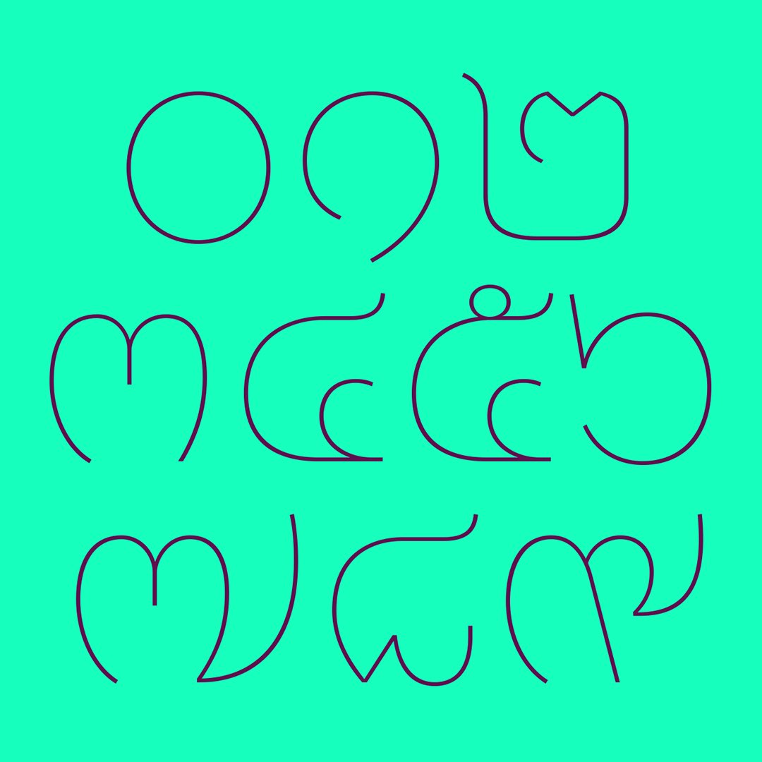
NEW RELEASE – Bilo Thai, designed by @boomtypexyz
The modern, loopless design shares many of (Latin) Bilo’s occasional curious details and unique flavour, for instance the slightly pointy-eared terminals and wide, round shapes.
https://t.co/BhdMzbRfYT
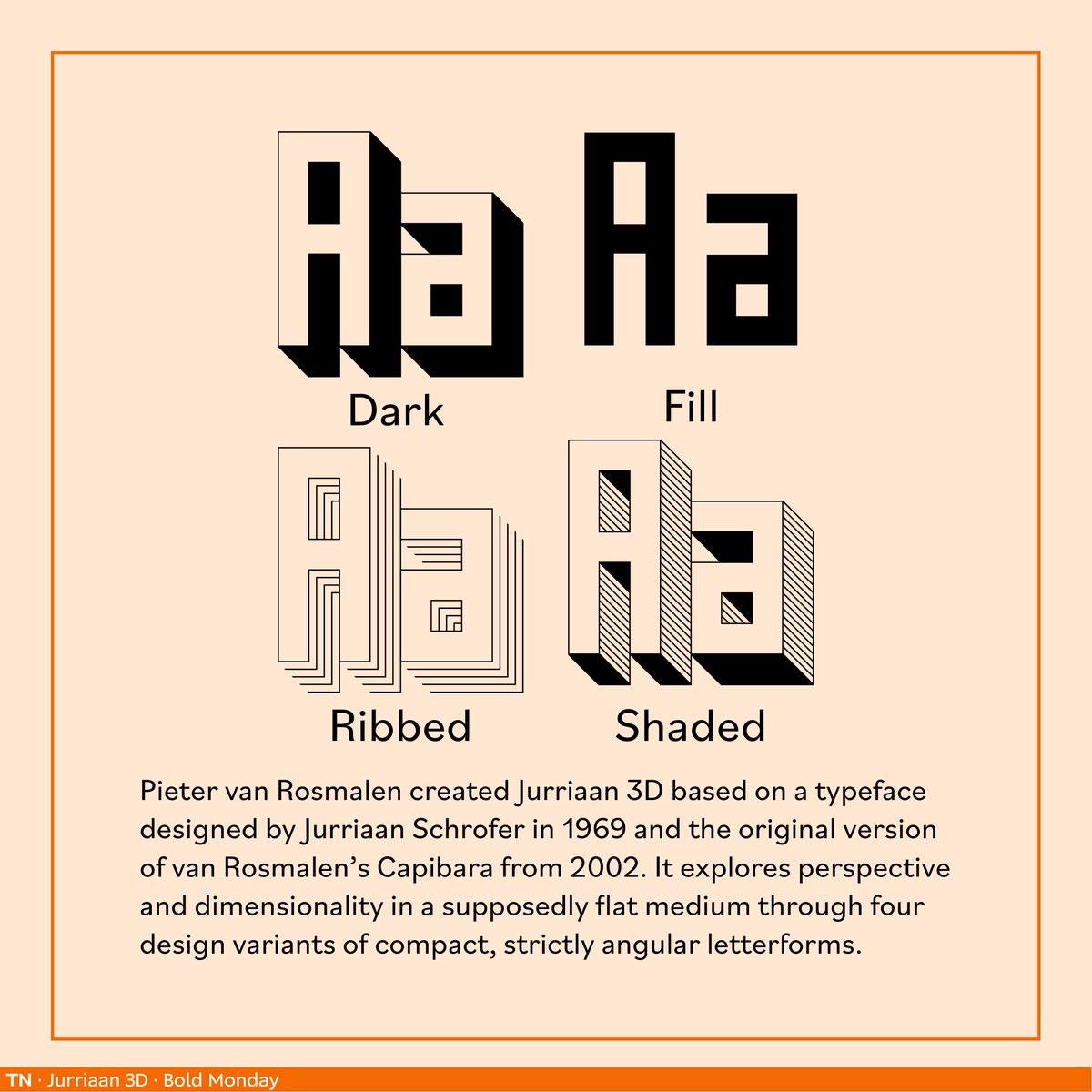
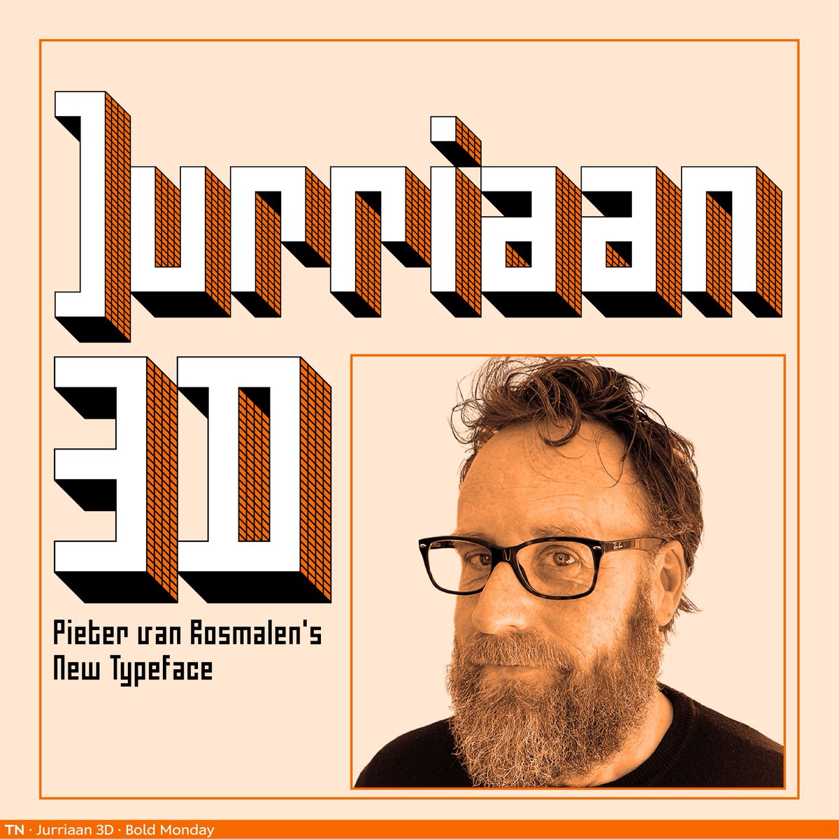
Here's #Juriaan3D by @BoldMonday! A fusion of Pieter van Rosmalen's Capibara & Jurriaan Schrofer's 1969 design, this typeface explores depth in a flat medium. Experience 4 unique styles! 👉 License it here https://t.co/F17ETcnoUC
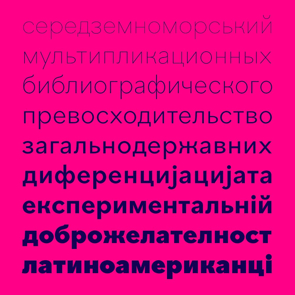
UPDATE – Version 2.0 adds Cyrillic, Greek and Hebrew to my Pieter van Rosmalen’s Nitti Mostro. The Cyrillic and Greek character sets are designed in close collaboration with @aleksamul and Hebrew with @YanekIontef.
https://t.co/34aaXtaiu6
NEW RELEASE – Jurriaan 3D by Pieter van Rosmalen.
Jurriaan 3D is a mash-up between a typeface designed by Jurriaan Schrofer in 1969 and the original version of van Rosmalen’s Capibara from 2002. Available in four styles.
https://t.co/ouR1X2KaAe
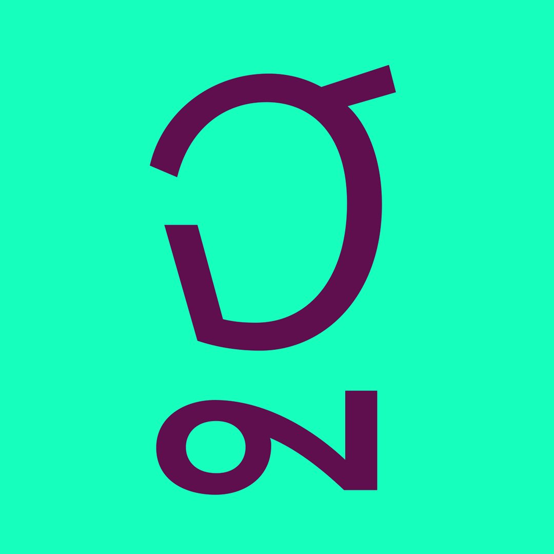
UPDATE – Bilo v.2 adds Cyrillic to Pieter van Rosmalen’s friendly typeface. The Cyrillic character set is designed meticulously by Anna Khorash. Existing Bilo customers can update for free.
https://t.co/tVgeVYmBZm
🎉 On 16 June 2008 – that is exactly 15 years ago – we founded Bold Monday! We want to express a big thank you to our customers, collaborators & supporters. To celebrate you can get a 15% discount on all items in our webshop today. Use voucher code: BoldMonday15years
@JanineAbbring (Kleine correctie: Simplistic Sans is ontworpen door Bold Monday in samenwerking met Thonik.)
De naam Simplistic was natuurlijk een perfecte manier om verbinding te maken met de geschiedenis van de VPRO. Alle betrokkenen waren meteen akkoord.
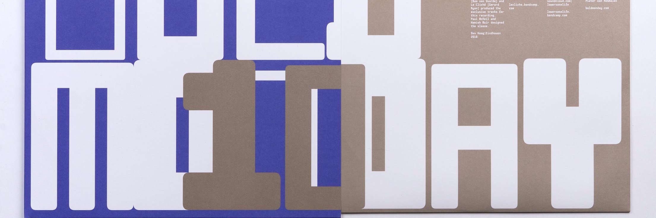
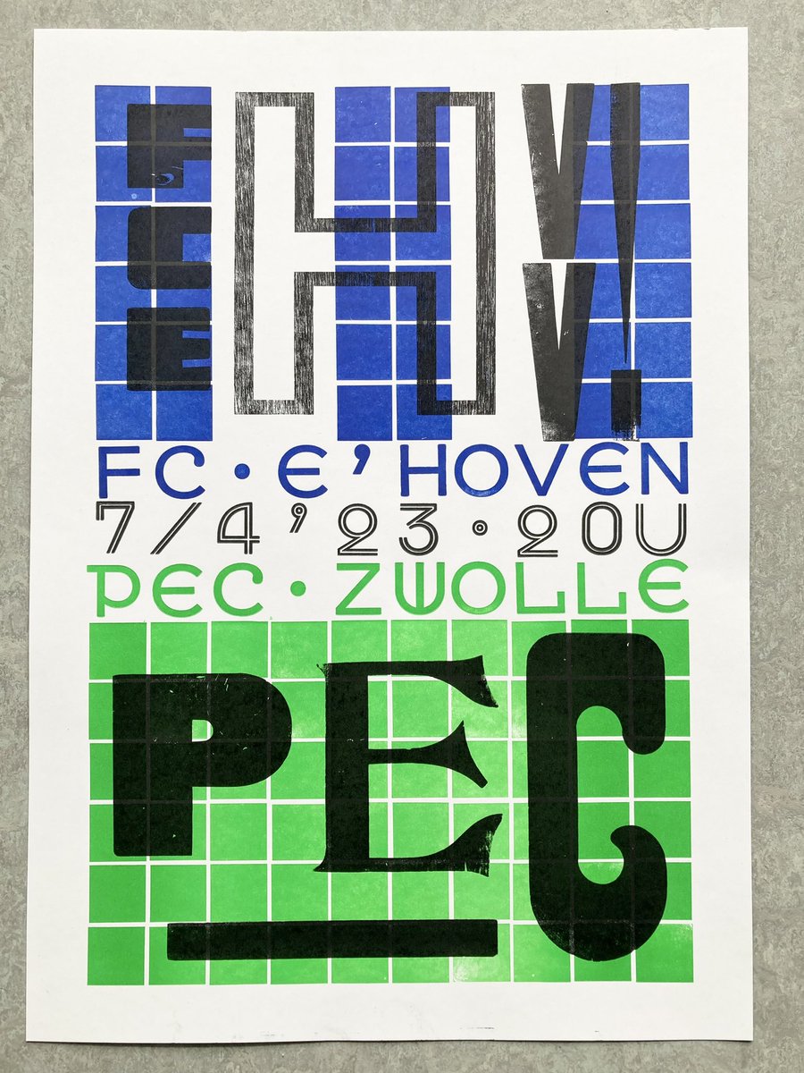
One and a half week ago I letterpressed (is that a word?) this art poster together with Mizdruk for the football game between @FCEindhoven and @PECZwolle on April the 7th. The poster uses my typeface Pim & the Analogue Pixels and various wooden letters.