@hkmett51 FWIW, odd they’re using a photo of the NYC mayor for a state bill.
The bill replaces the words with “parent” for family court purposes.
Yes, it’s odd to read “gestating parent” but in cases where there’s 2 moms, the new language is clarifying.
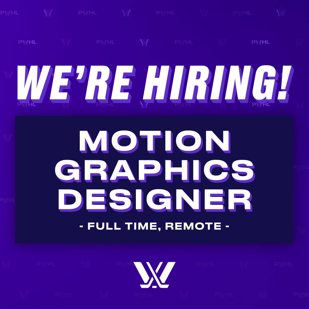
🚨 THE #PWHL IS HIRING 🚨
The league has expanded, and so has our Marketing and Creative team! We are looking for a talented Motion Graphics Designer to join us in creating a world-class atmosphere for the best fans in the world!
🖥️ Apply: https://t.co/mezkaanJD4
#SMSports
I've been oscillating between interested and exhausted with (my own and in general) sports concepts, but I have so enjoyed these pops of design history popping up in my TL every day or so. It takes me back to what pulled me into football when I was little.
@hkmett51@Colin_Waldorf As someone who posts concepts, too, I appreciate anyone who puts in the time and shares their work.
I will say this is a tough design challenge. A hurricane being rounded with an absent center; an H being angular with a crossbar center. You get one or the other.
I’ve spent 8+ years creating work for the WNBA, TikTok, corporate brands, athletes, and organizations across the country. I’m confident in the work. I just need the next opportunity.
If you know of a team, company, looking for a designer, let’s connect.
https://t.co/wxJSLpyXjs
Yes, obvs the overall baseball platform favors the larger schools. But if you, a power school, can't avoid double elimination in the opening round, I can't be sure you'd have the power to escape the super regionals and get to Omaha anyway.
In an era of the never-ending CFB postseason and sprawling BB tournaments, the NCAA baseball format is the "fairest" contest. It comforts, not coddles, dominant programs.
I feel for UCLA, but we can have entitlement or competition.
I choose competition.
A moment of transparency.
Today was my last day at Jack Porter Inc. after 3.5 great years. I now find myself officially unemployed, and officially uninsured - both extremely scary.
I am now aggressively seeking my next full time job in graphic design. Friday I make my move to Orlando, FL and I have an immense amount of time on my hands. I am ready to work, I can begin immediately, and I am a driven designer who values intentional, meaningful design.
I am looking to take on as much freelance work as possible to bridge this gap of uncertainty. If you are looking for a designer who values strong, intentional creative, I would love to connect.
If you would not mind taking a second to retweet and share this post, it would mean so much. There have been so many great members of the design community who have been looking out for me, and I am extremely thankful.
This time will pass, and I will look back at it as a growing opportunity. I would genuinely just love a chance.
Thank you!
https://t.co/uwCE9uh2Ev
@joeflaccoburner@csimms4 My take on this one is more brand editor, less brand designer. The answer is there (w/ the baseball team); I still can’t shake the feeling the school was sold a concept that IMO just doesn’t land in a contemporary space. A distinctive logotype or alt should be in the program.
@joeflaccoburner@csimms4 I stand by my older thoughts. Leverage the wishbone C from the baseball team; promote it to primary. Yes there’s so many wishbones but at least it’s something.
Did some quick sketching re: Catawba. Sometimes a small step is all that’s needed. Use the wishbone C that’s already used (📸 @kinghedrick) but add a terminal inspired by the feather C. A simplification that holds equity, is distinctive. #conceptart#logo#college#design
@joeflaccoburner@csimms4 What it gains in tactical benefits, it lacks deeply in distinction. In the wild you can’t tell if this is an old UConn identity or any of the high schools or small colleges. I know simple C has century roots, but it’s lifeless.
@number9concepts@TheAHL I know it's not realistic (and forgive the live trace hack job on my part):
- Lease the Hammer logo from the Ti-Cats.
- Add four rivets for the Isles four Cups.
- Have Triple H nights with wrestling somehow happening concurrently with the hockey game.
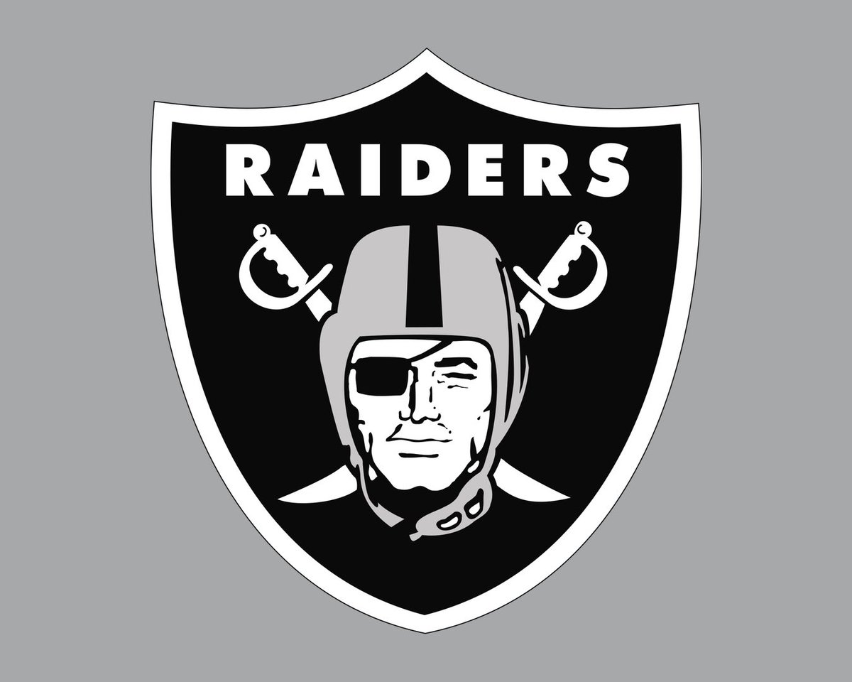
Any time someone online tells me a concept is too far-fetched or niche or complicated, I recall that one of the dominant marks in sports marketing features an illustrated man in a leather football helmet w/ an eye patch - and swords - in a shield - with type.
@HelmetAddict This one looks good.
More bothered in cases like this where the logo is treated like a logo first, helmet graphic second. The mark should either lean forward or backward on both sides IMO.
While some will cite brand consistency, I see it as dismissive of the context.
@0xCharlota A conversation, or series of conversations, where we discuss ideas/sketches... meter.
A multi-page report with custom-illustrated cover... one-time (because it makes it easier for their billing).
Need a design help desk over the summer just in case... recurring (month-to-month)
@0xCharlota Perhaps a shortcoming on my part, but I don't give it a marketing title. I use it as part of 3 pricing options. "For this ask, would you prefer recurring, one-time, or meter?" Recurring=retainer. One-time=project. Meter=hourly. Flex for them = flex for me.