Really proud to see that our project has won bronze in the Science, Technology & Health category of the @infobeautyawards this year. Congrats to all the winners and finalists! https://t.co/uaqsPzPeap
#IIBAW2023@DataVizSociety#iibawards#datavisualization
Over the last few months, I’ve been working on a little project with the ABC here in Australia to help people visualise their exposure in data breaches. This has just gone live today and I reckon they’ve done an amazing job, check it out: https://t.co/K0QXip1Je2
Had a lot of fun working on the visuals for this piece with @FellJulian & @mattliddy. There's something about the perfection of a simple black box that's really satisfying to create. https://t.co/mSPleNaAH9
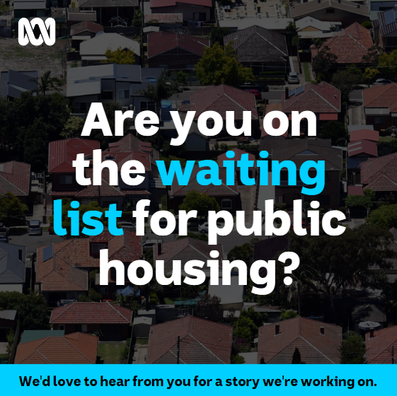
I'm working on a story about the NSW Private Rental Subsidy program for @abcnews.
I want to know whether it's fair and easy to navigate, so if you've got something to share, fill out this survey:
https://t.co/sFJC80iyNL
RIP Vangelis. People point to Chariots of Fire as his masterwork but it will always be the Blade Runner soundtrack for me. What a creator. I mean, just listen to the power of this https://t.co/dW9jPy6n8p #VangelisRIP
🚨 Job Alert @BBCNews
We're looking for a Designer to create news graphics, UX for storytelling formats & features and to help our global hub designers!
🗓️ Apply by 9 May: https://t.co/YFQhlc3Xwh
@lisacmuth@jhilden@jonolave@stonecolor1 Plus choropleths generally work best to show trends or obvious outliers, both of which would be satisfied in this example by the direct juxtoposition of the other countries. The contrast to the background becomes less important than the contrast between the surrounding countries.
@lisacmuth@jhilden@jonolave I would argue that 1 is more accessible for understanding because of the greater contrast between countries which is where the storytelling lives— but I agree with @stonecolor1 that the hue shift moves too far into another colour 'family' which confuses things.
We’re hiring a journalist who can code to help make @nytimes visual and interactive experiences more accessible to those who rely on assistive technologies such as screen readers. Reach out if you’re interested https://t.co/f3ap5gMwaz
We're hiring! We're looking for a talented UX/UI Designer to help us out with some exciting new projects. Check out the role and get in touch. https://t.co/ucJF25TIld
What’s your unpaid labour worth? This interactive data story brings together 14 yrs data and ~500 stories. I’d love you to take a look for #IWD. Thx 2 ABC readers who spoke & Story Lab stars @BSpraggon Emma Machan, Colin Gourlay @mattliddy @CristenTilley
https://t.co/hYlRdC1Nlt
This is wild! The @abcnews app shot to number one in the Australian App Store yesterday, apparently thanks to FB, who own the next 4 top apps in the list…
Huge news - probably the biggest announcement we've made since establishing NIghtingale: in 2021 we will add a Print format!!!! Read all about it here and PLEASE SHARE! Woohoo! https://t.co/5VBJwufaWN
Heard of 'pumping & dumping'?
It's a by-product of #COVID19 & it's costing amateur traders big-time.
If you're thinking of dabbling, read @l_deveridge's excellent (made from scratch) multimedia report, first!
Ping @mattliddy@bspraggon@data_by_conrad
https://t.co/j8I6MA9ecC