Personal news: I've joined the ABC's new Climate team! Graphics are key to getting over some big challenges in climate reporting: big numbers, repetitiveness, misinfo, doom & gloom, etc. How does Australia adapt to a changing, warming world? Let's take a look. I'm so excited :)
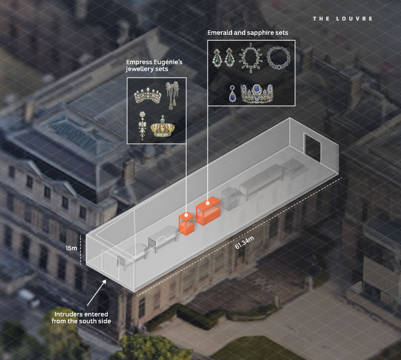
Some maps 📍 to help put the Geelong refinery fire in context. My colleagues and I matched images of damage to the area of the facility where the fire burned. https://t.co/ynkJILj5qh
If any American news graphics designers are brave enough to move to Australia like I did, there's a very cool opening at the ABC currently. It's a very creative, wide-ranging role. Happy to answer questions. Closes 17 Feb (Aus. time)
https://t.co/xf027qAOUT
End of the year! ✨🎄🎇 So here we've got a special Data Vis Dispatch for you: it comes from the whole Datawrapper team. We're sharing our favorite visualizations of 2024. Take a look here 🎁 https://t.co/xz5vx9EBqz and tell us: what were your favorites?
@robfarago@abcnews Hey Rob, glad you enjoyed the article. Looks like we've made a mistake and that should be c/W not c/Wh, referring to Fig 3.1 in the IRENA report. Thanks for pointing this out!
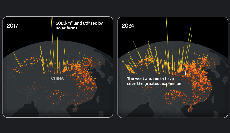
It's a good time to be a solar panel, they're taking off all over the world. The @abcnews Story Lab and Climate teams looked at how #solar is exceeding all expectations 💯☀️ https://t.co/QBaTKpIj2G
Countries like China and India are rapidly building solar farms the size of cities. The picture in Australia, on the other hand, is much different. It's a world leader in rooftop solar. https://t.co/QBaTKpIj2G
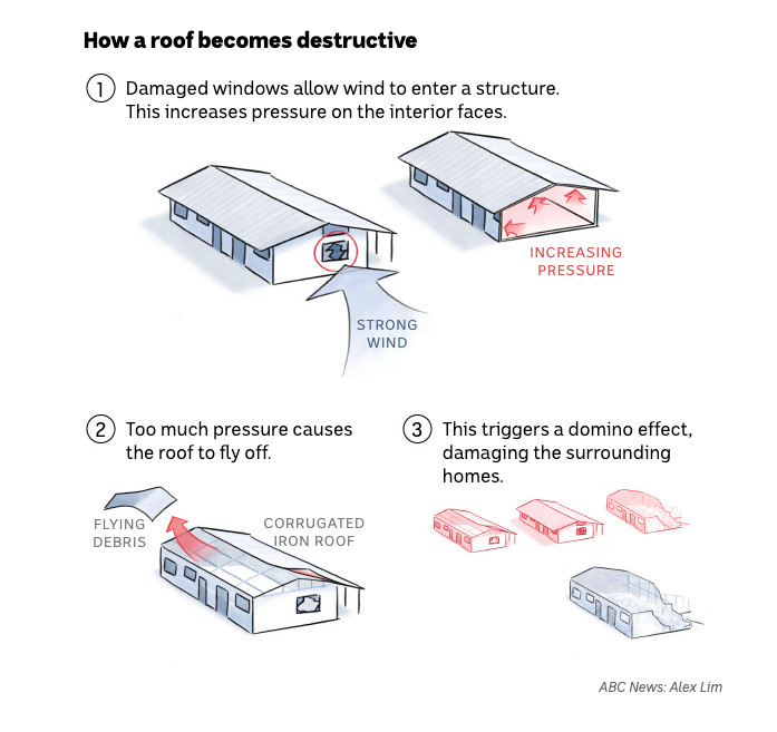
Slowly stepping into the world of illustrated news graphics. Here's one from a story about how a construction decision flattened Darwin when Cyclone Tracy struck 50 years ago. https://t.co/MiFuRvPJhn
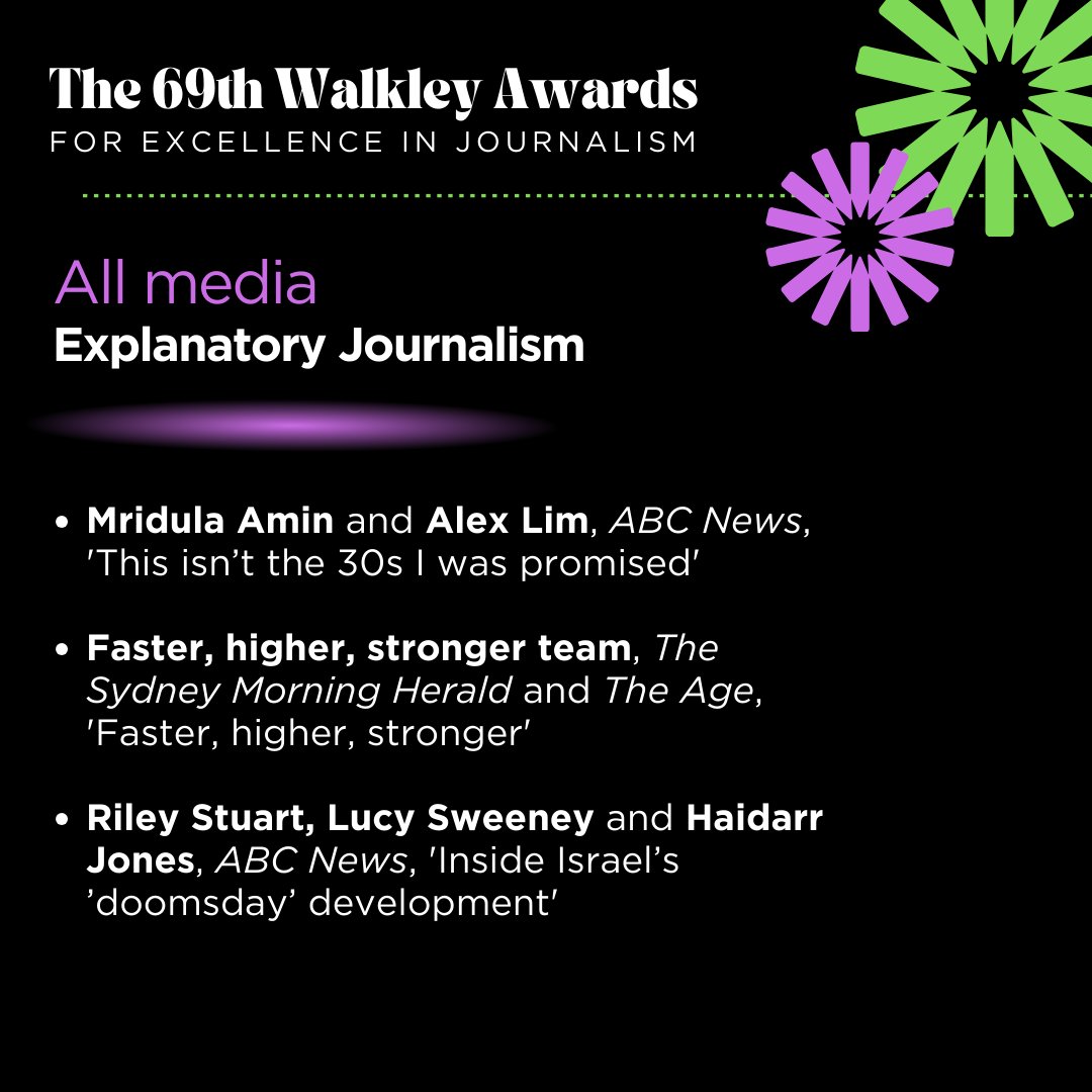
Grateful to be a Walkleys finalist for Explanatory Journalism with @Mridula_Amin. A data story meets photo essay for a topic on a lot of people's minds in this explainer for @abcnews. https://t.co/VruMNTAJI8
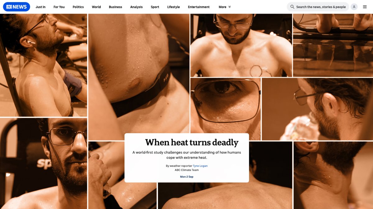
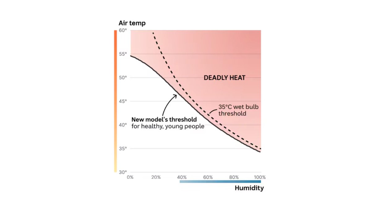
This summer alone, in the northern hemisphere, thousands have died during extreme heat events. “This study is all about human survivability,” says Dr Jem Cheng. https://t.co/WN5AHsXTRF
Researchers are forming a better understanding of how humans cope with extreme heat. In certain conditions, the thresholds for when heat turns deadly are lower than we thought.
https://t.co/WN5AHsXTRF
@datakid23 @abcnews Some of the details are noted at the bottom of the article. Segment Anything for image analysis, selenium for web scraping, and good ol’ Google sheets to crunch numbers
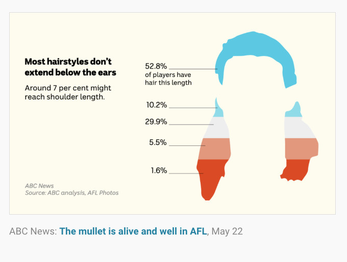
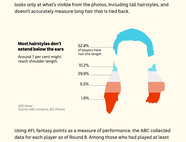
My deep dive into mullets in the AFL won a Kennedy Award for Outstanding Digital Innovation. 🏆 I’m really proud of that! Big thanks to my team and editors @abcnews who let me take some risks with this one. And thanks to our hair/makeup dept for the wigs! https://t.co/94UfqEdUuq
The Kennedy Award for Outstanding Digital Innovation goes to Alex Lim, Katia Shatoba, & Thomas Brettell from @abcnews for The Mullet is Alive & Well in AFL.
My first @aaja convention was incredibly fortifying. I got to meet some of my favorite journalists like @joseiswriting & @Angela_Y_Yang, make new friends like @journalims & @troydoesnews and explore downtown Austin during Pride weekend.
My heart is so full ❤️
Hey friends, I’m in Austin at the @aaja convention this week. Very happy to be here in person this year and keen to chat about about any aspect of journalism + design, data, dev etc. See you around! #aaja24