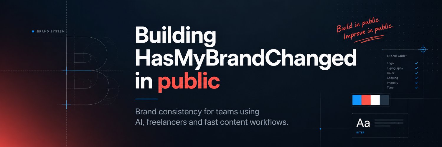
I’m building HasMyBrandChanged in public.
The idea is simple:
Upload your brand rules once. Check anything you’re about to publish. Know if your brand has drifted before your customers do.
I’ve spent 25 years seeing brands slowly lose consistency.
Now I’m trying to fix that.
#BuildInPublic
Weekend question: what's the worst rebrand you've ever seen — and why?
Not just "ugly." One where the brand lost something it couldn't get back.
Drop it below. I'll go first in the replies.
Myth: brand consistency is about being strict.
Reality: it's about being recognisable — so people trust you without thinking.
It's not a rulebook for its own sake. It's the reason a customer knows you in half a second. Drift quietly chips away at that half-second.
In 2010, Gap swapped its classic logo for a new one. The backlash was so fast they reverted in about six days.
People don't just see a logo. They feel when "their" brand suddenly isn't itself.
Consistency isn't cosmetic. It's trust — and it's fragile.
There's a live demo on the site: take a sample brand, stretch the logo, recolour it, swap the accent — and watch the compliance score react in real time.
It's the quickest way to see what the tool does. Early-access list is open if you want in first.
Every designer has opened a client file and thought: "who changed the font?"
Then you notice the colour's slightly off. Then the logo spacing. Then the whole thing just feels different.
That slow drift is exactly what I'm trying to catch — before it goes live, not after.
A subtle one the tool is built to catch: the stretched logo.
12% wider than approved. Looks "basically fine" on its own — until it's next to a correct version and your eye can't unsee it.
This is the kind of thing that slips through when you're moving fast.
Show me a brand you think would be hard to keep consistent — big range, lots of sub-brands, hundreds of assets a month.
Drop one below and I'll talk through where drift usually creeps in for a brand like that. (While the app's in early access, I'm doing these by hand.)
5 signs your brand has quietly drifted:
1. Two "official" versions of your logo are in circulation
2. Your blue looks slightly different across decks
3. Someone rebuilt a template "to save time"
4. New hires guess at fonts
5. Your latest asset feels off — but nobody can say why
How many can you tick?
The other side of the score: a clean pass.
When an asset matches the Brand Blueprint, you get a green light and a number you can trust — no second-guessing before it ships.
The goal isn't to nitpick everything. It's to catch the drift and get out of your way.
Been thinking a lot about tone in the report.
"This asset failed" makes people argue. "This may be drifting from your approved rules" makes them look.
Same finding. Completely different reaction. Building tools for creative teams, the wording isn't a detail — it's the product.
"Our team knows the brand — we'd notice if something was off."
You notice the big misses. The small, compounding ones slip through every time.
Not because anyone's careless. A stretched logo or a shade-off blue looks fine at a glance. It's the pattern across everything that does the damage.
25 years in branding, and the damage is almost never dramatic.
It's the wrong red. The nearly-right font. The template someone tweaked "just this once."
Small, boring, repeated — until one day the brand feels off and nobody can say when it happened. That slow drift is what I'm trying to make visible.
In your experience, what drifts first?
A) The colour — wrong shade of the "same" colour
B) The logo — stretched, recoloured, crowded
C) The type — a "close enough" font swap
Genuinely curious. I have a hunch but I want to hear yours.
AI can generate 50 "on-brand-ish" assets before lunch. The problem is the "-ish."
Speed without a brand check just means you drift faster — everywhere, at once.
I think the next wave of AI tools won't only make things. They'll check them against your rules first.
A design decision I keep going back and forth on: how blunt should the report be?
A) "This asset failed the brand check."
B) "This asset may be drifting from your approved brand rules."
I lean B — a tool should help you fix it, not make you defensive. Tell me if you think A lands better.
Payment-gateway experience while getting set up as a founder 👇
Started with @lemonsqueezy. Verification wouldn't accept my tax number — which was correct. Emailed support a few times. Got a reply until a week later.
Switched to @PaddleHQ. They responded almost immediately, and I'm already verified and ready to go.
Same founder, same paperwork — completely different experience. Paddle's been excellent.
Quietly building something: HasMyBrandChanged.
Upload your Brand Blueprint once. Then check anything you're about to publish against your approved logos, colours, fonts and layout — in under a minute.
Early access is opening soon. Link in bio if you want in first.
@enzao_eth@markproduct B2B: Reddit 🤔
I still don’t get how people promote on Reddit as the first sniff by mods that you dare to mention your app in the slightest way gets you banned from the subreddit.
Two weeks posting about my app. Two new followers.
Fair enough — nobody follows a tool. People follow a problem they recognise.
So I'm changing the plan: less explaining, more showing brand drift in the wild and what the tool would catch. Starting now.