Two weeks ago, I wrote my last blog of my 'Becoming a @tableau Desktop Specialist Series' and now I can say that I achieved my goal. 😊
#certifiablytableau
@_melodycheung Thank you so much, Melody. I really enjoyed writing the blog and I'm even more pleased when it helps many people get started. So thank you very much for your effort and for publishing my story.
@ugamarkj@VizWizBI@tableaupublic Thanks for the advice, Mark. That's why it was important for us to mark where we got the data from and how the individual disasters were defined. But you're absolutely right. Maybe we shouldn't have considered the older data.
This semester I worked together with a friend on a project about global warming.🔥
Inspired by @VizWizBI dashboard about Arctic Sea Ice.
Check it out on @tableaupublic: https://t.co/VZ1CNA4ymN
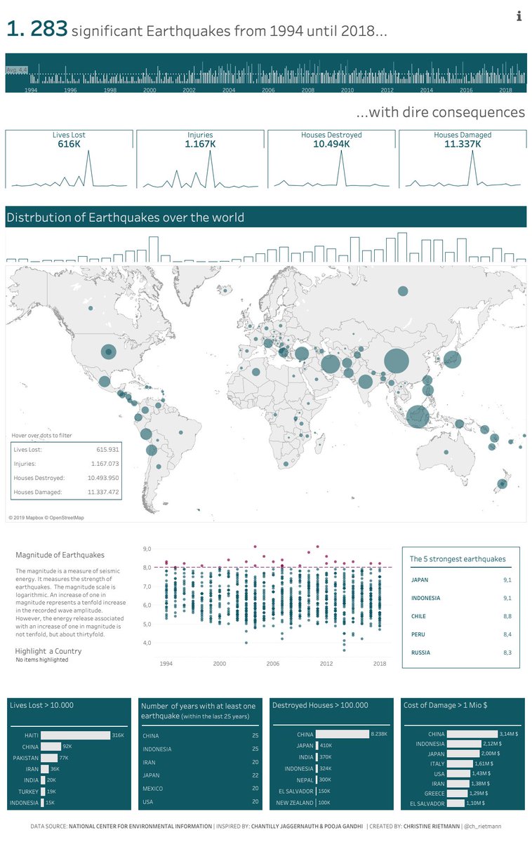
@chris_vizes@ProfDrKSchulte I think looking at the absolute distribution can be interesting as well. I think you can see from the map that the countries around, for example, Australia have relatively large circles despite their smaller area. So both would make sense to me.
In Nov '16 the earth in NZ suddenly began to quake. I didn't know what happened.
More often than I thought people in certain regions have to expect earthquakes and live with the consequences.
Find out more about it
https://t.co/tkyKMGi2by…
Feedback is welcome! Merry Christmas🎄
@chris_vizes@ProfDrKSchulte Thanks for your feedback, Chris. 😊That's a good point. If I understand you correctly, it would mean that the circle of e.g. Indonesia would be larger than that of China. To evaluate it from a country perspective, it makes perfect sense.