ΔΥΣΤΥΧΩΣ αναγκάζομαι να διακόψω την κανονική ροή του προγράμματος μας διότι έχουν περιέλθει στην αντίληψη μου διάφορα ''περίεργα'' που αφορούν στον σχεδιασμό του νέου λογότυπου του @visitcyprus για την Κύπρο κ έχω διάφορες ερωτήσεις να υποβάλω😎☝️
We are pleased to see our “Cyrillic Type Travel Book” on @typotheque 's web-shop. Only 4 copies left, hurry up! https://t.co/G2bbGN1AS5 🌪
It’s also time to say thanks to our friends at @readymag—the coolest design-driven tool for making digital media products bold!
In 2011, Paula Scher redesigned the @NYCParks brand identity & signage. Eight years later, the signs have been implemented in almost all of the city's more than 1,700 parks, playgrounds & recreation facilities https://t.co/Q4cO5YRopN
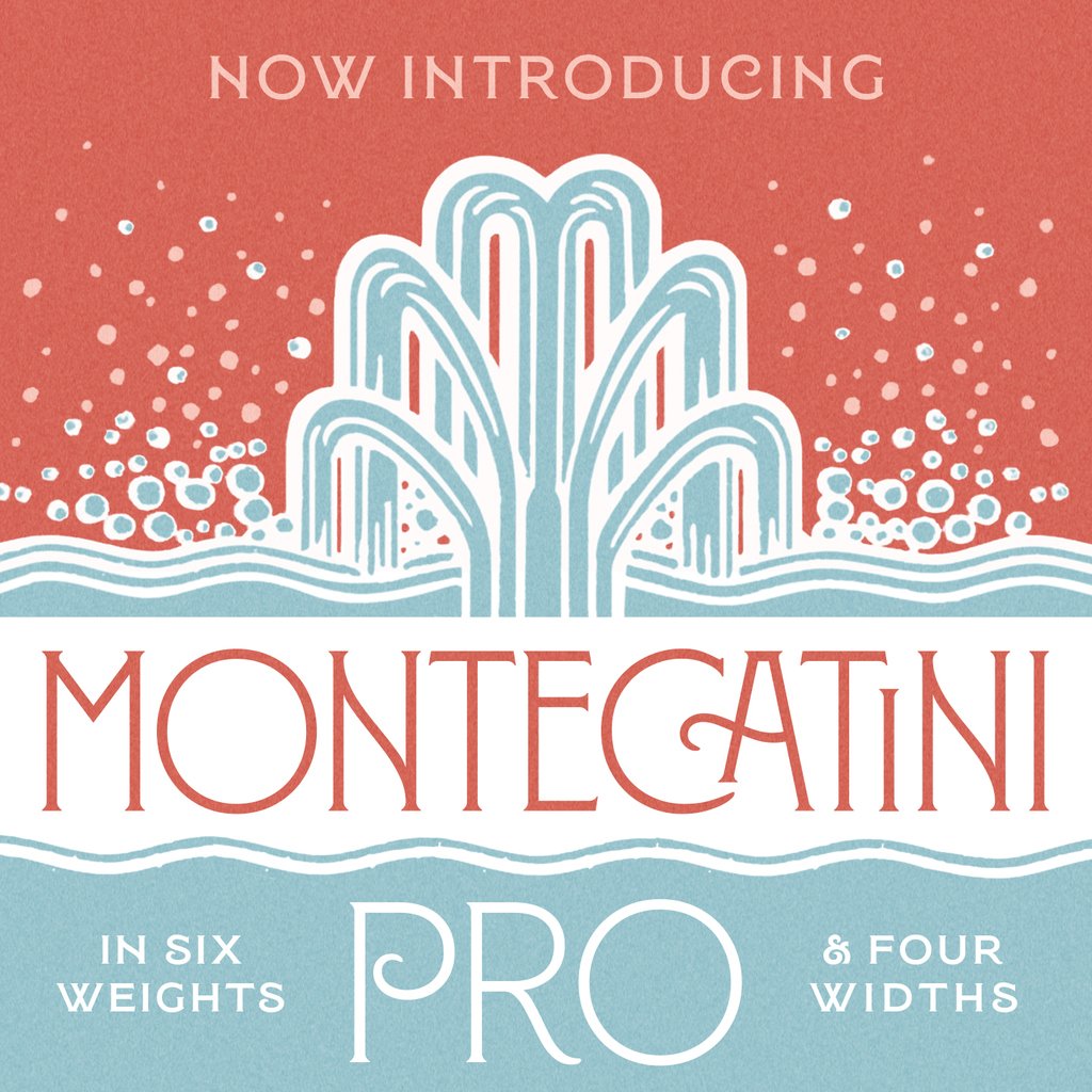
We are pleased to announce Montecatini Pro, a new expanded version of our font in 24 styles, spanning 6 weights and 4 widths. With the addition of these new styles, Montecatini Pro now has a dynamic capacity for comprehensive usage. Available today!
https://t.co/wNyCy6YazM
Just under 48 hours left of our @Kickstarter campaign to republish Manuals 2. It’s fully funded, but if you’d still like to pledge you have until 4.14pm on Sunday. Thanks to everyone who’s already helped to ensure we can bring this one back! https://t.co/CozfBmGlwK
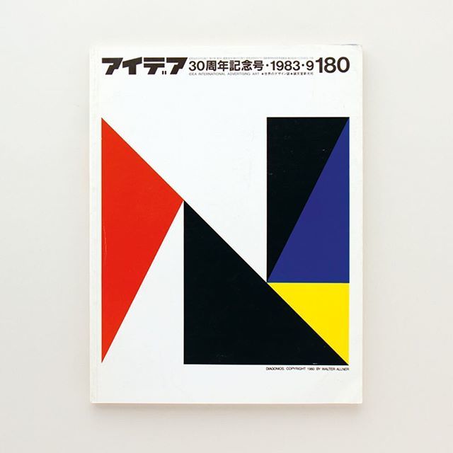
Cover of IDEA, September 1983, by Walter Allner. As featured in Impact 2.0: Design magazines, journals and periodicals, 1974-2016 (tap image for more details) #uniteditions#magazinecover#graphicdesign https://t.co/JJ5AU6E65k
Can good typography make a product taste better? (Or make a bad name seem less bad?) I will reveal these trade secrets and more in my @Skillshare class, Lettering for Brands. Take my class for free with this special 2 month Skillshare trial! https://t.co/Wp33xAWK1U