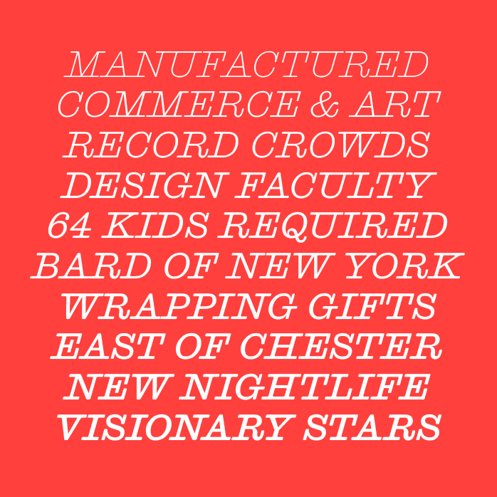
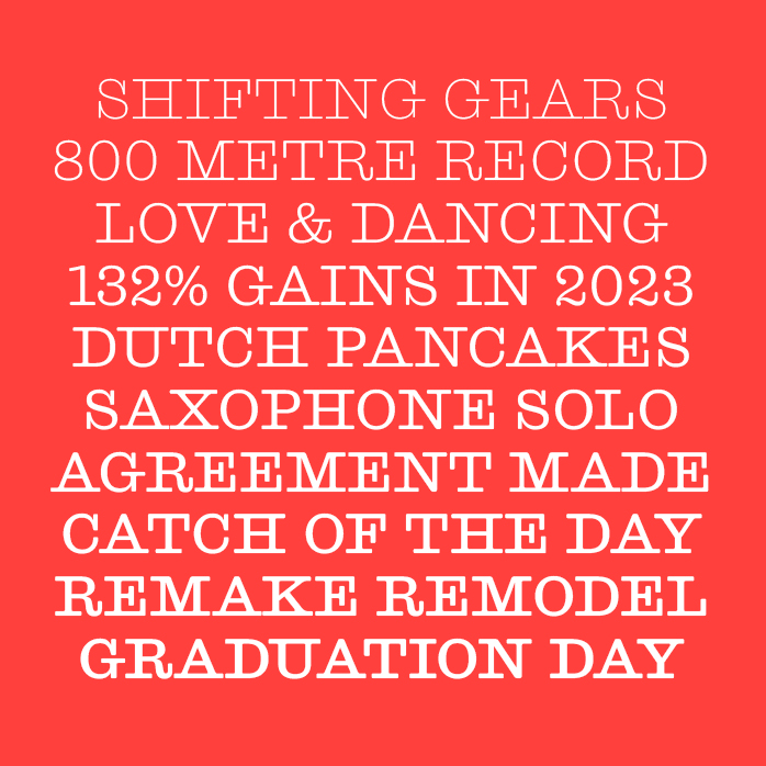
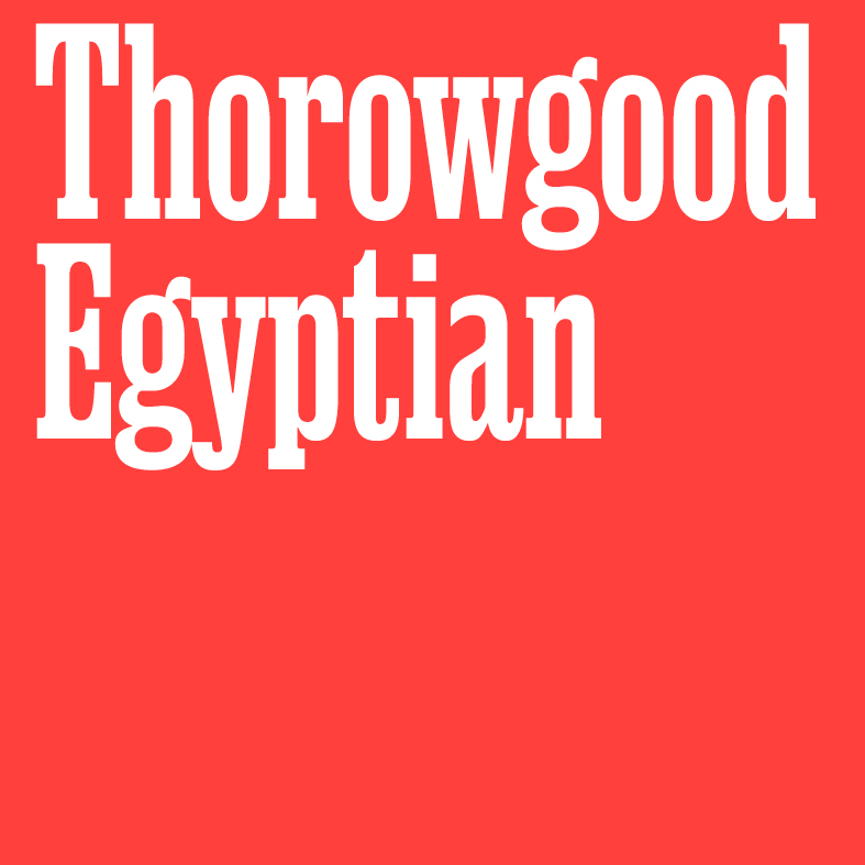
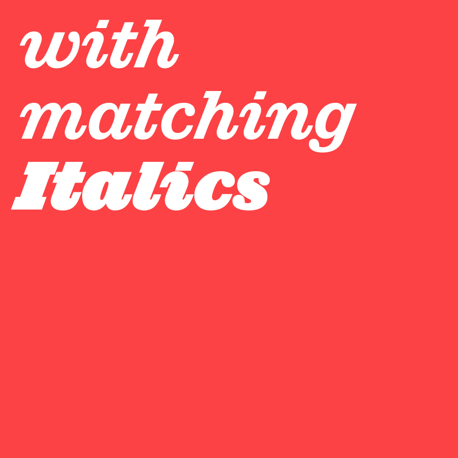
Expansion: Thorowgood Egyptian
Paul Barnes & Greg Gazdowicz
With five new weights with matching italics, it is the perfect encapsulation of early condensed slab forms. Famed for their punch in headlines it is the perfect companion to Thorowgood Grotesque.
https://t.co/DXP6e2T6Z5
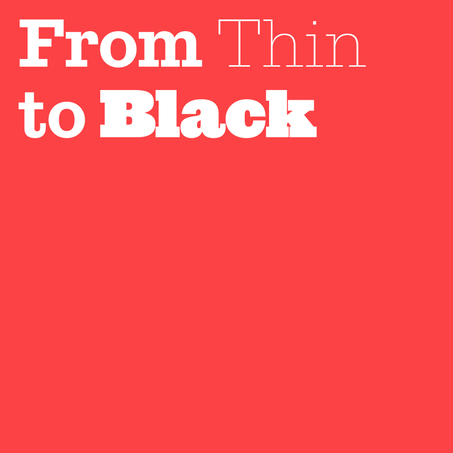
NEW RELEASE: Successor by Tim Ripper.
The slab serif convincingly reimagined for today; from Thin to Black with matching italics.
Available in Vault https://t.co/3OzxDquCYv
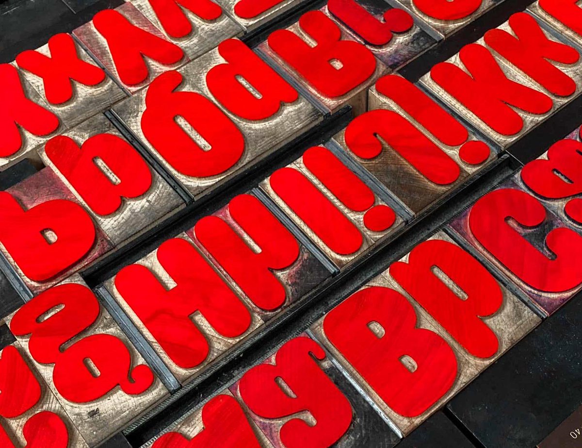
Our second contributor in EC3 is the wonderful Paul Barnes of @commercialclassics, who drew a custom version of Caslon Rounded specially to be cut as new wood type, to accompany his article. This is the first showing of that full alphabet, in upper and lowercase, in 14-line pica.
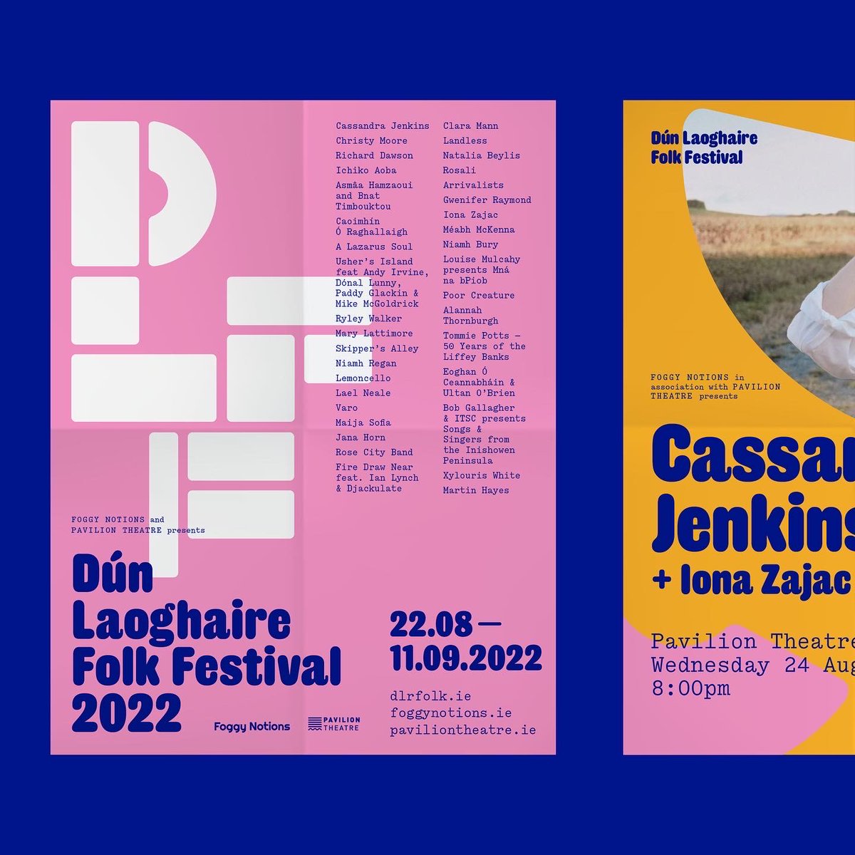
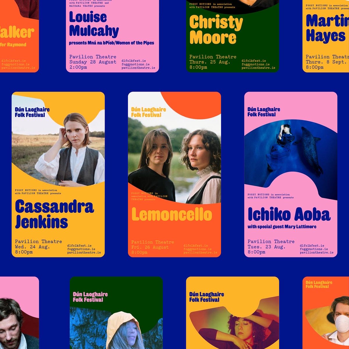
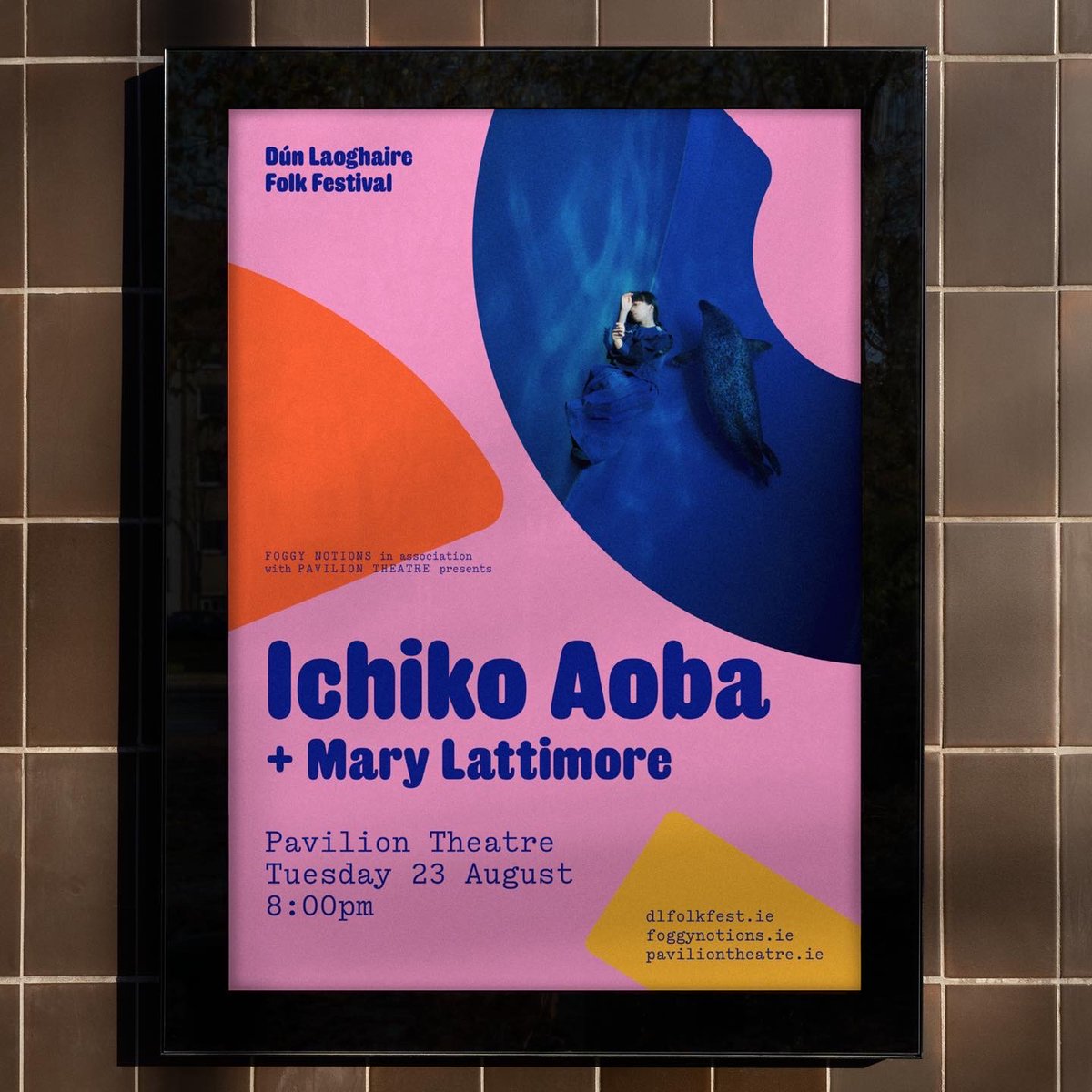
Visual identity, print and digital communications for Dún Laoghaire Folk Festival 2022. 70+ artists and 20 events spanning music, film and discussion presented by @foggynotions and @PavilionTheatre
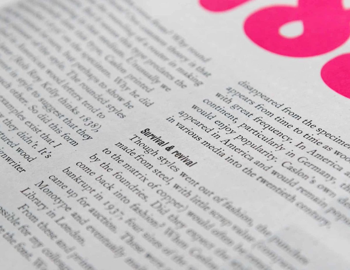
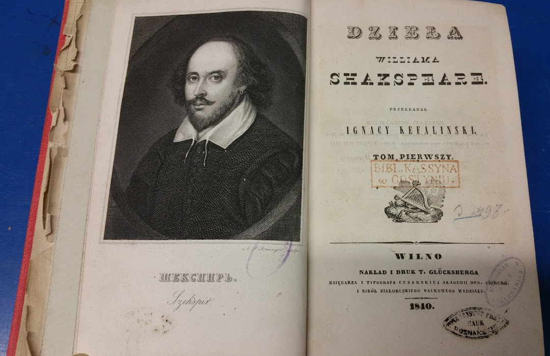
Rather than being struck with a punch, sanspareil mats, for very large types, were created as brass or copper ‘stencils’ riveted to a metal backing plate. The rivets are visible in these examples. Invented by Caslon in 1810.
A Little Patch of Ground
A new guided audio performance created in collaboration between Parrabbola and the @E2EShakespeare Project which takes place in locations across the city centre from 15 – 17 Sept.
Free to attend however booking is required via:
https://t.co/SQ24RBVHA0
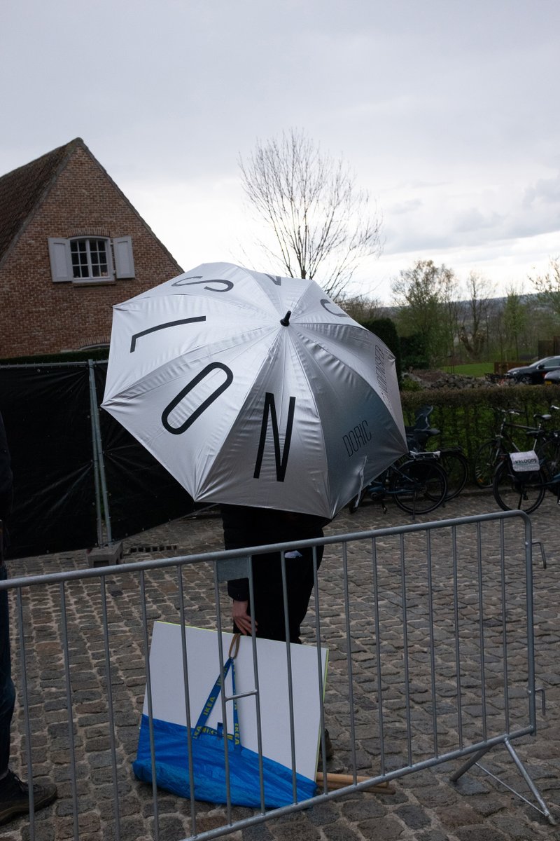
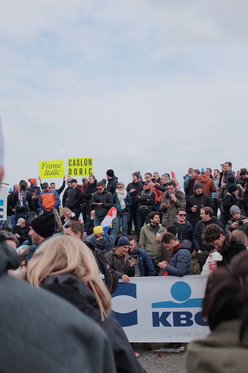
@rapha brand fonts Caslon Doric with @commercialtype new release, Frame at the spring cycling classics. Here @RondeVlaanderen
Concept @Matt__Tucker Graphics and realisation by Andy Edwards
https://t.co/Rn1wXQthfn
https://t.co/Zxnrx0KVM1
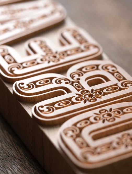
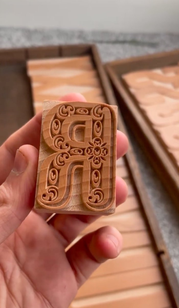
Now available in wood @reppiRmiT fantastic version of Caslon Rounded Ornamented. I think Henry Caslon would be proud. 12 line or 144 point. Coming soon Thorowgood Grotesque Dimensional. Which may or may not be true.