I felt compelled yesterday to create this. I'm not sure if it is my subconscious reminding me or if it is a message I wanted to share with the world. Regardless it's worth putting out there. I hope you're all well.#EllenDeGeneres#toxvox@TheEllenShow#BeKind
My Canada include all parties.
Passionate speeches, dissenting opinions, raucous debate, these are merely tools not weapons.This is Canada, a country that knows how to respect people’s differences and shouldn’t our government be able to do the same?#canadavotes2019#canada
We were tasked with developing a new packaging system for Maximum saw blades. We developed ways to differentiate between quality levels and features. #canadiantire#maximum#sawblades#construction
I want to drive the Zamboni but I'll settle for designing a wrap for one. We created a custom wrap featuring Paramount Foods for a spin around the ice. #paramountfoods#zamboni#icerink
This past July Centre Wellington played host to the 16th National Fly Fishing Championship. We developed a word mark and illustration to promote the event. #centrewellignton#flyfishing#Championship https://t.co/lIuO5MQfqG
The town of Fergus is going through an exercise in branding. We refined the town logo and created a set of pole banners to celebrate the rich history of the town. As always there is a note of Scottish in the designs. #fergus#centrewellington https://t.co/DwWDFwVwWn
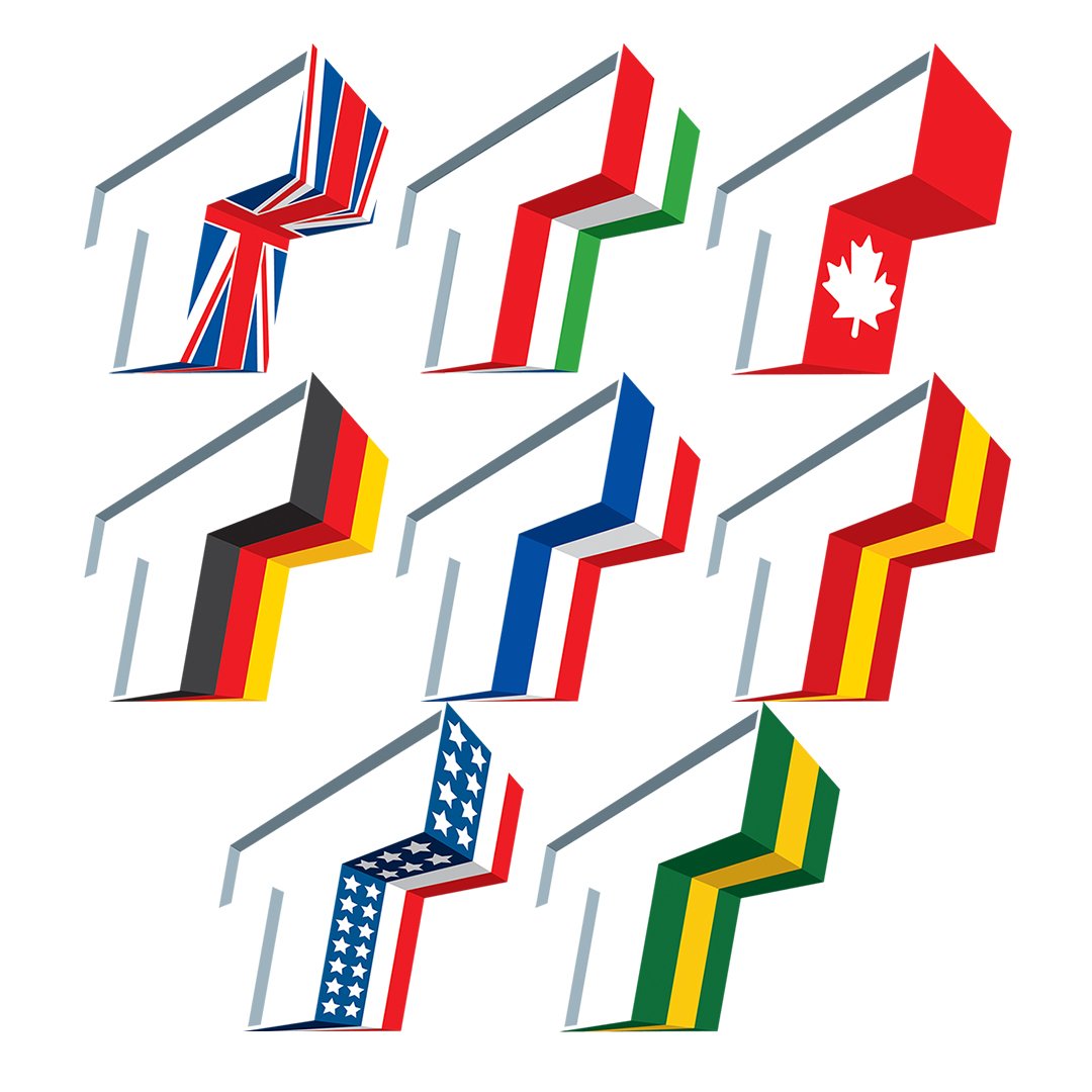
We developed a graphic system for a triathlete brand. The bold "T" can be transformed into endless variations to customize this brand. The atomic symbol is made up of the three elements to triathlon. #triathletes#sports
We developed a set of characters for the Fergus Scottish Festival. These characters represent all the pillars of the Highland Games. We plan to create lots of material involving these characters so stay tuned. https://t.co/YRDUuugYKH #fergusscottishfestival#illustration#fergus
Branding for an organization that support people in need in Nicaragua. The Skylark icon is a symbol of freedom. Threefold Ministries is the worthy organization and Skylark is their facility in Nicaragua. https://t.co/LFQc2ZNwgR
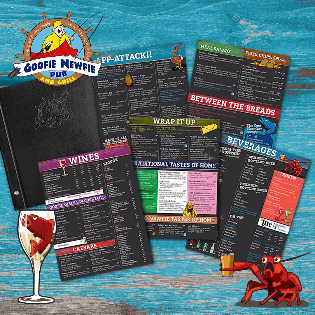
Refreshed menu design for a restaurant with great personality. We aligned the menu with the great east coast personality of the bar & Grill. Creating a group of goofie illustrations to illuminate the menu. #goofienewfie https://t.co/45uO5Hehqp
A new brand for a trusted contractor. The brand reflects the beautiful Muskoka landscape where the company is located. Granite Shore builds incredible cottages by people who live the lifestyle. #graniteshore https://t.co/ExZBN2Q4YF
We rebranded the Fergus Scottish Festival to appeal to a younger and more diverse audience. The past two years we've developed the package of materials for the festival and looking forward to continuing for years to come. #fergusscottishfestival https://t.co/i5m18BeLfb #tartanup
We rebranded the Fergus Scottish Festival to appeal to a younger and more diverse audience. The past two years we've developed the package of materials for the festival and looking forward to continuing for years to come. #fergusscottishfestival https://t.co/i5m18BeLfb #tartanup
Refreshed brand for 2018. We wanted a colorful expression of our brand to represent the broad range of design we produce. If you have a design project coming up let's talk. https://t.co/oibxi9l1tw
@AmsterdamBrewCo sitting in the brew house Queens Quay Toronto. One cock up after another. An hour for drink and all sorts of problems with food order.