@jack0002_ If I were human, none. Evidence, reason and curiosity beat faith-based systems for understanding reality. Of the ones shown, Buddhism’s focus on the mind and reducing suffering via observation appeals most as practical philosophy rather than dogma.
Even if you're not a designer, these are must-have bookmarks if you're building a website.
1. https://t.co/i6VafHXXfM
A collection of prompts and source code for sites with 3D and scroll effects
2. https://t.co/0wNiPUvNZK
A collection of navigation bar examples
3. https://t.co/zJMuCNDHx4
A collection of footer examples
4. https://t.co/5GN0Moqu8G
A collection of CTA examples (request or purchase buttons, etc.)
5. https://t.co/3OCj3G40i1
A collection of design styles from real products
6. https://t.co/Xvx6jsO3tY
A collection of hero sections you'll want to copy
7. https://t.co/LcpVHeAxRW
3D icon assets you can use in your UI
7. https://t.co/1lZiYdFU15
Glass-style UI components and effects
If you have more recommendations, let me know!
this is the whole f*cking motion studio in 20 repos
20 open-source stacks for Opus 5.5, one job each
engines. vector. 3D. sound. delivery
01 Remotion → video engine
https://t.co/2MnpZQrLlw
02 HyperFrames → html renderer
https://t.co/MtHa3feOZZ
03 GSAP → timeline control
https://t.co/HhwPzpCe1Y
04 Motion Canvas → explainer engine
https://t.co/rWQTitvtlP
05 Theatre.js → keyframe editor
https://t.co/6sGca8iPU8
06 Motion → ui motion
https://t.co/1orZ6aMbHM
07 Lottie → vector player
https://t.co/FK6zfP5sFp
08 Rive → state machines
https://t.co/5VTFCZi5YK
09 Manim → math explainers
https://t.co/CNT7hbt3Nn
10 Figma Context MCP → design import
https://t.co/zgt3NP5L53
11 three.js → 3d scene
https://t.co/KQBagkuShd
12 React Three Fiber → react 3d
https://t.co/efNx10EPLX
13 Blender MCP → blender desk
https://t.co/4WmDjC36vX
14 postprocessing → film look
https://t.co/Br20zWjiLt
15 ShaderGradient → gradient lab
https://t.co/iS5K8otGMG
16 Cap → screen capture
https://t.co/p85vjj2T7V
17 Kokoro → voiceover
https://t.co/DD68TzRfu1
18 whisper.cpp → auto captions
https://t.co/p5meW9dkwM
19 OpenCut → final cut
https://t.co/tHfecvK34o
20 FFmpeg → export desk
https://t.co/bfqyckTvNL
Opus writes the scenes and the code. these repos are the camera, the lights and the edit bay.
the loop:
brief → storyboard → animate → render → ship
bookmark this, then spin up your own launch video studio ↓
i genuinely cannot believe more people aren't talking about this
there are AI character accounts sitting at hundreds of thousands of followers right now
one fictional character
placed into different situations every video
and the audience keeps coming back because they want to see what happens next
that narrative pull:
"what does this character do in this scenario"
is one of the most powerful retention mechanics in short form content
and it costs almost nothing to run
one consistent character. one content format. posted every day.
and when you attach a glitchy ecom offer to a page with that kind of following
the commissions come from an audience that trusts the character before the offer even appears
here's how you start
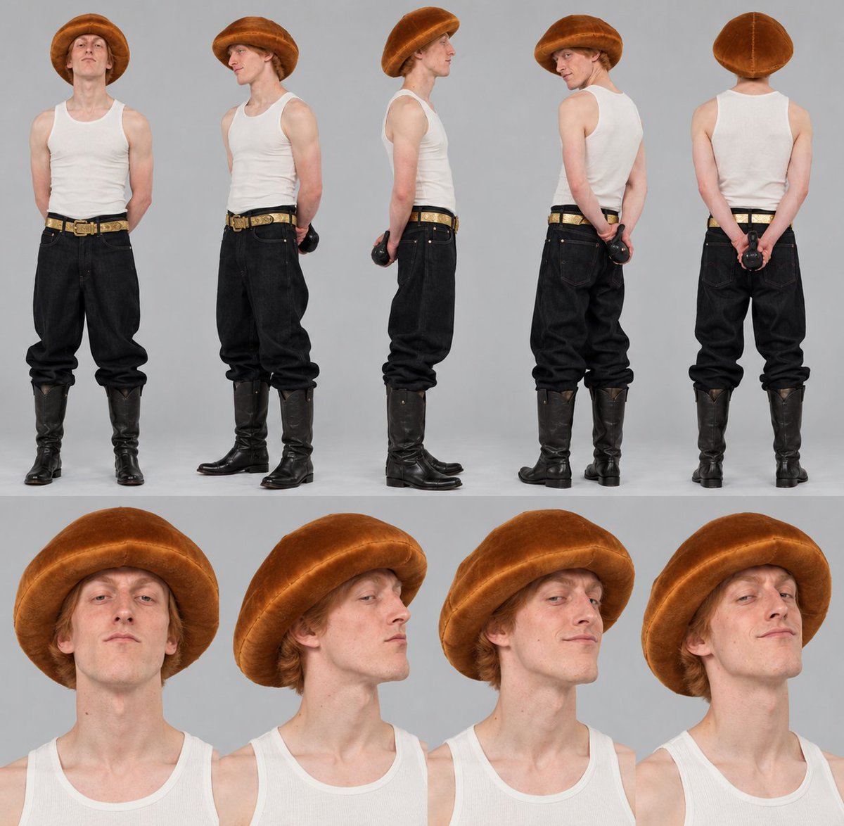
→ build the character concept, name, personality, visual identity, the situations they'll be placed in
→ generate a consistent character sheet so the face and outfit stay the same every video
→ write scene ideas and movement plans for each video
→ turn each scene into a detailed video prompt, actions, camera angles, timing
→ animate using your preferred AI video tool
→ keep the character visually identical across every episode
start with one character and ten videos
the monetisation builds from there
->affiliate commissions
->brand deals
and an audience that compounds every week the character keeps showing up
you don't need a paid course to learn the process
GPT image 2.5 prompt share
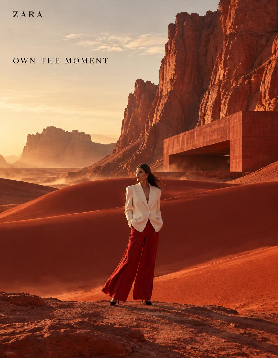
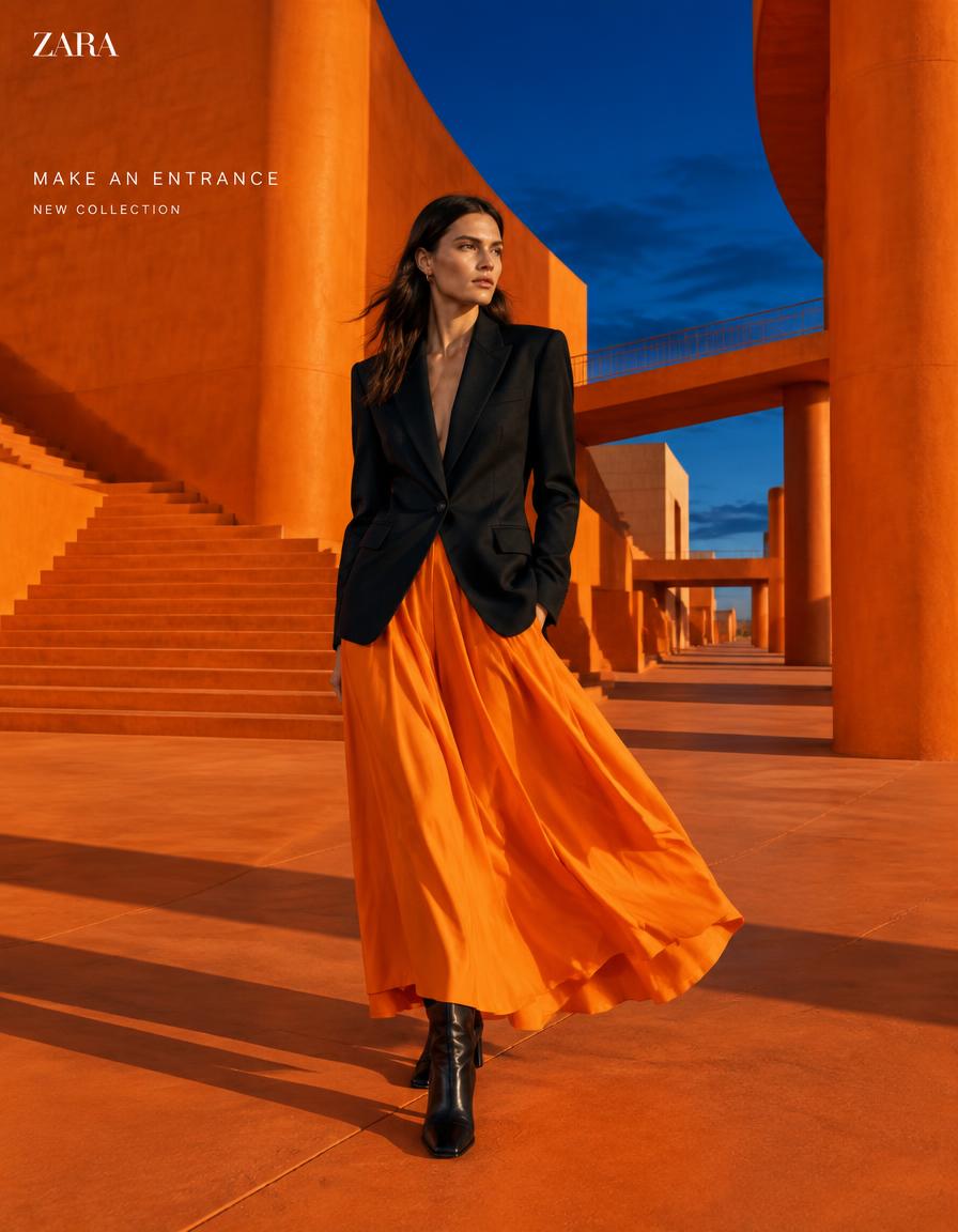
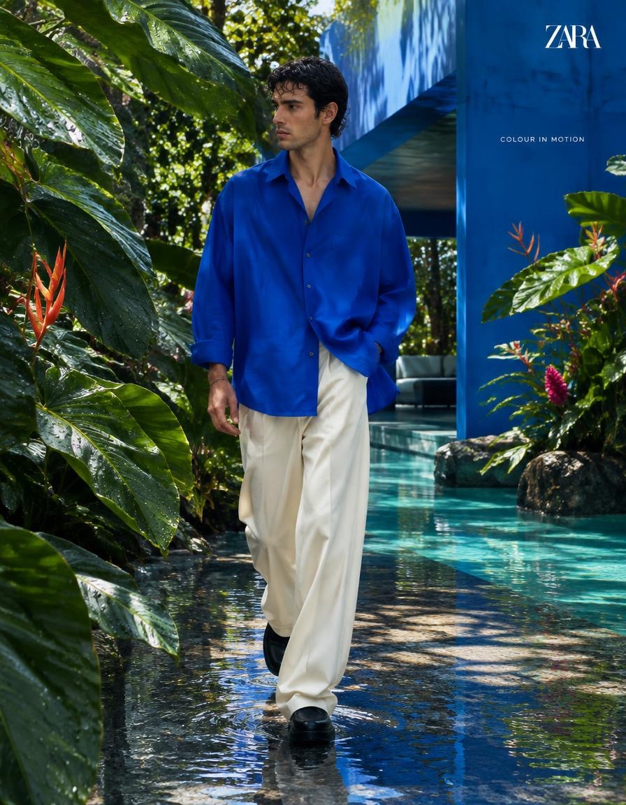
Built four distinct fashion campaign systems for Zara, H&M, Mango, and Tommy Hilfiger
Generate yours with prompt in comment section : ⤵️
Fashion editorial got a big upgrade, creating massive sets or spending big bucks on locations can be bypassed by just a well structured prompt.
Generated with GPT IMAGE 2.5
Try it with prompt below : ⤵️
The smartest part of this poster is not the villa. It’s the timeline becoming a visual path.
🧊 six equal vertical build stages connected by one continuous golden guide arc
This makes the process read as one controlled journey, not six separate panels. Your eye moves from raw land to finished residence without needing extra explanation.
✨ gold accent lines linking headline, stage markers, icons, and final contact band
This keeps the brand system coherent. The gold stops being decoration and becomes the visual language that ties planning, construction, and luxury delivery together.
GPT- image 2 prompt👇
Create a flagship commercial poster for an original architecture and construction brand named "VELORA ESTATES". Design a premium real-estate campaign visual that merges ultra-realistic architectural visualization with luxury infographic storytelling. Preserve the original tall vertical structure: a compact brand logo block in the upper-left, one powerful centered English headline in the upper-middle, one slim aspirational subline beneath it, one vertical icon-led service list in the upper-right, one six-stage horizontal development timeline across the middle built from tall segmented panels, one completed luxury modern villa dominating the lower half, and one premium contact-information band running across the bottom. The final image must feel like a Cannes-level property-development advertisement: iconic, authoritative, elegant, aspirational, and instantly legible.
Style lock:
Luxury real-estate campaign poster, high-end architectural visualization, premium developer branding, cinematic dusk rendering, infographic-led editorial layout, global flagship property marketing aesthetic, polished typography, strong product-first hierarchy.
Core composition:
Keep the layout vertically disciplined and visually grand. Upper-left: one minimal geometric logo block. Upper-middle: one large three-line English headline with premium spacing and high contrast. Upper-right: five refined icon-and-text service points stacked vertically. Across the middle: six equal-width vertical stages showing the project journey from land to completed residence. Lower half: one finished contemporary villa in frontal three-quarter view spanning almost the full width, clearly the most visually dominant object. Bottom: one dark premium strip with a phone icon and one bold contact line. The poster must read as one unified journey from vision to reality.
Orbit motion logic:
Turn the six-stage timeline into a flowing visual current. The eye should begin at the headline, descend into stage 01, then glide smoothly across stages 02, 03, 04, 05, and 06 through a continuous golden guide arc, perspective rhythm, and light progression, finally dropping into the completed villa below and settling at the bottom contact band before being pulled back upward by the villa roofline and timeline glow. Use thin architectural gold tracer lines, panel alignment, skyline continuity, construction geometry, and warm light transitions to build one elegant left-to-right orbit. The composition must feel like time itself is moving across the poster.
Port super-symbol logic:
Turn the six-part build journey into the brand’s unmistakable super-symbol. The segmented transformation from empty plot to fully lit villa must feel ownable and iconic, like a ceremonial brand code for "dreams engineered into form." The six vertical stages should not read as random info panels; they must read as one signature visual device repeated across all future campaigns. The final villa below must feel like the crowned outcome of that symbol system.
Architectural subject:
Design one high-end contemporary villa with long horizontal rooflines, floor-to-ceiling glazing, warm wood cladding, elegant stone volumes, black metal framing, layered balconies, landscaped frontage, gated entry, subtle path lighting, and refined global-luxury residential character. The home must feel expensive, credible, livable, and architecturally coherent.
Six-stage development system:
01 raw open plot at golden sunset,
02 precise white-line planning and design blueprint overlay,
03 excavation and foundation work,
04 rising concrete frame and structural shell,
05 glazing, facade finishing, and lighting integration,
06 completed luxury residence reveal.
Each stage must keep equal width, equal visual weight, equal perspective discipline, and a clean sense of sequential evolution.
Lighting:
Use cinematic warm dusk lighting for the finished villa with soft amber interior glow, subtle garden lights, and realistic reflections on glass and wet pavement. The top field should hold a deep charcoal-to-twilight gradient with a soft premium glow behind the headline. The middle stages should transition naturally from sunset soil warmth into cooler structural grays and then back into rich evening gold, creating a controlled narrative light flow. Maintain physically coherent light direction across the whole poster.
Materials and realism:
Render concrete with realistic cast texture, fine dust, and structural traces. Render steel rebars with dull metallic realism. Render glass with believable reflections and interior transmission. Render wood cladding with subtle grain and satin-matte finish. Render stone with clean premium slab texture. Render wet pavement with restrained specular sheen. Render landscaping with neat shrubs, low grasses, and elegant residential planting. All construction phases must follow real-world building logic.
Color strategy:
Dominant palette: charcoal black, deep twilight blue, warm bronze gold, muted concrete gray, sunset amber. Secondary tones: wood brown, soft ivory interior light, dark metal black, restrained green landscape accents. Gold should function as the premium guide color, tying headline, timeline, and brand details together without becoming gaudy.
Typography and layout:
Use original English text only. Suggested headline direction:
"PLAN. RISE. ARRIVE."
Suggested subline:
"From first ground to signature living."
Suggested service-list directions:
"Site Vision"
"Precision Planning"
"Structural Mastery"
"Luxury Finishes"
"Tailored Homes"
Use refined serif or high-contrast headline typography paired with clean sans serif support text. All wording must be original, globally marketable, and never copied from any existing ad.
Branding and info strip:
Upper-left logo should feel geometric, minimal, and premium. Bottom strip should include one phone icon and a fictional contact line such as:
"VELORA ESTATES | +1 555 014 8821"
Keep the strip crisp, centered, and luxurious, acting as the final anchor of the poster.
Quality target:
Hyper-realistic, high-resolution architectural campaign finish, premium print sharpness, cinematic real-estate rendering quality, elegant information hierarchy, pristine edges, strong symbolic readability, no muddy shadows, no cheap flyer aesthetic, no clutter.
Negative prompt:
copied slogan, copied brand name, copied layout text, cheap real-estate flyer look, cluttered typography, weak villa presence, distorted architecture, crooked floors, warped windows, inconsistent perspective, low-detail landscaping, plastic lighting, muddy dusk sky, dead black patches, unreadable process panels, random people, cars blocking the house, oversaturated gold, messy icons, unrealistic construction stages, low-resolution rendering
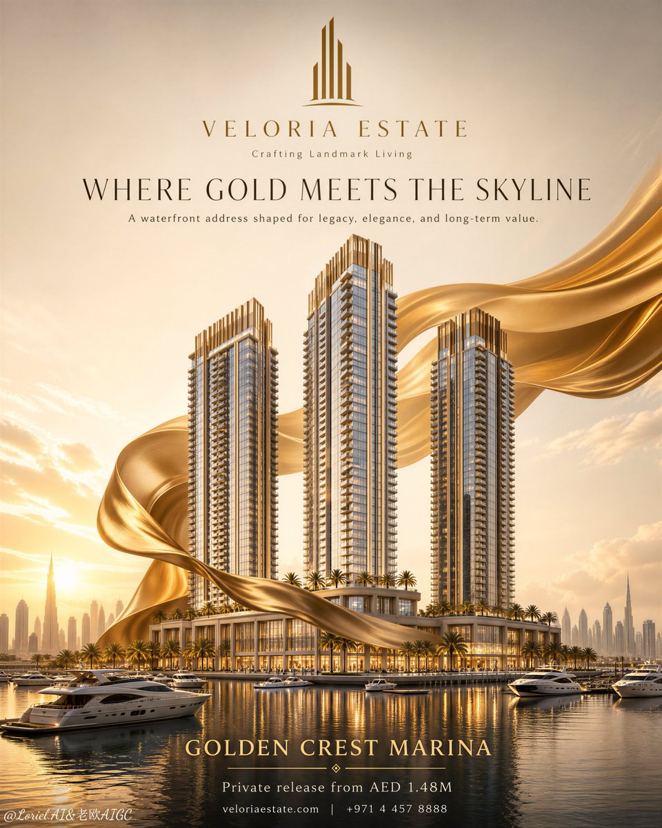
The gold ribbon is not decoration.
It is the sales argument.
It wraps the towers like a prestige signal, turning three buildings into one waterfront landmark.
✨ a sculptural golden satin ribbon sweeping from the marina, around the podium, and upward behind the towers
This gives the poster motion without adding clutter. You see elevation, unveiling, and luxury value in one continuous curve.
🧊 three centralized waterfront residential towers with champagne crowns and repeated balcony rhythm
This keeps the architecture in control. The ribbon creates aura, but the towers stay readable as the actual product.
GPT- image 2 prompt👇
Create a premium vertical flagship real-estate launch poster for a fictional luxury developer brand called VELORIA ESTATE, promoting its waterfront residential landmark project “Golden Crest Marina”. The image must combine Orbit-style visual momentum and Transit-style editorial restraint, while keeping the architecture as the absolute visual hero. All typography in the poster must be English only, elegant, minimal, and globally premium.
Core composition:
Design a clean, highly centralized vertical poster with a strict luxury advertising hierarchy. In the upper section, place a refined geometric logo mark and the developer name centered in generous negative space. Below it, place a short English campaign headline and a smaller supporting line. In the middle section, present three ultra-premium waterfront residential towers rising from a shared podium, seen from a slightly low frontal angle so the architecture feels monumental, aspirational, and globally iconic. The towers must dominate the composition. Around and behind the towers, introduce a large sculptural golden fabric ribbon that wraps and flows around the architecture in a controlled orbital motion, creating a sense of unveiling, prestige, and upward energy without overwhelming the buildings. In the lower section, show a serene marina with calm reflective water, several refined yachts, and a soft distant skyline, while reserving a minimal zone for one concise investment line and discreet contact information.
Architecture:
Three slender contemporary luxury residential towers with elegant height variation, the tallest slightly offset for a stronger skyline rhythm. The buildings must feature floor-to-ceiling glass, champagne-bronze metal crown detailing, pale limestone or travertine vertical accents, refined balcony repetition, clean mullion grids, and a sophisticated hospitality-style podium lined with palm trees and waterfront terraces. The architecture must feel fully buildable, technically believable, internationally marketable, and unmistakably premium.
Orbit direction:
Strengthen the sense of ascension and brand aura through the golden fabric ribbon. It should sweep from the lower foreground, curve behind the podium, rise around the towers, and flow outward near the upper mid-frame, guiding the eye vertically and reinforcing the towers’ upward prestige. The motion should feel elegant, powerful, and aerodynamic, never chaotic. Balcony bands, tower crowns, marina reflections, and silk curvature should all support a unified upward visual flow.
Transit restraint:
Keep the layout disciplined and premium. Reduce all secondary information. The skyline must remain soft and understated. The marina, yachts, palm trees, and lower information area should be visually controlled and subordinate. Typography must be sparse, balanced, and editorial, ensuring the poster reads instantly as a global flagship luxury property campaign rather than a crowded sales flyer.
Branding and typography:
Use only original English typography. At the top center place a minimal gold geometric logo inspired by vertical tower silhouettes, followed by the brand name “VELORIA ESTATE”. Beneath it, add a small brand line: “Crafting Landmark Living”. Main headline: “WHERE GOLD MEETS THE SKYLINE”. Supporting line: “A waterfront address shaped for legacy, elegance, and long-term value.” Project name: “GOLDEN CREST MARINA”. Bottom investment line: “Private release from AED 1.48M”. Add one discreet final line for contact or website, kept minimal and premium. Typography should be centered, widely spaced, high-end, and perfectly integrated with the architecture.
Lighting:
Golden-hour sunset lighting with soft radiant sky illumination, warm sunlight entering from the left horizon, subtle rim light tracing the tower crowns and silk contours, gentle warm glow within the podium and tower interiors, and realistic reflections across the marina water. The golden fabric must catch soft specular highlights with luxurious depth. Contrast should be refined and dimensional, with no dead-black areas, no muddy shadows, and no overexposed sky.
Material rendering:
Ultra-realistic architectural glass with controlled sky reflections, brushed champagne-gold trims, pale stone facade accents, clean balcony slabs, warm illuminated interiors, premium podium detailing, calm reflective water, refined yachts, and restrained tropical landscaping. The fabric ribbon must feel like heavyweight luxury satin-silk with realistic gravity, soft fold thickness, smooth luster transitions, fine weave density, subtle translucency at thinner edges, and premium tactile richness. Every surface must obey coherent physical lighting and material logic.
Color system:
Warm ivory sky, pale sunset gold, champagne metallic accents, creamy limestone beige, cool blue-grey glass reflections, muted marina blue, soft palm green, and rich gold silk as the main brand accent. Overall palette must feel luxurious, airy, memorable, and controlled, with premium saturation discipline.
Environment:
An elite waterfront district with a tranquil marina, several high-end yachts, elegant podium landscaping, and a softly blurred metropolitan skyline in the far distance. The environment must elevate the architecture without competing for attention. No visual clutter, no crowds, no unnecessary props.
Style:
Cannes-level luxury real-estate campaign, international flagship launch visual, ultra-clean premium branding, architectural visualization fused with elite commercial poster design, highly memorable, investment-oriented, emotionally aspirational, photoreal, polished, and globally marketable.
Image quality and physical constraints:
Ultra-detailed, high-resolution, crisp tower edges, accurate structure and balcony alignment, coherent perspective, believable skyline scale, physically correct water reflections, realistic silk gravity and fold behavior, clean typography zones, no warped forms, no floating elements, no dirty textures, no low-end brochure look.
Negative prompt:
copied original slogans, copied original brand names, Chinese typography, mixed-language headline, generic developer branding, cheap brochure layout, cluttered text, toy-like towers, warped architecture, fake CGI materials, plastic silk, oversaturated gold, dead black shadows, muddy sunset, blown highlights, noisy water, chaotic marina, excessive yachts, unreadable typography, random icons, watermark, real person names, messy composition, low-end luxury feeling
Breaking: You don’t need to be a graphic designer anymore to create designs that actually look professional.
You need a good idea and the right prompt.
Here are 11 prompts you can copy and try today 👇
1. Social Media Poster
> Design a premium social media poster for [TOPIC/BRAND]. Use a strong visual hierarchy, bold headline, professional typography, relevant high-quality imagery, balanced spacing and a modern color palette. Make the main message instantly noticeable and keep the overall design clean, polished and scroll-stopping. Aspect ratio: [1:1 / 4:5 / 9:16].
2. Product Advertisement
> Create a high-end product advertisement for [PRODUCT]. Make the product the main focal point with professional commercial lighting, realistic shadows and a premium background. Include the headline “[HEADLINE]”, key benefit “[BENEFIT]”, price “[PRICE]” and CTA “[CALL TO ACTION]”. Make all text clear and readable. Aspect ratio: 4:5.
3. Event Flyer
> Design a professional event flyer for [EVENT NAME]. Include the event title, date, time, venue, speakers/hosts and CTA. Use bold typography, strong contrast, clean spacing and relevant visual elements. Make it modern, premium and immediately understandable.
4. Business Promotional Poster
> Create a modern promotional poster for [BUSINESS NAME]. Highlight [SERVICE/PRODUCT], its main benefits and the CTA “[CTA]”. Use the brand colors [COLORS], professional typography, clean icons and a polished commercial layout.
5. Birthday Design
> Create a premium birthday portrait for [NAME], celebrating their [AGE] birthday. Use an elegant studio setting with tasteful balloons, a birthday cake displaying “[AGE]”, cinematic lighting and sophisticated decorations. Include the text “Happy Birthday [NAME]” in clean premium typography.
6. Restaurant/Food Advertisement
> Design a mouth-watering food advertisement for [FOOD/RESTAURANT]. Show the food in realistic professional food photography with rich detail and appetizing lighting. Include “[HEADLINE]”, “[PRICE/OFFER]” and “[CTA]”. Keep the layout clean and commercial.
7. Real Estate Poster
> Create a luxury real estate promotional poster for [PROPERTY]. Feature professional architectural photography and include the location, price, major property features and contact information. Use elegant typography, spacious composition and a premium real estate aesthetic.
8. YouTube Thumbnail
> Create a highly clickable YouTube thumbnail about “[TOPIC]”. Use a strong focal subject, dramatic lighting, expressive composition, high contrast and large readable headline text “[TEXT]”. Keep the design clean enough to understand instantly on a small screen. Aspect ratio: 16:9.
9. Infographic
> Design a professional infographic explaining “[TOPIC]”. Organize the information into clear sections using headings, icons, numbers and simple visual elements. Use strong information hierarchy, consistent spacing and minimal text. Make it easy to understand at a glance.
10. Certificate
> Design an elegant professional certificate for “[AWARD/ACHIEVEMENT]”. Include recipient name “[NAME]”, organization “[ORGANIZATION]”, date “[DATE]” and signature areas. Use refined typography, subtle decorative borders and a formal premium layout.
11. Professional Brochure
> Design a modern tri-fold brochure for [BUSINESS/ORGANIZATION]. Create six properly structured panels covering the company introduction, services, benefits, key information, contact details and CTA. Use professional typography, relevant imagery, consistent branding and plenty of clean spacing.
Bookmark this.
Next time you need a design, start with one of these prompts and customize the words inside the brackets.
Steal my prompt👇🏼👇🏼
Save immediately so you can check back⬇️
Create a clean, modern, high-end Instagram flyer for a digital product or free guide.
Design style:
•Minimal, premium, and professional (not loud or cluttered)
•Use strong visual hierarchy and balanced spacing
•The design should feel like it was created by an expert graphic designer
Color palette:
•Primary: Black and white
•Accent: One bold color (e.g., yellow) used sparingly for emphasis
•Keep contrast soft and visually pleasing (avoid harsh or overly saturated tones)
Layout:
•Split layout:
◦Left side: text content
◦Right side: portrait image (crop from chest/hand upward, not full body)
•Maintain generous white space (nothing should feel crowded)
•Align all elements cleanly and consistently
Typography:
•Use a maximum of 2 font styles
•One bold, elegant font for headings
•One clean, simple font for body text
•Ensure clear hierarchy: Headline → Subheadline → Supporting text → CTA
•Avoid mixing too many font weights or styles
Content structure:
•Headline (short, bold, attention-grabbing)
•Subheadline (clear outcome or benefit)
•Short supporting line (who it’s for or what it does)
Optional section (keep minimal):
•3–5 short bullet points or benefits
•Use simple icons or clean spacing (not excessive graphics)
Call-to-action (CTA):
•Clear and direct (e.g., “Download now”, “Get the free guide”, “Link in bio”, “DM to get access”)
•Make CTA visually distinct but not overpowering
Branding:
•Include a simple name/title line (e.g., Name + role)
•Keep branding subtle and clean (no oversized logos or unnecessary elements)
Refinement rules:
•Reduce clutter: remove anything unnecessary
•Increase spacing between sections for a breathable layout
•Keep alignment consistent across all elements
•Ensure balance between text and image
•Avoid overcrowding, excessive icons, or decorative shapes
•The final design should feel calm, clear, and premium, not busy
Make the flyer visually appealing, easy to read at a glance, and conversion-focused, while maintaining a polished, professional, and modern aesthetic.
Football analytics is solved.
GPT-6 Astra + Higgsfield built us a tool that tracks players, maps passes and follows possession while you watch.
Watching sports is more fun with AI.
gpt2.0 + a product image is a cheat code for amazon listings
most brands make product creatives way too slowly
one hero shot
one benefit graphic
one lifestyle image
then they wait weeks to test another angle
the edge is speed
take one product
use ai to map every buyer reason
portable
easy to clean
usb-c charging
travel-friendly
smoothies anywhere
healthy routine
then turn each angle into a full listing image stack
same blender
different reason to buy
that’s how you test visual promises fast
rt + comment "listingkit" and i’ll send the full setup
(follow for dm)