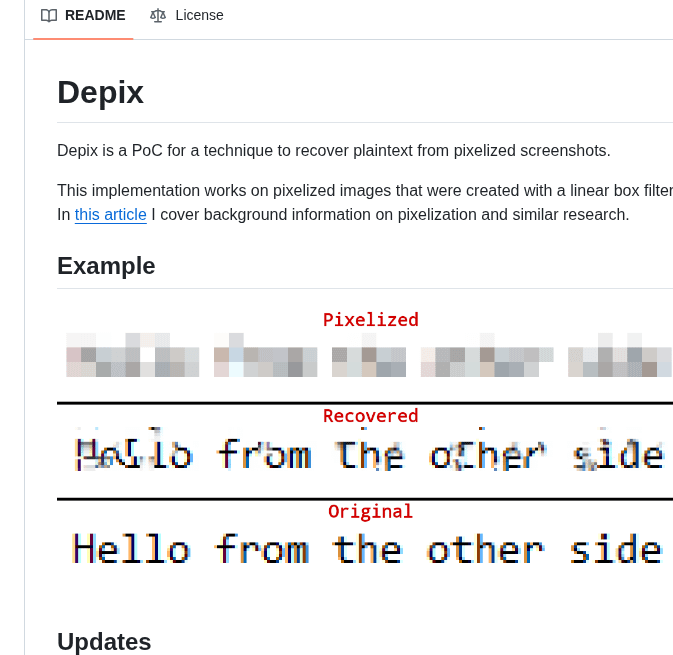
🚨BREAKING: This Python tool reverses pixelation and recovers the original text from "censored" screenshots.
It's called Depix. You pixelate a password. Depix reads it anyway.
No AI model. No GPU. No cloud service. Just math.
Here's how it works:
→ You feed it the pixelated screenshot
→ It generates a search image using a De Bruijn sequence
→ Matches each pixelated block against known character renders
→ Uses geometric proximity to eliminate false positives
→ Reconstructs the plaintext character by character
Here's the wildest part:
It was originally built because someone pixelated a Domain Admin password in a corporate screenshot. The kind of credential that controls an entire company's network. Depix cracked it.
Every redaction tool you've ever used. Greenshot, Gimp, Snagit. If it uses a linear box filter for pixelation, this tool can reverse it.
The original repo hit 26,152 GitHub stars before the creator reset it. That's how hard this blew up.
Think about every screenshot you've ever shared with "censored" credentials, API keys, emails, or private messages.
If you pixelated them instead of using solid black bars, they were never hidden.
One command to run. Pure Python.
100% Open Source.
consistency ≠ uniformity:
for those who haven't lived through this era – we used to have beautiful, precision interfaces. now they're replaced by a design language that originated from the Apple Watch, with icons that only fit in squircles. but that's not even the point.
the point is we used to design the whole stack – the technology, the concepts, the interfaces. when designers only care about superficial consistency, platforms lose their uniqueness.
apple used to design systems. skeuomorphism wasn't just about leather textures – it was about teaching people new mental models. the trash can empties because you understand what a trash can does. aqua's lickable buttons and sheets had depth because the OS had layers you could understand. the old apple designed the whole stack – from metal to pixels to concepts. teams weren't just shipping features in the same box, they were building coherent platforms each with opinions about what computing should feel like for the medium.
liquid glass is fine on a phone. but on macOS it's unusable – lack of precision, visual noise everywhere. this is what happens when UI language designed for fingers bleed into macOS. we went from interfaces designed for a 27" cinema display with a precise cursor to interfaces designed for a 1.5" screen you tap with one finger.
the Mac is for creation and precision work. it needs information density. it needs chrome you can grab. it needs UI that gets out of your way but gives you power when you need it. instead we got padding and whitespace and translucent blurs optimized for touch targets nobody's touching.
the squircle icon mandate is a symptom. when you force every icon into the same shape, you're saying "brand consistency" matters more than "each app icon needs to communicate its function instantly." we traded clarity for uniformity. we traded precise design for cross-platform sameness.
consistency means your system has coherent rules within itself. uniformity means everything looks the same regardless of context.
the hardware team still gets it – that macbook pro + M-series chips, chef's kiss. but software design feels like it's chasing fat fingers instead of remembering what people do on a Mac.
Galera estou nos grupos do NintendoBarato para economizar com Nintendo e participando do sorteio do Switch 2! #nintendobarato
Bora para mais um sorteio!