Tsla, pltr and nvdia investor. I use my homily charts for investing. Not financial advice. Tesla car owner, piano self learner. Don't follow me as I'm stupid.
How to read my charts more accurately?
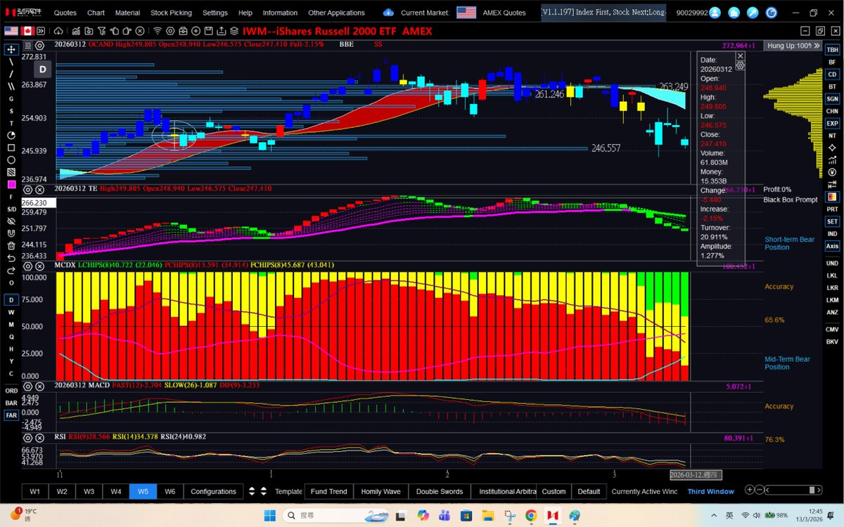
Box 1/Panel 1: Candle patterns
1. Red candle----a bullish signal, hinting that there is an uptrend in the shorter term.
2. Yellow candle---a bearish signal, implying that there is a downtrend in a shorter term.
3. Dark blue candle--the uptrend persists
4. Light blue candle---the downtrend persists
5. Red ribbon---uptrend in the middle term
6. Blue ribbon---downtrend in the middle term Even a red ribbon or blue ribbon has both red candles and yellow candles.
Box 2/Panel 2: Technical expert.
It is a mimic of Panel 1.
1. Green bar refers to bearish sentiment whereas red bar refers to bullish sentiment.
2. Purple line refers to the midterm uptrend line whereas the green line refers to the midterm downtrend line.
Box 3/Panel 3: Whale accumulation/distribution patterns vs Retail accumulation
1. Whales (red bars) need to reach 50 %for the stock to run and 75 % to surge.
2. Whales can both accumulate and distribute. The longer the red bars, the more the whales—a bullish trend
The shorter the red bars, the less the whales—less bullish, as whales might be shaking out weaker hands or distributing, depending on the price actions.
3. Retail investors (green bars). For a stock to run, green bars need to disappear. The longer the green bars, the more likely the stock is going to drop/plummet.
4 .When seeing a decrease in the percentage of retail accumulation over the past few days, weeks or months, it can also be a reliable signal that the stock is bottoming out.
5. Yellow bars are daily traders, which we don’t need to care.
Box 4/Panel 4: MACD (Moving Average Convergence Divergence)
1. When the MACD is below zero, the price is usually in a downward trend (bearish momentum)
2. When the MACD is above zero, the price is usually in an uptrend (bullish divergence)
3. The golden cross (fast and slow line crossing each other) curls to the upside, a bullish signal.
4. The golden cross curls to the downside, a bearish signal.
Box 5/Panel 5: RSI (Relative Strength Index)
1. RSI around 20-30 is oversold and it may be a buy indicator whereas RSI above 80-95 is usually a sell signal.
2. I like to use 3 sets of RSI and compare the previous lows as a signal to predict the bottom price. When 3 sets of RSI curl up, it’s usually bullish and vice versa.
For those of you who like to know more, you can just click the following video that Dr Cat @cryptocantoncat invited me to share.
https://t.co/WxdC9syzeD
or
https://t.co/ZQ6Yufd21M in which Matt @matthughes13 and I shared some tips on how to read my charts as well.
For those who would like to view more daily charts (at least 4-5 a day) with my (TA) technical analysis for free, you can join my patreon. For those who wish to view as many as 50 charts with my TA a day and understand more in depth, please subscribe it.
https://t.co/iB4xJha2Xd
Being 95% out of the market in early February means you missed the bottom on the following stocks:
$PLTR $COIN $MSTR $GLXY $CLSK $MARA $CIFR $BITF $SHOP $NET $BMNR $ARKK $RCAT and many more
Some might call it a win, but I call it missed opportunity
https://t.co/8inJltzYiv
What stocks do you like Dr Cat @cantonmeow to create videos for my patreon this week?
Remember, we don't cover meme stocks or laggards — only those showing strong whale momentum. We invest, but we never trade!
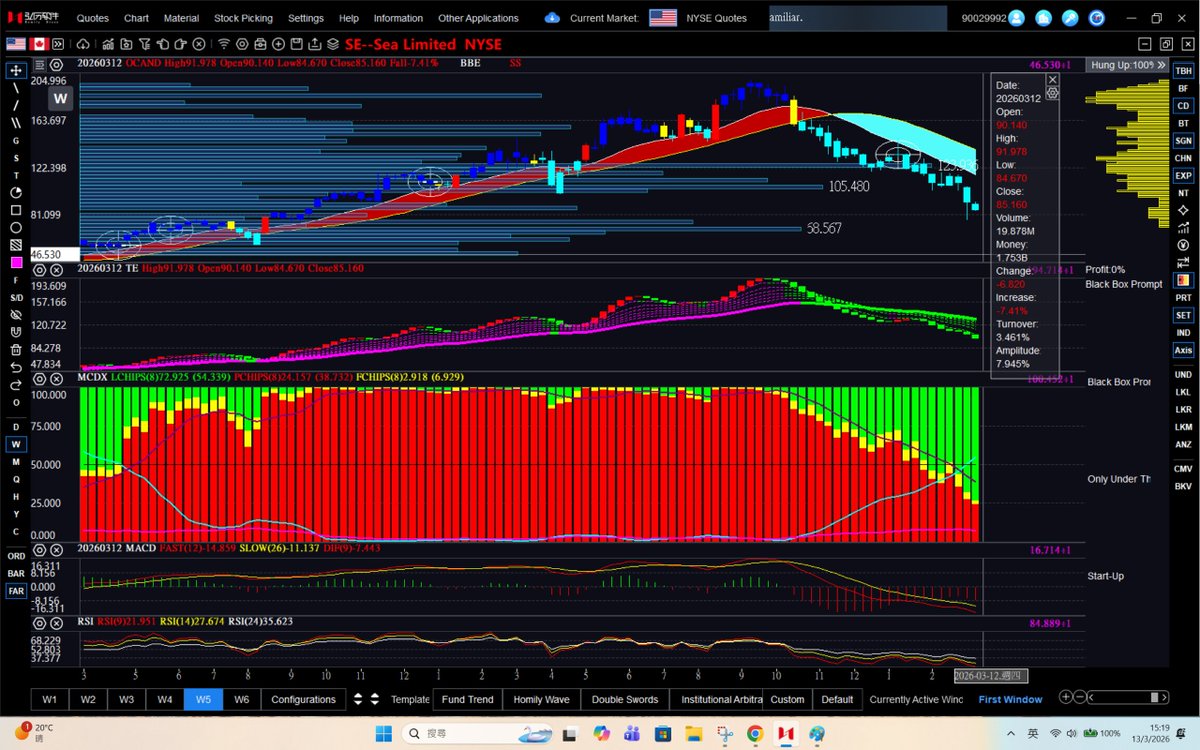
$SE (March 13, 2026-weekly chart)
Since my 2025 bearish call at $180, $SE keeps printing lower highs + lower lows, aligning with a gradual loss in whale momentum amid retail skepticism.
Weekly Chart: Breaching critical momentum bars one after another. $SE must continue to hold above $80-range to avoid a bigger dip.
$ADBE (March 13, 2026-weekly and monthly charts)
When will the mid-term and long-term downtrends finally end?
Wait for the next Volatility Hole to confirm and help nail the bottom!
$IWM (March 13, 2026-daily chart update)
$246.56 (Momentum Bar) serves as critical support for $IWM —holding above this level is essential to prevent a meaningful pullback.
@cantonmeow@matthughes13@EWTracker@blondebroker1
$AFRM (March 13, 2026-daily chart update)
Even with the recent bearish yellow candle, $AFRM is holding up well provided it remains inside the price range defined by the last volatility hole.
I've seen quite a few ex-clients build $US50M+ fortunes through long-term holdings in high-quality stocks. Yet I've never encountered anyone who achieved comparable wealth purely through long-term crypto and altcoin investments—except for Bitcoin and Ethereum.
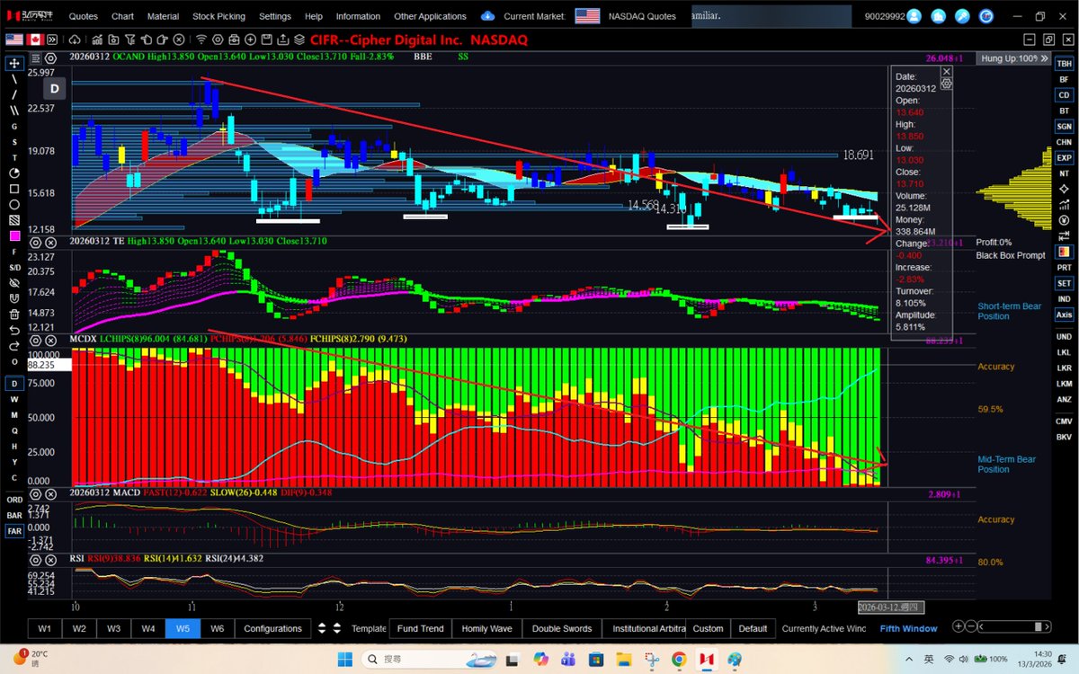
$CIFR (March 12, 2026-weekly chart)
Never bet against the Volatility Hole + Yellow Candle combo—it's been spot-on calling this downtrend since early November 2025.
I know most people ignored the bearish signals when I posted them earlier, hoping my charts were wrong.
But the bearish combo has been accurate most of the time—until proven otherwise.
Notably, a blue descending ribbon is poised to unfold, aligning with a gradual decrease in whale momentum, which currently stands at 60.14%.
@cantonmeow@chad_ventures
$ONDS (March 12, 2026-weekly chart)
$ONDS is a volatile stock right now—bulls are calling it a path to $100, while Elliott Wave analysts warn it could crash to $2–$3. The truth is, no one can pinpoint the exact top or bottom with certainty. I've been sharing updates on $ONDS since it was around $2, and I've held as an investor the whole time.
My approach is straightforward: I dollar-cost average (DCA) into support levels (highlighted by momentum bars on my charts) and stick to my own indicators. Getting too bullish or too bearish rarely leads anywhere productive—balance and discipline usually win out in the end.
For reference: The momentum bars at $9.23 and $9.82 are acting as current support, while $12.18 serves as midterm resistance.