Hi #EconTwitter!
Are you an applied economist who loves data visualization and binscatters? 📊📈
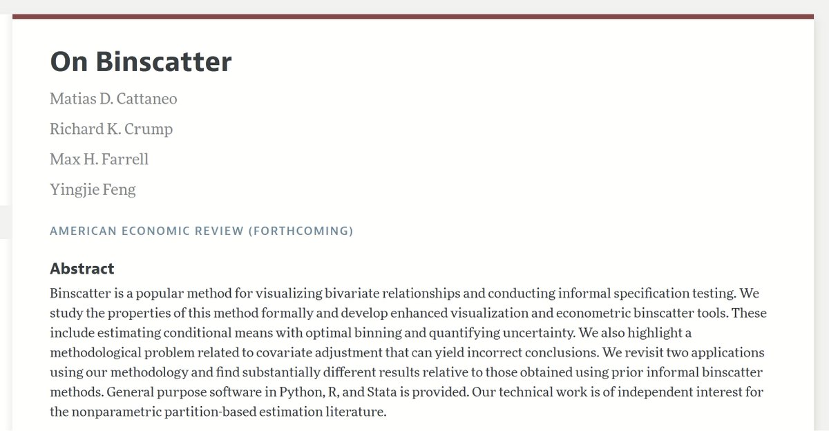
Don't miss👇this newly accepted paper in the American Economic Review by Cattaneo (@princeton), Crump (@NewYorkFed), Farrell (@UCSB) & Feng (Tsinghua U)!
They provide a lot of stuff, including novel visualization tools, principled covariate adjustment, estimation of conditional mean functions, and much more.
Super cool #econometrics paper - highly recommended! ⭐️⭐️⭐️
Links:
1⃣ https://t.co/fF3Yo66JeF
2⃣ https://t.co/RWMW1SptLl
🆕blog post summarizing Tim Harshbarger, Darrell Hilliker, @jcmankoff, and my recent work on designing more accessible dashboards for screen reader users.
We also presented the paper @sigaccess where it was🏅nominated for the best paper award: https://t.co/KPFIHK41BN
Map of all active and planned Solar System missions and their destinations as of December 1st 2023. @SLIM_JAXA Moon OI, @astrobotic Peregrine launch, @NASASun Parker perihelion, @NASAJuno perijove + close Io flyby! https://t.co/uGPR3uNHAR #KeepExploring
Nice data mapping in our new interactive: The impact of climate change on Black populations in the US. In conjunction with McKinsey's Institute for Black Economic Mobility. Congratulations to all my talented new colleagues!
https://t.co/Qg9KxtSsIE
The HCI and Visualization group at Autodesk Research (@ADSKResearch) is looking for graduate interns and postdocs to host in Toronto for 2024. We have a focus on HCI+AI, but also software learning, visualization, AR/VR, novel interaction techniques, creativity support, and more!
@TimBrock_DtD Oh yeah! Good thinking! Also wondered about library archives (public or university) might have some things depending on how big a city you re close by and what you'll do with them.
Wow! I didn't imagine how much fun I'd have with #DataPhysicalization. You're still in time to participate in the project run by @VizFSG. Just let your imagination fly! In my case, I chose to use leaves 🍃🍂 to create a heat map of global temperatures. 🤓
https://t.co/NMijN2wWG6
A while ago @Reyfenberg and I made a tutorial on how to create 3D data visualizations with svelte...
He just took it to a whole new level!
Tutorial: https://t.co/rzcYwE2Eq9
@FrankElavsky Yes!
Drives me crazy when it's a two column paper format and I have to zoom in and out just to try to follow the paper.
It's 2023. How is it still so bad?
I've written a blog post on creating large-scale interactive force-directed graphs, with PIXI.js v7 handling the rendering and D3.js for the force simulation abilities.
I also compared rendering between PIXI and D3.
https://t.co/eLm2DUFZvf
#dataviz#networkviz#pixijs@PixiJS
I’m happy to share that I’m starting a new position as Senior Data Visualization Editor, Global Publishing at McKinsey & Company. Very excited about this new journey @McKinsey
Why should stories be visualized as storylines? How else might stories be visualized? Narrative-time vs. world-time, StoryPrint, and text-heavy historical narrative visualizations. https://t.co/guel90JDv8