Helping people simplify how they organize their business data on the web. We love telling stories and sharing knowledge about dashboard design and dataviz.
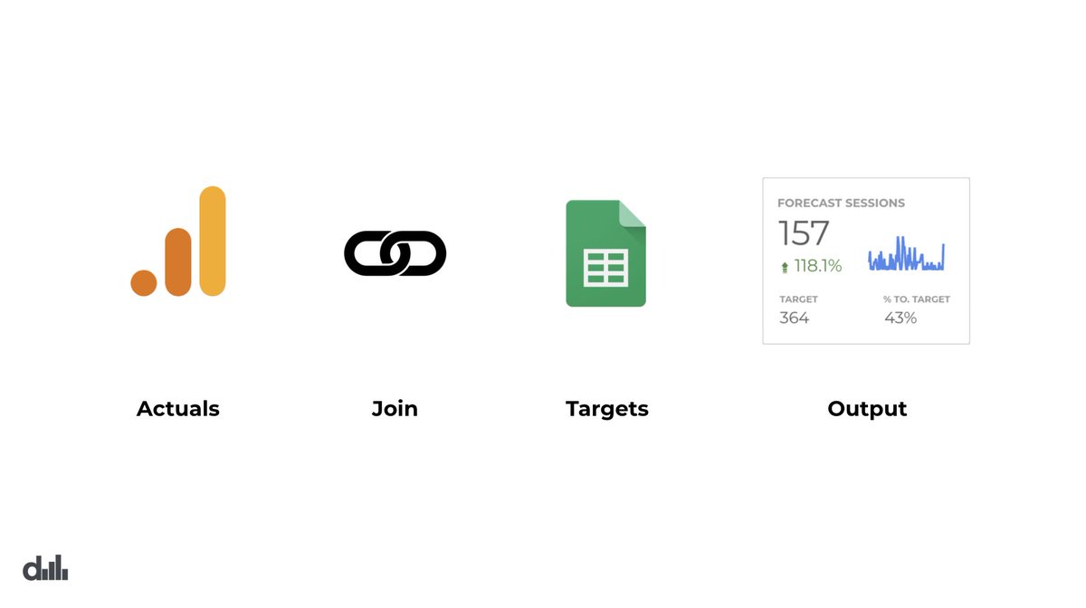
If you build forecasts or targets in spreadsheets, why not join and visualize this data against actuals and create a KPI performance scorecard.
#measure#marketing
The folks @data_narrative did an awesome job with their latest tutorial.
They created dashboard cards that help us understand the performance of articles within a blog against company KPIs.
The results are awesome!
#googledatastudio
https://t.co/vAAJEbWAXN
"Today, let’s continue our journey with Google Data Studio by making our mobile dashboards a little bit more pleasing on the eyes."
Designing a Feed of Dashboard Cards in Google Data Studio https://t.co/NOaBPOML4a /by @data_narrative#measure
This is the second article in a series dedicated to helping people build better dashboards on the mobile web.
Today, let's make a mobile dashboard that contains a feed of article performance cards to measure company blog content using Data Studio.
https://t.co/V49Yn9nDaF
Did you know that #datastudio is a great tool to develop custom mobile dashboards?
In this dataviz tutorial, let's build a simple mobile dashboard focused around customer lifecycle categories such as acquisition, engagement, retention & growth
https://t.co/37syxqdx9p
#measure