Your data is beautiful. It just needs a makeover.
We build actionable, UX-friendly, and beautiful Google Data Studio dashboards tailored to your business.
Lev Tolstoy once said: Spring is the time of plans and projects.
Our plans sound like this: we're moving the conversation on Linkedin because we want to be more focused, and we're preparing some cool interviews with data experts.
See ya on LinkedIn!
https://t.co/7PaUhL6OwE
Super excited to share my interview with @KPIs_Studio about:
✅ automated decision-making
✅ how bots can buy you more time
✅ free bots for recurring reporting
➕ more
😀 Hope it sparks a few ideas💡for you!
👇
https://t.co/vZvynPrg4B
#googledatastudio#data#reporting#bots
"The main purpose of data visualization is to improve our ability to understand and communicate with data."
Marc Soares on the power of focus and simplicity in data visualization https://t.co/XxNvvCy1nz /by @KPIs_Studio#measure
Interview with @KPIs_Studio :
My point of view as a data visualization designer on what it takes to communicate data efficiently.
https://t.co/iYoYhtZ4k7
A longer read, but I think it is worth it 😉
#dataviz#measure#DataStudio#GoggleDataStudio
I'm not the selfie type, what about you? This is why I got intrigued by the Selfiecity project. Their project came up with conclusions related to who smiles the most, who has more reserved looks, or which way do people look. Cool visualizations inside.
https://t.co/tnwNCn7JIN
Any "The Simpsons" fans around here? Let me show you a real fan: Adam Reevesman. He analyzed who talks the most, who talks to whom, and what these characters are saying in The Simpsons. He also analyzed when and where they speak. Shall I go on? Read on!
https://t.co/71XogVVJyf
"Beautiful" is the most common word translated to English with Google.
Google News Lab & Visual Cinnamon did some awesome visualizations of nouns and adjectives translated to English from the 10 popular languages, using Google Translate. Wanna see?
https://t.co/uYnV5Xg2PI
To all the cat lovers and data geeks out there! I have just run into this fun project that explored ~2200 most asked questions about cats that start with “why”. Needless to say, the visualizations are brilliant! Thanks, @NadiehBremer, you made my day!
https://t.co/crklG9km6G
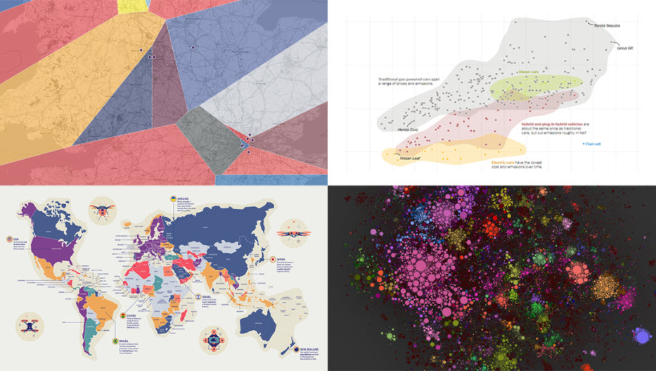
You know that feeling when you are looking at a chocolate cheesecake recipe, and you're close to drooling 👅 on your keyboard or phone? Well, this happens to me often with data visualizations. I mean, how can one resist this? via @AnyChart
https://t.co/lJ5uvmCVwQ
Data blending or data integration, helps you build charts that display data from different sources (eg: Facebook Ads and Google Analytics).
Wanna find out how? Follow the guidelines provided by @insight_whale.
#datastudio#googledatastudio
https://t.co/Io90m1wCzb
Guys, take a look at this: the checkout funnel Data Studio template by @SearchDiscovery! Give it a shot! Understanding the drop-offs across the funnel will help you make better-informed decisions that will end up generating more revenue.
#datastudio
https://t.co/aVhgpEbiAw
A must-read for content enthusiasts! The folks at @semrush did a study and managed to map out various types of content across the funnel stages. And they did not stop here, they delivered efficiency insights as well! Check out the article!
#funnels
https://t.co/9TEtJADJE3
When infographics go rogue...
2020 was the year of conflicting stories. Some of these stories were backed up by visuals that misled people and even stirred conflicts. Let's see some of these visuals in the @Venngage roundup of 2020's worst infographics.
https://t.co/l0GK6C9Ev4