Excel is still a daily tool for analysis.
Qlik Sense is built for governed analytics.
📝 We published a comprehensive guide to using both, and when each approach makes sense:
→ Exports & imports
→ Automation
→ Live connections
→ Embedded spreadsheets
Read it on our blog.
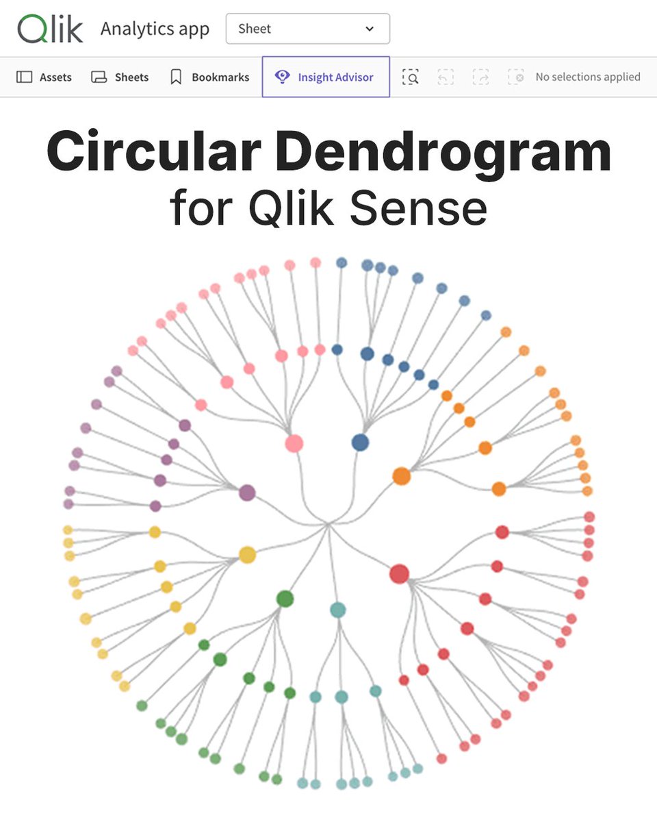
Qlik didn't have it.
We built it for Qlik.
Just released the Circular Dendrogram extension for Qlik Sense — a radial tree for org charts, product taxonomies, account hierarchies, file structures, and other nested data.
Learn more and check it out: https://t.co/DB5BBgy88Q
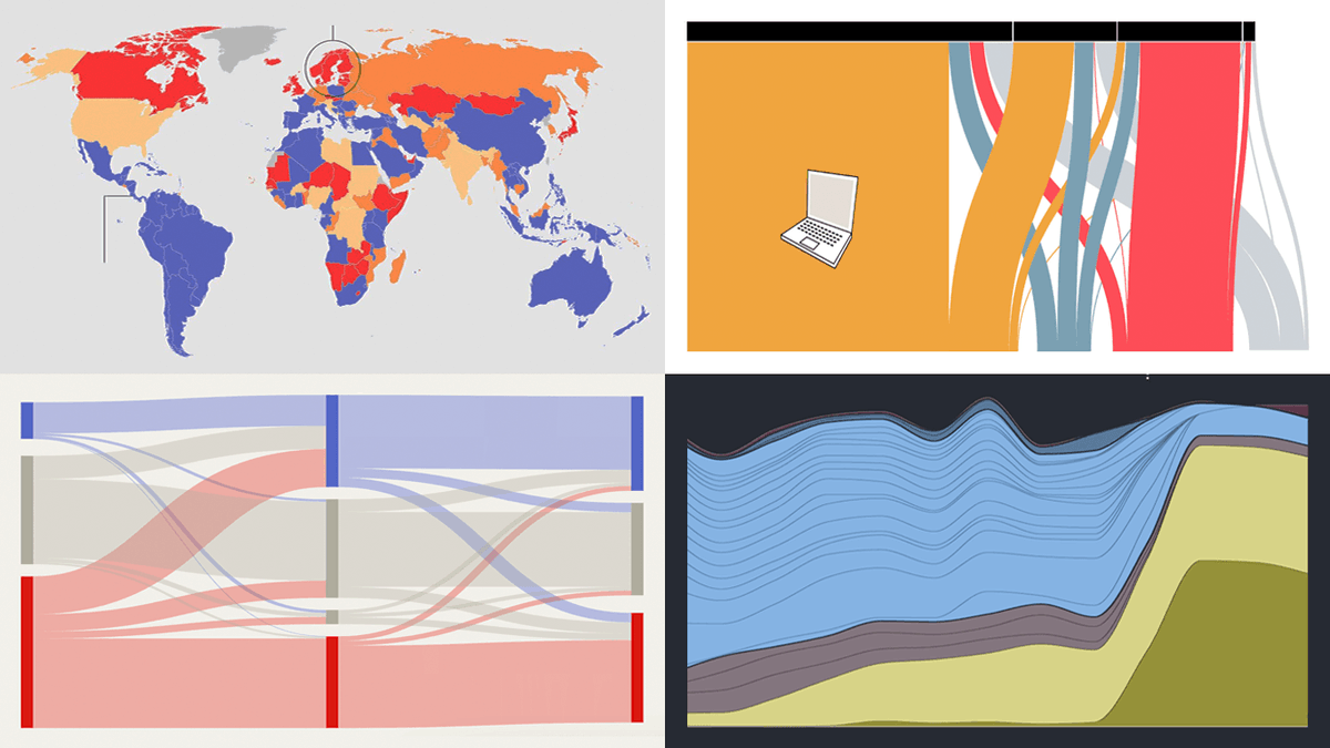
Every week brings more charts & maps into view.
We pick out those worth a closer look.
Discover the latest four featured in #DataViz Weekly:
🔸 Eurovision lyrics, 70 years
🔸 Political clusters in California
🔸 Yen's turbulent year
🔸 Britain's second city
https://t.co/6mm3Jl82Fi
Qlik didn't have it.
We built it for Qlik.
Just released the Circular Dendrogram extension for Qlik Sense — a radial tree for org charts, product taxonomies, account hierarchies, file structures, and other nested data.
Learn more and check it out: https://t.co/DB5BBgy88Q
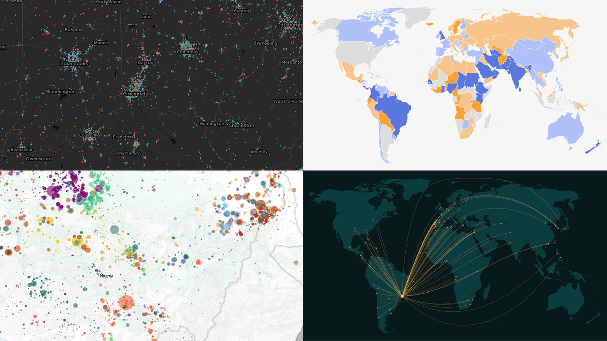
A data map turns location into a variable.
Patterns start to show across space.
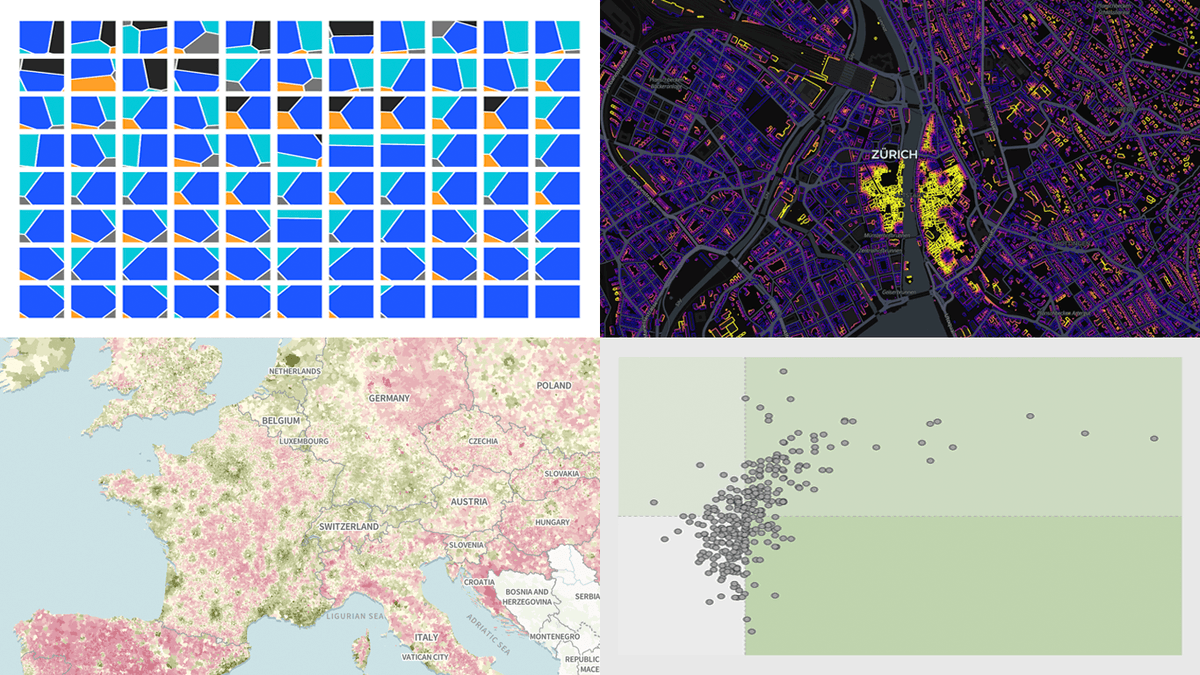
The new #DataViz Weekly leans spatial, showing what maps can add when data has a geographic side:
📍 146M U.S. jobs
📍 Sahel violence
📍 Rio's sister cities
📍 Smoking endgame
https://t.co/9G4FgsN1SF
Most line charts smooth between data points.
A step line chart doesn't. That's the whole point.
Our new JavaScript charting tutorial: build one with 10 years of real Fed rate data. Every hike, every cut, every flat stretch in between → https://t.co/tD2NoEr5gd
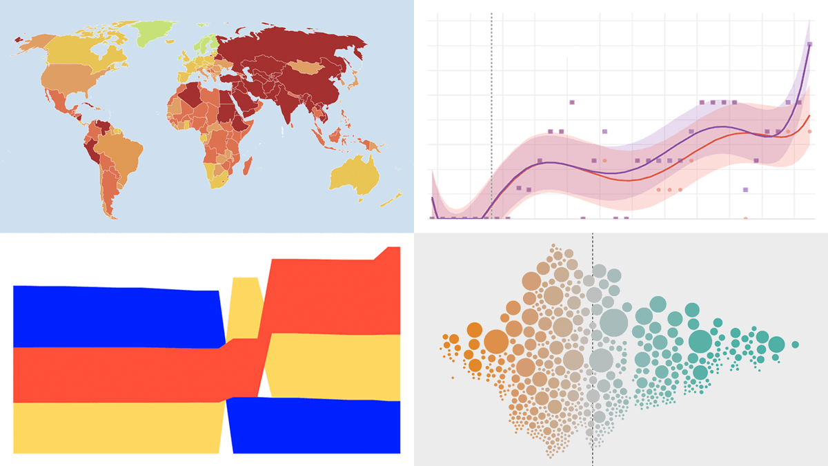
Data carries the facts.
A good chart unlocks the meaning 📈
Fresh examples that pulled us in lately and we believe will do the same for you:
▸ Polymarket winners/losers
▸ English similes
▸ Big Tech lobby in 🇩🇪
▸ Global progress
New #DataViz Weekly ↴
https://t.co/7xmpKjpjKH
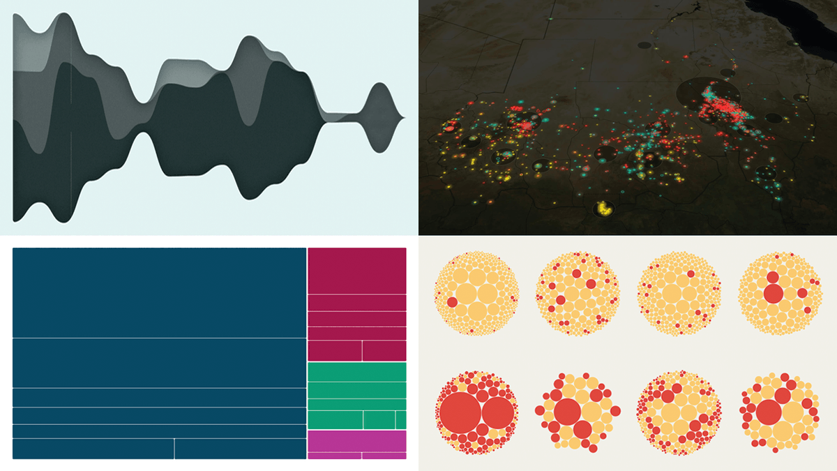
DataViz Weekly 📊 is back with another batch of great examples showing how visualization puts data to work:
🌟 Rise of AI-generated content
🌟 Divorce rates by job
🌟 Global press freedom at a 25-year low
🌟 Pet boom in Italy
New roundup on our blog: https://t.co/S9fUcVYXvT
New #DataViz Weekly is out, curating four fresh data visualization projects worth your time if charts and maps are your thing 📊
✦ British voter intent by demographic
✦ U.S. power grid under strain
✦ Iceberg A23a disappearing
✦ Music industry in 2025
https://t.co/KTdn8BG6jY
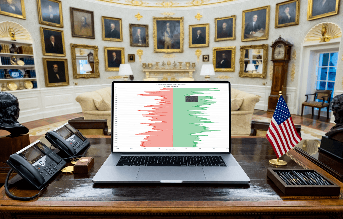
80+ years of U.S. presidential approval data (Gallup).
Visualized as a vertical area chart in #JavaScript.
Our new tutorial shows how to build it:
→ Mirrored areas
→ Smooth spline curves
→ Date/time scale
→ Highlighted zero baseline
→ Custom tooltip
https://t.co/oMeiTZ8wYR
Love good charts and maps? 👀
Welcome to #DataViz Weekly, putting a spotlight on notable data visualizations as they come out.
Made the cut this time:
📌 Tehran strike damage by land use
📌 Population change in Europe
📌 Job stability by occupation
📌 Buildings by road proximity
Visualization helps data say more 📈
New DataViz Weekly is out with fresh picks showing how charts & maps can make complex subjects easier to understand:
🔸 Causes of death
🔸 Cuba's oil crisis
🔸 Family business succession wave
🔸 3 years of war in Sudan
https://t.co/E42R2hmu9G
80+ years of U.S. presidential approval data (Gallup).
Visualized as a vertical area chart in #JavaScript.
Our new tutorial shows how to build it:
→ Mirrored areas
→ Smooth spline curves
→ Date/time scale
→ Highlighted zero baseline
→ Custom tooltip
https://t.co/oMeiTZ8wYR
Data rarely speaks for itself.
📈 Give it the right visual & it does.
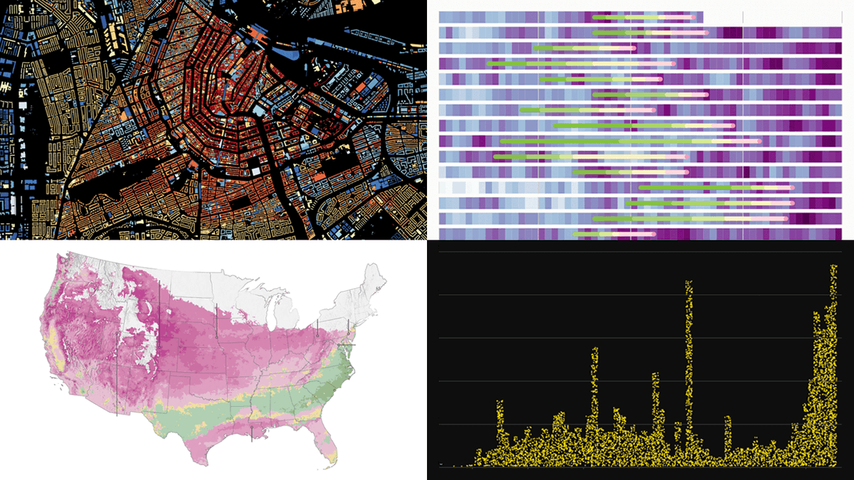
Good data graphics keep turning up, and we never stop looking. New DataViz Weekly's out, featuring:
📍 Early spring in 🇺🇸
📍 DC cherry blossom
📍 Orbital crowds
📍 Buildings by age in 🇳🇱
https://t.co/Hflz3x11uP
The world keeps shifting. Data tracks where.
Visuals help it land 📊
Fresh examples worth a look:
◆ China's rise in AI talent
◆ Shadow fleet & Iran war
◆ Vietnam's rise in U.S. electronics
◆ Food self-sufficiency by country
See the new #DataViz Weekly:
https://t.co/VsxG944AUM
Data has stories to tell.
Visualization helps them reach us 📈
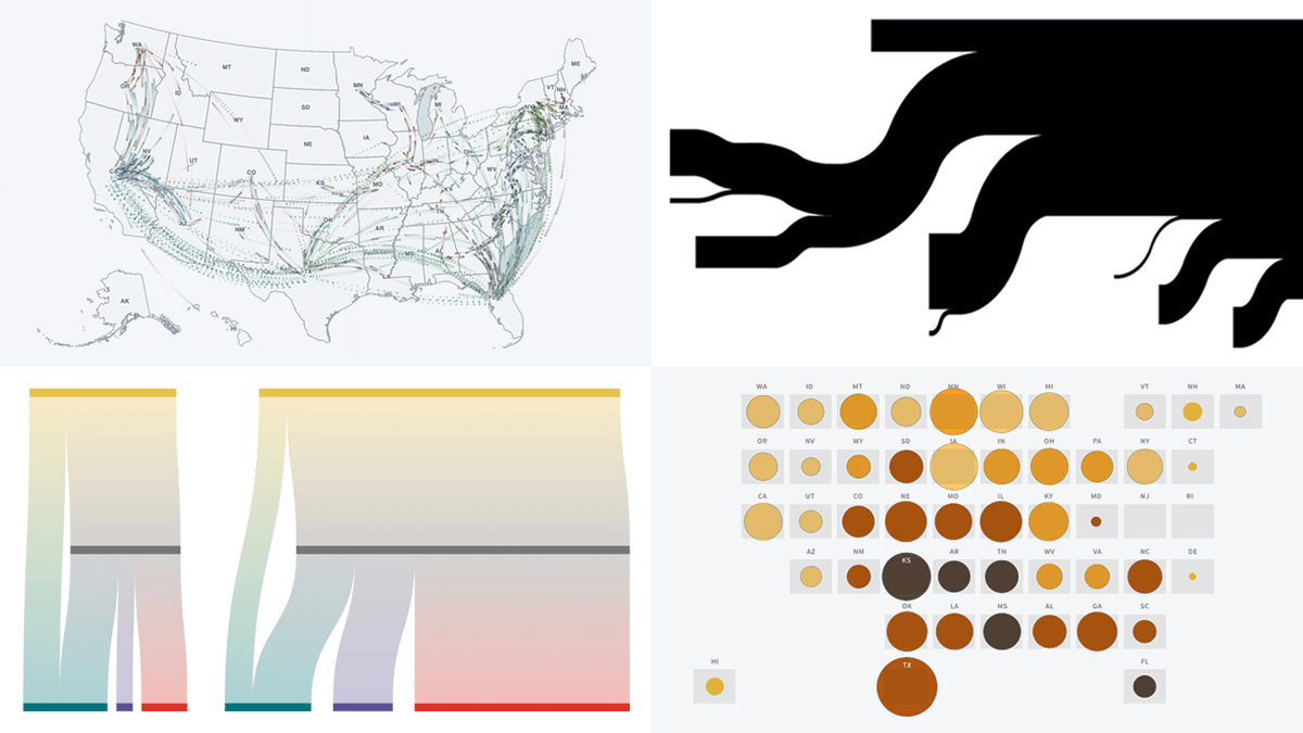
Continuing #DataViz Weekly with a spotlight on 4 compelling new examples:
📌 Hormuz oil & gas flows
📌 Rural hospital crisis
📌 ICE arrests of parents of U.S. citizen children
📌 State-to-state migration flows