The scale of the fires currently burning across northern Australia is pretty unfathomable.
This animation visualises just the last two months of fire captured by #DEAHotspots - for context, the map covers an area larger than France, Spain and Germany combined...
🌃 How bright is your night sky?
I used satellite data to create this map of average nightlight pollution in Europe for 2022. The darker the color, the less light pollution there is.
🌑 Can you spot the darkest area on the map?
Spoiler alert: It’s in Ukraine! 🇺🇦🥹
📢 Delighted to share the cover of my book Spatial Statistics for Data Science: Theory and Practice with R 😍😍😍
🔗 https://t.co/vrvMufKrEM
Thanks so much to my editor @lara_crc & all the team at @CRC_MathStats! The book will be available soon!
#rstats#stats#datascience
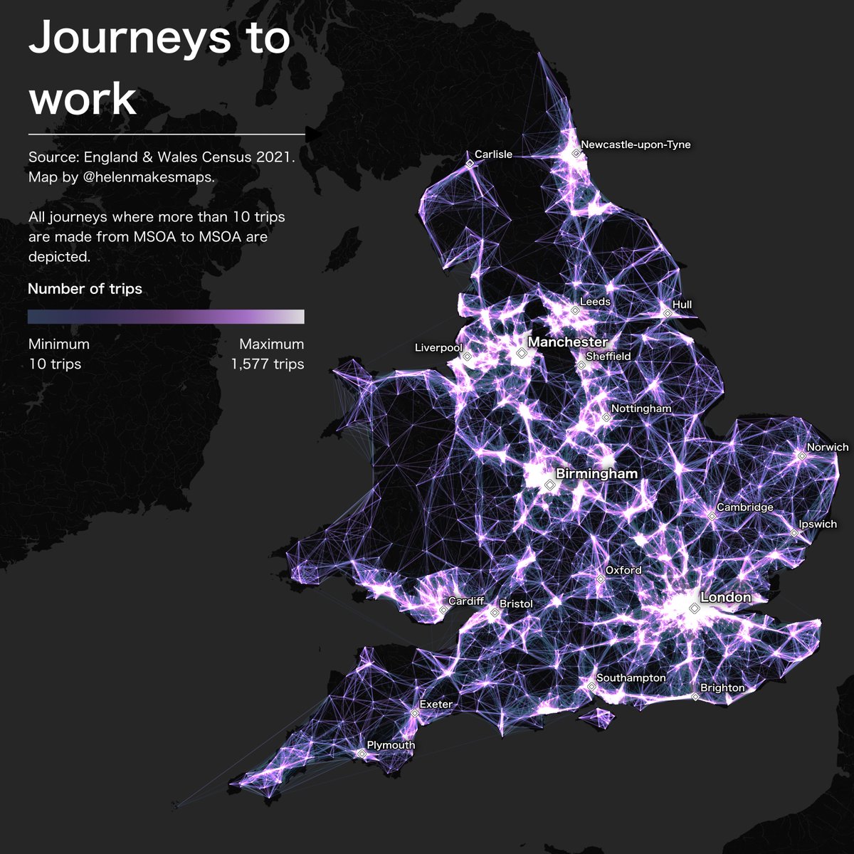
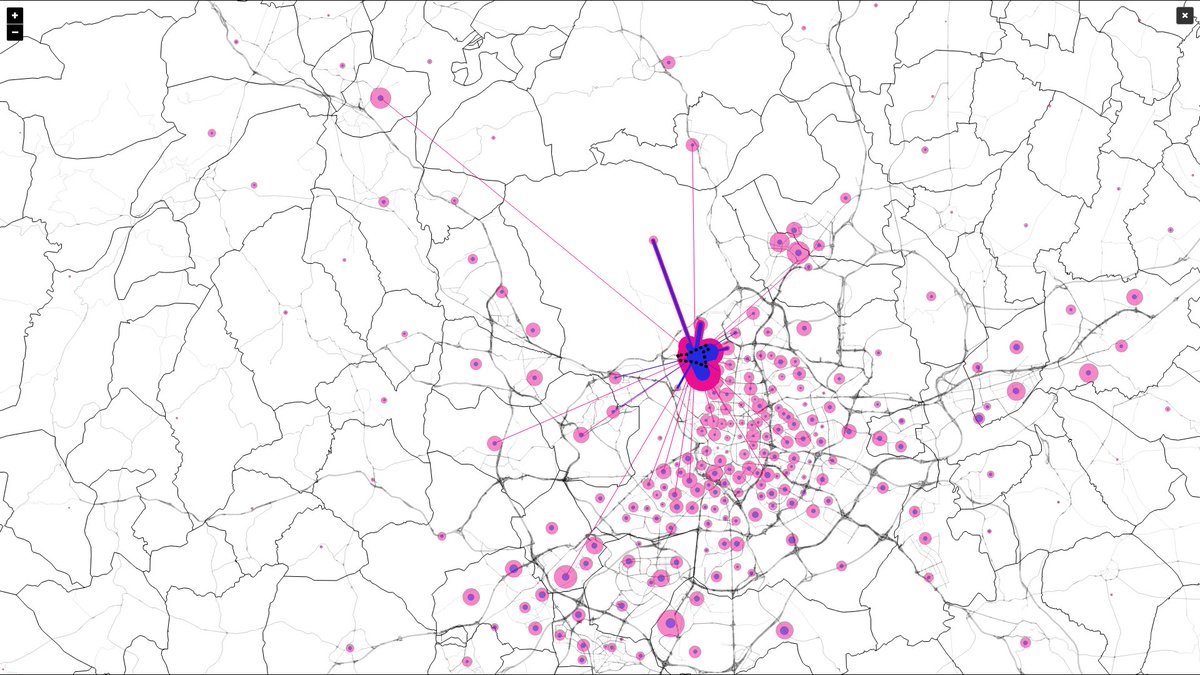
Day 2 of the #30daymapchallenge - Lines!
This map shows journeys to work in England & Wales where more than 10 people make that trip. Thanks to @ONSgeography for releasing the data just in time!
Designed in #QGIS with #CARTO & #bigquery doing the heavy lifting 💪
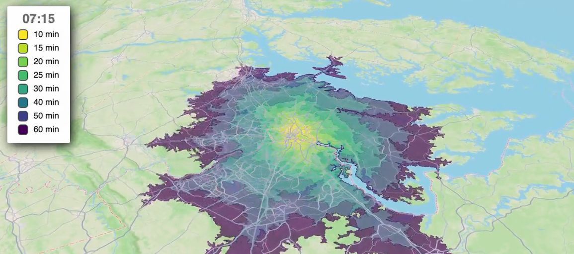
Accurately predict travel time ETAs for a given day of the week or time of day, with the 'depart_at' functionality in the Mapbox Isochrones API. 💡
See how: https://t.co/ET4LaFdrBV
#geospatial#mapping#gischat
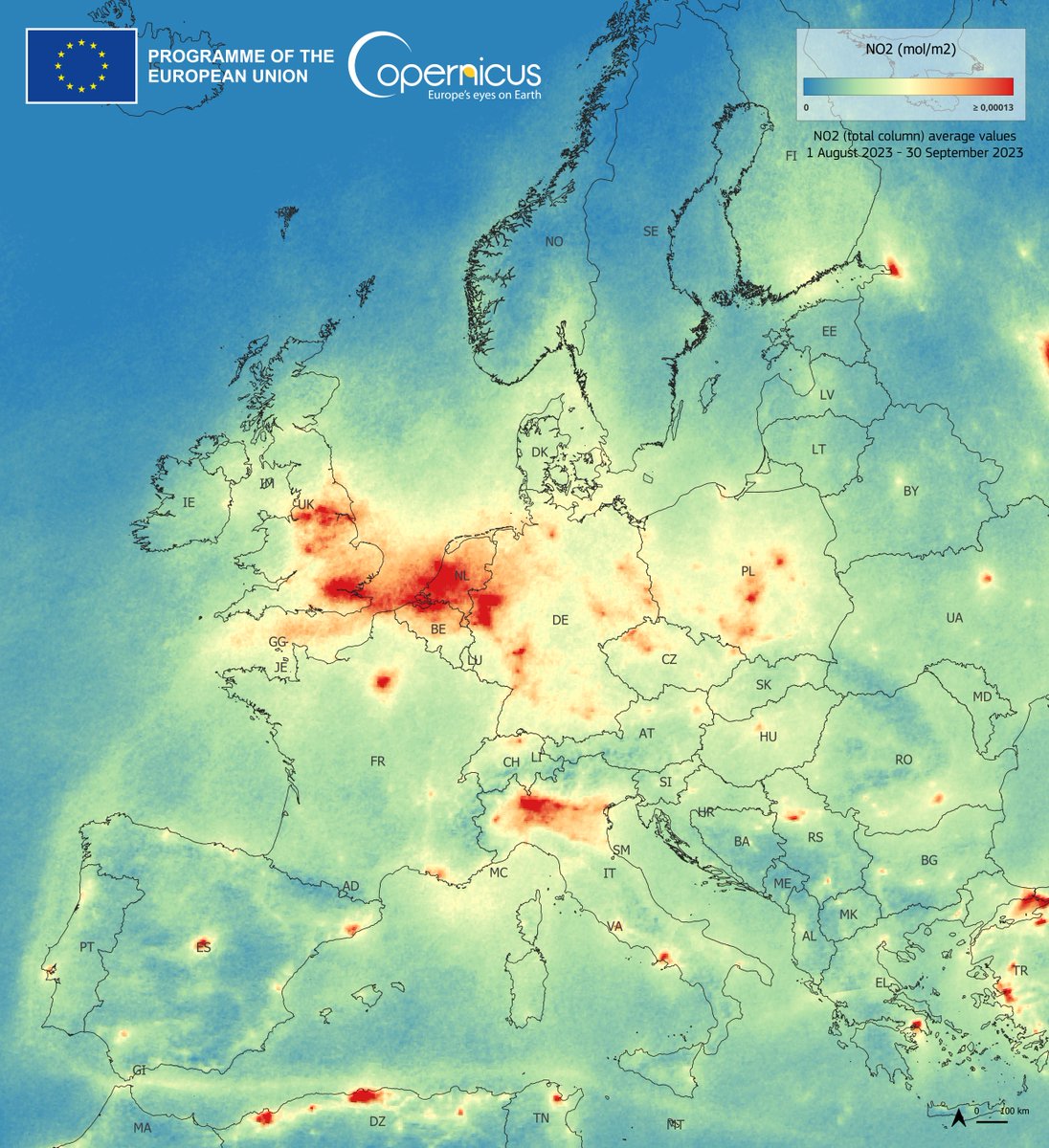
On a daily basis, our #Copernicus Sentinel5-P monitors a wide range of atmospheric gases, such as Nitrogen Dioxide #NO2, Sulphur Dioxide #SO2 or Methane #CH4
More at https://t.co/4QWUwk2nbV
#Sentinel5P average values for the tropospheric concentration of NO₂ for Aug.-Sept. 2023
Tradicionalmente hemos asociado el alto nivel de movilidad de una sociedad a su prosperidad y riqueza. Pero, probablemente, a partir de ahora, las sociedades prósperas serán aquellas que sepan contener la movilidad.
Podemos afirmar que la movilidad en el territorio también apoya la movilidad social y que si reducimos esta movilidad en el territorio entonces puede crecer la estratificación social, la desigualdad y por último lastrar también el progreso social de todo el país.