Data Visualization Zürich is an open, non-profit community for anyone involved or interested in data visualization. #DatavisZRH @IXT @lucguillemot @wiederkehr
Next Wednesday, March 20, we will hear from Guillermina Sutter Schneider, product specialist at @Datawrapper, about how Datawrapper fits into any #dataviz creator’s tool belt.
https://t.co/fCj68siJGL
Next Wednesday, January 24, we will hear from @nzzvisuals how they create visual, data-driven news stories. Join us to learn more about two specific projects that showcase their process and methods.
https://t.co/mshQB9iLJR
Tomorrow, 29 Nov 17:00 CET, we will hear about the experience of the team building the chart creator for Open Government Data for the Swiss Government. Join us to learn more about UX design for public services, visualization of linked data, and more.
https://t.co/jrPqTUT6uw
Next Thursday, October 26, we will hear from Martina Zunica and Alenka Gucek about the #journaldataviz challenge. Join us to learn more about visualizing personal data. https://t.co/PUlJaOi3hb
This Friday, April 29 at 17:00 CET, we will hear from @EricaGunn
on designing visualization ecosystems for your data. Join us to learn more about putting charts in context.
https://t.co/fLtQzbVueX
This Thursday, March 31 at 17:00 CET, we will hear from @h_i_g_s_c_h, co-lead of the graphics desk at @derspiegel, about creating unique #datavis with @sveltejs and @d3js_org.
https://t.co/5RIEdiXgPf
On March 2, we will hear from @wiederkehra about the importance of sketching and sharing in data visualization design. Join us for an inside look into the work process behind visual and interactive stories from
@fivethirtyeight and @nzzvisuals!
https://t.co/sq5XvR0zOy
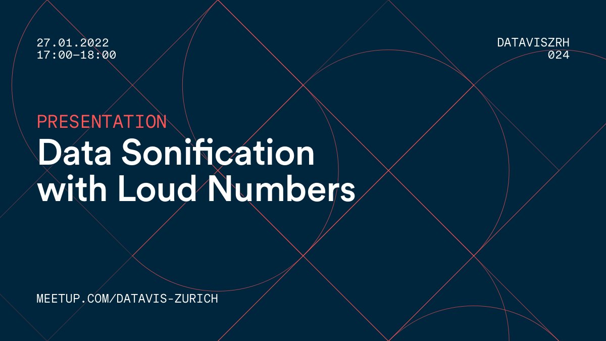
This Thursday, January 27 at 17:00 CET, we will hear from @miriamquick and @duncangeere, creators of the @loudnumbers podcast, about #datasonification. Join us to learn more about how they use sound to turn data stories into music.
This Friday, December 10, we will hear from @pabloroblesg, soon to be Visual Editor at @nytgraphics, about his award-winning cartographic work. Join us to learn more about how maps play an instrumental role in presenting the news.
https://t.co/OdL2yz6NJy
On October 27, we will hear from @a_bagaini and @terezaif about their learnings from the #30DayChartChallenge (@30DayChartChall). Join us for a practical look behind the #dataviz curtain!
https://t.co/RVXLLNdQsw
The replay is available here for a brilliantly illustrated introduction to network visualizations, and Dario's innovative approach to them. https://t.co/5EQYIka92S
You can watch the replay of our meetup about Data Visualization Intermediate Principles on Youtube! Let us know what you think! https://t.co/Y3UdwPtj08
There you can learn about very fundamental principles of data visualization or, in @ciyer's words, "how to enable quantitative reasoning with your eyes"
@ciyer 's material for Tonight's meetup about data visualization principles is on Github.
See you tonight at 5pm (Zürich time)!
→ https://t.co/LsbXKhCrMp