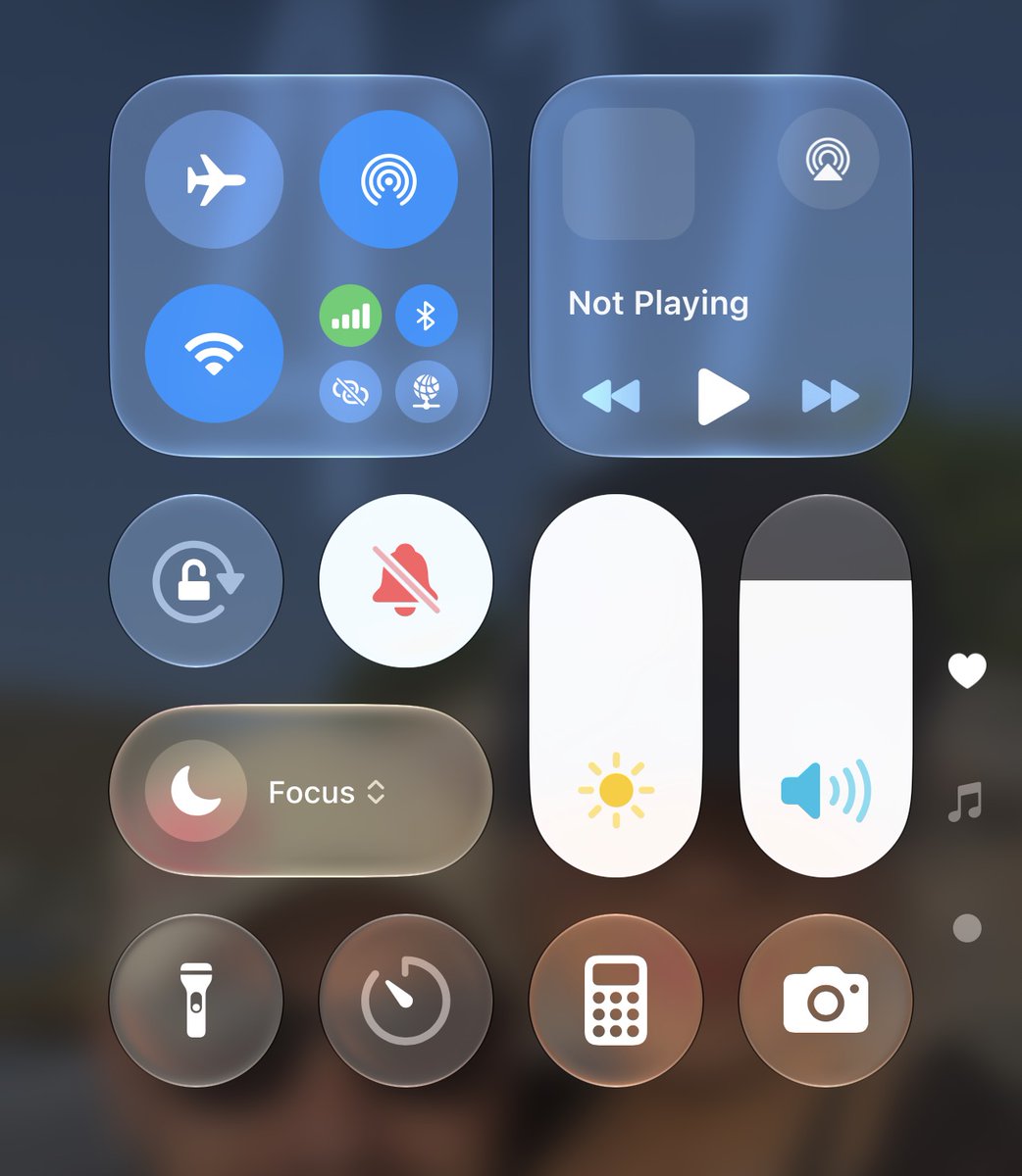
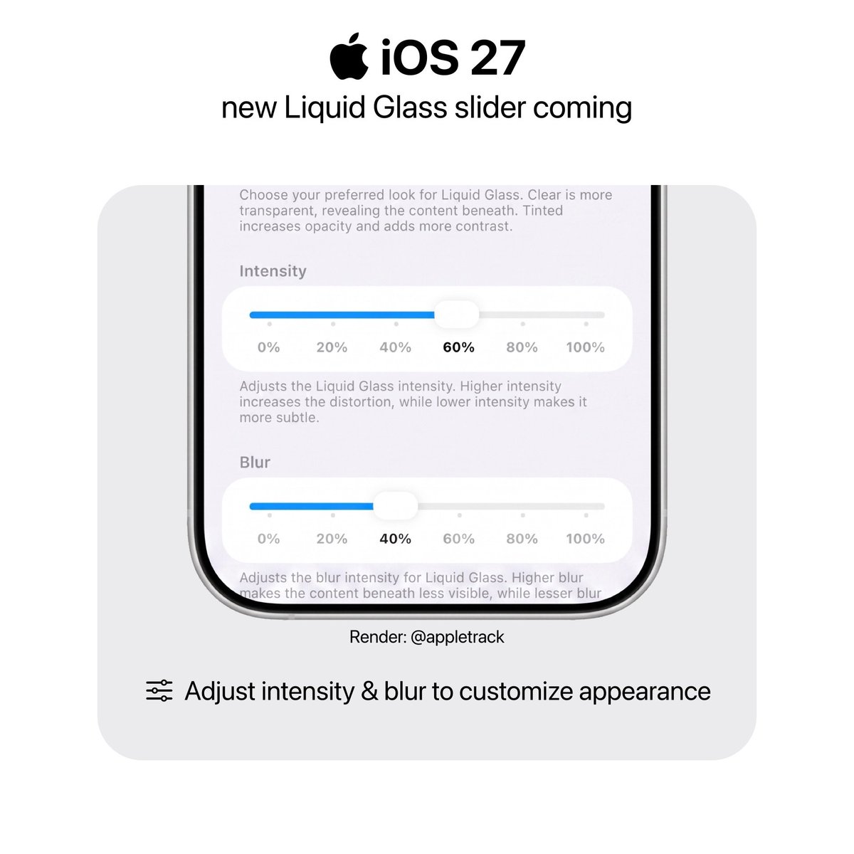
@privatetalky como fan de apple, microsoft, son los que mas se parecen a los iconos originales todavia. Los de apple se sienten forzados con tal de pegar con liquid glass. Los de google parecen hechos por IA.
iOS18: cute little animation that felt really like Apple.
iOS26: literally fucking Nothing. Even the morph is so quick that it often just looks like it pops in 🤡
@privatetalky ngl i’m starting to like more the design of the 17 Pro. There’s something to it that reminds me of the iPhone 7. Maybe the aluminum unibody, the softer camera bump, the antenas going like that, and that silver color.