Shine animations in CSS are actually simple to make.
.shine-container {
position: relative;
overflow: hidden;
}
.shine-container::after {
content: "";
position: absolute;
inset: 0;
transform: translateX(-100%);
background: linear-gradient(
90deg,
transparent,
rgba(255, 255, 255, 0.25),
transparent
);
animation: shine 1.5s infinite;
}
@keyframes shine {
100% { transform: translateX(100%); }
}
Now you have a reusable shine effect, that you can reuse in any container!
If you found this useful, follow for more. ❤️
#BirminghamHistory#CityOf1000Trades The Victoria Works on Graham Street was opened in 1840 and chiefly employed young women in the manufacturing of steel pen nibs making Gillott an extremely wealthy man. Reference: New Illustrated Directory (1856), LF 06 @LibraryofBham
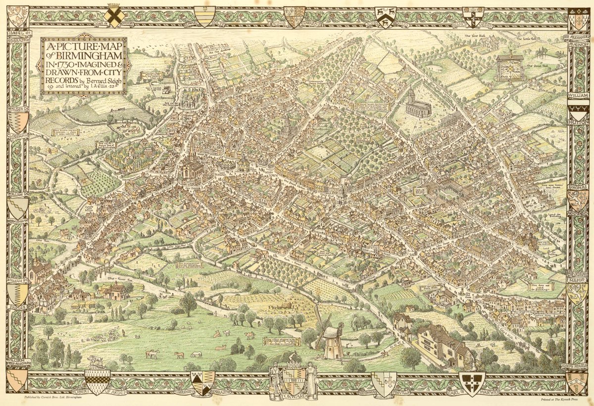
#MapOnATuesday is a picture map of Birmingham in the year 1730. Imagined and designed from official records with an introductory note by Bernard Sleigh (1872 – 1954) - the Birmingham born artist and illustrator (1924). Ref: LF 83.3/309631 @LibraryofBham
A colorised view of Birmingham in 1886, by H. W. Brewer. You can see the smoke of industry in the background. We rightly threw that out of cities, but we threw the baby out with the bathwater and demolished the foreground as well in the quest for cars and space. Awful mistake.
We love it when each item gets its own moment to shine 🤩
Use CSS scroll-driven animations to get this effect with only a few lines of code! #GUISnippets


