Some other companies building products in this space are @excalidraw, which has an SDK, and @dgm_sh is a new one moving super quickly (powers @frame0app). I also really love @daybrush's work on things like moveable https://t.co/fl0lsf00k6
10 Essential Tips for Low-Fi Wireframing
1 - Ditch Perfectionism
In low-fi wireframing, avoid obsessing over details—start with rough sketches and refine later. For example, quickly jot ideas on paper or in a digital tool to keep creativity flowing. This prevents delays and allows flexible transitions to high-fi designs, keeping your focus on core goals.
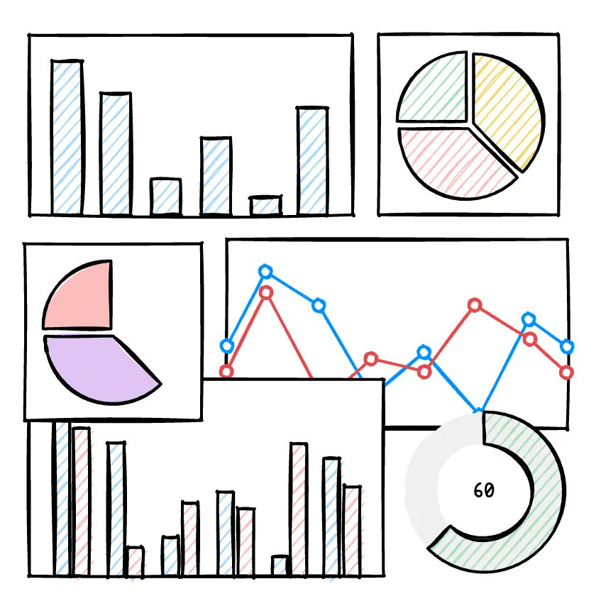
2 - Utilize Hand-Drawn Style
Embrace a hand-drawn approach with digital pens or paper for free-flowing ideas. In tools like Frame0, enable sketch mode for irregular lines and simple shapes. This makes communication natural and helps escape digital constraints, leading to more organic brainstorming sessions.
3 - Turn Off Snap Function
Disable auto-alignment features in your tool to allow free placement of elements. In Figma or Frame0, turning off snap lets you experiment without alignment fixation. This boosts creativity and uncovers unexpected insights, with alignment saved for later stages.
4 - Use Only Basic Elements
Keep it simple using only the basic shapes or components provided by the tool (rectangles, circles, lines, text, etc.)—skip putting effort into complex UI representations. Instead, utilize placeholders to focus on structure and functionality.
5 - Quick Iteration
Create multiple versions rapidly by applying feedback immediately after the first draft. Leverage AI in Frame0 or share with teams for 1-2 hour tweaks. This validates ideas early, improves quality, and minimizes waste—try presenting 2-3 options at once.
6 - Add Annotations
Include callouts or labels to explain interactions, like "Button click leads to page transition." This reduces misunderstandings in team collaborations and serves as reference for high-fi shifts. In mobile apps, annotate gestures for smoother developer handoffs.
7 - Use Minimal Color
Limit to grayscale or basic shades to emphasize structure, not visuals. Use color sparingly for functions (e.g., red for errors). This keeps discussions functional and supports accessibility, making content hierarchies clear in black-and-white web page mocks.
8 - Focus One Idea per Frame
Avoid overcrowding—dedicate each frame to a single concept for clarity. Limit login screens to just login elements, simplifying user flows. This modular approach reduces confusion in testing and enables scalable designs.
9 - Test Prototype Early
Build clickable low-fi prototypes and gather feedback from 5-10 users quickly. Tools like Figma help validate assumptions before big changes. For mobile apps, early sharing spots UX issues, saving time and costs through iterative user testing.
10 - Minimal Time and Effort
Aim to complete drafts in 30-60 minutes by reusing templates and basic tools. This embodies low-fi's low-cost, high-efficiency ethos. Focus core screens first, then iterate—freeing up time for feedback and refinements.
These tips can cut your wireframing time in half! Try them out and share your results.
#UIUX #Wireframing #DesignTips
🚀 Frame0 1.0 official release (out of beta) and -50% special offer.
We’re absolutely thrilled to announce that Frame0 v1.0 has officially been released!
See comment for -50% special offer 👇
https://t.co/W8CV2cz0EE
Frame0 v1.0.0-beta.14 is out! 🔥
- Third-party libraries
- New library : Neobrutalism components
- Icon styles
- Hiding shapes (layers)
- And more...
For more about the new features 👇
https://t.co/6w6eOROuEv