From the return of generalists to AI agents to iOS design missteps, 2025 had it all. Our top 10 most-read articles (plus 5 from 2024 you kept revisiting): https://t.co/ClCK05hbpA
#UX#UXResearch
🔠Did you know you can use rem in @framer to test your typographic scale?
Tweaking the root font size instantly reveals broken hierarchy (something pixel-perfect screens often hide)
1⃣ Set the base font size (typically 16px)
2⃣ Switch text elements from px to rem
3⃣ Change the base font size to see how your entire hierarchy behaves across the layout
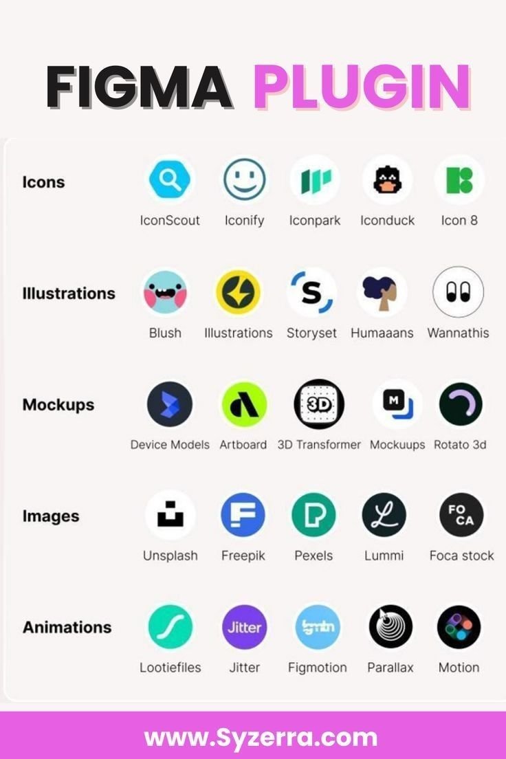
UI/UX Designers, here are some go-to sites for best design systems for mobile
Bookmark it for later 💜 you I'll love it
Aviva → https://t.co/SzgdxyG5St
Pinterest → https://t.co/GeiYFlvZAD
Line → https://t.co/YQPLcM9JJe
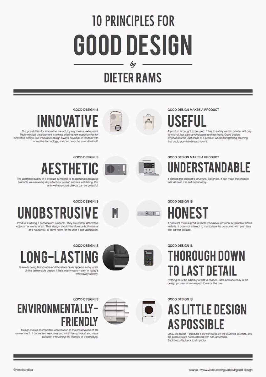
Excellent 10 Principles for Good Design, to Boost Your UX / UI Designs, by Dieter Rams! 🙌
FREE Cheatsheet attached 🔖
1. Good design is innovative
Possibilities for innovation are not, by any means, exhausted. Tech development is always offering new opportunities for innovative design. But innovative design always develops in tandem with innovative technology, & can never be an end in itself.
2. Good design makes a product useful
A product is bought to be used. It has to satisfy certain criteria, not only functional, but also psychological and aesthetic. Good design emphasises the usefulness of a product whilst disregarding anything that could possibly detract from it
3. Good design is aesthetic
The aesthetic quality of a product is integral to its usefulness because products we use every day affect our person and our well-being. But only well-executed objects can be beautiful.
4. Good design makes a product understandable
It clarifies the product’s structure. Better still, it can make the product talk. At best, it is self- explanatory.
5. Good design is unobtrusive
Products fulfilling a purpose are like tools. They are neither decorative objects nor works of art. Their design should therefore be both neutral and restrained, to leave room for the user’s self- expression.
6. Good design is honest
It does not make a product more innovative, powerful or valuable than it really is. It does not attempt to manipulate the consumer with promises that cannot be kept.
7. Good design is long-lasting
It avoids being fashionable and therefore never appears antiquated. Unlike fashionable design, it lasts many years – even in today’s throwaway society.
8. Good design is thorough down to the last detail
Nothing must be arbitrary or left to chance. Care and accuracy in the design process show respect towards the user.
9. Good design is environmentally-friendly
Design makes an important contribution to the preservation of the environment. It conserves resources and minimises physical and visual pollution throughout the lifecycle of the product.
10. Good design is as little design as possible
Less, but better – because it concentrates on the essential aspects, and the products are not burdened with non-essentials.
Back to purity, back to simplicity.
Follow @UXlinks to massively increase your UX / UI skills and knowledge 🙌
#ux #ui #uxdesign #uidesign #productdesign
💎 Spacing Scale for Products With High Information Density
The scale starts with 2px and 4px to allow for finer-grained margins when necessary, and it jumps 16px between the two largest steps
💎 Design System Contribution Process
Great overview of a contribution process that design teams can follow to achieve consistency and quality in their design system.
💡Design System Process
Excellent overview of the design system creation process by Mark Reynolds. The process covers 3 essential phases:
1️⃣ Audit & Research
2️⃣ Strategy & Planning
3️⃣ Execution
👇
💡Semantic Colors in UI Design
You need only 5 types of colors for UI
1️⃣ Surface: color of a canvas
2️⃣ Surface-container: content container color
3️⃣ On-surface: text or icons that appear on top of a surface
4️⃣ Border: borders around containers or dividers
5️⃣ Accent: CTAs
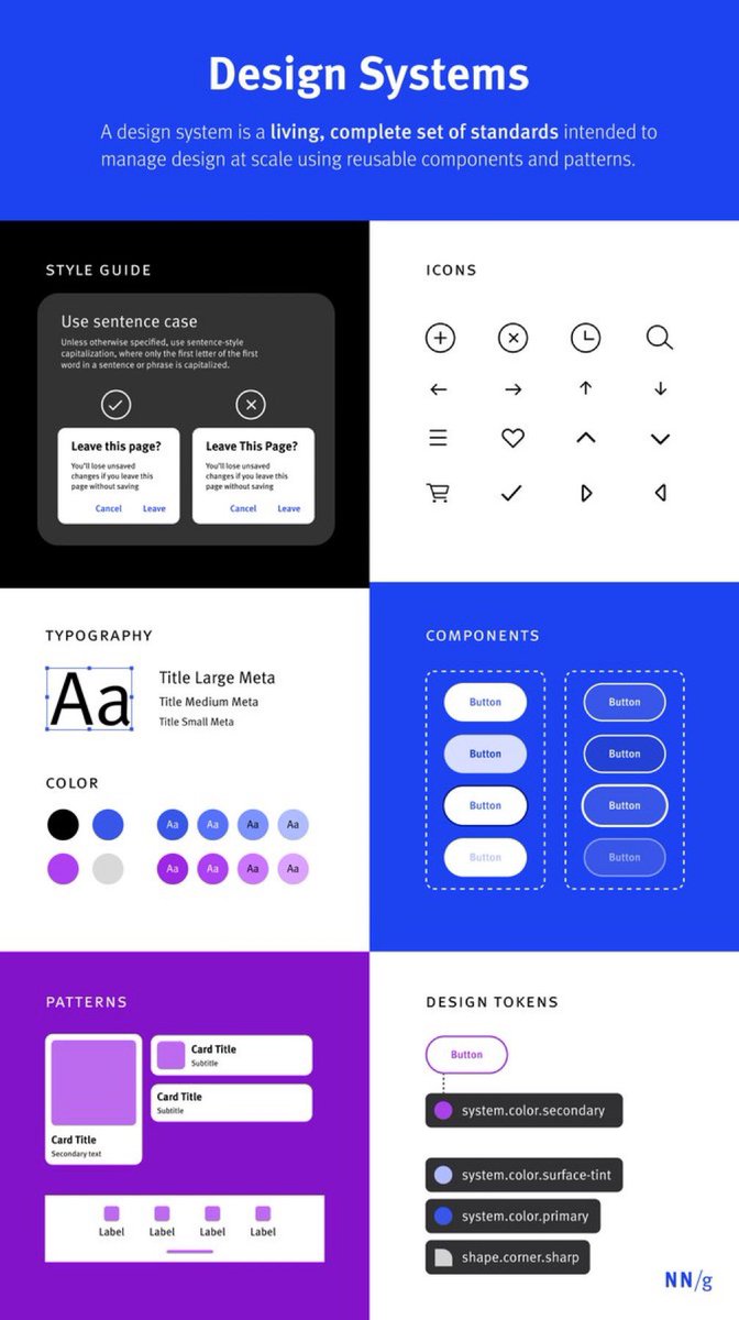
Design Systems vs. Style Guides to Boost your next UX / UI Project! 🙌
Save to Bookmarks for reference 🔖
DesignSystems are a set of standards (like #Google’s Material Design or #IBM’s Carbon Design System) needed to manage design at scale. #StyleGuides (like content or visual style guides) are just one piece in a design system.
Overview
A Parent-Child Relationship
Design systems and style guides both capture certain guidelines, principles, and visuals for creating interfaces or other designs within a company, product, or service. They allow UX professionals and developers to design and develop with visual consistency that otherwise would be challenging to produce and maintain at scale.
Design Systems
A design system is a living, complete set of standards intended to manage design at scale using reusable components and patterns.
Repository: Housing a Design System
A repository is used to house and access the pieces of a design system. This generally takes the form of a website.
Maintaining Design Systems
Design systems require continuous maintenance and oversight to ensure they do not become outdated, so a team is needed to manage it.
Style Guides
A style guide is a piece of documentation that contains specific implementation guidelines, visual references, and design principles for creating interfaces or other designs.
Content Style Guides
These guides contain content standards. They specify writing style and may also include information about the company’s editorial and publication processes.
Brand Style Guides
These guides specify brand-related rules and the foundational elements needed to define a brand.
Front-End (or Visual) Style Guides
Sometimes referred to as visual- and interaction-design standards, front-end style guides contain a modular collection of all the elements in your product’s user interface, guidelines for how to use each element, and code snippets for developers to copy and paste.
Maintaining Style Guides
Just like design systems, style guides need a team to create, oversee, and maintain them.
Conclusion
Design systems are made of many different pieces — components, patterns, styles, and guidelines — and can help operationalize and optimize design efforts.
Style guides are much more focused and provide guidelines for use, and are only one piece that makes up a design system.
Read the full post 👇
By @NNgroup
#ux #ui #uxdesign #uidesign #designsystem #productdesign #userexperience #usertesting #usability #typography #components #apple #mobile #iPhone #business #startup
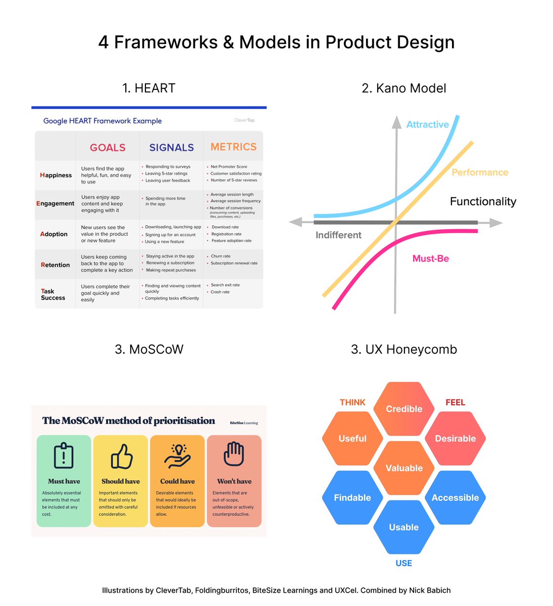
💡 4 Frameworks & Models in Product Design
1️⃣ HEART → Asses product user experience
2️⃣ Kano Model → Prioritize product features
3️⃣ MoSCoW Model → Prioritize design efforts
4️⃣ UX Honeycomb → Holistic view of user experience attributes
👇


