How to Get Involved - We’re looking for participants to join in with the 2021 Global Goals Jam from 15-19 September. The Global Goals Jam takes place every year on the weekend of the UN Climate Summit and brings people together to create a... https://t.co/BMM5tQj0hL
First Look: Cyberfeminism Index :: New Museum - online collection of resources for techno-critical works 1990-2020 gathered by Mindy Seu https://t.co/Of9uMQsMpr
I spent the past few months to learn more about colors, to finally get rid of the feeling that I'm bad with them. Here I tried to compress some of these learnings (there's more to come): https://t.co/UEf0XMJNAX
Did an afternoon riso printing beginner workshop by https://t.co/esayi4KbRD 🤩 Lots of fun!! I prepared a quick data art thingy of the 1st 1000 digits of pi, with circles from one color getting bigger from 0-9 and the other smaller. Drew some surrounding plants at the workshop 😅
Brief from the Isle of Wight Zoo - “Designing and building visitor interactive interpretation to deliver our conservation and natural history messages. This can be from a cleverly designed sign up to the theming of entire areas of the zoo to... https://t.co/b8vPgshdE3
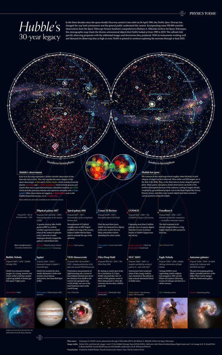
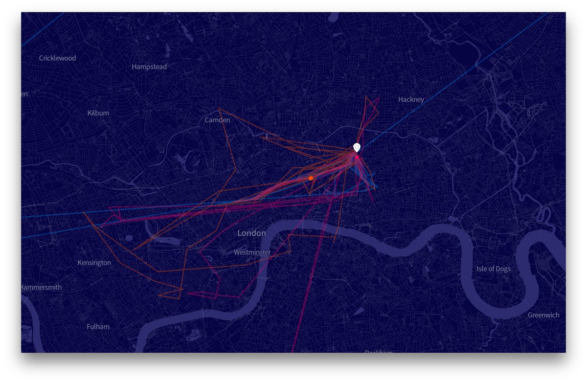
NEW!!! 🎉 One of my proudest #dataviz ever!! 🛰️😃
A birthday present to @NASAHubble that I've made for @PhysicsToday visualizing 30 years of observations, ±550k tiny diamonds in the sky ✨
I've poured my ❤️ into this, I hope you'll enjoy exploring it: https://t.co/SB2wX6hgnK
NEW VIZ - Modern Dashboard Design
I believe we as Data Viz practitioners have a lot to learn from Web Developers and Product Designers. Modern dashboard design will come to Tableau. Not there yet (but soon).
Inspiration: https://t.co/pCJSukA54o
Viz: https://t.co/ZOvx7lgJtx
From a livestream today analyzing pandemic data ... there at least seems to be an encouraging trend if one averages daily case ratios over countries...
https://t.co/0vNQOHLBmh
And here is my first pen plotter result of something that I created from scratch 🎉
Using a simple JS file + #d3js to create my SVG and then automatically save the file, using the axidraw-cli to plot it
It took me way to long to get back into the math of spirographs 😅
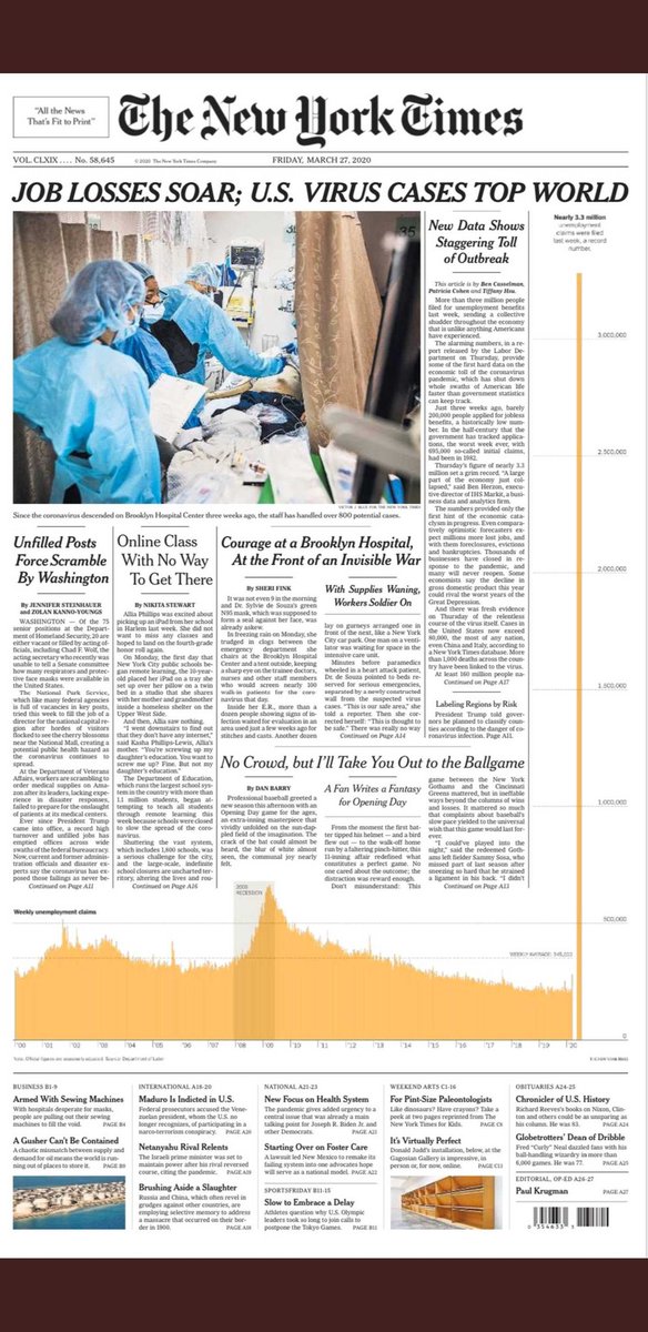
To keep the weekly unemployment chart all on one scale, the last data point had to span the full front page. What commitment from the @nytimes not to use broken bars when one data point dwarfs all else. And what a startling image.
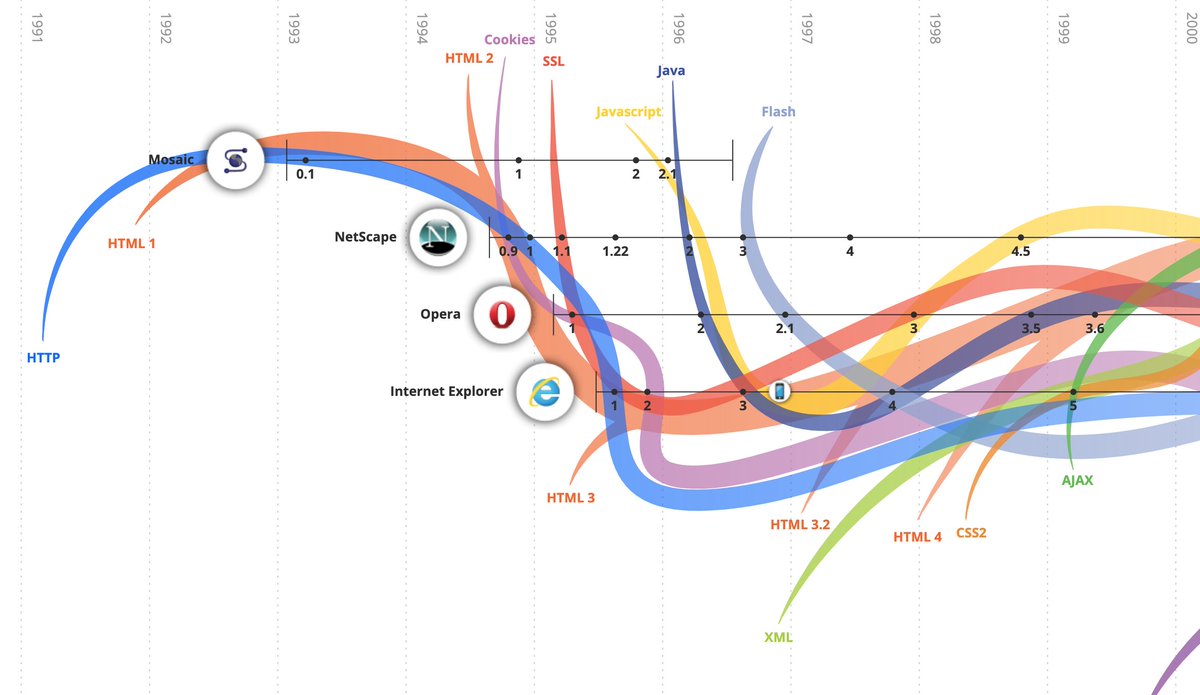
Today I am reminded of 1993 - the release of the graphic web browser led to growth of web use - and growth of "digital culture" as a whole. Now because of #CoronavirusOutbreak, people & institutions will experiment with new media forms... new Netscape? https://t.co/bPODSsK1Qm
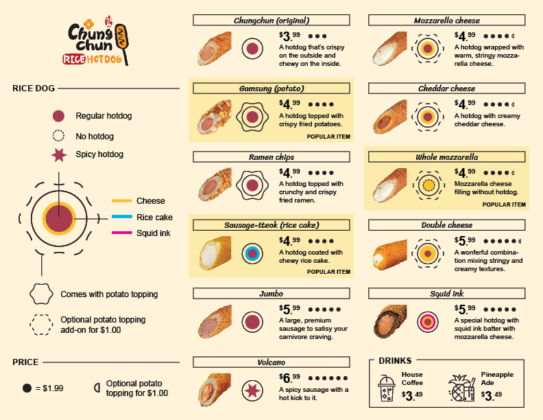
I made this #dataviz + food menu (#chungchun). I see a lot of potential for this. I might make a post about how I put this together via blog/medium. Thoughts? Pls note that this is a personal project, I wasn't commissioned to do this.
Government Statistical Service (GSS)launched a new housing statistics interactive tool, which will help users explore the landscape and range of housing, planning, homelessness and rough sleeping statistics produced by Government. https://t.co/8oEgEcp2eb
Our partners @aspexportsmouth are hosting a free 6-week course starting on the 9th of February all about learning to create #AR Facebook and Instagram filters and utilising social media as a networking tool! For more info, go to: https://t.co/OIYpUklyYf
FROM THE ARCHIVE: Over the years, attention and awareness in regards to #dataethics#bias and #privacy have steadily risen — but there's still lots to be done. Here's a collection of episodes in which we addressed those questions from different angles: https://t.co/cGiz2UPQWh