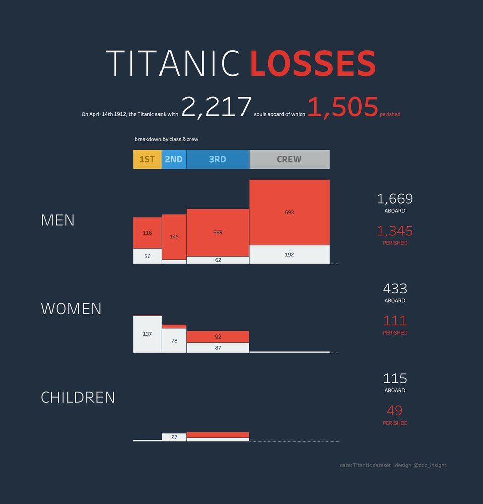
Best Titanic infographic I have come across. The loss of life ranked by passenger class and divided into men, women and children. Being a first class female passenger gave you best survival chance (no wonder Kate Winslet escaped while Leo died). Source: https://t.co/SWII7yCaWO HT @doc_insight
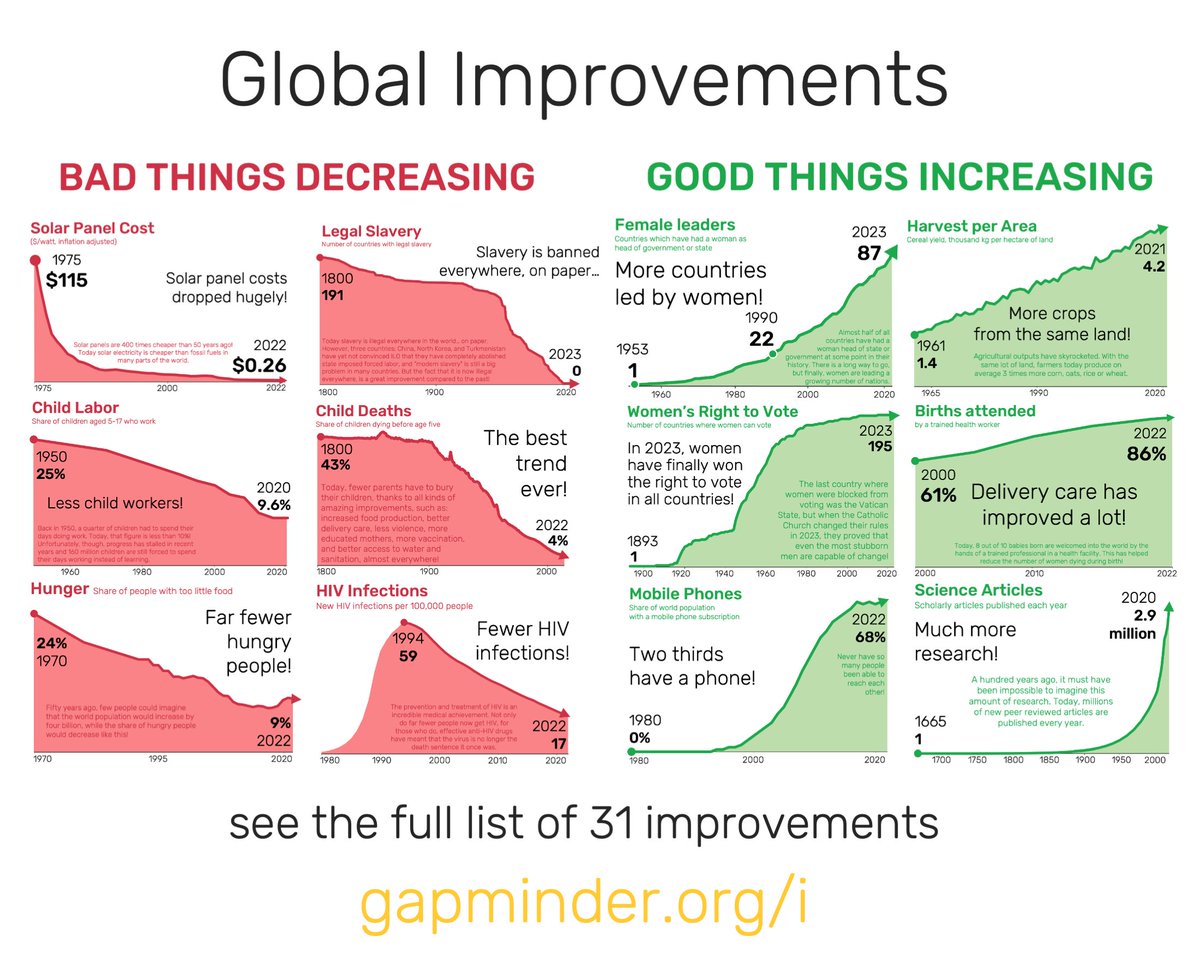
The world is full of problems, which people are often very aware of. But most people have no idea about the many improvements we have visualized, and therefore they lose hope for the future and think the world is doomed.
https://t.co/fOzOsDv5qU
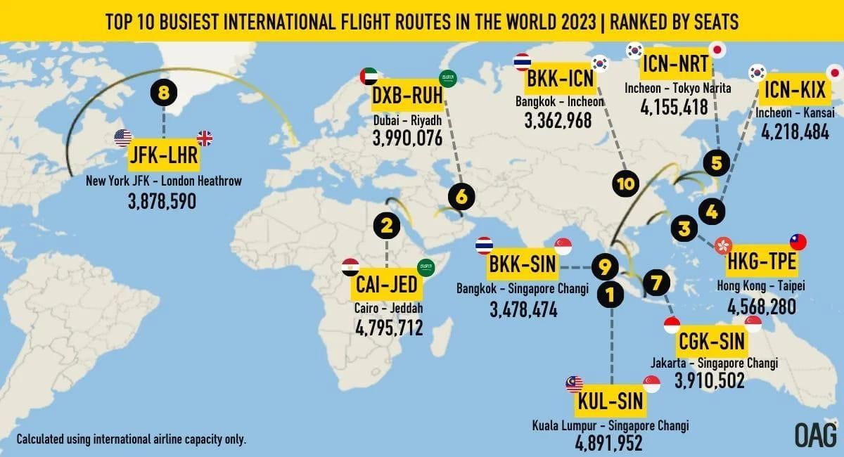
Yay! The 2023 top 10 busiest international flight routes can be seen in this map. It speaks to the importance of New York and London that two cities so far apart make it into the top 10.
@angiehjort@tableaupublic You got it, Angie.
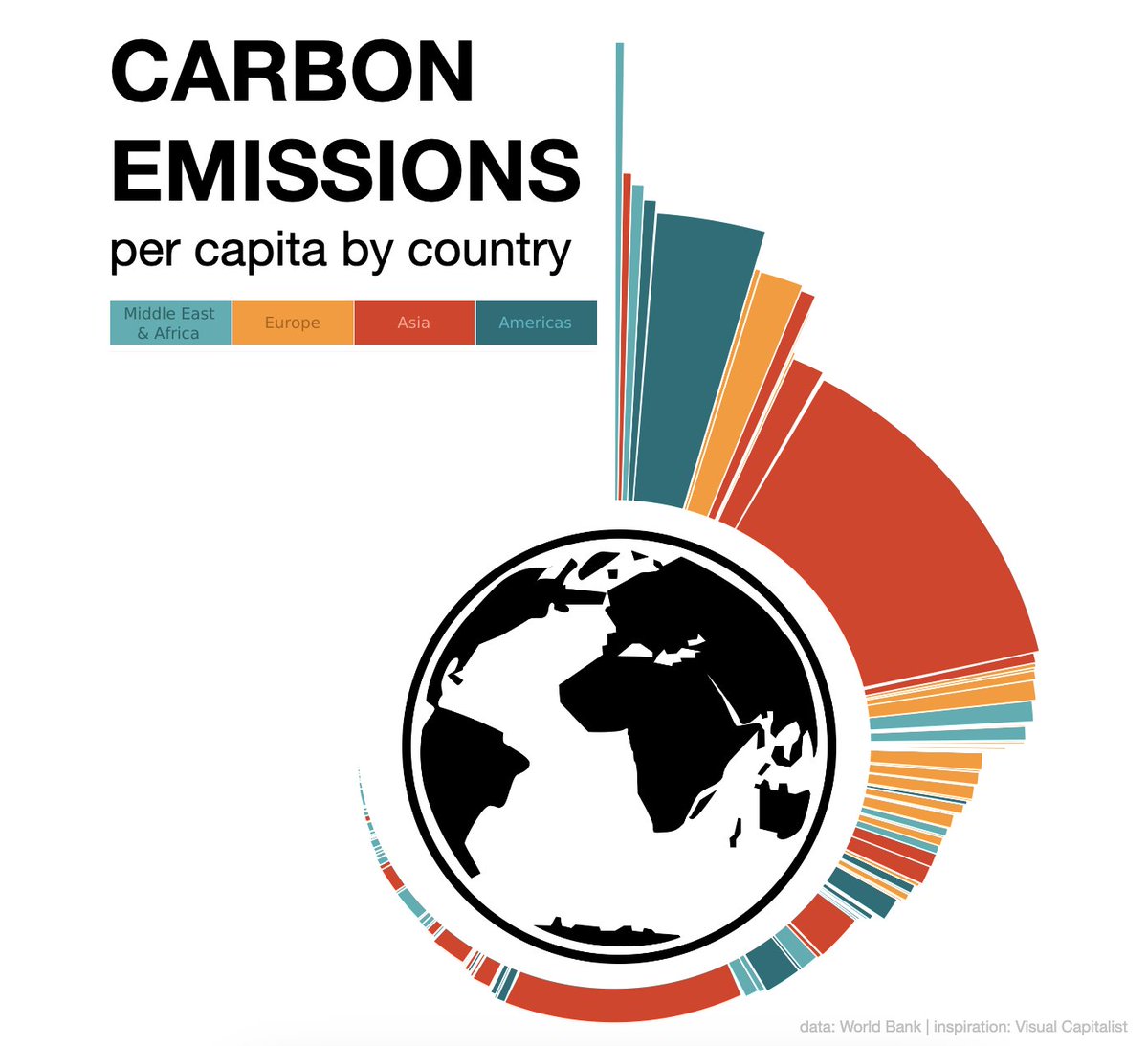
I didn’t do the work to label this chart, but height is per capita emissions, width is population so area is total CO2 emissions.
This effort was more a creative indulgence than a business ready chart ❤️📊
Featuring a radial marimekko, @doc_insight illustrates carbon emissions per capita around the globe. Explore this #VizOfTheDay. https://t.co/H59K7EZ1sD
#Eurozone now reports 'excluding #Ireland'. Congratulations! We've distorted the entire country out of the data set with our tax evasion / avoidance shenanigans.