أوزيمبيك بدأ كعلاج للسكري..
لكن الأبحاث الجديدة كشفت أشياء ما أحد توقعها:
🧠 44% انخفاض في خطر الاكتئاب
🫘 24% انخفاض في أمراض الكلى
🚭 47% انخفاض في الإدمان
العلم لسا في البداية مع هذا الدواء 🔬
#GLP1#أبحاث_طبية#أوزيمبيك
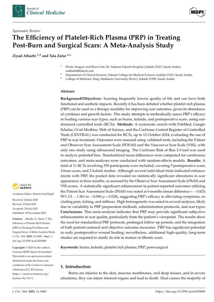
Again, the same issues, excessive AI use and minimal peer review as concepts introduced in the introduction are repeated in the discussion. That’s why some journals (i think)care more about APC than the actual content, and many authors care about quantity more than quality.
Interesting topic, but the manuscript raises real concerns. Repeated abbreviation definitions even in the conclusion?(AI?) No registration?, high heterogeneity with limited interpretation, and inconsistent methodology reporting. Yet still accepted. How did this pass peer review?
Proud to share my new publication!! 🤩📃
I’m deeply grateful to my supervisor, @ZiyadAlharbi83 , for his constant support, encouragement, and insightful contributions throughout this research 🙏🏻
Check it out here: https://t.co/EBSpj28uhg…
بالضبط كلامك ياكد المشكلة..فالمشكلة ليست في نوع البحث بحد ذاته بل في الفكرة العامة التي بدأت تنتشر انو سوّ أي بحث بأي طريقة المهم تجمع النقاط ( الغاية تبرر الوسيلة) هذا الأسلوب مع الوقت يضعف النزاهة العلمية ويحوّل البحث من أداة لبناء معرفة مفيدة إلى مجرد إجراء بيروقراطي في نظري
اتفق جدا بخصوص هذا الموضوع و لكن الهدف الأبحاث للاشخاص في المجال الصحي يكون غالبا بسبب اشتراطات الهيئة و الجامعات على الطلاب بنشر البحوث. كون انهم ملزومين بوقت معين فيه ابحاث اسرع من بعضها . مثلا prospective cohort studies تكون اقوى و قيمة علميه افضل لكن تحتاج فتره طويلة و قد يكون الوقت ضيق لعمل هذي الانواع من البحوث.
أقدّر رغبتك في تبسيط أنواع الأبحاث للطلاب لكن تصنيف الأبحاث بناءً على السرعة فقط يعطي انطباعاً ساذجاً وغير دقيق عن البحث العلمي وكأنه مشروع لإنتاج أوراق بأي طريقة وليس عملاً علمياً له منهجية ومسؤولية وهدف. البحث ليس سباق سرعة ولا هدفه تراكم أعداد منشورات بل بناء معرفة موثوقة..
أسرع 3 أنواع أبحاث في الإنجاز:
•Case Report
•Cross-Sectional Study
•Systematic Review
هذه الأنواع تعطيك إنتاجية عالية بزمن قليل، وتنشر بسرعة.
لأن الـ Case Report يعتمد على حالة جاهزة، والـ Cross-Sectional استبيان بدون متابعة، والـ Systematic Review يعتمد على تحليل دراسات منشورة بدون جمع بيانات جديدة.
لهذا تُنجز بسرعة. 📚
Publishing in predatory journals doesn’t increase impact, it erases it.
The study by Chawla ., Nature, 2020 showed that almost 60% of papers in predatory journals receive little to no scientific attention.
Choose rigorous journals, not easy acceptance!
Congrats bro, but i think the quality of the article is suboptimal . Used synthetic patient data is dangerous & cannot be verified, very verbose(AI?). The methods and results do not match. Focus on quality to have more impact than just publishing
الحمدلله دائماً وأبداً 🤍
تم بحمد الله نشر بحثنا بعنوان
“Advanced Computational Modeling and Machine Learning for Risk Stratification, Treatment Optimization, and Prognostic Forecasting in Appendiceal Neoplasms”
في مجلة Healthcare (Q2).
كل ال��كر للفريق البحثي الرائع 🤝✨
Congrats! Though i think the quality could be improved by reducing reliance on AI, adding figures, preventing redundancy in tables, limiting discussion to data. And lastly it’s dangerous to have medical intern as senior author, meaning no methodological&medical supervision
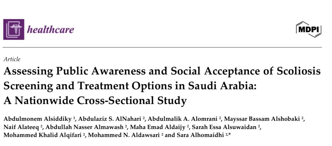
تم بحمد الله نشر بحثنا تحت إشراف أ.د. عبدالمنعم الصديقي، وكنت المؤلفة الرئيسية (Senior Author):
“تقييم الوعي العام والقبول المجتمعي لفحص الجنف وخيارات العلاج في السعودية: دراسة مقطعية وطنية”
تعد هذه الدراسة الأولى على نطاق واسع التي تجمع بين قياس وعي المجتمع، تقبّل الفحص المبكر، وتفضيلات العلاج.
نأمل أن تسهم النتائج في تعزيز برامج الفحص المدرسي وزيادة التوعية حول أهمية الاكتشاف المبكر.
🔗 رابط البحث: https://t.co/qOWKIgbFN0
R offers _thousands_ of packages. 🙈
I curated a list of the 47 best packages for #dataviz
https://t.co/X4v7Kl6OCT
For each package:
🔎 In-depth description
⚡️ Main features with code
📖 Real-life examples from the gallery
➡️ Agree with my list? Which one is missing? 🤔
ANOVA (Analysis of Variance) is a powerful statistical method used to compare the means of two or more groups. It helps to determine if there are significant differences among the group means. When applied correctly, ANOVA can provide clear insights into the variations within your data.
✔️ Uncover Hidden Patterns: ANOVA allows you to detect differences in group means, helping you understand the underlying patterns in your data.
✔️ Informed Decision-Making: By identifying significant differences, ANOVA supports more informed decisions based on data analysis.
✔️ Efficiency in Testing: ANOVA can test multiple groups simultaneously, saving time and reducing the risk of Type I errors.
❌ Misinterpretation Risk: If assumptions like normality or homogeneity of variances are not met, ANOVA results may be misleading.
❌ Complexity in Large Data Sets: Handling large data sets or multiple variables can complicate ANOVA, requiring careful management to avoid errors.
🔹 R: Use the aov() function for performing ANOVA, and ggplot2 for creating insightful visualizations like density plots to represent the distribution of groups.
🔹 Python: Utilize the statsmodels package to conduct ANOVA and seaborn or matplotlib for creating density plots and other visual aids.
In the attached visualization, a density plot is shown based on three groups (A, B, and C). Such a density by group plot is a useful complement to ANOVA as it enhances your understanding of the group distributions and the assumptions underlying the analysis.
For those interested in diving deeper into Statistical Methods, including ANOVA, my online course on Statistical Methods in R starts on September 9, 2024. This course covers this and many other related topics in detail. More information: https://t.co/7YQCRDKSPO
#DataAnalytics #pythonprogramming #tidyverse #Data #ggplot2 #datavis #RStats #Python
The esquisse package in R is an excellent tool for data visualization and exploration. Designed to streamline data analysis, esquisse turns raw data into interactive visualizations, facilitating easier understanding and interpretation of your data sets.
Here are some key features of esquisse:
1️⃣ Drag-and-Drop Interface: Create dynamic plots effortlessly using a simple drag-and-drop interface. This feature helps in quickly identifying trends and patterns in your data.
2️⃣ User-Friendly: esquisse is accessible even to beginners in R, thanks to its intuitive interface. It integrates well with other R libraries, enhancing your overall data analysis experience.
3️⃣ Customizable Visualizations: esquisse offers numerous customization options, enabling you to tailor visualizations to your specific requirements. From color palettes to various plot types, you have full control over your data's presentation.
4️⃣ Time-Saving: esquisse saves time by making it easy to create visualizations through an interactive and exploratory approach. While it excels in simplifying the process of visualizing data, it is particularly useful for quick, on-the-fly analysis rather than automating the creation of visualizations for very large data sets.
5️⃣ ggplot2 Integration: esquisse works seamlessly with ggplot2, one of the most popular visualization packages in R. This integration allows you to build complex and aesthetically pleasing plots with ease, leveraging the full power of ggplot2's capabilities.
6️⃣ Community and Support: Take advantage of a supportive community of users and contributors who provide tips, tricks, and assistance. This makes it easier to resolve issues and stay current with the latest updates.
Here is the package documentation, where you can find the visualizations shown in this post and many other examples: https://t.co/ZNIYwdMbPb
Stay updated with regular tips on data science, statistics, Python, and R programming by subscribing to my free email newsletter. See this link for additional information: https://t.co/X93SeCe0rb
#ggplot2 #DataAnalytics #tidyverse
7 Steps to write a PhD research proposal that stands out.
Here's how
I have reviewed over 100 PhD applications.
Here's a step-by-step guide to crafting a stellar PhD research proposal:
✅ أداة تعمل على تحويل النص إلى مخططات ورسوم بيانية قابلة للتحرير، سواء بلصق النص أو بتوليده.
كما يسهل مشاركة ما تنتجه
🔸 رابط الموقع https://t.co/4Z8bWJTlpq
🔸 سجل في قائمة الانتظار لتجربتها
Merging data in R is a crucial skill for any data analyst or scientist.
I've created an extensive playlist with 19 video tutorials to help you understand and master different types of joins and how to merge data using both base R and dplyr: https://t.co/DuA6kyjmed
Here are some highlights of what you'll learn:
✔️ Types of Joins: Understand inner, outer, left, and right joins to combine data sets effectively.
✔️ Base R Techniques: Learn how to use base R functions such as merge() for data merging.
✔️ Using dplyr: Leverage the dplyr package to perform joins with functions like left_join(), right_join(), inner_join(), and full_join().
I've also developed an extensive online course on "Data Manipulation in R Using dplyr & the tidyverse," which explains these and many other related topics comprehensively. See this link for additional information: https://t.co/dCT2uwurEh
#Rpackage #DataAnalytics #statisticians #tidyverse #programmer #datastructure
Principal Component Analysis (PCA) reduces data complexity by transforming variables into key components that capture the most variance.
Choosing the Optimal Number of Components for PCA is crucial for effective data analysis.
Here are some key methods to determine the optimal number of components:
✔️ Setting Threshold for Explained Variance: Select components that together explain a predetermined percentage of the total variance (e.g., 90%). This ensures that most of the data's variability is retained.
✔️ Using Kaiser’s Rule: Retain components with eigenvalues greater than 1. This rule suggests that components with variance greater than the variance of an individual original variable should be kept.
✔️ Plotting Scree Plot: Create a plot of the eigenvalues in descending order. Look for the "elbow point" where the explained variance starts to level off, indicating diminishing returns for additional components.
✔️ Using Permutation Test: Perform a permutation test to assess the significance of each component. This involves randomly shuffling the data and comparing the variance explained by the real data to the variance explained by the shuffled data.
For a detailed explanation, check out my tutorial created in collaboration with Paula Villasante Soriano and @Cansu_SG: https://t.co/15sCz41Vor
Additionally, I have created an extensive online course on PCA, which explains the theoretical concepts as well as how to apply them in R programming.
Learn more: https://t.co/DUfoAHuxxD
#DataVisualization #Python #RStats #programming #datastructure #coding