Eco3min focuses on macroeconomic regimes, liquidity transmission and structural constraints.
We don’t forecast headlines.
We analyze mechanisms.
Framework over forecasts.
Regimes over narratives.
Real US household income by percentile, 1967 to 2025, in 2025 dollars (Census):
20th: $23,620 → $35,800 (+52%)
Median: $56,230 → $87,460 (+56%)
80th: $93,210 → $182,400 (+96%)
95th: $149,600 → $354,000 (+137%)
Every point is at a record in 2025.
These are thresholds, not averages: household money income before taxes, so no tax credits, SNAP or Medicaid.
Census changed its questions in 2013 and its processing in 2017; both estimates for those years are on the chart. The 2013 change alone raised the 95th by 4.7%.
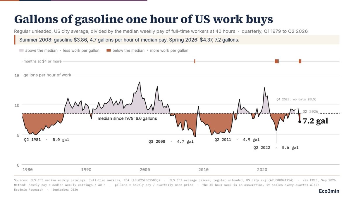
US gas averaged $4.37 a gallon in Q2 2026. One hour of median full-time pay buys 7.2 gallons.
Summer 2008, at $3.86: 4.7 gallons, the lowest since 1979.
Since then: pump price +13%, median pay +74%.
Quarterly BLS data, 1979 to 2026. Interactive chart and free CSV below.
.
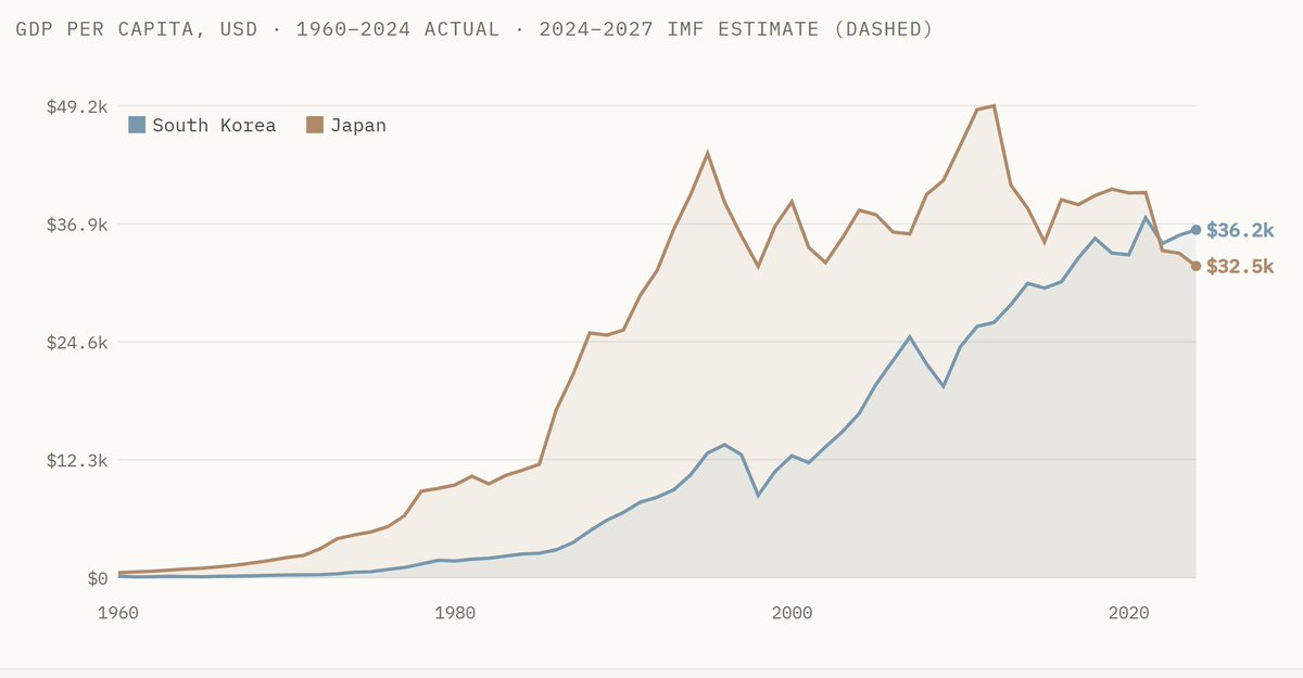
One of the biggest economic highlights of recent years: South KOREA has overtaken JAPAN in GDP per capita
For decades, Japan was the rich neighbor. In 1990, South Korea’s GDP per capita was only about a quarter of Japan’s. Today the lines have crossed.
Nominal GDP per capita
South Korea: $36.2k
Japan: $32.5k
Japan still has the much larger total economy. But on a per-person basis, Korea is now ahead, and IMF estimates keep Korea in front through 2027.
What the chart really shows
Japan’s takeoff started in the 1960s–80s.
Korea’s catch-up exploded after the 1980s and especially after 2000.
The crossover is recent, sharp, and historically rare.
Source: GDPIndex
🍔 How many minutes of work does a Big Mac cost?
🇨🇭 Switzerland: 7.3 min
🇺🇸 US: 10.3 min
🇯🇵 Japan: 12.1 min
🇵🇱 Poland: 31.0 min
🇲🇽 Mexico: 62.6 min
The surprising part: the most expensive Big Mac is the fastest to earn.
Wages matter more than the sticker price.
Methodology 👇
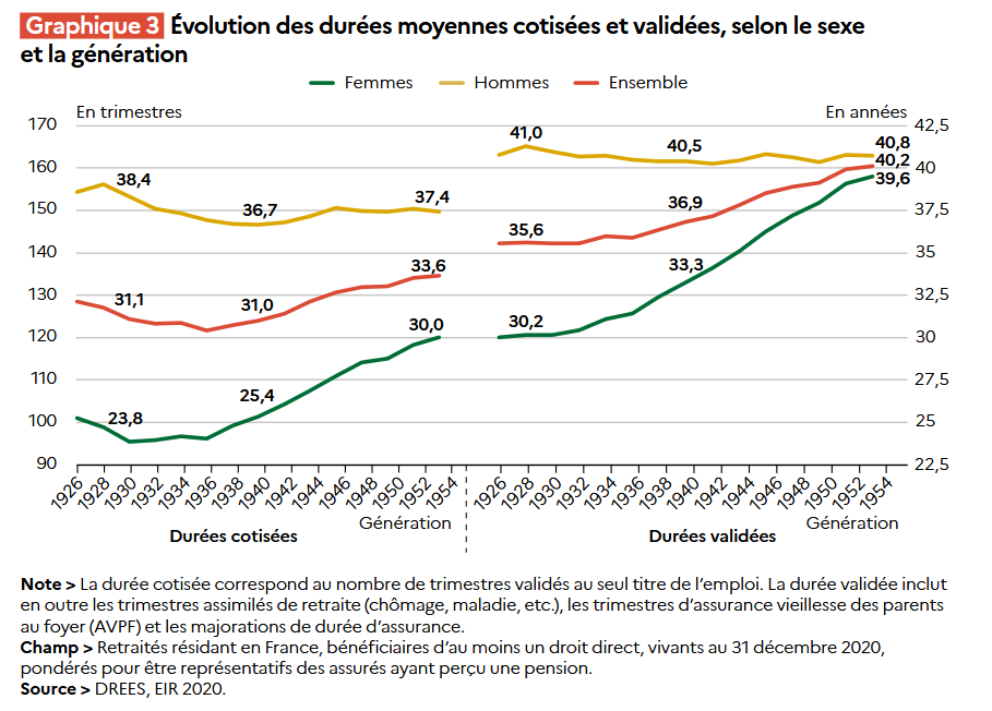
Ce qui compte, c'est la durée consacrée au financement du pot commun. Et la fraction du pot commun a beaucoup augmenté.
Pour autant, regardons les vrais chiffres. La cohorte partie à la retraite en 2008 (celle de 1948) n'a pas cotisé pendant 43 ans, mais l'équivalent de 33 ans.
There's a famous graph showing Nobel prizes vs. chocolate consumption per capita allegedly correlate very highly (r = 0.79), indicating confounding
The high correlation is based on cherrypicking:
Add in every country (0.17), or just ones with ≥1 Nobel (0.25), and it disappears
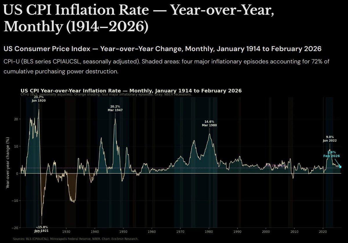
“Four periods destroyed it all…”
The chart reveals that US inflation history is not a story of gradual erosion but of episodic shocks separated by extended periods of near-stability
The four shaded episodes dominate the visual, and the data confirms it: 72% of all cumulative price increases since 1914 occurred within these four windows.
From the post-WWI spike (peaking at 23.7% in June 1920) and the sharp deflation that followed, through the post-WWII surge (20.2% in March 1947), the 1970s–early 1980s Great Inflation (14.6% in March 1980), and the recent post-COVID jump (9.0% in June 2022), these concentrated bursts account for the overwhelming majority of the long-term rise in the price level.
Outside those episodes, inflation has spent long stretches hovering near or below the 2% line that today’s policymakers treat as the target.
In short: most of the destruction of purchasing power has come in a handful of discrete shocks, not as a steady drip.
Source: @eco3min
Paying for things with cash is basically the domain of older people who are making small purchases now.
For the young and anyone making a larger purchase, other payment methods dominate.
Cash use rises sharply with age—and peaks on small purchases.
65+: 52% use cash under $10, vs. just 13% for $50–100.
Fed data, Oct. 2025 👇
https://t.co/cKGN4KIOZH
The euro area aggregate unemployment rate (15–74 years, seasonally adjusted) reached a record low of 6.2%
However, let’s evaluate carefully!
The chart clearly shows the trend of the euro area aggregate unemployment rate from 2000 to 2026: In the early 2000s it stood at around 9%, following a fluctuating path until the 2008 crisis. After the 2008-2009 global financial crisis a sharp rise began, peaking at 12.1% in 2013.bThereafter a long and continuous downward trend set in.
Although a short-lived spike occurred during the 2020 pandemic period, the recovery was rapid.
In the 2024-2026 period the rate fell to 6.2%, reaching a record low.
This long-term decline looks quite positive at first glance. However, this aggregate statistic completely conceals the enormous differences between countries within the euro area. While unemployment remains very low in countries such as Germany and the Netherlands, double-digit rates can still be observed in Spain, Greece or some regions of Italy.
Because the average does not reflect this dispersion, it paints a more favourable picture of the real situation than is warranted and becomes misleading.
Source: @eco3min Research. (2026). Euro Area Unemployment Rate (1998–2026)
Can you predict what happens next? 📈
🎮 Hindsight — your intuition vs. real data.
Draw the forecast. Let the data catch up.
How good are you?
https://t.co/GyjUnZwTNW
By 2029, Americans aged 65+ could outnumber children under 18 for the first time.
In 1950: ~4 children per older adult.
Today: the gap is just ~12M.
The U.S. is aging fast.
https://t.co/2NdZf6nGgj