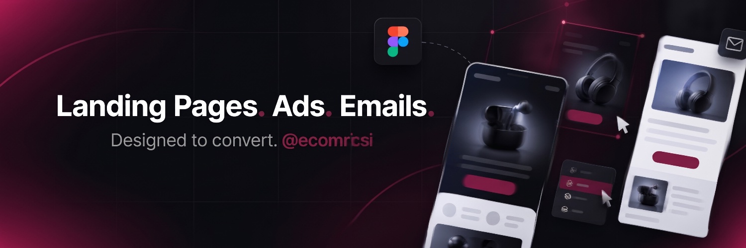
I recreated 10 landing pages from scratch to learn.
What I noticed:
The best ones don’t look the best.
They’re the clearest.
Clarity beats creativity on a landing page.
5 landing page mistakes killing your ad spend:
1. Vague headline
2. No proof above the fold
3. Too many buttons
4. Slow, heavy images
5. No clear offer
Fix #1 first. It costs nothing.
@david_bassey_ When you did outreach, did you pitch a specific problem you spotted in their site, or send your portfolio first? Trying to figure out what makes a cold message get a reply as a beginner.
🎯 Great ads + a weak hero = wasted ad spend.
Redesigned Lumin’s mobile hero 👇
✅ Sale bar + red accents matching the product glow
✅ Social proof above the fold
✅ One clear CTA: “Get Started”
✅ Free shipping under the button
Paying for traffic? FOLLOW or DM me 🤝
Black Friday traffic is expensive. Don’t waste it on a weak hero. 💸
Old hero showed the product but never told the story. ❌
✅ Flavour-first headline: “Pick your flavour.”
✅ 3 icons explain how it works in 2 seconds
Want a landing page that actually converts? DM me 🤝