Significazióne s. f. [dal lat. significatio -onis], non com. – Il fatto di significare, di esprimere cioè e di comunicare un contenuto semantico, una nozione, un messaggio, una volontà. @Treccani#dictionary
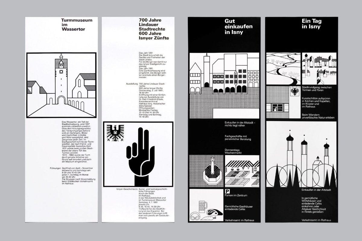
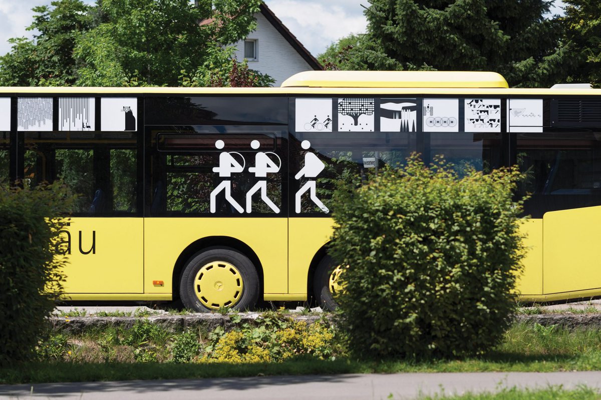
Otl Aicher's Isny showcases the graphic identity that the modernist graphic designer and typographer – best known for creating the Munich Olympics identity in 1972 – developed for the town around the same time.
https://t.co/zplEU4DLKB
Kawasaki Shinkin Bank commissioned Mitsuo Katsui to develop a logo to rejuvenate its image and reflect, in an approachable way, the modernisation of banking that was underway. This would also be symbolic of the continued growth of the bank and the wealth of its customers, and serve to motivate staff under a strong image.
Katsui put forward the following requirements for the design of a new logo; that it be simple, strong and distinctive; it accurately represent the content and character of the bank; directly connect with customers, and be easy for them to get used to. And finally, it should be deployable and effective in all media types, from large format signage to smaller items such as forms and stationery.
As the new corporate identity would be based around this new logo it was felt that it, not only serve as an eye-catcher, clearly distinguishing the company from others amongst a ‘flood of advertisements’ and ‘propaganda materials’, but also be ‘beautiful’.
Prior to starting the design work research was conducted, with the people of Kawasaki City being asked about their daily lives and their expectations for the city. Their responses suggested that they wanted to live in a place with a rich natural environment with blue skies, bright sunshine and a refreshing breeze. And from a bank? Safe, friendly and easy to trade with.
Katsui devised a new logo that brought together a number of different notions. At first, it takes on the qualities of a tree that ‘takes root in the earth and grows toward the sky’ symbolising the prosperity of customers and the wealth being placed in reliable hands. This was then given the brilliance of the sun, as a radiating form. The outstretched branches became beams of light. The sun shining in all directions was also said to resemble the shape of an open hand and alluded to the ‘hand-in-hand’ relationship and a desire to have a welcoming attitude.
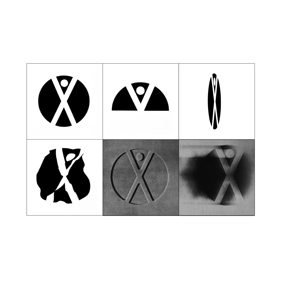
Do you know what this is?
Known as a ‘legibility test’ it was devised in the late part of the 1950s as a way to test the efficacy of a logo concept.
Legibility tests would see how well a logo performed under certain conditions. From left to right, the logo as it was unaltered; only when partially seen; from an angle; distorted on a flag; blind embossed; and blurred as if seen motion.
The example here is Ernst Roch’s concept for Expo 67.
That narrative of elusive satisfaction isn’t just something we’re repeatedly being told; it is a story we’re literally buying into all the time. https://t.co/w0UagucM8w













![MrPrudence's tweet photo. Frauhofer patterns from 'Diffraction in the Fundamental Laws of Wave Theory - Friedrich M Schwerd [1835] https://t.co/4Nhy1jqqiZ](https://pbs.twimg.com/media/GYuPV6tXAAAZO-b.jpg)