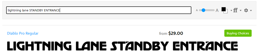
@esplanerd@ST1401toEndor Yes, that's because the font has different glyphs/letters for uppercase and lowercase. For some reason, whoever made the Lightning Lane sign set the type in lowercase when the original sign was set in uppercase, creating the visual disparity.
The font family used for the new Walt Disney World Resort area road signage is Expressway.
You might think the same font is used for signage at the Disneyland Resort - but that one is actually Interstate (Trust me, there's a difference).
📷: @Blog_Mickey
The font family used for 2021 #WaltDisneyWorld Annual Passholder text (first image) is Filson Pro. The Walt Disney World Annual Passholder logo font itself (second image) is custom and based on the Walt Disney World logo primarily used from 1971 to 1996.
After much research, I'm convinced the Disney Genie logo font is custom-made. If you want to get very close, I'd recommend Sansita Bold. https://t.co/7MNEyCiEtp
@GerardMundo @hastin I'm guessing the font on the signs itself was designed by Disney's in-house team. Probably a new World Bold like @hastin mentioned.