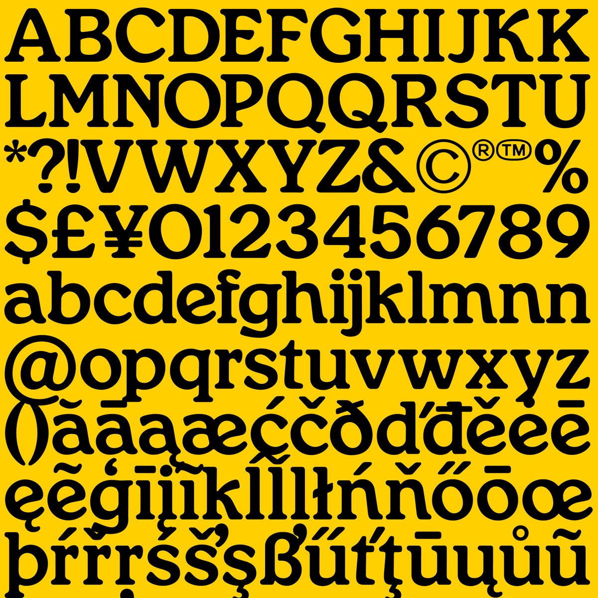
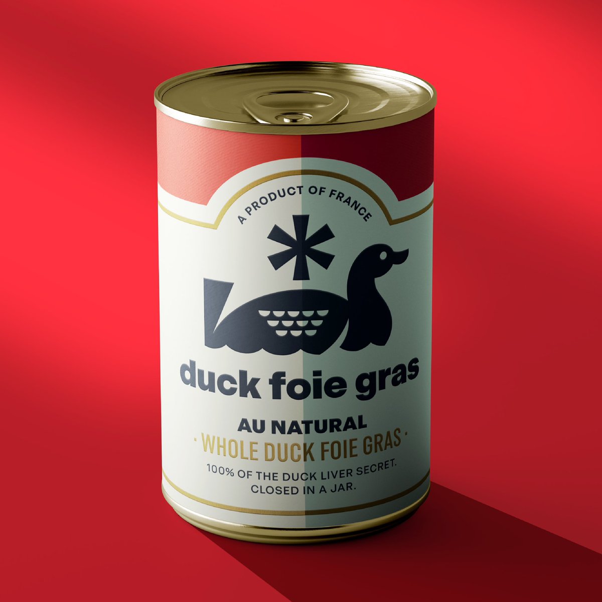
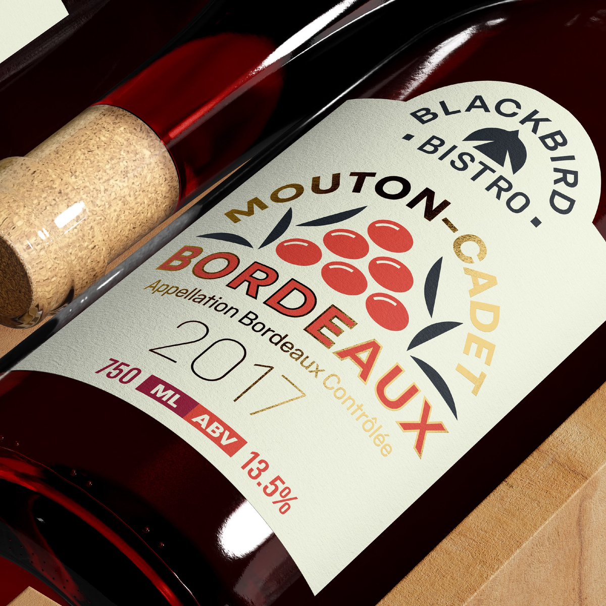
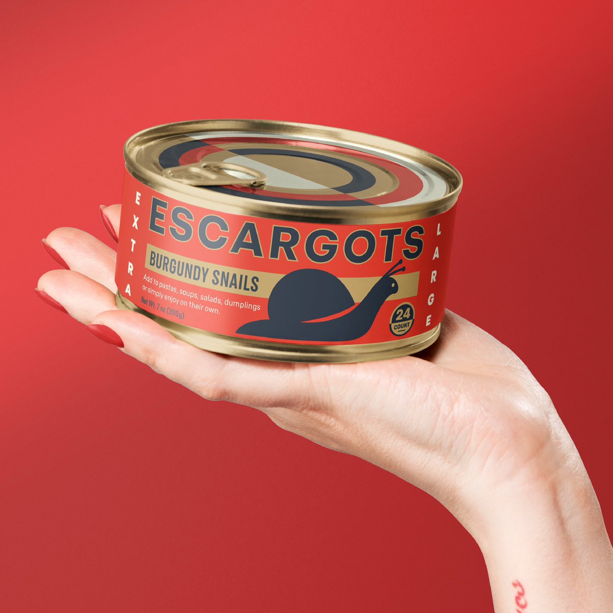
Food packaging for Blackbird Bistro utilizing @fortfoundry’s new typeface, Blackbird. We not only wanted to show how successful this typeface was in digital spaces but also it’s strengths dimensionally on forms and packaging.
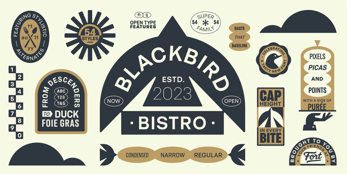
Comprehensive visual identity & title specimen artwork for Blackbird—a new typeface from the wonderful @fortfoundry. This geometric & grotesk workhorse typeface is available in 9 weights across 3 widths. Much more to come but the typeface is available now! https://t.co/laqVgDhOLe
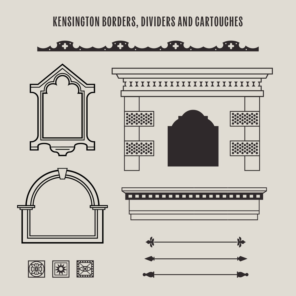
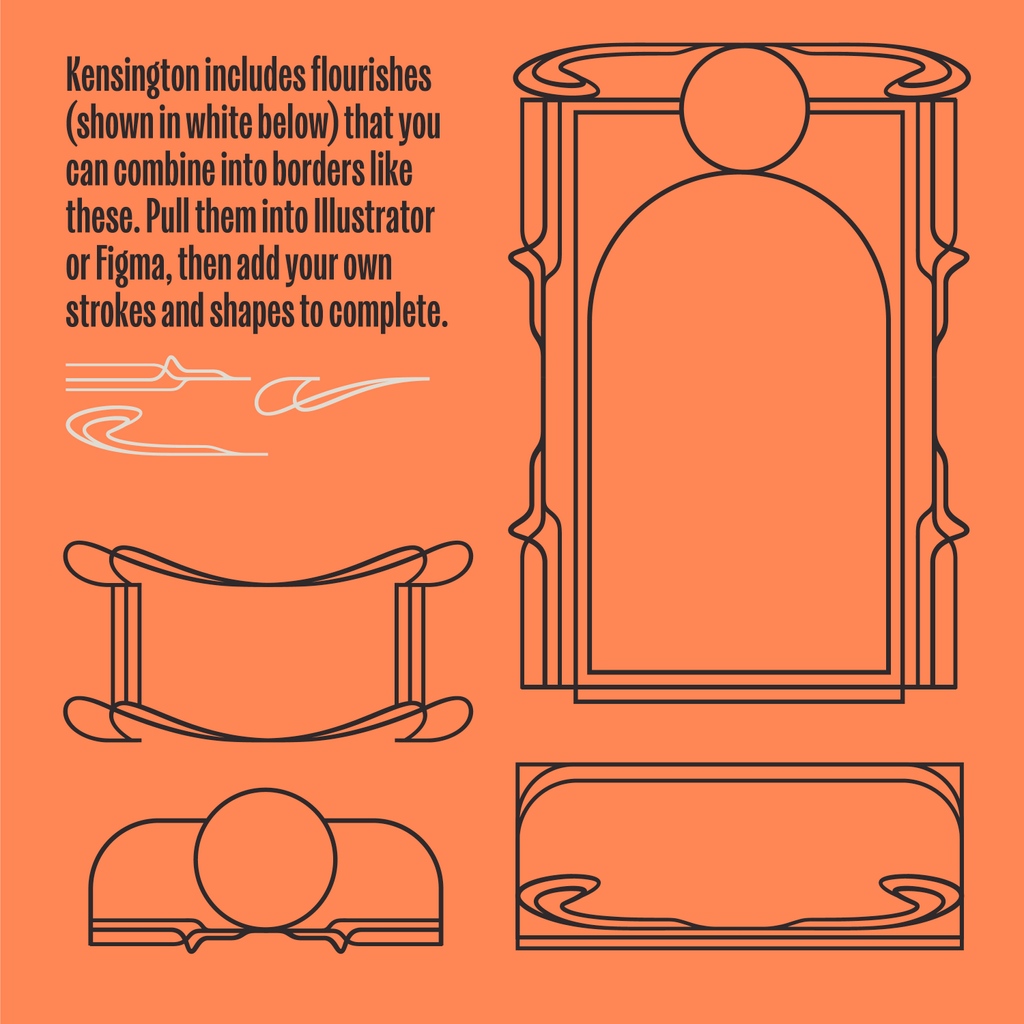
Tomorrow is the last day to get our new typeface Kensington for 30% off! The family includes regular to black weights, italics, plus extras like dingbats, cartouches (a real word), decorative dividers and border elements. Get the font over at @FortFoundry: https://t.co/I392DboBIu
New typeface! Meet Kensington: a narrow, stately, and eclectic sans serif we designed with our friends at @FortFoundry.
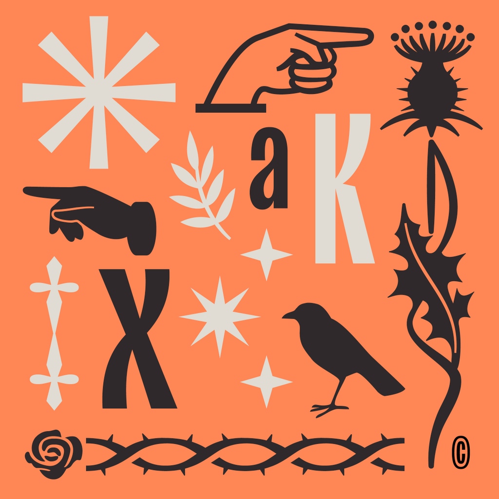
5 weights + italics + Kensingdings (ornaments).
🍒 This week only: get 30% off the full font family - no coupon code necessary.
https://t.co/I392Dbp9y2
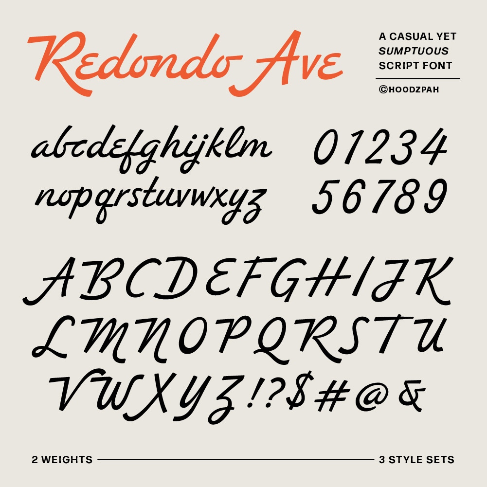
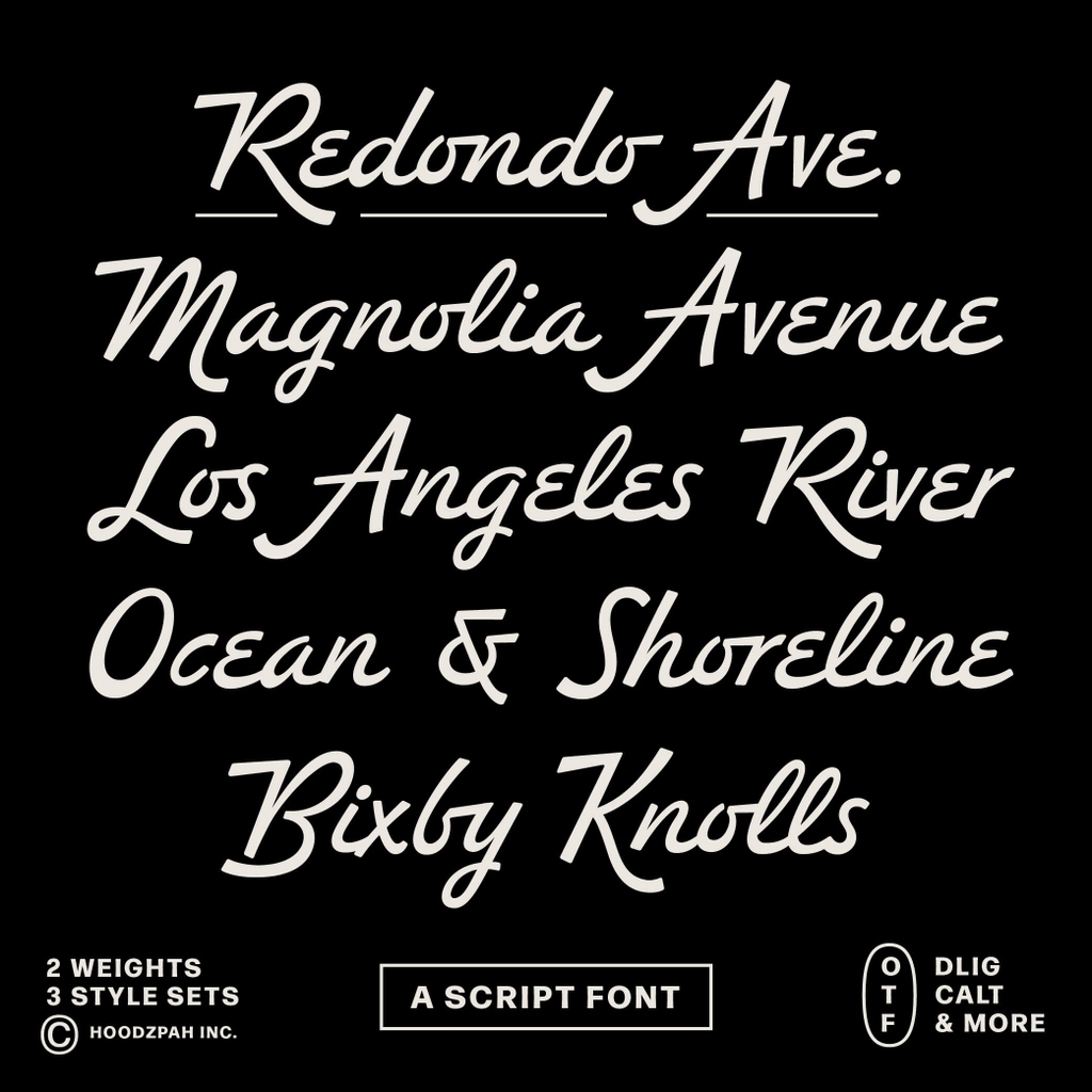
Redondo Ave script font is the newest font from Hoodzpah! This display font adds instant personality to any design or layout. It has an extravagance that's simultaneously relatable and down to earth. Head to our shop to purchase or get trial fonts: https://t.co/RBGn8Ir92O
It’s SUN-day!
SUN No. 403. #SUNdaySUNS
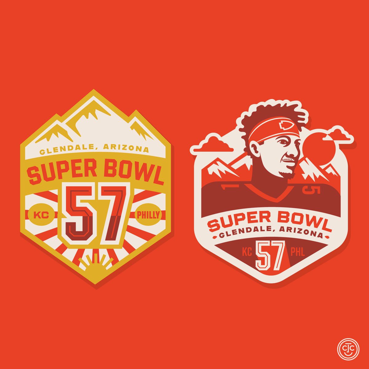
Super Bowl SUNday baby!!! You know who I’m cheering for. Let’s Go Chiefs!!!
See them all at https://t.co/Sp3KBctHfk.
Also I’m using the new typeface Shuttleblock from my friends @fortfoundry and @clarkorr.
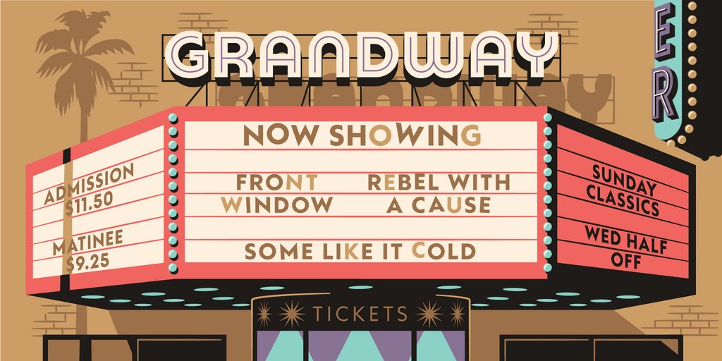
Congrats to our friends at @fortfoundry for the release of their newest font, Grandway! This collaboration between Fort and @sethnick has been years in the making, and it's a geometric stunner. Here's some tangential graphics we made with Fort for the launch.
NEW CASE STUDY // Catlin Sans for The Fifty-Nine Parks Print Series. 🏔🔤
26 letters, that have been put to use on a beautiful series of posters, over the course of many years.
https://t.co/ZIX6pEIOvx
@faisaldesignco Hey Farhath, we submit all our families to Adobe for consideration, but some like Locale are not chosen for release. You can download and play with Locale through our Test Fonts though.
Locale hits the interwaves today with a generous heaping of goop + geometry + grotesk character. Also it’s only $10 (usually $100) for the full fam for the next 24 hours 🎉 https://t.co/uXK5sNjMjH
@Manoz Hey! Sorry for the delay! These are setup at Tabular Figures / Numbers so in CSS you could try “font-variant-numeric: tabular-nums;” Let me know if that doesn’t do the trick though.
Three weights of VC Garamond Condensed, my holiday break exercise in redrawing a big ol' classic from memory. Pretty sure this is dying on the hard drive, so it might as well go here.
https://t.co/msnWVWlHAh
Big Update: 🌟The online "Foundations of Type Design" course is now fully accessible for everyone on the internet! Another round of thanks for the community support, this course wouldn't exist without y'all! 😍 Happy learning! #typeface#design#education https://t.co/MmmcWlTtSL
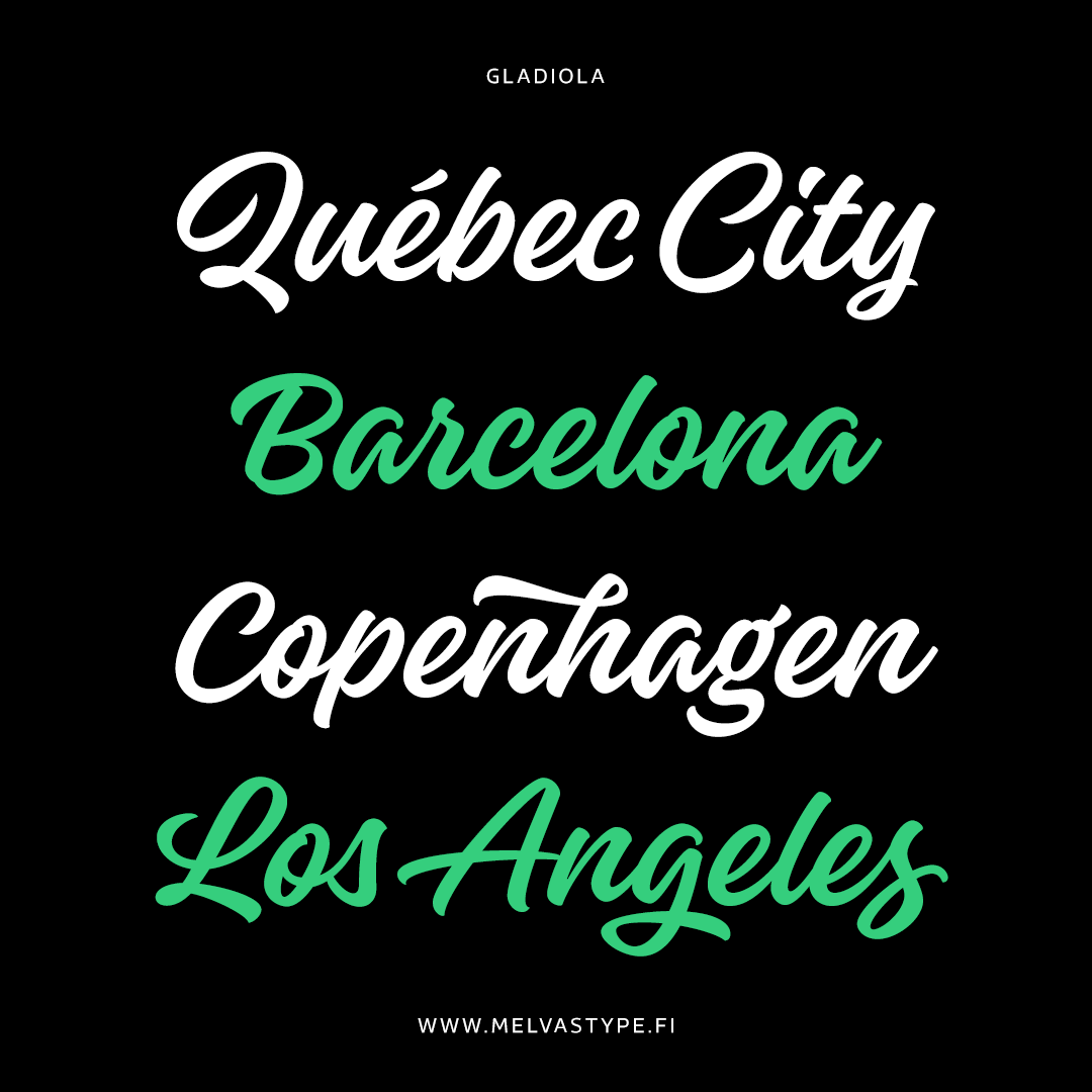
It has been a week for scripts!
☞ Balneario from @sudtipos — https://t.co/GUnl9mGBUk
☞ Alkaline from @fortfoundry — https://t.co/qrOec9dIgA
☞ Gladiola from @MelvasType — https://t.co/AdA8qotB0d
Love the inspirations behind all of these.
I must really give it up to @AdobeFonts employees past and present that have worked hard to make sure foundries are treated well. It has made a huge difference for my emotional well-being! 🖤


![typecache's tweet photo. [New Font Release] Fort Foundry released Shuttleblock. https://t.co/ApZ2Brfcfz #typecache https://t.co/HKbDpceu6f](https://pbs.twimg.com/media/FohqRI6aMAIKukD.jpg)