One of the most common mix-ups in statistics is between standard deviation (SD) and standard error (SE). They sound similar, but they describe two completely different things—and using the wrong one can lead to misleading conclusions. Here's how to tell them apart.
🔹 Standard Deviation (SD): SD measures how spread out individual values are in your sample. It tells you about the variability within the data set. Example: How much do individual incomes vary in a sample of 1,000 people?
🔹 Standard Error (SE): SE measures how much an estimate (like a mean or proportion) would vary across repeated samples. It tells you how precise your estimate is. Example: How much would the sample mean income change if you ran the survey again?
As your sample gets larger, SE gets smaller because you're more confident in your estimate. But SD often stays about the same since it reflects the natural spread in the data, not how many observations you have. Use SD to describe the data, and SE to describe the reliability of the estimate.
For more on statistics, data science, R, and Python, subscribe to my email newsletter.
Click this link for detailed information: https://t.co/ktUcWo9XpO
#DataAnalytics #RStudio #datasciencetraining #RStats
gander is an R package that brings AI directly into RStudio or Posit.
Instead of switching between your IDE and a chat window, gander lets you ask questions or request code changes right inside your script. It automatically shares relevant context such as variable names, data types, and the surrounding code, so the model can provide precise answers without extra copy-pasting.
You can trigger it with a simple keyboard shortcut, choose from different AI models (OpenAI, Claude, or local ones), and control how much of your data is sent for context. In short, gander makes working with AI in RStudio smoother, faster, and smarter.
Take a look at the visualization below. It shows an example of how to use gander to create a ggplot2 graph. It’s taken from the package website: https://t.co/DbsZTbsmVK
Join my newsletter for more tutorials and insights on R, Python, data science, and AI.
See this link for additional information: https://t.co/ktUcWo9XpO
#tidyverse #R #datastructure #RStats
The GitHub repository with a template to reproduce this and many more image recognition tasks is public.
I made it as simple as possible so everybody can play with it . If you run out of ideas, I also leave a list of cool Kaggle datasets to play with.
Check the first comment!
Add custom text styling to your ggplot2 visualizations with ggtext, an extension that brings advanced text formatting options directly into your R plots. With ggtext, you can use Markdown and HTML to style plot text, allowing you to incorporate features like bold, italics, colors, and more complex layouts.
Key benefits of using ggtext include:
✔️ Enhanced Aesthetic Control: Style individual plot titles, labels, and annotations with Markdown or HTML, providing precise control over text appearance.
✔️ Custom Formatting: Easily mix and match text styles within the same plot element, such as adding bold or colored text to specific words in titles.
✔️ Dynamic Styling Options: Customize plots to align more closely with branding or design standards, improving clarity and visual appeal.
Using ggtext in ggplot2 is straightforward. By replacing standard text elements with element_markdown() in the plot’s theme, you can apply rich formatting to elements like plot.title, axis.title, and legend.text. This flexibility enables you to bring text to life in your plots without needing external design tools.
The example visualization shown here is from the ggtext package website and demonstrates these formatting features: https://t.co/eZY9Im5h1z
To learn more about creating visually compelling plots with R, check out my course, "Data Visualization in R Using ggplot2 & Friends!"
Check out this link for more details: https://t.co/ztlEzoEDWv
#Rpackage #RStats #ggplot2 #coding #VisualAnalytics
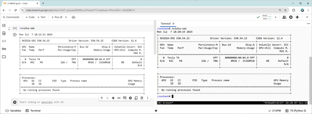
MATLAB + Google Colab 🧡
Train a model in MATLAB. Export to TensorFlow. Test in Python.
In few minutes, you can:
- Provision a free GPU in Colab
- Spin up full MATLAB using the MATLAB Package Manager
- Train a deep learning model with the GPU
Full Blog: https://t.co/3R9tmow0XU
Kernel Smoothing Regression is a flexible technique used to model complex, non-linear relationships in data. Unlike linear regression, which assumes a straight-line relationship, kernel smoothing adapts to the underlying patterns, making it ideal for data that doesn't fit simple models.
Opportunities:
✔️ Captures Complex Patterns: It identifies intricate relationships in data, providing a more accurate fit for non-linear trends.
✔️ Adaptable: Adjusts to data variations without being overly restricted by assumptions, making it useful for exploratory analysis.
✔️ Handles Noise Effectively: Smooths out random variations, which can help reveal the true signal in noisy data.
Challenges:
❌ Computationally Intensive: Requires significant computational power, especially with large data sets, which might slow down analysis.
❌ Sensitive to Parameters: The choice of kernel and bandwidth can significantly impact results. A poor choice may lead to overfitting or underfitting.
❌ Less Interpretability: Compared to simpler models like linear regression, the results of kernel smoothing can be harder to interpret and explain.
To handle Kernel Smoothing Regression in practice:
🔹 R: Use the ggplot2 package for visualization and the geom_smooth() function with method = "loess" to apply kernel smoothing.
🔹 Python: Use the seaborn library for visualization, specifically the sns.lmplot() function with the lowess=True parameter to perform kernel smoothing.
The visualization above shows the difference between linear regression (dashed red line) and kernel smoothing (solid green line). The kernel smoothing line adjusts to the data's natural curvature, providing a better fit for non-linear relationships.
If you're interested in learning more about Kernel Smoothing Regression and other statistical methods, check out my online course on Statistical Methods in R! Learn more by visiting this link: https://t.co/7YQCRDKSPO
#Rpackage #RStats #DataAnalytics #VisualAnalytics #Data #ggplot2
Chi-square testing is a statistical method for comparing categorical variables. It determines if there's a significant association between two variables in a contingency table or if observed frequencies differ from expected ones. In statistics, it tests for independence and goodness of fit. In machine learning, it's used for feature selection, helping identify features that are most dependent on the target variable, which can improve model performance and reduce dimensionality.
Understanding the difference between t-tests and z-tests is essential for accurate statistical analysis. Both tests help compare means, but they differ in application based on sample size and population variance.
✔️ t-tests are ideal when the sample size is small or the population variance is unknown. They account for increased variability with smaller samples, providing a more accurate analysis.
✔️ z-tests are best suited for large sample sizes where the population variance is known. They are simpler and faster, making them practical when conditions are met.
❌ Incorrect test selection can lead to misleading conclusions, especially if the sample size is small or if assumptions about population variance are incorrect.
❌ Overlooking assumptions can result in inaccurate p-values and confidence intervals, undermining the validity of your results.
🔹 In R: Use the t.test() function for t-tests and z.test() from the BSDA package for z-tests.
🔹 In Python: Utilize scipy.stats.ttest_ind() for t-tests and ztest() from the statsmodels package for z-tests.
The visualization compares t- and z-distributions, showing how the t-distribution with degrees of freedom equal to 10 is broader, reflecting the higher variability typical of smaller sample sizes.
For a deeper dive into this topic and more, check out my online course on Statistical Methods in R.
Learn more by visiting this link: https://t.co/7YQCRDKSPO
#Rpackage #rstudioglobal #RStats #DataScientist #datascienceeducation
The XGBoost Python library is one of the most powerful and widely used tools for gradient boosting, designed to optimize both speed and performance. Known for its scalability and efficiency, XGBoost is widely used in machine learning competitions, research, and real-world applications.
Key features of XGBoost include:
✅ Regularization techniques to prevent overfitting (L1 and L2 regularization)
✅ Handling of missing values during training
✅ Parallel processing for faster computation
✅ Tree pruning to reduce unnecessary complexity
✅ Customizable objective functions and evaluation metrics
The image illustrates how XGBoost balances model complexity and accuracy. The top-left plot shows raw data points over time. The top-right plot demonstrates overfitting with too many splits. The bottom-left plot shows poor performance due to an incorrect split point. The bottom-right plot represents an optimal balance, capturing the main trend without unnecessary complexity. The image is sourced from the XGBoost documentation: https://t.co/mWghcv105A
Stay updated with regular tips, insights, and resources on data science, statistics, Python, and R programming by subscribing to my free email newsletter! Learn more: https://t.co/X93SeCe0rb
#Statistics #VisualAnalytics #RStats #Data #rstudioglobal #datastructure
People often ask how to visualize multiple biplots, each showing different combinations of principal components, on a single graph. Here's a straightforward code snippet for achieving that:
---------------------------------------------------
library("factoextra")
library("patchwork")
data(iris)
pca_result <- prcomp(iris[ , -5],
scale = TRUE)
bipl1 <- fviz_pca_biplot(pca_result,
axes = c(1, 2),
label="var",
habillage = iris$Species)
bipl2 <- fviz_pca_biplot(pca_result,
axes = c(1, 3),
label="var",
habillage = iris$Species)
bipl3 <- fviz_pca_biplot(pca_result,
axes = c(2, 3),
label="var",
habillage = iris$Species)
bipl1 / bipl2 / bipl3
---------------------------------------------------
Biplots are useful for simultaneously showing the scores of observations and the loadings of variables on principal components. This dual display helps in visualizing both the data structure and the variable contributions within the same plot.
For more comprehensive guidance, including step-by-step instructions and code examples, consider exploring my online course dedicated to PCA in R. For more information, visit this link: https://t.co/DUfoAHuxxD
#Python #datastructure #RStats #R #programming #statisticians
As biologists dive deeper into complex ecological systems, genetic data, and population trends, traditional statistical methods alone may not be enough to extract meaningful insights. https://t.co/rsv92qLAzi
#DataScience#rstats#DataScientist#statistics#biotech#DataAnalytics
Another fun example of the `mapgl::enable_shiny_hover()` function: using a buffer that follows your cursor as a "magnifying glass" over a circle layer!
#rstats
Give it a try: https://t.co/dZy1obM5Ee
4 ways to improve your ML model results:
1. Use a larger training dataset (i.e. more rows)
2. Add more features to the dataset (i.e. more columns)
3. Try another ML algorithm (e.g. LightGBM instead of CatBoost)
4. Tune the hyper-parameters of your ML algorithm.











![JoachimSchork's tweet photo. People often ask how to visualize multiple biplots, each showing different combinations of principal components, on a single graph. Here's a straightforward code snippet for achieving that:
---------------------------------------------------
library("factoextra")
library("patchwork")
data(iris)
pca_result <- prcomp(iris[ , -5],
scale = TRUE)
bipl1 <- fviz_pca_biplot(pca_result,
axes = c(1, 2),
label="var",
habillage = iris$Species)
bipl2 <- fviz_pca_biplot(pca_result,
axes = c(1, 3),
label="var",
habillage = iris$Species)
bipl3 <- fviz_pca_biplot(pca_result,
axes = c(2, 3),
label="var",
habillage = iris$Species)
bipl1 / bipl2 / bipl3
---------------------------------------------------
Biplots are useful for simultaneously showing the scores of observations and the loadings of variables on principal components. This dual display helps in visualizing both the data structure and the variable contributions within the same plot.
For more comprehensive guidance, including step-by-step instructions and code examples, consider exploring my online course dedicated to PCA in R. For more information, visit this link: https://t.co/DUfoAHuxxD
#Python #datastructure #RStats #R #programming #statisticians](https://pbs.twimg.com/media/Gu2xJYbWwAAozZX.jpg)





