Pinch us – we've gotta be dreaming!!
Parade's been nominated for a GOLDEN KITTY AWARD on @ProductHunt 🏆🤯
You can support us here >>> https://t.co/cWkz0RM40M
Thank you 🙏
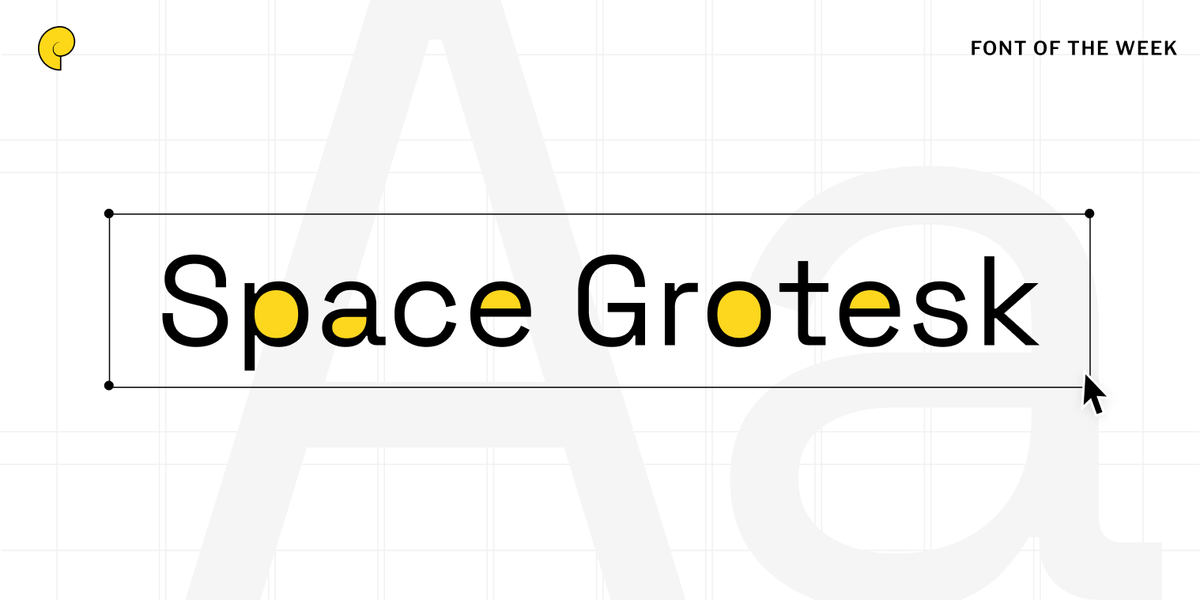
We're really excited to see @sweetfontHQ on Hacker News today -- https://t.co/BgRmlFvh59
It's a tool that helps you find great fonts for whatever you're designing 👀
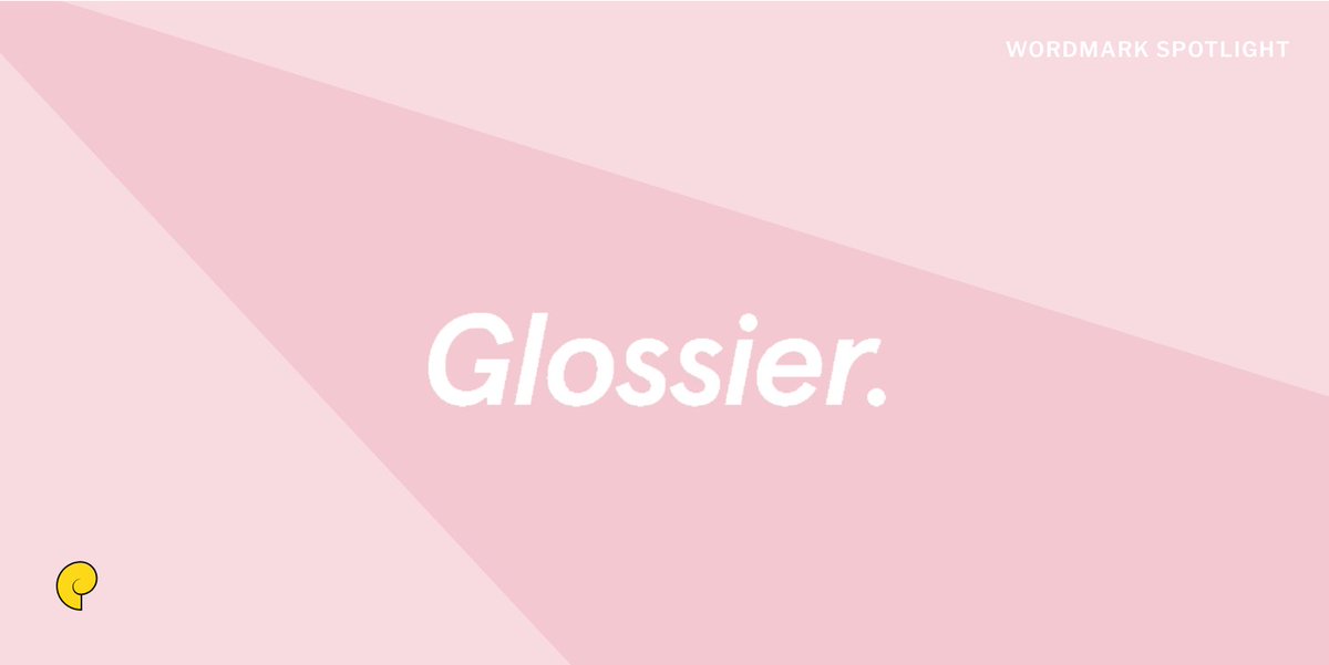
Millennial beauty brand @glossier opted for a grotesque sans-serif typeface for their wordmark. The creators of this font describe it as a fusion of ITC Johnson, Gill Sans, Franklin Gothic, and other notable fonts. Get a similar look with Google Fonts lato or cabin.
Synesthesia – a phenomenon where people perceive accompanying colors for letters/numbers. For some with this condition (including our founder @kleintech), 2's are always red or 5's are always blue. There aren't any known disadvantages of this condition, but it seems really cool.
Aligning with their mission of disrupting the cereal industry, @eatmagicspoon opted for a funky brutalist font that stands out on any grocery store aisle. 🥄
Yellow and red together make you hungry. Fast food chains figured this out years ago and use this color combination over and over in branding, advertising, and restaurant decor.🍟
Possibly the best part of 2020 was the reinstatement of everybody's favorite wordmark – the worm! @NASA announced that it was bringing back the groovy stylized text as their secondary logo after it was retired back in 1992.🪐
Back in the day, there were two words for orange: one for the fruit, and one for the color. The fruit was an orange, and the color was either "geoluread" (yellow-red) or "crog" 🍊
A sweet rebrand launched by @sweetgreen last year. Though they kept their wordmark fully lowercase, features of their new custom font include a lower x-height along with decreased letter spacing 🥬