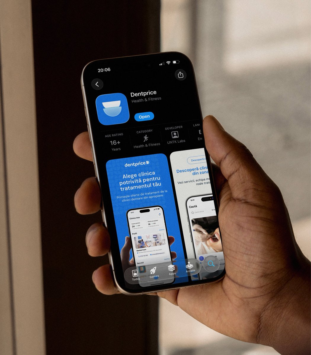
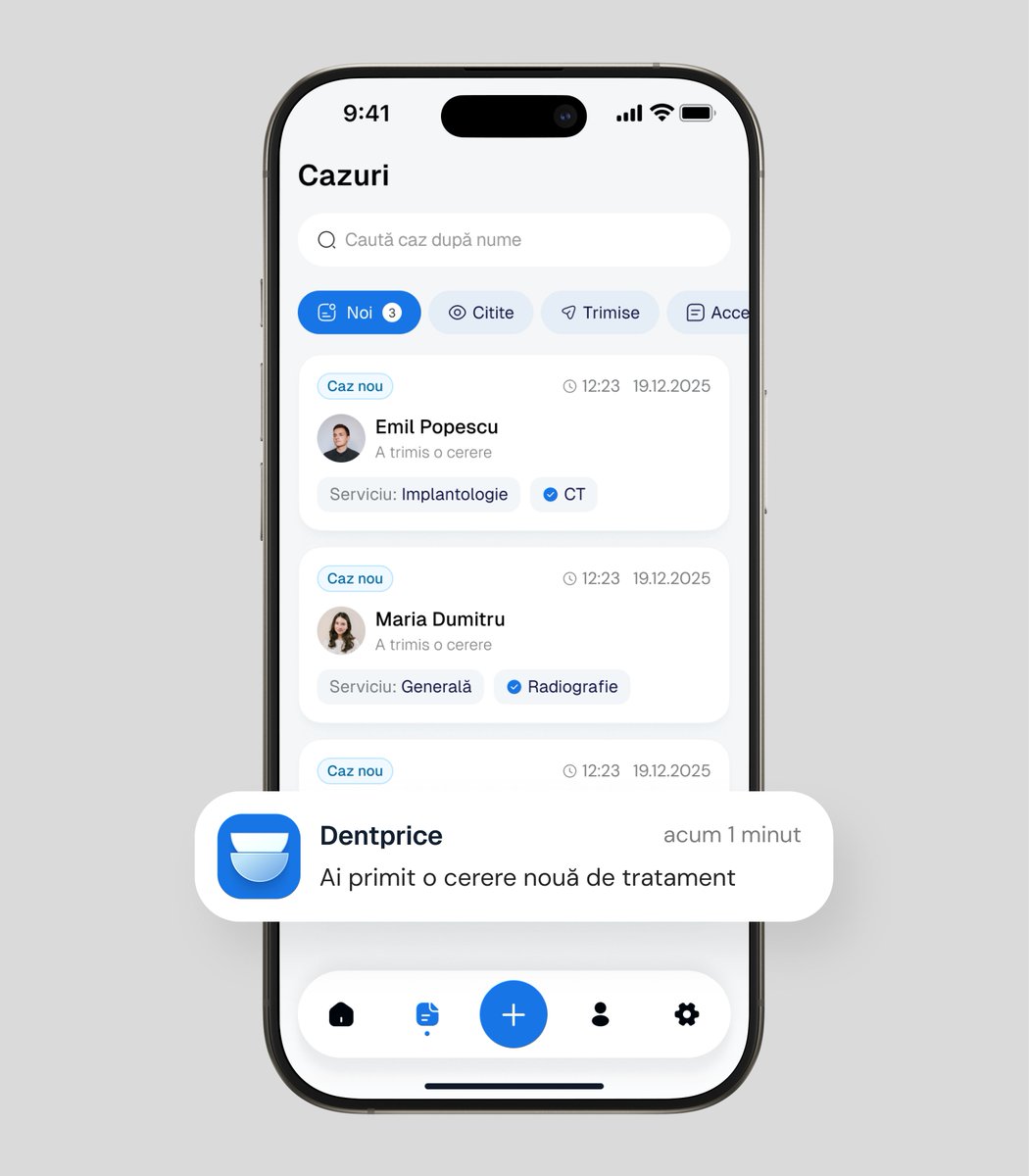
The app we designed for Dentprice from 0 → 1 live on App Store.
Worked closely with the founder from the idea stage to launch.
Did brand, website, web and native app design and build.
We delivered this investor pitch deck in 4 days.
Here's the process we used:
1. Deep discovery call with the founder
We prepared questions beforehand so the session focused on decisions, not information gathering.
2. We wrote the entire deck first
Every slide, every message, every argument
The founder reviewed the content before a single screen was designed.
(Clients usually come to us with the content but when we work on a project from idea to launch clients prefer letting us write the deck as they know we have all the context of the business within the team)
3. We used Claude to structure the information.
Not to think for us, just to organize content so we didn't start from a blank canvas.
4. We designed every slide from scratch
Each visual is custom designed and supports the story investors need to understand, not just the brand.
5. Final review
Content always reads differently once it's designed, so we gave the founder one last pass before investor meetings.
But delivery is not where the process ends.
A pitch deck is a living document.
After every investor presentation, we stay close to the client, review what they learned and improve the deck so the next pitch is stronger than the last.
The most dangerous moment for a founder it's when everything in the company starts routing through you.
It starts innocently. A designer here, a dev there, and you'll "just handle the rest."
The positioning, the coordination, the decisions between people who've never worked together.
Then one day nothing moves without you.
Every handoff waits on your reply. Every gap gets filled by you and the business can't grow past your own bandwidth.
I counted out loud how this actually happens.
What raised money in 2021 won't raise a dollar in 2026.
AI changed the math and most founders haven't caught up yet.
Back then, a sharp deck and a good story could open doors. Investors were betting on potential. On vision. On "imagine what this could become."
That era is over.
When anyone can build a working prototype in a weekend, prototypes stop being impressive.
When every pitch includes an AI demo, demos stop being differentiators.
When code is getting cheaper by the month, code alone stops being the moat.
So what are investors actually pricing now?
Execution quality, evidence and judgment.
Not "we built something." Everyone builts something now.
But "we built the right thing, in the right way, and here's proof it works."
I've been working with founders preparing for raises for a while now and the pattern is clear.
The ones who actually close aren't the ones with the most features or the biggest vision.
They're the ones where the investor can open the product, use it without a walkthrough, and think "this feels like a real company."
There are three things I keep seeing matter more than anything else right now.
I broke them down in detail in the video because they deserve more than a bullet point each. 👇
This weekend I am shooting some more videos.
This content creation thing starts to grow on me with every video and I really enjoy them.
Will be talking about design and product advice that helps founders turn a rough product into one users and investors actually trust.
Most MVPs I see aren't MVPs.
They're full products wearing a budget costume.
Founders show up with eight features on day one and call it an MVP because it's the first version.
That's not minimum.
That's everything at once, just earlier and without testing.
Talked about this one in more detail.
When to actually build an MVP and the one question that should decide your scope before anything else.
When we designed the new agency website, the rule was simple:
Show the work everywhere, not in one portfolio page.
Across the entire site, next to the service it belongs to, the industry it was built for, the deliverable it represents.
With motion and interactions that make you actually want to keep scrolling.
So visitors see proof at every scroll. Not when they decide to click into a case study.
Context beats portfolio pages every time.
The first video is out.
And it covers one of the biggest problems we keep seeing with growing SaaS companies.
“We’ve been fully focused on the features. We haven’t had the chance to update the product, site, and positioning yet.”
The product evolved. The business matured. The team scaled.
But the design still looks like the early MVP.
And most founders don’t realize how much this affects perception until it costs them something important.
One of our recent clients came to us after he lost a $10M deal because of it.
The investor checked the website before the meeting.
What he saw online felt completely different from what was presented in the pitch.
Different level. Different story. Different company.
“I don’t understand what your company does.”
That was the feedback.
Time that should have gone into the conversation was spent correcting assumptions.
Only because the product, website, and positioning stopped telling the same story.
This is exactly why design is not decoration.
It directly impacts trust, positioning, and growth.
Starting today, Nuova has a new brand identity, new website and a completely new direction 🔥
39 pages of it.
(Yeah, I counted and I'm proud of every page)
Over the past few months, we went quiet and rebuilt everything from the ground up.
The old identity did its job but we outgrew it.
The work evolved, the clients evolved, the way we think about what we do evolved. And at some point the website was telling an older version of the story.
The new site isn't a landing page anymore with a "book a call" button slapped on.
It's a proper website built to actually explain what we do, who we do it for, and why it matters.
Every page is designed to help someone make an informed decision about whether we're the right team for them.
We combine portfolio work, motion, real case studies, and the right information to make every section an experience worth having.
Three years of evolution, went through different stages and learned so many lessons.
This version finally feels like us.
Not what we were. What we've become.
Check it out in the comments.
This website design came with a huge challenge:
Introducing technology without breaking trust, in an industry that is personal, emotional, and face-to-face like dentistry is.
So we didn't design a website to show the app, we solved the tension between three different audiences at once:
- The founder who wants scale through technology
- The clinics who want qualified, reliable patients
- The patients who want clarity before they sit in the chair
The solution couldn’t feel like a tech platform. It had to feel like a professional extension of the clinic.
- If the page felt too “tech,” clinics would reject it.
- If it felt too “salesy,” patients would fear it.
- If it felt too soft, the business model wouldn’t land.
So we designed for balance.
Closer calmer and clearer.
Human in tone, precise in structure and high-trust by design.
That was the real strategy behind this website.