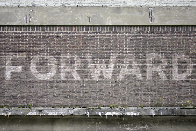
The Fonts In Use team unanimously condemns the assault on safety, security, and basic humanity continually displayed by Twitter’s new ownership. We loved it here, but can no longer justify engaging in this platform. Find us at https://t.co/sUgAgKsHuV and https://t.co/dV2ePZveBN.
@LeoVazquezC @Mikeashworth12 Agreed! Stempel didn’t trust the appeal of these idiosyncracies, and offered a second series with conventional (Futura-like) terminals. Guildford Sans is equivalent to series I, but w/ the two-story ‘a’.
It didn’t help: the design wasn’t a big hit, neither in Germany nor the UK.
@LeoVazquezC @Mikeashworth12 The name is English. The design came from Frankfurt, though, just like Futura (Kabel is from nearby Offenbach): Guildford Sans is Caslon’s name for Stempel’s Elegant-Grotesk: https://t.co/gpCYY6Tg4F
@EvaSilvertant What I’m saying is, to achieve such tightly spaced and even overlapping pairs in metal type, one would need to make ligatures. And that’s unlikely, not only because ligatures for such pairs are uncommon, but also because the visual result isn’t really convincing.
@MilesNewlyn@gabrowitsch@AdobeCC From the Adobe Blog: “[D]id you know that you can also use the fonts in other software like Microsoft Office and Keynote? They’ll appear in your font menus just like the fonts you have installed on your computer” https://t.co/7BjKOfNuMC
@JonathanHoefler@TiroTypeworks@EvaSilvertant That article you’re thinking of is probably @BaldCondensed’s about finding the “Most Totally Awesome Fleischmann Digitisation™”, incl. DTL’s, Mercury, Farnham, Fenway, and Eudald:
https://t.co/FaoAz1xtRQ
Archived version with intact encoding:
https://t.co/NNVmPCwlU4
A little belated, but I'm so honored to have been asked to write the release essay for @frerejones’s incredible new type family Community Gothic that came out earlier this week! Also excited to use the typefaces in some design projects myself soon too... https://t.co/QwIqMCnBYl
@riccard0@FontsInUse@Font_ID Right – it’s difficult to say. Maybe there was yet another alternate for A. Or maybe a sort from Semplicità ended up in the wrong case.