@olegcoada it's such a UX nightmare costing people so many opportunities. why do we have to dig through 4 different setups and multiple clicks just to see all the messages. needs a better spam filter than whatever is going on rn
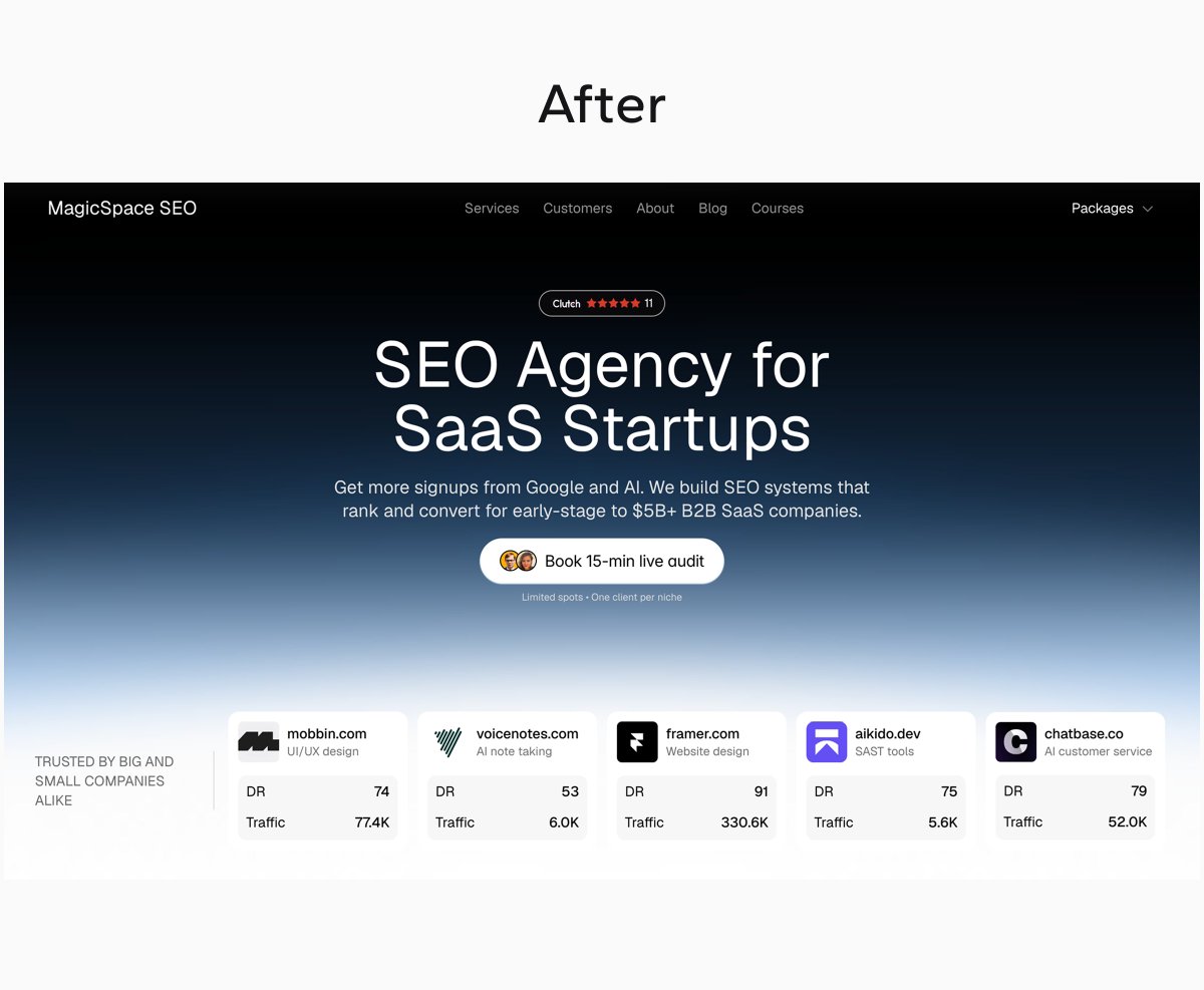
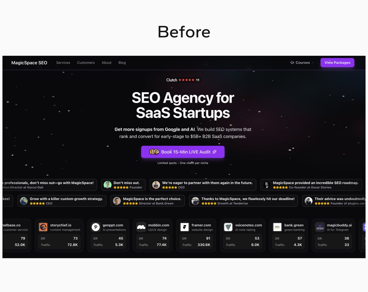
Above the fold #5:
Redesigned @magicspaceseo's hero.
Two versions: light and dark.
Focus was stripping back on visual elements and making the design more cohesive.
Here's some of the design decisions 🧵 (concept work)