Top Tweets for #Boxart

Beautiful large print of my classic DarkSide of Xeen Map that I repainted in 2014!
#illustration #popculture #boxart #mightandmagic #DarkSideofXeen #gameart

My classic Land of Xeen map painting that was included in Clouds of Xeen PC game box 1992!
#retrogaming #boxart #LandOfXeen #popculture #illustration


🔥
#POTD #promptoftheday #AI #AiArt #Art #AnimeArt #RetroGaming #BoxArt #GameArt #NES #CharacterDesign #DigitalArt #AnimeStyle #CommunityPrompt #Tartarus #ourhellourhome


Prompt of the Day: NES ILLUSTRATED ERA BOX ART GENERATOR 🎮📦💜💚
This prompt is entirely built by our good friend @ASithLawd amazing prompt and needed no modding at all
Today’s Prompt of the Day turns your character reference image into a fictional late-1980s / early-1990s illustrated console-style vertical box-front cover.
Choose your Genre, add your exact Game Title, attach your character reference image, and let the prompt build a believable lost retail game box from the illustrated commercial box-art era.
Have fun with this one 🎮
............................PROMPT STARTS HERE............................
NES ILLUSTRATED ERA BOX ART GENERATOR — MASTER PROMPT
Use the attached character image as the main character identity reference.
USER INPUTS:
* Genre: [Action / Adventure / Platformer / Light Gun / Sports / Wrestling / Racing / Puzzle / Fighting / Shooter / Horror / Fantasy Quest / RPG / Sci-Fi / Comedy / Western / Ninja / Martial Arts / Custom]
* Game Title: [INSERT TITLE]
REFERENCE IMAGE RULE:
* Image 1 = character reference.
Create a fictional retro late-1980s / early-1990s illustrated console-style vertical box-front cover based on Image 1, the selected Genre, and the selected Game Title.
This is the illustrated commercial box-art era.
There is no rigid template.
The cover should feel like a believable lost retail game box from the late NES era, where the entire design is driven by painted or illustrated cover art, genre-coded typography, and era-appropriate packaging composition.
CANVAS / FORMAT RULE:
Generate a single vertical retro game box-front cover, roughly 2:3 portrait proportions.
Do not create:
* square image
* horizontal poster
* wide banner
* cropped box
* 3D product mockup
* visible side/spine view
ILLUSTRATED ERA CORE RULE:
This cover must feel like a late-80s / early-90s illustrated game box front.
Use a fully illustrated, painted, airbrushed, cartoon-commercial, or retro commercial-art style cover design.
The exact layout may vary according to Genre, Character, and Game Title.
The final image may resemble different kinds of classic illustrated box fronts, such as:
* a full-bleed action painting
* a framed illustration on a solid background
* a dramatic hero-versus-monster composition
* a painted fantasy adventure cover
* a loud arcade-style action illustration
* a horror cover with a looming villain or creature
* a clean mascot/platformer box with simple bright composition
* a cute cartoon-commercial character showcase
* an RPG/fantasy cover with a scenic quest composition
* a sci-fi cover with dynamic machinery, ships, or futuristic threats
* a minimalist but bold character-on-background cover if that best suits the concept
Do not make the result look like a modern poster, modern key art, or a digital fan-art splash page.
VISUAL STYLE RULE:
The image should feel like real illustrated packaging art from the late NES era.
Use:
* painted or airbrushed illustration feel
* cartoon-commercial illustration when the Genre calls for it
* bold readable composition
* strong commercial-art readability
* slightly print-aged color
* high contrast
* clear focal point
* era-appropriate visual drama
* shelf-readable title design
* packaging-friendly layout
Avoid:
* modern glossy concept-art finish
* contemporary esports poster design
* cinematic movie-poster overrendering
* ultra-clean modern vector branding
* photobashing
* obvious AI mush
* anime splash-art presentation unless the concept genuinely calls for that look in an era-appropriate way
* raw pixel-art box covers
* gameplay screenshots used as the main cover design
LAYOUT FLEXIBILITY RULE:
Choose a layout that fits the Genre, Character, and Game Title.
Possible layout behaviors include:
* large title at the top with full illustration below
* framed painting beneath a title banner
* full central illustration with title integrated above or across it
* character floating on a bright background with minimal environmental detail
* hero foreground with villain or environment in the background
* group shot / montage if the concept feels ensemble-driven
* central emblematic composition if the genre or title suggests a simple iconic design
* clean mascot-style character pose on a bold simple background
The cover does not need to imitate one single box layout.
However, it must still feel like a believable NES retail cover.
REQUIRED PACKAGING ELEMENTS:
The final cover must include:
* the exact selected Game Title
* some version of the fictional N1ntend0 branding
* “ENTERTAINMENT SYSTEM” as generic packaging text
* one N1ntend0 quality seal
* optional REV-A if it fits the design
* no real-world console wordmark
The final cover may optionally include:
* a small generic banner
* a decorative border
* framed art panels
* stripes, bars, or ornamental shapes
* a small generic publisher-like mark if needed, but do not use real publisher logos
Do not use real-world company logos such as Konami, Sunsoft, or other real publishers.
N1NTEND0 BRANDING RULE:
Use fictional parody-style text replacement only.
Where a classic console wordmark would normally appear, use the fictional wordmark:
N1ntend0
Everything else about the branding should remain visually similar to retro console-box packaging:
* same general packaging role
* same red logo color when using the classic rounded-rectangle logo style
* same approximate packaging feel
* same era-appropriate readability
Use “ENTERTAINMENT SYSTEM” as generic packaging text.
The N1ntend0 branding may appear in different locations depending on the cover design, including:
* bottom-left
* bottom-center
* bottom-right
* small top area
* on a small banner or badge
Choose the placement that best fits the composition.
Do not duplicate the N1ntend0 logo excessively.
Do not render the real-world console wordmark anywhere in the image.
SEAL RULE:
Include one N1ntend0 quality seal.
The seal may be either:
* a round seal
or
* an oval seal
Choose whichever best fits the composition.
The seal should feel like an old NES-era quality seal and may resemble either:
* a round darker seal with a clean circular form
* a lighter oval seal
* an oval seal with a surrounding outline/starburst if compositionally appropriate
Replace the center branding with N1ntend0.
Keep it generic and fictional.
Do not copy a real seal exactly.
The seal may sit in a corner or along the lower area of the cover, wherever it best balances the design.
TITLE / LOGO RULE:
Use the exact selected Game Title.
The title should be designed as an era-appropriate illustrated box-art logo.
Unlike the Black Box, Silver Box, and Gold Box styles, the Illustrated Era title may be more expressive and custom-designed.
The title style should be determined by three sources:
* the selected Genre’s mood
* Image 1 character palette and identity
* the mood and wording of the selected Game Title
The title may be:
* bold
* stylized
* outlined
* shaded
* multi-colored
* gradient-filled
* banner-based
* logo-like
* hand-drawn
* serif
* sans-serif
* fantasy-styled
* action-styled
* horror-styled
* mascot-styled
* arcade-styled
The title should look like a real illustrated game-box title logo, not flat placeholder text.
The title must remain:
* readable
* era-appropriate
* shelf-readable
* visually tied to the cover art
Do not let the title become unreadable decorative nonsense.
Do not misspell the Game Title.
TITLE PLACEMENT RULE:
Choose a title placement that fits the cover design.
Common valid placements include:
* large at the top
* very large across the upper third
* bannered at the top
* integrated near the top of the illustration
* large on a bright background above the cover art
* large at the top with subtitle-like supporting text below
* large near the center if that fits a minimalist composition
The title must remain a major design element.
GENERAL CHARACTER INTERPRETATION RULE:
Analyze Image 1 and infer:
* identity
* silhouette
* face shape
* hairstyle
* colors
* outfit motifs
* body type
* accessories
* implied powers
* combat style
* archetype
* species traits
* personality
* overall vibe
Use those traits to create a strong illustrated-era box-cover interpretation.
If the character appears directly on the cover, preserve their recognizable identity.
The cover may depict the character as:
* hero
* villain
* antihero
* mascot
* athlete
* fighter
* adventurer
* pilot
* monster
* mystery figure
* central icon
The result should feel like the same character reinterpreted through retro commercial box-art language.
ILLUSTRATED CHARACTER STYLE RANGE RULE:
The character’s rendering style should adapt to the selected Genre.
The character does not always need to be rendered realistically.
For mascot-friendly genres such as Platformer, Puzzle, Comedy, bright Adventure, and some Sports concepts, the character may be simplified into a cuter, more mascot-like illustrated version.
Mascot-style adaptation may include:
* rounder shapes
* larger expressive eyes
* simplified facial features
* softer proportions
* more playful pose language
* cleaner silhouette
* brighter color handling
* less realistic anatomy
* more cartoon-commercial packaging energy
Preserve the character’s recognizable identity through:
* core color palette
* hairstyle or head shape
* outfit motifs
* signature accessories
* species traits
* silhouette cues
* personality
For darker, more intense genres such as Horror, Fighting, Shooter, RPG, Sci-Fi, Western, Ninja, Martial Arts, or serious Action, use a more dramatic painted/commercial illustration style unless the Game Title clearly suggests comedy or mascot treatment.
Do not force realism when the selected Genre would historically favor mascot-style box art.
GENRE INTERPRETATION RULE:
The selected Genre should heavily influence:
* cover composition
* environment
* action
* enemies or supporting imagery
* title style
* overall energy
* framing choices
* color mood
* character rendering style
Examples:
* Action: explosive action, danger, weapons, movement, intense hero pose
* Adventure: exploration, treasure, ruins, mystery, relics, scenic discovery
* Platformer: bright mascot energy, jumping, whimsical motion, colorful simplicity, cute simplified character treatment
* Light Gun: targets, outlaws, monsters, action aiming, shooting-gallery energy
* Sports: athletic hero pose, competition, movement, stadium or arena cues, mascot-like character treatment when appropriate
* Wrestling: dramatic grapple energy, ring presence, bold character showdown
* Racing: speed, track, vehicle, motion, arcade intensity
* Puzzle: iconic objects, symbols, graphic clarity, clever abstract structure, cute or mascot-like character treatment when appropriate
* Fighting: one-on-one confrontation, rival energy, martial tension
* Shooter: ships, lasers, blasters, enemy threats, arcade chaos
* Horror: looming menace, cursed atmosphere, monsters, gothic or eerie imagery
* Fantasy Quest: swords, magic, relics, monsters, kingdoms, immediate fantasy drama
* RPG: epic quest energy, world-scale stakes, prophecy, castles, villains, scenic fantasy
* Sci-Fi: tech, planets, aliens, mechs, starfields, futuristic danger
* Comedy: absurd premise treated like a real game concept, playful exaggeration, cartoonish or mascot-like character treatment when appropriate
* Western: outlaws, saloons, desert, horses, dust, duels
* Ninja: rooftops, moonlight, stealth, blades, fast movement
* Martial Arts: dojo, tournament, discipline, impact, kicks and punches
* Custom: infer the most fitting retro-game cover concept from the user’s premise
COMPOSITION MODE RULE:
Choose the composition mode that best fits the concept.
Strong possible modes include:
1. Hero Foreground Mode
* character large in foreground
* danger or environment behind
* ideal for action, adventure, western, martial arts, horror
2. Hero vs Threat Mode
* character facing villain, monster, or looming threat
* ideal for horror, fantasy, action, shooter
3. Scenic Quest Mode
* character plus large environment, castle, landscape, or objective
* ideal for adventure, RPG, fantasy quest, sci-fi
4. Mascot Showcase Mode
* character simplified into a cute, iconic, shelf-readable mascot-style illustration
* bold bright background
* playful pose
* clean silhouette
* ideal for platformer, comedy, puzzle, bright adventure, and some sports concepts
5. Ensemble / Montage Mode
* multiple supporting visual elements arranged around central character
* ideal for larger story concepts, action, shooter, RPG
6. Object / Symbol Driven Mode
* composition built around a striking object, creature, or concept image
* ideal for puzzle, horror, comedy, abstract titles, some sci-fi
Choose the one that gives the cover the strongest retail-box identity.
COLOR RULE:
Color should be driven by Genre, Character, and Title mood.
The cover may be:
* bright and clean
* moody and dark
* saturated and loud
* eerie and atmospheric
* warm and heroic
* cool and mysterious
Use color like a commercial illustrator would use it to sell the game instantly from the shelf.
Do not lock all covers into one palette.
ILLUSTRATION RULE:
The cover art should feel custom-made for the game concept.
Do not make it generic.
Use meaningful visual cues from:
* character identity
* costume and accessories
* genre language
* implied gameplay premise
* title wording
If the title suggests a strong visual hook, exploit it.
For example:
* monster name -> show monster energy
* relic name -> show relic or quest atmosphere
* sports or racing title -> show competitive movement
* joke title -> sell the joke through the imagery while keeping it like a real box cover
SUBTLE BOX WEAR RULE:
The cover should look like a real printed cardboard game box from the late 1980s, but still clean and well preserved.
Add only a very small amount of localized physical wear:
* a few tiny corner scuffs
* one or two faint edge marks
* very light cardboard print texture
* tiny isolated ink imperfections
Keep the wear sparse, uneven, and barely noticeable.
Do not apply uniform aging across the whole cover.
Do not add heavy scratches, grime, stains, tears, folds, water damage, mold, dirt, or strong distressing.
The box should look lightly handled, not old and damaged.
PROMPT TEXT VISIBILITY RULE:
Do not render this prompt, headings, labels, instructions, explanations, section names, genre labels, or prompt metadata anywhere in the image.
The final image may contain only intended box-cover text such as:
* exact selected Game Title
* N1ntend0
* ENTERTAINMENT SYSTEM
* the N1ntend0 quality seal
* optional REV-A
* any small packaging text naturally appropriate to the illustrated-era box concept
Do NOT show text such as:
* “NES ILLUSTRATED ERA BOX ART GENERATOR”
* “USER INPUTS”
* “Genre”
* “Game Title”
* fake prompt labels
* prompt instructions or category labels
QUALITY / FAILURE PREVENTION:
The final image must be:
* clean
* coherent
* readable
* era-accurate
* high quality without looking modern
* strongly illustrative
* clearly designed like a retail box front
* clean and well preserved, with only tiny localized signs of handling
Avoid:
* real publisher logos
* real-world console wordmark
* modern ESRB ratings
* barcode on the front unless requested
* cluttered unreadable layout
* weak generic poster composition
* floating random elements
* broken anatomy
* extra limbs
* duplicated faces
* melted facial features
* unreadable title logo
* tiny insignificant title
* seal missing entirely
* N1ntend0 branding missing entirely
* modern fan-poster layout
* gameplay screenshot replacing the cover art
* raw pixel-art main cover
* full modern digital-painting polish with no retro print character
* forcing realistic anatomy for mascot-friendly genres
* uniform aging overlay across the whole cover
* excessive grime, scratches, stains, or damage
* perfectly pristine modern digital-poster finish
TEXT ACCURACY RULE:
Spell [INSERT TITLE] exactly.
Do not invent a different main title.
Do not render prompt headings or instructions as visible box-cover text.
Do not render the real-world console wordmark.
FINAL GOAL:
Generate a convincing fictional late-1980s / early-1990s illustrated-era NES-style game box cover based on Image 1, the selected Genre, and the selected Game Title.
The result should look like a believable lost retro retail box with illustrated commercial cover art, era-appropriate layout freedom, strong title-logo design, one N1ntend0 quality seal, some version of the N1ntend0 branding, only tiny localized signs of handling, and a visual concept clearly extrapolated from the character, genre, and title.
..............................END OF PROMPT..................................
#POTD #promptoftheday #AI #AiArt #Art #AnimeArt #RetroGaming #BoxArt #GameArt #NES #CharacterDesign #DigitalArt #AnimeStyle #CommunityPrompt #Tartarus #ourhellourhome
![EvaGlitchAI's tweet photo. Prompt of the Day: NES ILLUSTRATED ERA BOX ART GENERATOR 🎮📦💜💚
This prompt is entirely built by our good friend @ASithLawd amazing prompt and needed no modding at all
Today’s Prompt of the Day turns your character reference image into a fictional late-1980s / early-1990s illustrated console-style vertical box-front cover.
Choose your Genre, add your exact Game Title, attach your character reference image, and let the prompt build a believable lost retail game box from the illustrated commercial box-art era.
Have fun with this one 🎮
............................PROMPT STARTS HERE............................
NES ILLUSTRATED ERA BOX ART GENERATOR — MASTER PROMPT
Use the attached character image as the main character identity reference.
USER INPUTS:
* Genre: [Action / Adventure / Platformer / Light Gun / Sports / Wrestling / Racing / Puzzle / Fighting / Shooter / Horror / Fantasy Quest / RPG / Sci-Fi / Comedy / Western / Ninja / Martial Arts / Custom]
* Game Title: [INSERT TITLE]
REFERENCE IMAGE RULE:
* Image 1 = character reference.
Create a fictional retro late-1980s / early-1990s illustrated console-style vertical box-front cover based on Image 1, the selected Genre, and the selected Game Title.
This is the illustrated commercial box-art era.
There is no rigid template.
The cover should feel like a believable lost retail game box from the late NES era, where the entire design is driven by painted or illustrated cover art, genre-coded typography, and era-appropriate packaging composition.
CANVAS / FORMAT RULE:
Generate a single vertical retro game box-front cover, roughly 2:3 portrait proportions.
Do not create:
* square image
* horizontal poster
* wide banner
* cropped box
* 3D product mockup
* visible side/spine view
ILLUSTRATED ERA CORE RULE:
This cover must feel like a late-80s / early-90s illustrated game box front.
Use a fully illustrated, painted, airbrushed, cartoon-commercial, or retro commercial-art style cover design.
The exact layout may vary according to Genre, Character, and Game Title.
The final image may resemble different kinds of classic illustrated box fronts, such as:
* a full-bleed action painting
* a framed illustration on a solid background
* a dramatic hero-versus-monster composition
* a painted fantasy adventure cover
* a loud arcade-style action illustration
* a horror cover with a looming villain or creature
* a clean mascot/platformer box with simple bright composition
* a cute cartoon-commercial character showcase
* an RPG/fantasy cover with a scenic quest composition
* a sci-fi cover with dynamic machinery, ships, or futuristic threats
* a minimalist but bold character-on-background cover if that best suits the concept
Do not make the result look like a modern poster, modern key art, or a digital fan-art splash page.
VISUAL STYLE RULE:
The image should feel like real illustrated packaging art from the late NES era.
Use:
* painted or airbrushed illustration feel
* cartoon-commercial illustration when the Genre calls for it
* bold readable composition
* strong commercial-art readability
* slightly print-aged color
* high contrast
* clear focal point
* era-appropriate visual drama
* shelf-readable title design
* packaging-friendly layout
Avoid:
* modern glossy concept-art finish
* contemporary esports poster design
* cinematic movie-poster overrendering
* ultra-clean modern vector branding
* photobashing
* obvious AI mush
* anime splash-art presentation unless the concept genuinely calls for that look in an era-appropriate way
* raw pixel-art box covers
* gameplay screenshots used as the main cover design
LAYOUT FLEXIBILITY RULE:
Choose a layout that fits the Genre, Character, and Game Title.
Possible layout behaviors include:
* large title at the top with full illustration below
* framed painting beneath a title banner
* full central illustration with title integrated above or across it
* character floating on a bright background with minimal environmental detail
* hero foreground with villain or environment in the background
* group shot / montage if the concept feels ensemble-driven
* central emblematic composition if the genre or title suggests a simple iconic design
* clean mascot-style character pose on a bold simple background
The cover does not need to imitate one single box layout.
However, it must still feel like a believable NES retail cover.
REQUIRED PACKAGING ELEMENTS:
The final cover must include:
* the exact selected Game Title
* some version of the fictional N1ntend0 branding
* “ENTERTAINMENT SYSTEM” as generic packaging text
* one N1ntend0 quality seal
* optional REV-A if it fits the design
* no real-world console wordmark
The final cover may optionally include:
* a small generic banner
* a decorative border
* framed art panels
* stripes, bars, or ornamental shapes
* a small generic publisher-like mark if needed, but do not use real publisher logos
Do not use real-world company logos such as Konami, Sunsoft, or other real publishers.
N1NTEND0 BRANDING RULE:
Use fictional parody-style text replacement only.
Where a classic console wordmark would normally appear, use the fictional wordmark:
N1ntend0
Everything else about the branding should remain visually similar to retro console-box packaging:
* same general packaging role
* same red logo color when using the classic rounded-rectangle logo style
* same approximate packaging feel
* same era-appropriate readability
Use “ENTERTAINMENT SYSTEM” as generic packaging text.
The N1ntend0 branding may appear in different locations depending on the cover design, including:
* bottom-left
* bottom-center
* bottom-right
* small top area
* on a small banner or badge
Choose the placement that best fits the composition.
Do not duplicate the N1ntend0 logo excessively.
Do not render the real-world console wordmark anywhere in the image.
SEAL RULE:
Include one N1ntend0 quality seal.
The seal may be either:
* a round seal
or
* an oval seal
Choose whichever best fits the composition.
The seal should feel like an old NES-era quality seal and may resemble either:
* a round darker seal with a clean circular form
* a lighter oval seal
* an oval seal with a surrounding outline/starburst if compositionally appropriate
Replace the center branding with N1ntend0.
Keep it generic and fictional.
Do not copy a real seal exactly.
The seal may sit in a corner or along the lower area of the cover, wherever it best balances the design.
TITLE / LOGO RULE:
Use the exact selected Game Title.
The title should be designed as an era-appropriate illustrated box-art logo.
Unlike the Black Box, Silver Box, and Gold Box styles, the Illustrated Era title may be more expressive and custom-designed.
The title style should be determined by three sources:
* the selected Genre’s mood
* Image 1 character palette and identity
* the mood and wording of the selected Game Title
The title may be:
* bold
* stylized
* outlined
* shaded
* multi-colored
* gradient-filled
* banner-based
* logo-like
* hand-drawn
* serif
* sans-serif
* fantasy-styled
* action-styled
* horror-styled
* mascot-styled
* arcade-styled
The title should look like a real illustrated game-box title logo, not flat placeholder text.
The title must remain:
* readable
* era-appropriate
* shelf-readable
* visually tied to the cover art
Do not let the title become unreadable decorative nonsense.
Do not misspell the Game Title.
TITLE PLACEMENT RULE:
Choose a title placement that fits the cover design.
Common valid placements include:
* large at the top
* very large across the upper third
* bannered at the top
* integrated near the top of the illustration
* large on a bright background above the cover art
* large at the top with subtitle-like supporting text below
* large near the center if that fits a minimalist composition
The title must remain a major design element.
GENERAL CHARACTER INTERPRETATION RULE:
Analyze Image 1 and infer:
* identity
* silhouette
* face shape
* hairstyle
* colors
* outfit motifs
* body type
* accessories
* implied powers
* combat style
* archetype
* species traits
* personality
* overall vibe
Use those traits to create a strong illustrated-era box-cover interpretation.
If the character appears directly on the cover, preserve their recognizable identity.
The cover may depict the character as:
* hero
* villain
* antihero
* mascot
* athlete
* fighter
* adventurer
* pilot
* monster
* mystery figure
* central icon
The result should feel like the same character reinterpreted through retro commercial box-art language.
ILLUSTRATED CHARACTER STYLE RANGE RULE:
The character’s rendering style should adapt to the selected Genre.
The character does not always need to be rendered realistically.
For mascot-friendly genres such as Platformer, Puzzle, Comedy, bright Adventure, and some Sports concepts, the character may be simplified into a cuter, more mascot-like illustrated version.
Mascot-style adaptation may include:
* rounder shapes
* larger expressive eyes
* simplified facial features
* softer proportions
* more playful pose language
* cleaner silhouette
* brighter color handling
* less realistic anatomy
* more cartoon-commercial packaging energy
Preserve the character’s recognizable identity through:
* core color palette
* hairstyle or head shape
* outfit motifs
* signature accessories
* species traits
* silhouette cues
* personality
For darker, more intense genres such as Horror, Fighting, Shooter, RPG, Sci-Fi, Western, Ninja, Martial Arts, or serious Action, use a more dramatic painted/commercial illustration style unless the Game Title clearly suggests comedy or mascot treatment.
Do not force realism when the selected Genre would historically favor mascot-style box art.
GENRE INTERPRETATION RULE:
The selected Genre should heavily influence:
* cover composition
* environment
* action
* enemies or supporting imagery
* title style
* overall energy
* framing choices
* color mood
* character rendering style
Examples:
* Action: explosive action, danger, weapons, movement, intense hero pose
* Adventure: exploration, treasure, ruins, mystery, relics, scenic discovery
* Platformer: bright mascot energy, jumping, whimsical motion, colorful simplicity, cute simplified character treatment
* Light Gun: targets, outlaws, monsters, action aiming, shooting-gallery energy
* Sports: athletic hero pose, competition, movement, stadium or arena cues, mascot-like character treatment when appropriate
* Wrestling: dramatic grapple energy, ring presence, bold character showdown
* Racing: speed, track, vehicle, motion, arcade intensity
* Puzzle: iconic objects, symbols, graphic clarity, clever abstract structure, cute or mascot-like character treatment when appropriate
* Fighting: one-on-one confrontation, rival energy, martial tension
* Shooter: ships, lasers, blasters, enemy threats, arcade chaos
* Horror: looming menace, cursed atmosphere, monsters, gothic or eerie imagery
* Fantasy Quest: swords, magic, relics, monsters, kingdoms, immediate fantasy drama
* RPG: epic quest energy, world-scale stakes, prophecy, castles, villains, scenic fantasy
* Sci-Fi: tech, planets, aliens, mechs, starfields, futuristic danger
* Comedy: absurd premise treated like a real game concept, playful exaggeration, cartoonish or mascot-like character treatment when appropriate
* Western: outlaws, saloons, desert, horses, dust, duels
* Ninja: rooftops, moonlight, stealth, blades, fast movement
* Martial Arts: dojo, tournament, discipline, impact, kicks and punches
* Custom: infer the most fitting retro-game cover concept from the user’s premise
COMPOSITION MODE RULE:
Choose the composition mode that best fits the concept.
Strong possible modes include:
1. Hero Foreground Mode
* character large in foreground
* danger or environment behind
* ideal for action, adventure, western, martial arts, horror
2. Hero vs Threat Mode
* character facing villain, monster, or looming threat
* ideal for horror, fantasy, action, shooter
3. Scenic Quest Mode
* character plus large environment, castle, landscape, or objective
* ideal for adventure, RPG, fantasy quest, sci-fi
4. Mascot Showcase Mode
* character simplified into a cute, iconic, shelf-readable mascot-style illustration
* bold bright background
* playful pose
* clean silhouette
* ideal for platformer, comedy, puzzle, bright adventure, and some sports concepts
5. Ensemble / Montage Mode
* multiple supporting visual elements arranged around central character
* ideal for larger story concepts, action, shooter, RPG
6. Object / Symbol Driven Mode
* composition built around a striking object, creature, or concept image
* ideal for puzzle, horror, comedy, abstract titles, some sci-fi
Choose the one that gives the cover the strongest retail-box identity.
COLOR RULE:
Color should be driven by Genre, Character, and Title mood.
The cover may be:
* bright and clean
* moody and dark
* saturated and loud
* eerie and atmospheric
* warm and heroic
* cool and mysterious
Use color like a commercial illustrator would use it to sell the game instantly from the shelf.
Do not lock all covers into one palette.
ILLUSTRATION RULE:
The cover art should feel custom-made for the game concept.
Do not make it generic.
Use meaningful visual cues from:
* character identity
* costume and accessories
* genre language
* implied gameplay premise
* title wording
If the title suggests a strong visual hook, exploit it.
For example:
* monster name -> show monster energy
* relic name -> show relic or quest atmosphere
* sports or racing title -> show competitive movement
* joke title -> sell the joke through the imagery while keeping it like a real box cover
SUBTLE BOX WEAR RULE:
The cover should look like a real printed cardboard game box from the late 1980s, but still clean and well preserved.
Add only a very small amount of localized physical wear:
* a few tiny corner scuffs
* one or two faint edge marks
* very light cardboard print texture
* tiny isolated ink imperfections
Keep the wear sparse, uneven, and barely noticeable.
Do not apply uniform aging across the whole cover.
Do not add heavy scratches, grime, stains, tears, folds, water damage, mold, dirt, or strong distressing.
The box should look lightly handled, not old and damaged.
PROMPT TEXT VISIBILITY RULE:
Do not render this prompt, headings, labels, instructions, explanations, section names, genre labels, or prompt metadata anywhere in the image.
The final image may contain only intended box-cover text such as:
* exact selected Game Title
* N1ntend0
* ENTERTAINMENT SYSTEM
* the N1ntend0 quality seal
* optional REV-A
* any small packaging text naturally appropriate to the illustrated-era box concept
Do NOT show text such as:
* “NES ILLUSTRATED ERA BOX ART GENERATOR”
* “USER INPUTS”
* “Genre”
* “Game Title”
* fake prompt labels
* prompt instructions or category labels
QUALITY / FAILURE PREVENTION:
The final image must be:
* clean
* coherent
* readable
* era-accurate
* high quality without looking modern
* strongly illustrative
* clearly designed like a retail box front
* clean and well preserved, with only tiny localized signs of handling
Avoid:
* real publisher logos
* real-world console wordmark
* modern ESRB ratings
* barcode on the front unless requested
* cluttered unreadable layout
* weak generic poster composition
* floating random elements
* broken anatomy
* extra limbs
* duplicated faces
* melted facial features
* unreadable title logo
* tiny insignificant title
* seal missing entirely
* N1ntend0 branding missing entirely
* modern fan-poster layout
* gameplay screenshot replacing the cover art
* raw pixel-art main cover
* full modern digital-painting polish with no retro print character
* forcing realistic anatomy for mascot-friendly genres
* uniform aging overlay across the whole cover
* excessive grime, scratches, stains, or damage
* perfectly pristine modern digital-poster finish
TEXT ACCURACY RULE:
Spell [INSERT TITLE] exactly.
Do not invent a different main title.
Do not render prompt headings or instructions as visible box-cover text.
Do not render the real-world console wordmark.
FINAL GOAL:
Generate a convincing fictional late-1980s / early-1990s illustrated-era NES-style game box cover based on Image 1, the selected Genre, and the selected Game Title.
The result should look like a believable lost retro retail box with illustrated commercial cover art, era-appropriate layout freedom, strong title-logo design, one N1ntend0 quality seal, some version of the N1ntend0 branding, only tiny localized signs of handling, and a visual concept clearly extrapolated from the character, genre, and title.
..............................END OF PROMPT..................................
#POTD #promptoftheday #AI #AiArt #Art #AnimeArt #RetroGaming #BoxArt #GameArt #NES #CharacterDesign #DigitalArt #AnimeStyle #CommunityPrompt #Tartarus #ourhellourhome](https://pbs.twimg.com/media/HLnJJuVbcAAbVP3.jpg)
![EvaGlitchAI's tweet photo. Prompt of the Day: NES ILLUSTRATED ERA BOX ART GENERATOR 🎮📦💜💚
This prompt is entirely built by our good friend @ASithLawd amazing prompt and needed no modding at all
Today’s Prompt of the Day turns your character reference image into a fictional late-1980s / early-1990s illustrated console-style vertical box-front cover.
Choose your Genre, add your exact Game Title, attach your character reference image, and let the prompt build a believable lost retail game box from the illustrated commercial box-art era.
Have fun with this one 🎮
............................PROMPT STARTS HERE............................
NES ILLUSTRATED ERA BOX ART GENERATOR — MASTER PROMPT
Use the attached character image as the main character identity reference.
USER INPUTS:
* Genre: [Action / Adventure / Platformer / Light Gun / Sports / Wrestling / Racing / Puzzle / Fighting / Shooter / Horror / Fantasy Quest / RPG / Sci-Fi / Comedy / Western / Ninja / Martial Arts / Custom]
* Game Title: [INSERT TITLE]
REFERENCE IMAGE RULE:
* Image 1 = character reference.
Create a fictional retro late-1980s / early-1990s illustrated console-style vertical box-front cover based on Image 1, the selected Genre, and the selected Game Title.
This is the illustrated commercial box-art era.
There is no rigid template.
The cover should feel like a believable lost retail game box from the late NES era, where the entire design is driven by painted or illustrated cover art, genre-coded typography, and era-appropriate packaging composition.
CANVAS / FORMAT RULE:
Generate a single vertical retro game box-front cover, roughly 2:3 portrait proportions.
Do not create:
* square image
* horizontal poster
* wide banner
* cropped box
* 3D product mockup
* visible side/spine view
ILLUSTRATED ERA CORE RULE:
This cover must feel like a late-80s / early-90s illustrated game box front.
Use a fully illustrated, painted, airbrushed, cartoon-commercial, or retro commercial-art style cover design.
The exact layout may vary according to Genre, Character, and Game Title.
The final image may resemble different kinds of classic illustrated box fronts, such as:
* a full-bleed action painting
* a framed illustration on a solid background
* a dramatic hero-versus-monster composition
* a painted fantasy adventure cover
* a loud arcade-style action illustration
* a horror cover with a looming villain or creature
* a clean mascot/platformer box with simple bright composition
* a cute cartoon-commercial character showcase
* an RPG/fantasy cover with a scenic quest composition
* a sci-fi cover with dynamic machinery, ships, or futuristic threats
* a minimalist but bold character-on-background cover if that best suits the concept
Do not make the result look like a modern poster, modern key art, or a digital fan-art splash page.
VISUAL STYLE RULE:
The image should feel like real illustrated packaging art from the late NES era.
Use:
* painted or airbrushed illustration feel
* cartoon-commercial illustration when the Genre calls for it
* bold readable composition
* strong commercial-art readability
* slightly print-aged color
* high contrast
* clear focal point
* era-appropriate visual drama
* shelf-readable title design
* packaging-friendly layout
Avoid:
* modern glossy concept-art finish
* contemporary esports poster design
* cinematic movie-poster overrendering
* ultra-clean modern vector branding
* photobashing
* obvious AI mush
* anime splash-art presentation unless the concept genuinely calls for that look in an era-appropriate way
* raw pixel-art box covers
* gameplay screenshots used as the main cover design
LAYOUT FLEXIBILITY RULE:
Choose a layout that fits the Genre, Character, and Game Title.
Possible layout behaviors include:
* large title at the top with full illustration below
* framed painting beneath a title banner
* full central illustration with title integrated above or across it
* character floating on a bright background with minimal environmental detail
* hero foreground with villain or environment in the background
* group shot / montage if the concept feels ensemble-driven
* central emblematic composition if the genre or title suggests a simple iconic design
* clean mascot-style character pose on a bold simple background
The cover does not need to imitate one single box layout.
However, it must still feel like a believable NES retail cover.
REQUIRED PACKAGING ELEMENTS:
The final cover must include:
* the exact selected Game Title
* some version of the fictional N1ntend0 branding
* “ENTERTAINMENT SYSTEM” as generic packaging text
* one N1ntend0 quality seal
* optional REV-A if it fits the design
* no real-world console wordmark
The final cover may optionally include:
* a small generic banner
* a decorative border
* framed art panels
* stripes, bars, or ornamental shapes
* a small generic publisher-like mark if needed, but do not use real publisher logos
Do not use real-world company logos such as Konami, Sunsoft, or other real publishers.
N1NTEND0 BRANDING RULE:
Use fictional parody-style text replacement only.
Where a classic console wordmark would normally appear, use the fictional wordmark:
N1ntend0
Everything else about the branding should remain visually similar to retro console-box packaging:
* same general packaging role
* same red logo color when using the classic rounded-rectangle logo style
* same approximate packaging feel
* same era-appropriate readability
Use “ENTERTAINMENT SYSTEM” as generic packaging text.
The N1ntend0 branding may appear in different locations depending on the cover design, including:
* bottom-left
* bottom-center
* bottom-right
* small top area
* on a small banner or badge
Choose the placement that best fits the composition.
Do not duplicate the N1ntend0 logo excessively.
Do not render the real-world console wordmark anywhere in the image.
SEAL RULE:
Include one N1ntend0 quality seal.
The seal may be either:
* a round seal
or
* an oval seal
Choose whichever best fits the composition.
The seal should feel like an old NES-era quality seal and may resemble either:
* a round darker seal with a clean circular form
* a lighter oval seal
* an oval seal with a surrounding outline/starburst if compositionally appropriate
Replace the center branding with N1ntend0.
Keep it generic and fictional.
Do not copy a real seal exactly.
The seal may sit in a corner or along the lower area of the cover, wherever it best balances the design.
TITLE / LOGO RULE:
Use the exact selected Game Title.
The title should be designed as an era-appropriate illustrated box-art logo.
Unlike the Black Box, Silver Box, and Gold Box styles, the Illustrated Era title may be more expressive and custom-designed.
The title style should be determined by three sources:
* the selected Genre’s mood
* Image 1 character palette and identity
* the mood and wording of the selected Game Title
The title may be:
* bold
* stylized
* outlined
* shaded
* multi-colored
* gradient-filled
* banner-based
* logo-like
* hand-drawn
* serif
* sans-serif
* fantasy-styled
* action-styled
* horror-styled
* mascot-styled
* arcade-styled
The title should look like a real illustrated game-box title logo, not flat placeholder text.
The title must remain:
* readable
* era-appropriate
* shelf-readable
* visually tied to the cover art
Do not let the title become unreadable decorative nonsense.
Do not misspell the Game Title.
TITLE PLACEMENT RULE:
Choose a title placement that fits the cover design.
Common valid placements include:
* large at the top
* very large across the upper third
* bannered at the top
* integrated near the top of the illustration
* large on a bright background above the cover art
* large at the top with subtitle-like supporting text below
* large near the center if that fits a minimalist composition
The title must remain a major design element.
GENERAL CHARACTER INTERPRETATION RULE:
Analyze Image 1 and infer:
* identity
* silhouette
* face shape
* hairstyle
* colors
* outfit motifs
* body type
* accessories
* implied powers
* combat style
* archetype
* species traits
* personality
* overall vibe
Use those traits to create a strong illustrated-era box-cover interpretation.
If the character appears directly on the cover, preserve their recognizable identity.
The cover may depict the character as:
* hero
* villain
* antihero
* mascot
* athlete
* fighter
* adventurer
* pilot
* monster
* mystery figure
* central icon
The result should feel like the same character reinterpreted through retro commercial box-art language.
ILLUSTRATED CHARACTER STYLE RANGE RULE:
The character’s rendering style should adapt to the selected Genre.
The character does not always need to be rendered realistically.
For mascot-friendly genres such as Platformer, Puzzle, Comedy, bright Adventure, and some Sports concepts, the character may be simplified into a cuter, more mascot-like illustrated version.
Mascot-style adaptation may include:
* rounder shapes
* larger expressive eyes
* simplified facial features
* softer proportions
* more playful pose language
* cleaner silhouette
* brighter color handling
* less realistic anatomy
* more cartoon-commercial packaging energy
Preserve the character’s recognizable identity through:
* core color palette
* hairstyle or head shape
* outfit motifs
* signature accessories
* species traits
* silhouette cues
* personality
For darker, more intense genres such as Horror, Fighting, Shooter, RPG, Sci-Fi, Western, Ninja, Martial Arts, or serious Action, use a more dramatic painted/commercial illustration style unless the Game Title clearly suggests comedy or mascot treatment.
Do not force realism when the selected Genre would historically favor mascot-style box art.
GENRE INTERPRETATION RULE:
The selected Genre should heavily influence:
* cover composition
* environment
* action
* enemies or supporting imagery
* title style
* overall energy
* framing choices
* color mood
* character rendering style
Examples:
* Action: explosive action, danger, weapons, movement, intense hero pose
* Adventure: exploration, treasure, ruins, mystery, relics, scenic discovery
* Platformer: bright mascot energy, jumping, whimsical motion, colorful simplicity, cute simplified character treatment
* Light Gun: targets, outlaws, monsters, action aiming, shooting-gallery energy
* Sports: athletic hero pose, competition, movement, stadium or arena cues, mascot-like character treatment when appropriate
* Wrestling: dramatic grapple energy, ring presence, bold character showdown
* Racing: speed, track, vehicle, motion, arcade intensity
* Puzzle: iconic objects, symbols, graphic clarity, clever abstract structure, cute or mascot-like character treatment when appropriate
* Fighting: one-on-one confrontation, rival energy, martial tension
* Shooter: ships, lasers, blasters, enemy threats, arcade chaos
* Horror: looming menace, cursed atmosphere, monsters, gothic or eerie imagery
* Fantasy Quest: swords, magic, relics, monsters, kingdoms, immediate fantasy drama
* RPG: epic quest energy, world-scale stakes, prophecy, castles, villains, scenic fantasy
* Sci-Fi: tech, planets, aliens, mechs, starfields, futuristic danger
* Comedy: absurd premise treated like a real game concept, playful exaggeration, cartoonish or mascot-like character treatment when appropriate
* Western: outlaws, saloons, desert, horses, dust, duels
* Ninja: rooftops, moonlight, stealth, blades, fast movement
* Martial Arts: dojo, tournament, discipline, impact, kicks and punches
* Custom: infer the most fitting retro-game cover concept from the user’s premise
COMPOSITION MODE RULE:
Choose the composition mode that best fits the concept.
Strong possible modes include:
1. Hero Foreground Mode
* character large in foreground
* danger or environment behind
* ideal for action, adventure, western, martial arts, horror
2. Hero vs Threat Mode
* character facing villain, monster, or looming threat
* ideal for horror, fantasy, action, shooter
3. Scenic Quest Mode
* character plus large environment, castle, landscape, or objective
* ideal for adventure, RPG, fantasy quest, sci-fi
4. Mascot Showcase Mode
* character simplified into a cute, iconic, shelf-readable mascot-style illustration
* bold bright background
* playful pose
* clean silhouette
* ideal for platformer, comedy, puzzle, bright adventure, and some sports concepts
5. Ensemble / Montage Mode
* multiple supporting visual elements arranged around central character
* ideal for larger story concepts, action, shooter, RPG
6. Object / Symbol Driven Mode
* composition built around a striking object, creature, or concept image
* ideal for puzzle, horror, comedy, abstract titles, some sci-fi
Choose the one that gives the cover the strongest retail-box identity.
COLOR RULE:
Color should be driven by Genre, Character, and Title mood.
The cover may be:
* bright and clean
* moody and dark
* saturated and loud
* eerie and atmospheric
* warm and heroic
* cool and mysterious
Use color like a commercial illustrator would use it to sell the game instantly from the shelf.
Do not lock all covers into one palette.
ILLUSTRATION RULE:
The cover art should feel custom-made for the game concept.
Do not make it generic.
Use meaningful visual cues from:
* character identity
* costume and accessories
* genre language
* implied gameplay premise
* title wording
If the title suggests a strong visual hook, exploit it.
For example:
* monster name -> show monster energy
* relic name -> show relic or quest atmosphere
* sports or racing title -> show competitive movement
* joke title -> sell the joke through the imagery while keeping it like a real box cover
SUBTLE BOX WEAR RULE:
The cover should look like a real printed cardboard game box from the late 1980s, but still clean and well preserved.
Add only a very small amount of localized physical wear:
* a few tiny corner scuffs
* one or two faint edge marks
* very light cardboard print texture
* tiny isolated ink imperfections
Keep the wear sparse, uneven, and barely noticeable.
Do not apply uniform aging across the whole cover.
Do not add heavy scratches, grime, stains, tears, folds, water damage, mold, dirt, or strong distressing.
The box should look lightly handled, not old and damaged.
PROMPT TEXT VISIBILITY RULE:
Do not render this prompt, headings, labels, instructions, explanations, section names, genre labels, or prompt metadata anywhere in the image.
The final image may contain only intended box-cover text such as:
* exact selected Game Title
* N1ntend0
* ENTERTAINMENT SYSTEM
* the N1ntend0 quality seal
* optional REV-A
* any small packaging text naturally appropriate to the illustrated-era box concept
Do NOT show text such as:
* “NES ILLUSTRATED ERA BOX ART GENERATOR”
* “USER INPUTS”
* “Genre”
* “Game Title”
* fake prompt labels
* prompt instructions or category labels
QUALITY / FAILURE PREVENTION:
The final image must be:
* clean
* coherent
* readable
* era-accurate
* high quality without looking modern
* strongly illustrative
* clearly designed like a retail box front
* clean and well preserved, with only tiny localized signs of handling
Avoid:
* real publisher logos
* real-world console wordmark
* modern ESRB ratings
* barcode on the front unless requested
* cluttered unreadable layout
* weak generic poster composition
* floating random elements
* broken anatomy
* extra limbs
* duplicated faces
* melted facial features
* unreadable title logo
* tiny insignificant title
* seal missing entirely
* N1ntend0 branding missing entirely
* modern fan-poster layout
* gameplay screenshot replacing the cover art
* raw pixel-art main cover
* full modern digital-painting polish with no retro print character
* forcing realistic anatomy for mascot-friendly genres
* uniform aging overlay across the whole cover
* excessive grime, scratches, stains, or damage
* perfectly pristine modern digital-poster finish
TEXT ACCURACY RULE:
Spell [INSERT TITLE] exactly.
Do not invent a different main title.
Do not render prompt headings or instructions as visible box-cover text.
Do not render the real-world console wordmark.
FINAL GOAL:
Generate a convincing fictional late-1980s / early-1990s illustrated-era NES-style game box cover based on Image 1, the selected Genre, and the selected Game Title.
The result should look like a believable lost retro retail box with illustrated commercial cover art, era-appropriate layout freedom, strong title-logo design, one N1ntend0 quality seal, some version of the N1ntend0 branding, only tiny localized signs of handling, and a visual concept clearly extrapolated from the character, genre, and title.
..............................END OF PROMPT..................................
#POTD #promptoftheday #AI #AiArt #Art #AnimeArt #RetroGaming #BoxArt #GameArt #NES #CharacterDesign #DigitalArt #AnimeStyle #CommunityPrompt #Tartarus #ourhellourhome](https://pbs.twimg.com/media/HLnJDUNaUAAWAQd.jpg)
![EvaGlitchAI's tweet photo. Prompt of the Day: NES ILLUSTRATED ERA BOX ART GENERATOR 🎮📦💜💚
This prompt is entirely built by our good friend @ASithLawd amazing prompt and needed no modding at all
Today’s Prompt of the Day turns your character reference image into a fictional late-1980s / early-1990s illustrated console-style vertical box-front cover.
Choose your Genre, add your exact Game Title, attach your character reference image, and let the prompt build a believable lost retail game box from the illustrated commercial box-art era.
Have fun with this one 🎮
............................PROMPT STARTS HERE............................
NES ILLUSTRATED ERA BOX ART GENERATOR — MASTER PROMPT
Use the attached character image as the main character identity reference.
USER INPUTS:
* Genre: [Action / Adventure / Platformer / Light Gun / Sports / Wrestling / Racing / Puzzle / Fighting / Shooter / Horror / Fantasy Quest / RPG / Sci-Fi / Comedy / Western / Ninja / Martial Arts / Custom]
* Game Title: [INSERT TITLE]
REFERENCE IMAGE RULE:
* Image 1 = character reference.
Create a fictional retro late-1980s / early-1990s illustrated console-style vertical box-front cover based on Image 1, the selected Genre, and the selected Game Title.
This is the illustrated commercial box-art era.
There is no rigid template.
The cover should feel like a believable lost retail game box from the late NES era, where the entire design is driven by painted or illustrated cover art, genre-coded typography, and era-appropriate packaging composition.
CANVAS / FORMAT RULE:
Generate a single vertical retro game box-front cover, roughly 2:3 portrait proportions.
Do not create:
* square image
* horizontal poster
* wide banner
* cropped box
* 3D product mockup
* visible side/spine view
ILLUSTRATED ERA CORE RULE:
This cover must feel like a late-80s / early-90s illustrated game box front.
Use a fully illustrated, painted, airbrushed, cartoon-commercial, or retro commercial-art style cover design.
The exact layout may vary according to Genre, Character, and Game Title.
The final image may resemble different kinds of classic illustrated box fronts, such as:
* a full-bleed action painting
* a framed illustration on a solid background
* a dramatic hero-versus-monster composition
* a painted fantasy adventure cover
* a loud arcade-style action illustration
* a horror cover with a looming villain or creature
* a clean mascot/platformer box with simple bright composition
* a cute cartoon-commercial character showcase
* an RPG/fantasy cover with a scenic quest composition
* a sci-fi cover with dynamic machinery, ships, or futuristic threats
* a minimalist but bold character-on-background cover if that best suits the concept
Do not make the result look like a modern poster, modern key art, or a digital fan-art splash page.
VISUAL STYLE RULE:
The image should feel like real illustrated packaging art from the late NES era.
Use:
* painted or airbrushed illustration feel
* cartoon-commercial illustration when the Genre calls for it
* bold readable composition
* strong commercial-art readability
* slightly print-aged color
* high contrast
* clear focal point
* era-appropriate visual drama
* shelf-readable title design
* packaging-friendly layout
Avoid:
* modern glossy concept-art finish
* contemporary esports poster design
* cinematic movie-poster overrendering
* ultra-clean modern vector branding
* photobashing
* obvious AI mush
* anime splash-art presentation unless the concept genuinely calls for that look in an era-appropriate way
* raw pixel-art box covers
* gameplay screenshots used as the main cover design
LAYOUT FLEXIBILITY RULE:
Choose a layout that fits the Genre, Character, and Game Title.
Possible layout behaviors include:
* large title at the top with full illustration below
* framed painting beneath a title banner
* full central illustration with title integrated above or across it
* character floating on a bright background with minimal environmental detail
* hero foreground with villain or environment in the background
* group shot / montage if the concept feels ensemble-driven
* central emblematic composition if the genre or title suggests a simple iconic design
* clean mascot-style character pose on a bold simple background
The cover does not need to imitate one single box layout.
However, it must still feel like a believable NES retail cover.
REQUIRED PACKAGING ELEMENTS:
The final cover must include:
* the exact selected Game Title
* some version of the fictional N1ntend0 branding
* “ENTERTAINMENT SYSTEM” as generic packaging text
* one N1ntend0 quality seal
* optional REV-A if it fits the design
* no real-world console wordmark
The final cover may optionally include:
* a small generic banner
* a decorative border
* framed art panels
* stripes, bars, or ornamental shapes
* a small generic publisher-like mark if needed, but do not use real publisher logos
Do not use real-world company logos such as Konami, Sunsoft, or other real publishers.
N1NTEND0 BRANDING RULE:
Use fictional parody-style text replacement only.
Where a classic console wordmark would normally appear, use the fictional wordmark:
N1ntend0
Everything else about the branding should remain visually similar to retro console-box packaging:
* same general packaging role
* same red logo color when using the classic rounded-rectangle logo style
* same approximate packaging feel
* same era-appropriate readability
Use “ENTERTAINMENT SYSTEM” as generic packaging text.
The N1ntend0 branding may appear in different locations depending on the cover design, including:
* bottom-left
* bottom-center
* bottom-right
* small top area
* on a small banner or badge
Choose the placement that best fits the composition.
Do not duplicate the N1ntend0 logo excessively.
Do not render the real-world console wordmark anywhere in the image.
SEAL RULE:
Include one N1ntend0 quality seal.
The seal may be either:
* a round seal
or
* an oval seal
Choose whichever best fits the composition.
The seal should feel like an old NES-era quality seal and may resemble either:
* a round darker seal with a clean circular form
* a lighter oval seal
* an oval seal with a surrounding outline/starburst if compositionally appropriate
Replace the center branding with N1ntend0.
Keep it generic and fictional.
Do not copy a real seal exactly.
The seal may sit in a corner or along the lower area of the cover, wherever it best balances the design.
TITLE / LOGO RULE:
Use the exact selected Game Title.
The title should be designed as an era-appropriate illustrated box-art logo.
Unlike the Black Box, Silver Box, and Gold Box styles, the Illustrated Era title may be more expressive and custom-designed.
The title style should be determined by three sources:
* the selected Genre’s mood
* Image 1 character palette and identity
* the mood and wording of the selected Game Title
The title may be:
* bold
* stylized
* outlined
* shaded
* multi-colored
* gradient-filled
* banner-based
* logo-like
* hand-drawn
* serif
* sans-serif
* fantasy-styled
* action-styled
* horror-styled
* mascot-styled
* arcade-styled
The title should look like a real illustrated game-box title logo, not flat placeholder text.
The title must remain:
* readable
* era-appropriate
* shelf-readable
* visually tied to the cover art
Do not let the title become unreadable decorative nonsense.
Do not misspell the Game Title.
TITLE PLACEMENT RULE:
Choose a title placement that fits the cover design.
Common valid placements include:
* large at the top
* very large across the upper third
* bannered at the top
* integrated near the top of the illustration
* large on a bright background above the cover art
* large at the top with subtitle-like supporting text below
* large near the center if that fits a minimalist composition
The title must remain a major design element.
GENERAL CHARACTER INTERPRETATION RULE:
Analyze Image 1 and infer:
* identity
* silhouette
* face shape
* hairstyle
* colors
* outfit motifs
* body type
* accessories
* implied powers
* combat style
* archetype
* species traits
* personality
* overall vibe
Use those traits to create a strong illustrated-era box-cover interpretation.
If the character appears directly on the cover, preserve their recognizable identity.
The cover may depict the character as:
* hero
* villain
* antihero
* mascot
* athlete
* fighter
* adventurer
* pilot
* monster
* mystery figure
* central icon
The result should feel like the same character reinterpreted through retro commercial box-art language.
ILLUSTRATED CHARACTER STYLE RANGE RULE:
The character’s rendering style should adapt to the selected Genre.
The character does not always need to be rendered realistically.
For mascot-friendly genres such as Platformer, Puzzle, Comedy, bright Adventure, and some Sports concepts, the character may be simplified into a cuter, more mascot-like illustrated version.
Mascot-style adaptation may include:
* rounder shapes
* larger expressive eyes
* simplified facial features
* softer proportions
* more playful pose language
* cleaner silhouette
* brighter color handling
* less realistic anatomy
* more cartoon-commercial packaging energy
Preserve the character’s recognizable identity through:
* core color palette
* hairstyle or head shape
* outfit motifs
* signature accessories
* species traits
* silhouette cues
* personality
For darker, more intense genres such as Horror, Fighting, Shooter, RPG, Sci-Fi, Western, Ninja, Martial Arts, or serious Action, use a more dramatic painted/commercial illustration style unless the Game Title clearly suggests comedy or mascot treatment.
Do not force realism when the selected Genre would historically favor mascot-style box art.
GENRE INTERPRETATION RULE:
The selected Genre should heavily influence:
* cover composition
* environment
* action
* enemies or supporting imagery
* title style
* overall energy
* framing choices
* color mood
* character rendering style
Examples:
* Action: explosive action, danger, weapons, movement, intense hero pose
* Adventure: exploration, treasure, ruins, mystery, relics, scenic discovery
* Platformer: bright mascot energy, jumping, whimsical motion, colorful simplicity, cute simplified character treatment
* Light Gun: targets, outlaws, monsters, action aiming, shooting-gallery energy
* Sports: athletic hero pose, competition, movement, stadium or arena cues, mascot-like character treatment when appropriate
* Wrestling: dramatic grapple energy, ring presence, bold character showdown
* Racing: speed, track, vehicle, motion, arcade intensity
* Puzzle: iconic objects, symbols, graphic clarity, clever abstract structure, cute or mascot-like character treatment when appropriate
* Fighting: one-on-one confrontation, rival energy, martial tension
* Shooter: ships, lasers, blasters, enemy threats, arcade chaos
* Horror: looming menace, cursed atmosphere, monsters, gothic or eerie imagery
* Fantasy Quest: swords, magic, relics, monsters, kingdoms, immediate fantasy drama
* RPG: epic quest energy, world-scale stakes, prophecy, castles, villains, scenic fantasy
* Sci-Fi: tech, planets, aliens, mechs, starfields, futuristic danger
* Comedy: absurd premise treated like a real game concept, playful exaggeration, cartoonish or mascot-like character treatment when appropriate
* Western: outlaws, saloons, desert, horses, dust, duels
* Ninja: rooftops, moonlight, stealth, blades, fast movement
* Martial Arts: dojo, tournament, discipline, impact, kicks and punches
* Custom: infer the most fitting retro-game cover concept from the user’s premise
COMPOSITION MODE RULE:
Choose the composition mode that best fits the concept.
Strong possible modes include:
1. Hero Foreground Mode
* character large in foreground
* danger or environment behind
* ideal for action, adventure, western, martial arts, horror
2. Hero vs Threat Mode
* character facing villain, monster, or looming threat
* ideal for horror, fantasy, action, shooter
3. Scenic Quest Mode
* character plus large environment, castle, landscape, or objective
* ideal for adventure, RPG, fantasy quest, sci-fi
4. Mascot Showcase Mode
* character simplified into a cute, iconic, shelf-readable mascot-style illustration
* bold bright background
* playful pose
* clean silhouette
* ideal for platformer, comedy, puzzle, bright adventure, and some sports concepts
5. Ensemble / Montage Mode
* multiple supporting visual elements arranged around central character
* ideal for larger story concepts, action, shooter, RPG
6. Object / Symbol Driven Mode
* composition built around a striking object, creature, or concept image
* ideal for puzzle, horror, comedy, abstract titles, some sci-fi
Choose the one that gives the cover the strongest retail-box identity.
COLOR RULE:
Color should be driven by Genre, Character, and Title mood.
The cover may be:
* bright and clean
* moody and dark
* saturated and loud
* eerie and atmospheric
* warm and heroic
* cool and mysterious
Use color like a commercial illustrator would use it to sell the game instantly from the shelf.
Do not lock all covers into one palette.
ILLUSTRATION RULE:
The cover art should feel custom-made for the game concept.
Do not make it generic.
Use meaningful visual cues from:
* character identity
* costume and accessories
* genre language
* implied gameplay premise
* title wording
If the title suggests a strong visual hook, exploit it.
For example:
* monster name -> show monster energy
* relic name -> show relic or quest atmosphere
* sports or racing title -> show competitive movement
* joke title -> sell the joke through the imagery while keeping it like a real box cover
SUBTLE BOX WEAR RULE:
The cover should look like a real printed cardboard game box from the late 1980s, but still clean and well preserved.
Add only a very small amount of localized physical wear:
* a few tiny corner scuffs
* one or two faint edge marks
* very light cardboard print texture
* tiny isolated ink imperfections
Keep the wear sparse, uneven, and barely noticeable.
Do not apply uniform aging across the whole cover.
Do not add heavy scratches, grime, stains, tears, folds, water damage, mold, dirt, or strong distressing.
The box should look lightly handled, not old and damaged.
PROMPT TEXT VISIBILITY RULE:
Do not render this prompt, headings, labels, instructions, explanations, section names, genre labels, or prompt metadata anywhere in the image.
The final image may contain only intended box-cover text such as:
* exact selected Game Title
* N1ntend0
* ENTERTAINMENT SYSTEM
* the N1ntend0 quality seal
* optional REV-A
* any small packaging text naturally appropriate to the illustrated-era box concept
Do NOT show text such as:
* “NES ILLUSTRATED ERA BOX ART GENERATOR”
* “USER INPUTS”
* “Genre”
* “Game Title”
* fake prompt labels
* prompt instructions or category labels
QUALITY / FAILURE PREVENTION:
The final image must be:
* clean
* coherent
* readable
* era-accurate
* high quality without looking modern
* strongly illustrative
* clearly designed like a retail box front
* clean and well preserved, with only tiny localized signs of handling
Avoid:
* real publisher logos
* real-world console wordmark
* modern ESRB ratings
* barcode on the front unless requested
* cluttered unreadable layout
* weak generic poster composition
* floating random elements
* broken anatomy
* extra limbs
* duplicated faces
* melted facial features
* unreadable title logo
* tiny insignificant title
* seal missing entirely
* N1ntend0 branding missing entirely
* modern fan-poster layout
* gameplay screenshot replacing the cover art
* raw pixel-art main cover
* full modern digital-painting polish with no retro print character
* forcing realistic anatomy for mascot-friendly genres
* uniform aging overlay across the whole cover
* excessive grime, scratches, stains, or damage
* perfectly pristine modern digital-poster finish
TEXT ACCURACY RULE:
Spell [INSERT TITLE] exactly.
Do not invent a different main title.
Do not render prompt headings or instructions as visible box-cover text.
Do not render the real-world console wordmark.
FINAL GOAL:
Generate a convincing fictional late-1980s / early-1990s illustrated-era NES-style game box cover based on Image 1, the selected Genre, and the selected Game Title.
The result should look like a believable lost retro retail box with illustrated commercial cover art, era-appropriate layout freedom, strong title-logo design, one N1ntend0 quality seal, some version of the N1ntend0 branding, only tiny localized signs of handling, and a visual concept clearly extrapolated from the character, genre, and title.
..............................END OF PROMPT..................................
#POTD #promptoftheday #AI #AiArt #Art #AnimeArt #RetroGaming #BoxArt #GameArt #NES #CharacterDesign #DigitalArt #AnimeStyle #CommunityPrompt #Tartarus #ourhellourhome](https://pbs.twimg.com/media/HLnI6SiasAAYiJC.jpg)
![EvaGlitchAI's tweet photo. Prompt of the Day: NES ILLUSTRATED ERA BOX ART GENERATOR 🎮📦💜💚
This prompt is entirely built by our good friend @ASithLawd amazing prompt and needed no modding at all
Today’s Prompt of the Day turns your character reference image into a fictional late-1980s / early-1990s illustrated console-style vertical box-front cover.
Choose your Genre, add your exact Game Title, attach your character reference image, and let the prompt build a believable lost retail game box from the illustrated commercial box-art era.
Have fun with this one 🎮
............................PROMPT STARTS HERE............................
NES ILLUSTRATED ERA BOX ART GENERATOR — MASTER PROMPT
Use the attached character image as the main character identity reference.
USER INPUTS:
* Genre: [Action / Adventure / Platformer / Light Gun / Sports / Wrestling / Racing / Puzzle / Fighting / Shooter / Horror / Fantasy Quest / RPG / Sci-Fi / Comedy / Western / Ninja / Martial Arts / Custom]
* Game Title: [INSERT TITLE]
REFERENCE IMAGE RULE:
* Image 1 = character reference.
Create a fictional retro late-1980s / early-1990s illustrated console-style vertical box-front cover based on Image 1, the selected Genre, and the selected Game Title.
This is the illustrated commercial box-art era.
There is no rigid template.
The cover should feel like a believable lost retail game box from the late NES era, where the entire design is driven by painted or illustrated cover art, genre-coded typography, and era-appropriate packaging composition.
CANVAS / FORMAT RULE:
Generate a single vertical retro game box-front cover, roughly 2:3 portrait proportions.
Do not create:
* square image
* horizontal poster
* wide banner
* cropped box
* 3D product mockup
* visible side/spine view
ILLUSTRATED ERA CORE RULE:
This cover must feel like a late-80s / early-90s illustrated game box front.
Use a fully illustrated, painted, airbrushed, cartoon-commercial, or retro commercial-art style cover design.
The exact layout may vary according to Genre, Character, and Game Title.
The final image may resemble different kinds of classic illustrated box fronts, such as:
* a full-bleed action painting
* a framed illustration on a solid background
* a dramatic hero-versus-monster composition
* a painted fantasy adventure cover
* a loud arcade-style action illustration
* a horror cover with a looming villain or creature
* a clean mascot/platformer box with simple bright composition
* a cute cartoon-commercial character showcase
* an RPG/fantasy cover with a scenic quest composition
* a sci-fi cover with dynamic machinery, ships, or futuristic threats
* a minimalist but bold character-on-background cover if that best suits the concept
Do not make the result look like a modern poster, modern key art, or a digital fan-art splash page.
VISUAL STYLE RULE:
The image should feel like real illustrated packaging art from the late NES era.
Use:
* painted or airbrushed illustration feel
* cartoon-commercial illustration when the Genre calls for it
* bold readable composition
* strong commercial-art readability
* slightly print-aged color
* high contrast
* clear focal point
* era-appropriate visual drama
* shelf-readable title design
* packaging-friendly layout
Avoid:
* modern glossy concept-art finish
* contemporary esports poster design
* cinematic movie-poster overrendering
* ultra-clean modern vector branding
* photobashing
* obvious AI mush
* anime splash-art presentation unless the concept genuinely calls for that look in an era-appropriate way
* raw pixel-art box covers
* gameplay screenshots used as the main cover design
LAYOUT FLEXIBILITY RULE:
Choose a layout that fits the Genre, Character, and Game Title.
Possible layout behaviors include:
* large title at the top with full illustration below
* framed painting beneath a title banner
* full central illustration with title integrated above or across it
* character floating on a bright background with minimal environmental detail
* hero foreground with villain or environment in the background
* group shot / montage if the concept feels ensemble-driven
* central emblematic composition if the genre or title suggests a simple iconic design
* clean mascot-style character pose on a bold simple background
The cover does not need to imitate one single box layout.
However, it must still feel like a believable NES retail cover.
REQUIRED PACKAGING ELEMENTS:
The final cover must include:
* the exact selected Game Title
* some version of the fictional N1ntend0 branding
* “ENTERTAINMENT SYSTEM” as generic packaging text
* one N1ntend0 quality seal
* optional REV-A if it fits the design
* no real-world console wordmark
The final cover may optionally include:
* a small generic banner
* a decorative border
* framed art panels
* stripes, bars, or ornamental shapes
* a small generic publisher-like mark if needed, but do not use real publisher logos
Do not use real-world company logos such as Konami, Sunsoft, or other real publishers.
N1NTEND0 BRANDING RULE:
Use fictional parody-style text replacement only.
Where a classic console wordmark would normally appear, use the fictional wordmark:
N1ntend0
Everything else about the branding should remain visually similar to retro console-box packaging:
* same general packaging role
* same red logo color when using the classic rounded-rectangle logo style
* same approximate packaging feel
* same era-appropriate readability
Use “ENTERTAINMENT SYSTEM” as generic packaging text.
The N1ntend0 branding may appear in different locations depending on the cover design, including:
* bottom-left
* bottom-center
* bottom-right
* small top area
* on a small banner or badge
Choose the placement that best fits the composition.
Do not duplicate the N1ntend0 logo excessively.
Do not render the real-world console wordmark anywhere in the image.
SEAL RULE:
Include one N1ntend0 quality seal.
The seal may be either:
* a round seal
or
* an oval seal
Choose whichever best fits the composition.
The seal should feel like an old NES-era quality seal and may resemble either:
* a round darker seal with a clean circular form
* a lighter oval seal
* an oval seal with a surrounding outline/starburst if compositionally appropriate
Replace the center branding with N1ntend0.
Keep it generic and fictional.
Do not copy a real seal exactly.
The seal may sit in a corner or along the lower area of the cover, wherever it best balances the design.
TITLE / LOGO RULE:
Use the exact selected Game Title.
The title should be designed as an era-appropriate illustrated box-art logo.
Unlike the Black Box, Silver Box, and Gold Box styles, the Illustrated Era title may be more expressive and custom-designed.
The title style should be determined by three sources:
* the selected Genre’s mood
* Image 1 character palette and identity
* the mood and wording of the selected Game Title
The title may be:
* bold
* stylized
* outlined
* shaded
* multi-colored
* gradient-filled
* banner-based
* logo-like
* hand-drawn
* serif
* sans-serif
* fantasy-styled
* action-styled
* horror-styled
* mascot-styled
* arcade-styled
The title should look like a real illustrated game-box title logo, not flat placeholder text.
The title must remain:
* readable
* era-appropriate
* shelf-readable
* visually tied to the cover art
Do not let the title become unreadable decorative nonsense.
Do not misspell the Game Title.
TITLE PLACEMENT RULE:
Choose a title placement that fits the cover design.
Common valid placements include:
* large at the top
* very large across the upper third
* bannered at the top
* integrated near the top of the illustration
* large on a bright background above the cover art
* large at the top with subtitle-like supporting text below
* large near the center if that fits a minimalist composition
The title must remain a major design element.
GENERAL CHARACTER INTERPRETATION RULE:
Analyze Image 1 and infer:
* identity
* silhouette
* face shape
* hairstyle
* colors
* outfit motifs
* body type
* accessories
* implied powers
* combat style
* archetype
* species traits
* personality
* overall vibe
Use those traits to create a strong illustrated-era box-cover interpretation.
If the character appears directly on the cover, preserve their recognizable identity.
The cover may depict the character as:
* hero
* villain
* antihero
* mascot
* athlete
* fighter
* adventurer
* pilot
* monster
* mystery figure
* central icon
The result should feel like the same character reinterpreted through retro commercial box-art language.
ILLUSTRATED CHARACTER STYLE RANGE RULE:
The character’s rendering style should adapt to the selected Genre.
The character does not always need to be rendered realistically.
For mascot-friendly genres such as Platformer, Puzzle, Comedy, bright Adventure, and some Sports concepts, the character may be simplified into a cuter, more mascot-like illustrated version.
Mascot-style adaptation may include:
* rounder shapes
* larger expressive eyes
* simplified facial features
* softer proportions
* more playful pose language
* cleaner silhouette
* brighter color handling
* less realistic anatomy
* more cartoon-commercial packaging energy
Preserve the character’s recognizable identity through:
* core color palette
* hairstyle or head shape
* outfit motifs
* signature accessories
* species traits
* silhouette cues
* personality
For darker, more intense genres such as Horror, Fighting, Shooter, RPG, Sci-Fi, Western, Ninja, Martial Arts, or serious Action, use a more dramatic painted/commercial illustration style unless the Game Title clearly suggests comedy or mascot treatment.
Do not force realism when the selected Genre would historically favor mascot-style box art.
GENRE INTERPRETATION RULE:
The selected Genre should heavily influence:
* cover composition
* environment
* action
* enemies or supporting imagery
* title style
* overall energy
* framing choices
* color mood
* character rendering style
Examples:
* Action: explosive action, danger, weapons, movement, intense hero pose
* Adventure: exploration, treasure, ruins, mystery, relics, scenic discovery
* Platformer: bright mascot energy, jumping, whimsical motion, colorful simplicity, cute simplified character treatment
* Light Gun: targets, outlaws, monsters, action aiming, shooting-gallery energy
* Sports: athletic hero pose, competition, movement, stadium or arena cues, mascot-like character treatment when appropriate
* Wrestling: dramatic grapple energy, ring presence, bold character showdown
* Racing: speed, track, vehicle, motion, arcade intensity
* Puzzle: iconic objects, symbols, graphic clarity, clever abstract structure, cute or mascot-like character treatment when appropriate
* Fighting: one-on-one confrontation, rival energy, martial tension
* Shooter: ships, lasers, blasters, enemy threats, arcade chaos
* Horror: looming menace, cursed atmosphere, monsters, gothic or eerie imagery
* Fantasy Quest: swords, magic, relics, monsters, kingdoms, immediate fantasy drama
* RPG: epic quest energy, world-scale stakes, prophecy, castles, villains, scenic fantasy
* Sci-Fi: tech, planets, aliens, mechs, starfields, futuristic danger
* Comedy: absurd premise treated like a real game concept, playful exaggeration, cartoonish or mascot-like character treatment when appropriate
* Western: outlaws, saloons, desert, horses, dust, duels
* Ninja: rooftops, moonlight, stealth, blades, fast movement
* Martial Arts: dojo, tournament, discipline, impact, kicks and punches
* Custom: infer the most fitting retro-game cover concept from the user’s premise
COMPOSITION MODE RULE:
Choose the composition mode that best fits the concept.
Strong possible modes include:
1. Hero Foreground Mode
* character large in foreground
* danger or environment behind
* ideal for action, adventure, western, martial arts, horror
2. Hero vs Threat Mode
* character facing villain, monster, or looming threat
* ideal for horror, fantasy, action, shooter
3. Scenic Quest Mode
* character plus large environment, castle, landscape, or objective
* ideal for adventure, RPG, fantasy quest, sci-fi
4. Mascot Showcase Mode
* character simplified into a cute, iconic, shelf-readable mascot-style illustration
* bold bright background
* playful pose
* clean silhouette
* ideal for platformer, comedy, puzzle, bright adventure, and some sports concepts
5. Ensemble / Montage Mode
* multiple supporting visual elements arranged around central character
* ideal for larger story concepts, action, shooter, RPG
6. Object / Symbol Driven Mode
* composition built around a striking object, creature, or concept image
* ideal for puzzle, horror, comedy, abstract titles, some sci-fi
Choose the one that gives the cover the strongest retail-box identity.
COLOR RULE:
Color should be driven by Genre, Character, and Title mood.
The cover may be:
* bright and clean
* moody and dark
* saturated and loud
* eerie and atmospheric
* warm and heroic
* cool and mysterious
Use color like a commercial illustrator would use it to sell the game instantly from the shelf.
Do not lock all covers into one palette.
ILLUSTRATION RULE:
The cover art should feel custom-made for the game concept.
Do not make it generic.
Use meaningful visual cues from:
* character identity
* costume and accessories
* genre language
* implied gameplay premise
* title wording
If the title suggests a strong visual hook, exploit it.
For example:
* monster name -> show monster energy
* relic name -> show relic or quest atmosphere
* sports or racing title -> show competitive movement
* joke title -> sell the joke through the imagery while keeping it like a real box cover
SUBTLE BOX WEAR RULE:
The cover should look like a real printed cardboard game box from the late 1980s, but still clean and well preserved.
Add only a very small amount of localized physical wear:
* a few tiny corner scuffs
* one or two faint edge marks
* very light cardboard print texture
* tiny isolated ink imperfections
Keep the wear sparse, uneven, and barely noticeable.
Do not apply uniform aging across the whole cover.
Do not add heavy scratches, grime, stains, tears, folds, water damage, mold, dirt, or strong distressing.
The box should look lightly handled, not old and damaged.
PROMPT TEXT VISIBILITY RULE:
Do not render this prompt, headings, labels, instructions, explanations, section names, genre labels, or prompt metadata anywhere in the image.
The final image may contain only intended box-cover text such as:
* exact selected Game Title
* N1ntend0
* ENTERTAINMENT SYSTEM
* the N1ntend0 quality seal
* optional REV-A
* any small packaging text naturally appropriate to the illustrated-era box concept
Do NOT show text such as:
* “NES ILLUSTRATED ERA BOX ART GENERATOR”
* “USER INPUTS”
* “Genre”
* “Game Title”
* fake prompt labels
* prompt instructions or category labels
QUALITY / FAILURE PREVENTION:
The final image must be:
* clean
* coherent
* readable
* era-accurate
* high quality without looking modern
* strongly illustrative
* clearly designed like a retail box front
* clean and well preserved, with only tiny localized signs of handling
Avoid:
* real publisher logos
* real-world console wordmark
* modern ESRB ratings
* barcode on the front unless requested
* cluttered unreadable layout
* weak generic poster composition
* floating random elements
* broken anatomy
* extra limbs
* duplicated faces
* melted facial features
* unreadable title logo
* tiny insignificant title
* seal missing entirely
* N1ntend0 branding missing entirely
* modern fan-poster layout
* gameplay screenshot replacing the cover art
* raw pixel-art main cover
* full modern digital-painting polish with no retro print character
* forcing realistic anatomy for mascot-friendly genres
* uniform aging overlay across the whole cover
* excessive grime, scratches, stains, or damage
* perfectly pristine modern digital-poster finish
TEXT ACCURACY RULE:
Spell [INSERT TITLE] exactly.
Do not invent a different main title.
Do not render prompt headings or instructions as visible box-cover text.
Do not render the real-world console wordmark.
FINAL GOAL:
Generate a convincing fictional late-1980s / early-1990s illustrated-era NES-style game box cover based on Image 1, the selected Genre, and the selected Game Title.
The result should look like a believable lost retro retail box with illustrated commercial cover art, era-appropriate layout freedom, strong title-logo design, one N1ntend0 quality seal, some version of the N1ntend0 branding, only tiny localized signs of handling, and a visual concept clearly extrapolated from the character, genre, and title.
..............................END OF PROMPT..................................
#POTD #promptoftheday #AI #AiArt #Art #AnimeArt #RetroGaming #BoxArt #GameArt #NES #CharacterDesign #DigitalArt #AnimeStyle #CommunityPrompt #Tartarus #ourhellourhome](https://pbs.twimg.com/media/HLnI3RLbEAABWSQ.jpg)
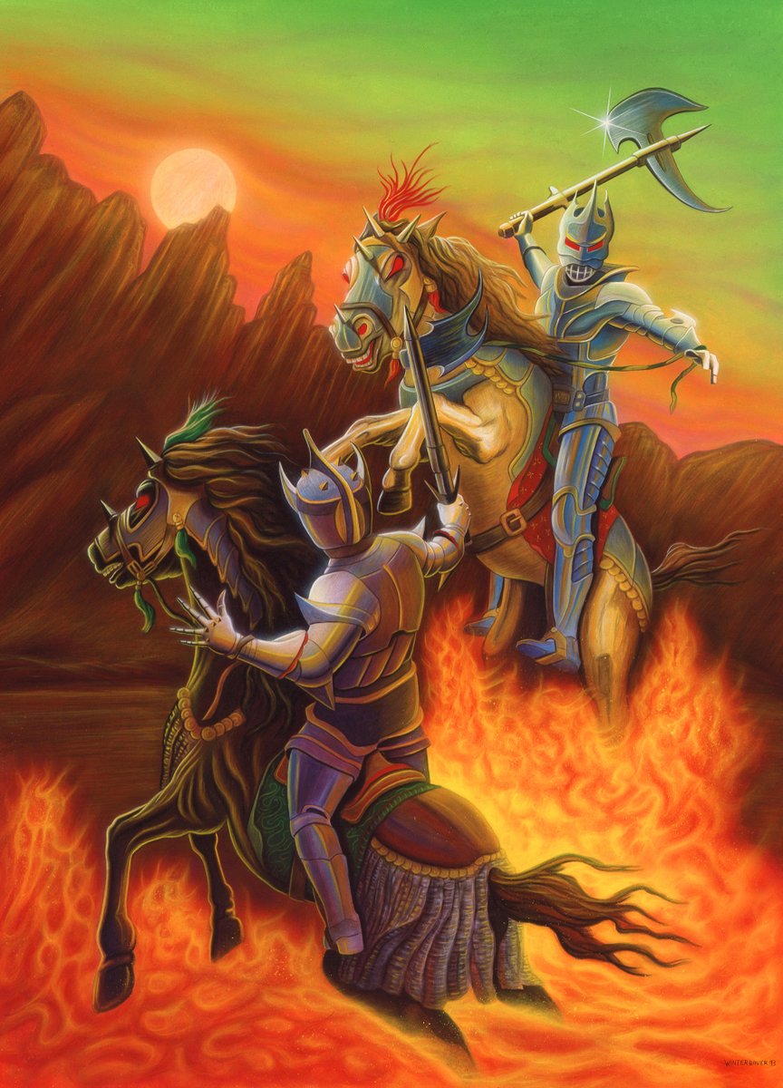
Beautiful large print of my classic Land of Xeen Map repaint 2013!
#illustration #popculture #boxart #mightandmagic #landofxeen #gameart


Dragon Ball Z Idainaru Dragon Ball Densetsu (also known as Dragon Ball Z Legends or Dragon Ball Z: The Legend) is a 1996 fighting game released for the Sega Saturn and PlayStation. #FightingGames #BoxArt #gaming #90s #DragonBallZ
https://t.co/f5zKzZCqe4

Run & gun platformer that represented the finest of European game design, here all packaged up in an exquisite piece of #boxart for those who never sampled the highly-desired original. The sound was optimised to the #SuperFamicom architecture using Dolby.
https://t.co/mOUcVBBFT6

Classic WolfChild Sega box with my cover painting and title 1992!
#illustration #popculture #WolfChild #boxart #retrogaming

My cool Trouble Shooter painting and title for Sega 1991
#TroubleShooter #popculture #boxart #retrogaming #illustration

My cool DoubleStrike painting for Nintendo game box cover 1990!
#illustration #popculture #retrogames #doublestrike #boxart

Classic box cover for SNES Wing Commander 1992!
#illustration #popculture #WingCommander #boxart #retrogaming

My fun box cover painting and title for Spaceward Ho computer game 1993!
#illustration #popculture #boxart #retrogames #spacewardho


Armadillo tank made by @headcannontoys on Instagram. Happy #YoJoeJune everyone! Yo Joe!!!
#gijoe #armadillo #classified #dusty #spirit #alpine #boxart #toyphotography #practicalfx #diorama #hotglue #sixinchjoes #arah #actionfigures #yesiamanadult


I enjoyed painting the cover and title art for Ninja Taro Game Boy 1992!
#illustration #popculture #NinjaTaro #boxart #retrogaming

#BoxArt Selfish time with BlackMyth. Mac isn't fond of getting his picture taken.
#stonemonkeh #LegoMonkieKid #BlackMythWukong #plushies


Last Seen Hashtags on Sotwe
الراس_الاخضر_السعوديه
Seen from United States
asiantop
Seen from United States
nolimit() somno() +filter:native_video
Seen from United Kingdom
مغربية_سخونة
pissinass
Seen from Turkey
หลุดนักเรียน
Seen from Thailand
asarimaniac
Seen from Russia
สว่างแดนดินนัดเย็ด
Seen from Thailand
corluescort
Seen from Turkey
ntr
Seen from Saudi Arabia
Most Popular Users

Elon Musk 
@elonmusk
240.6M followers

Barack Obama
@barackobama
119.3M followers

Donald J. Trump
@realdonaldtrump
111.7M followers

Cristiano Ronaldo
@cristiano
110.4M followers

Narendra Modi
@narendramodi
107M followers

Rihanna
@rihanna
97.6M followers

NASA
@nasa
92.2M followers

Justin Bieber
@justinbieber
90.9M followers

KATY PERRY
@katyperry
87.5M followers

Taylor Swift
@taylorswift13
81.4M followers

Lady Gaga
@ladygaga
72.9M followers

Kim Kardashian
@kimkardashian
69.7M followers

Virat Kohli
@imvkohli
69.7M followers

YouTube
@youtube
68.7M followers

Bill Gates
@billgates
63.8M followers

The Ellen Show
@theellenshow
62.5M followers

Neymar Jr
@neymarjr
62.4M followers

CNN
@cnn
61.9M followers

X
@x
60.8M followers

Selena Gomez
@selenagomez
60.6M followers