Top Tweets for #DataPlotly

Plotly: crea gráficos interactivos con datos espaciales https://t.co/4bkg8feWa0 #DataPlotly #matplotlib #Plotly #Python

📊 Fin de notre série #QGIS + #DataPlotly sur https://t.co/wfWe7F7vZj !
📄 1. Intégrer des graphiques dans un Atlas PDF
📈 2. Construire un tableau de bord interactif dans QGIS
🔗 https://t.co/Inmpuxg4h5
#SIG #DataViz #OpenSource

Plotly: crea gráficos interactivos con datos espaciales https://t.co/4bkg8feWa0 #DataPlotly #matplotlib #Plotly #Python
Plotly: crea gráficos interactivos con datos espaciales https://t.co/4bkg8feWa0 #DataPlotly #matplotlib #Plotly #Python

Day 6 #30DaysofDQ3x2nd Part 2 Ex#2 you learn to work with tables. Use SQL to query features by attributes, query by location, add/remove fields, calculate values, use case statements, generate histograms, create charts via #DataPlotly & set up conditional table formatting #QGIS
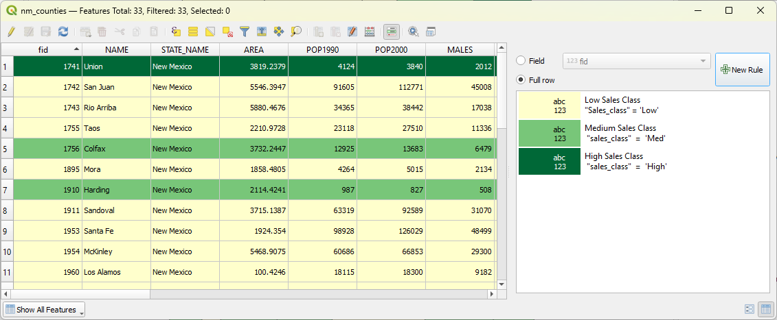


And the legend of the resulting #DataPlotly pie chart can now be easier matched with the legend of a layer in #QGIS 3.26+! https://t.co/aAkK0SOIpv
👉L'intervento di @ghtmtt al @foss4g , fatto insieme a @etrimaille di #3Liz ha evidenziato delle novità in campo #DataPlotly in #Lizmap, tra le quali molti miglioramenti e nuovi stimoli per continuare a sviluppare nuove features.

Matteo Ghetta, Etienne Trimaille - 'Dataviz in QGIS and on the web, at #FOSS4G2022.
Talk: https://t.co/acjeM94RYe
#OSGeo #FOSS4G #maps #QGIS #DataPlotly
@ghtmtt @etrimaille
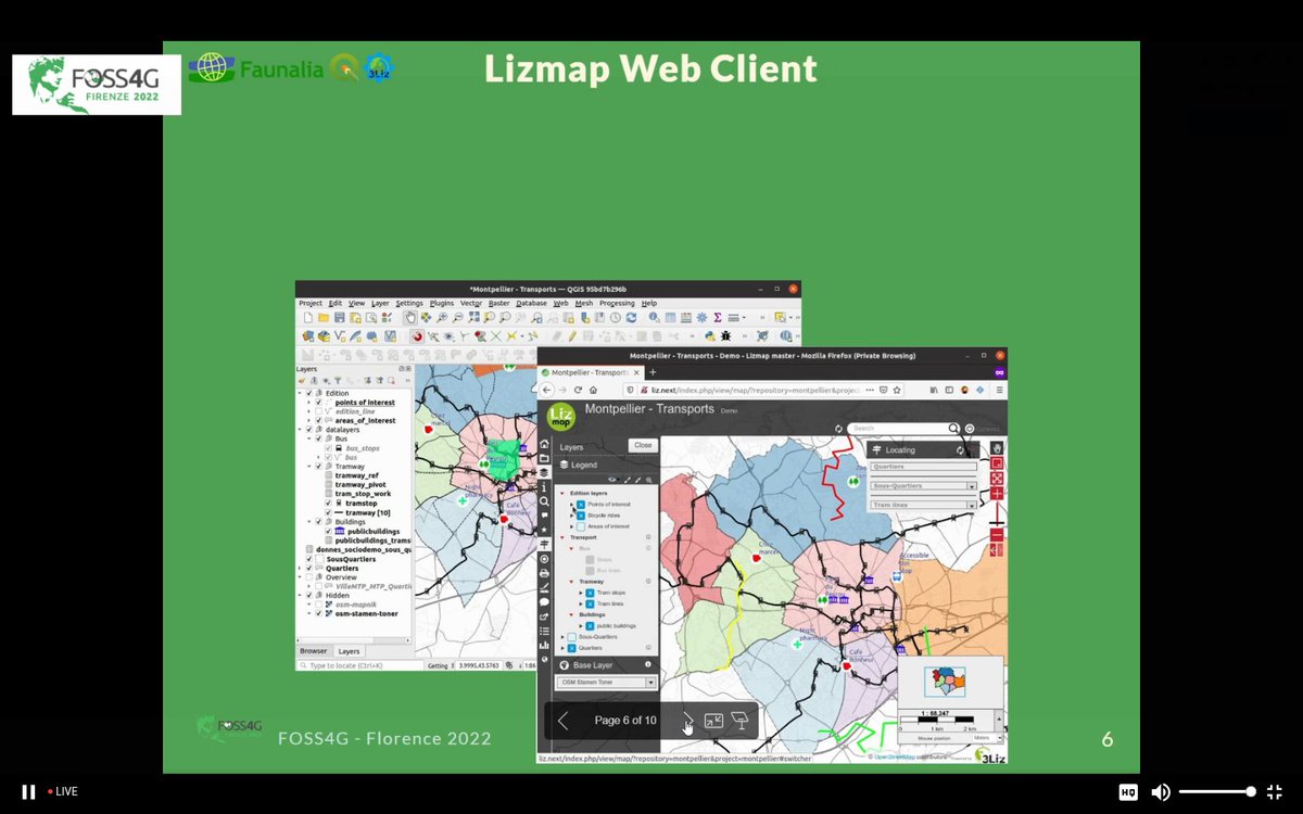


A great result from the #QGIS Contributor Meeting in Firenze: easily use the colours of a layer for the legend of #DataPlotly plugin plots. Thanks a lot @ghtmtt @nyalldawson @etrimaille! #FOSS4G

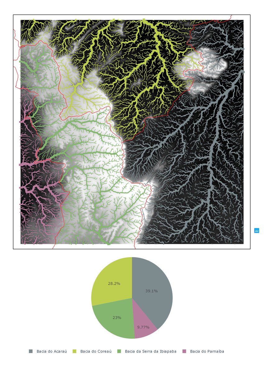
Loyout tá simples mas o importante é ressaltar consegui fazer o gráfico pelo #DataPlotly no @qgis com as mesmas cores das feições de referencia. A drenagem tá dividida considerando a bacia e a classificação de strahler
In Chapter 6 on the calculation of the percentage of land cover per subcatchment, we have added the steps to match the colours of the #dataplotly pie chart with the legend of the layer.
5/9

Tutorial showing how to make a simple and dynamic color map with #charts in QGIS by @underdarkGIS
The purpose of this tutorial is to show how to make a design map using #QGIS and #DataPlotly with the use of variables.
Vía #boletínNosolosig
https://t.co/chylpxhqDQ

The tutorial is available, thanks @underdarkGIS for sharing, hosting and her really inspiring work on https://t.co/a8HZ0L4x47 #QGIS #Dataplotly #QuickOSM
Map design with #QGIS and #Plotly with variables for map colors, charts, titles and even SVG #storyset illustrations. Here’s the result! @qgis #Dataplotly


🗺💻 En esta entrada vamos aprender cómo crear gráficas en 𝗤𝗚𝗜𝗦 con el complemento 𝘿𝙖𝙩𝙖 𝙋𝙡𝙤𝙩𝙡𝙮.
Leer más: https://t.co/CknOXk37fD
#SIG #QGIS #DataPlotly #QGIS3

Most Popular Users

Elon Musk 
@elonmusk
240.3M followers

Barack Obama
@barackobama
119.3M followers

Donald J. Trump
@realdonaldtrump
111.6M followers

Cristiano Ronaldo
@cristiano
109.5M followers

Narendra Modi
@narendramodi
107M followers

Rihanna
@rihanna
97.4M followers

NASA
@nasa
92.1M followers

Justin Bieber
@justinbieber
90.7M followers

KATY PERRY
@katyperry
87.1M followers

Taylor Swift
@taylorswift13
80.9M followers

Lady Gaga
@ladygaga
72.5M followers

Kim Kardashian
@kimkardashian
69.5M followers

Virat Kohli
@imvkohli
69M followers

YouTube
@youtube
68.6M followers

Bill Gates
@billgates
63.6M followers

The Ellen Show
@theellenshow
62.5M followers

CNN
@cnn
61.9M followers

Neymar Jr
@neymarjr
61.7M followers

X
@x
60.9M followers

Selena Gomez
@selenagomez
60.2M followers