

Top Tweets for #DensityPlot

DIY violin plot with Highcharts for continuous data set.
By @MusMekh
Read more here: https://t.co/3OwFji0nN4
#violinplot #densityplot #dataviz #datascience #js #a11y

DIY violin plot with Highcharts for continuous data set.
By @MusMekh
Read more here: https://t.co/3OwFji0nN4
#violinplot #densityplot #dataviz #datascience #js #a11y

DIY violin plot with Highcharts for continuous data set.
By @MusMekh
Read more here: https://t.co/3OwFji0nN4
#violinplot #densityplot #dataviz #datascience #js #a11y

DIY violin plot with Highcharts for continuous data set.
By @MusMekh
Read more here: https://t.co/3OwFji0nN4
#violinplot #densityplot #dataviz #datascience #js


'Top 5 drivers points finish frequency.' 🏎
🔎 https://t.co/DJBk6yHMt8
The design was created with Datylon for Illustrator, a chart maker AI plug-in for dataviz & graphic designers.
#designthinking #datavisualization #Formula1 #densityplot #dataviz #charts #graphs #f1 #racing

DIY violin plot with Highcharts for continuous data set.
By @MusMekh
Read more here: https://t.co/3OwFji0VCC
#violinplot #densityplot #dataviz #datascience #js
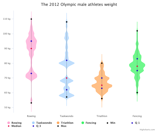
Create compelling interactive charts to visualize density distribution and relationships with jitter and density plots.
By @MusMekh
https://t.co/k5gyxi1LPy
#jitter #dataviz #js #densityplot #jitterplot #DataScience #DataScientist
If you like violin charts or chart curves based on the Kernel Density Estimation, you will find the Density Chart very useful.
By @MusMekh
Learn how to create one here: https://t.co/jx5pRJOifM
#dataviz #DataScience #DataScientist #densityplot #KernelDensityEstimation
If you like violin charts or chart curves based on the Kernel Density Estimation, you will find the Density Chart very useful.
By @MusMekh
Learn how to create one here: https://t.co/jx5pRJOifM
#dataviz #DataScience #DataScientist #densityplot #KernelDensityEstimation
If you like violin charts or chart curves based on the Kernel Density Estimation, you will find the Density Chart very useful.
By @MusMekh
Learn how to create one here: https://t.co/jx5pRJOifM
#dataviz #DataScience #DataScientist #densityplot #KernelDensityEstimation
Create compelling interactive charts to visualize density distribution and relationships with jitter and density plots.
By @MusMekh
https://t.co/k5gyxi1LPy
#jitter #dataviz #js #densityplot #jitterplot #DataScience #DataScientist
Create compelling interactive charts to visualize density distribution and relationships with jitter and density plots.
By @MusMekh
https://t.co/k5gyxi1LPy
#jitter #dataviz #js #densityplot #jitterplot #DataScience #DataScientist

Random data plot to rando'my'sed data plot. #anscombe with #gganimate #ggside (summary data in next tweet) #rtistry #RStats and #densityplot on sides. Shows how the group wise data differ! And yet have same summary data. #anscombiser::mimic() was very useful
DIY violin plot with Highcharts for continuous data set.
By @MusMekh
Read more here: https://t.co/3OwFji0nN4
#violinplot #densityplot #dataviz #DataScience #DataScientist #js
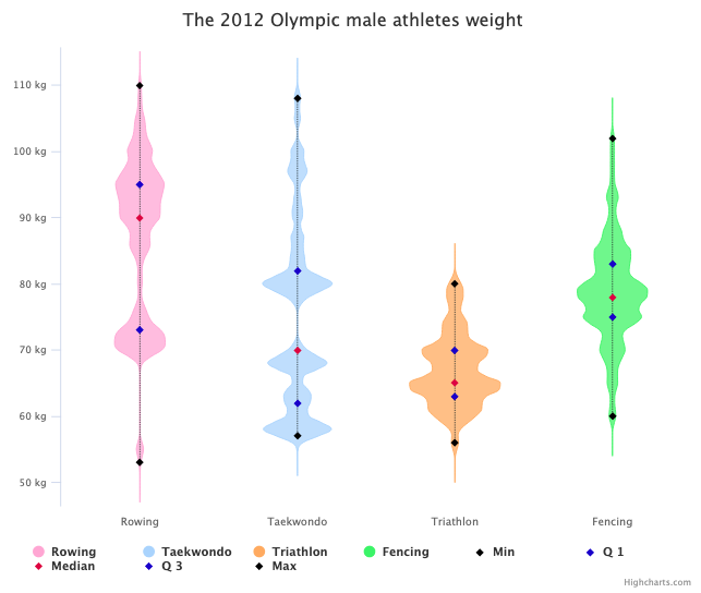
Create compelling interactive charts to visualize density distribution and relationships with jitter and density plots.
By @MusMekh
https://t.co/k5gyxi1LPy
#jitter #dataviz #js #densityplot #jitterplot #DataScience #DataScientist
Create compelling interactive charts to visualize density distribution and relationships with jitter and density plots.
By @MusMekh
#jitter #dataviz #js #densityplot #jitterplot
https://t.co/k5gyxi1LPy
Create compelling interactive charts to visualize density distribution and relationships with jitter and density plots.
#jitter #dataviz #js #densityplot #jitterplot
https://t.co/k5gyxi1LPy
If you like violin charts or chart curves based on the Kernel Density Estimation, you will find the Density Chart very useful.
Learn how to create one here: https://t.co/jx5pRJOifM
#dataviz #datascience #densityplot #KernelDensityEstimation
Create compelling interactive charts to visualize density distribution and relationships with jitter and density plots.
#jitter #dataviz #js #densityplot #jitterplot
https://t.co/k5gyxi1LPy
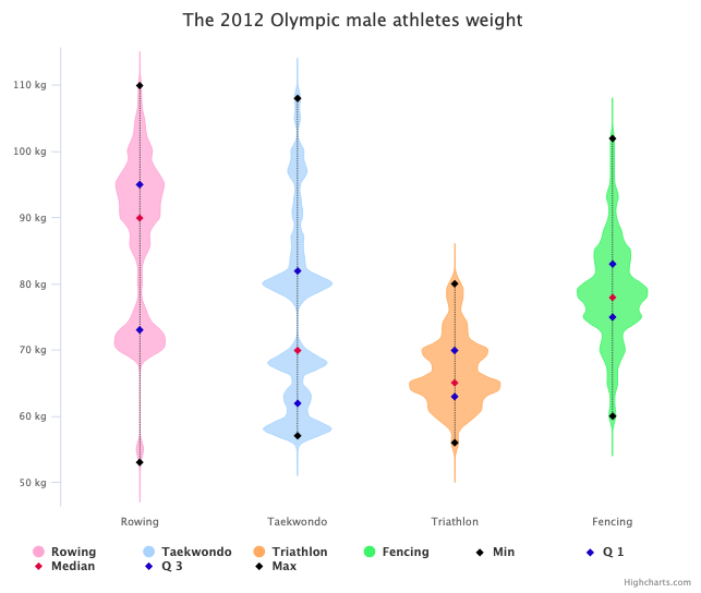
DIY violin plot with Highcharts for continuous data set.
https://t.co/3OwFji0nN4
#violinplot #densityplot #dataviz #datascience #js
Last Seen Hashtags on Sotwe
r34 murrcrawler
Seen from United States
xlii or #exny or #momson or #nolimit() +filter:native_video
Seen from Turkey
little pussy
Seen from Turkey
cintiacossio
Seen from Colombia
elaziggay
Seen from Turkey
baits
Seen from Brazil
มอยส์ว่านปลาดาว
Seen from United States
nolimit nolimit
Seen from Bahrain
momson((()))*+filter:native_video
Seen from Ukraine
お仕立て出す前に
Seen from Korea
Most Popular Users

Elon Musk 
@elonmusk
241M followers

Barack Obama
@barackobama
119.2M followers

Cristiano Ronaldo
@cristiano
112M followers

Donald J. Trump
@realdonaldtrump
111.8M followers

Narendra Modi
@narendramodi
107.1M followers

Rihanna
@rihanna
98M followers

NASA
@nasa
92.2M followers

Justin Bieber
@justinbieber
91.2M followers

KATY PERRY
@katyperry
88.5M followers

Taylor Swift
@taylorswift13
82.4M followers

Lady Gaga
@ladygaga
73.9M followers

Virat Kohli
@imvkohli
71.2M followers

Kim Kardashian
@kimkardashian
70.2M followers

YouTube
@youtube
68.7M followers

Bill Gates
@billgates
64.3M followers

Neymar Jr
@neymarjr
64M followers

The Ellen Show
@theellenshow
62.4M followers

CNN
@cnn
61.8M followers

Selena Gomez
@selenagomez
61.6M followers

X
@x
60.8M followers