Top Tweets for #densityplot

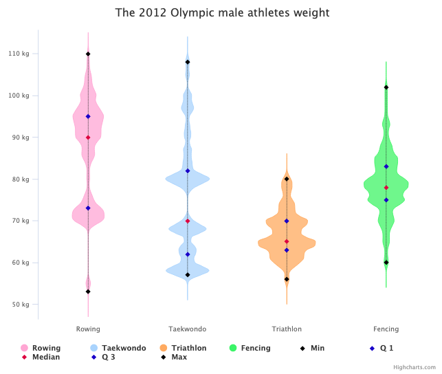
DIY violin plot with Highcharts for continuous data set.
By @MusMekh
Read more here: https://t.co/3OwFji0nN4
#violinplot #densityplot #dataviz #datascience #js #a11y

DIY violin plot with Highcharts for continuous data set.
By @MusMekh
Read more here: https://t.co/3OwFji0nN4
#violinplot #densityplot #dataviz #datascience #js #a11y

DIY violin plot with Highcharts for continuous data set.
By @MusMekh
Read more here: https://t.co/3OwFji0nN4
#violinplot #densityplot #dataviz #datascience #js #a11y

DIY violin plot with Highcharts for continuous data set.
By @MusMekh
Read more here: https://t.co/3OwFji0nN4
#violinplot #densityplot #dataviz #datascience #js


'Top 5 drivers points finish frequency.' 🏎
🔎 https://t.co/DJBk6yHMt8
The design was created with Datylon for Illustrator, a chart maker AI plug-in for dataviz & graphic designers.
#designthinking #datavisualization #Formula1 #densityplot #dataviz #charts #graphs #f1 #racing

DIY violin plot with Highcharts for continuous data set.
By @MusMekh
Read more here: https://t.co/3OwFji0VCC
#violinplot #densityplot #dataviz #datascience #js

Create compelling interactive charts to visualize density distribution and relationships with jitter and density plots.
By @MusMekh
https://t.co/k5gyxi1LPy
#jitter #dataviz #js #densityplot #jitterplot #DataScience #DataScientist
If you like violin charts or chart curves based on the Kernel Density Estimation, you will find the Density Chart very useful.
By @MusMekh
Learn how to create one here: https://t.co/jx5pRJOifM
#dataviz #DataScience #DataScientist #densityplot #KernelDensityEstimation
If you like violin charts or chart curves based on the Kernel Density Estimation, you will find the Density Chart very useful.
By @MusMekh
Learn how to create one here: https://t.co/jx5pRJOifM
#dataviz #DataScience #DataScientist #densityplot #KernelDensityEstimation
If you like violin charts or chart curves based on the Kernel Density Estimation, you will find the Density Chart very useful.
By @MusMekh
Learn how to create one here: https://t.co/jx5pRJOifM
#dataviz #DataScience #DataScientist #densityplot #KernelDensityEstimation
Create compelling interactive charts to visualize density distribution and relationships with jitter and density plots.
By @MusMekh
https://t.co/k5gyxi1LPy
#jitter #dataviz #js #densityplot #jitterplot #DataScience #DataScientist
Create compelling interactive charts to visualize density distribution and relationships with jitter and density plots.
By @MusMekh
https://t.co/k5gyxi1LPy
#jitter #dataviz #js #densityplot #jitterplot #DataScience #DataScientist

Random data plot to rando'my'sed data plot. #anscombe with #gganimate #ggside (summary data in next tweet) #rtistry #RStats and #densityplot on sides. Shows how the group wise data differ! And yet have same summary data. #anscombiser::mimic() was very useful
DIY violin plot with Highcharts for continuous data set.
By @MusMekh
Read more here: https://t.co/3OwFji0nN4
#violinplot #densityplot #dataviz #DataScience #DataScientist #js
Create compelling interactive charts to visualize density distribution and relationships with jitter and density plots.
By @MusMekh
https://t.co/k5gyxi1LPy
#jitter #dataviz #js #densityplot #jitterplot #DataScience #DataScientist
Create compelling interactive charts to visualize density distribution and relationships with jitter and density plots.
By @MusMekh
#jitter #dataviz #js #densityplot #jitterplot
https://t.co/k5gyxi1LPy
Create compelling interactive charts to visualize density distribution and relationships with jitter and density plots.
#jitter #dataviz #js #densityplot #jitterplot
https://t.co/k5gyxi1LPy
If you like violin charts or chart curves based on the Kernel Density Estimation, you will find the Density Chart very useful.
Learn how to create one here: https://t.co/jx5pRJOifM
#dataviz #datascience #densityplot #KernelDensityEstimation
Create compelling interactive charts to visualize density distribution and relationships with jitter and density plots.
#jitter #dataviz #js #densityplot #jitterplot
https://t.co/k5gyxi1LPy
DIY violin plot with Highcharts for continuous data set.
https://t.co/3OwFji0nN4
#violinplot #densityplot #dataviz #datascience #js

Most Popular Users

Elon Musk 
@elonmusk
240.2M followers

Barack Obama
@barackobama
119.3M followers

Donald J. Trump
@realdonaldtrump
111.6M followers

Cristiano Ronaldo
@cristiano
109.1M followers

Narendra Modi
@narendramodi
107M followers

Rihanna
@rihanna
97.3M followers

NASA
@nasa
92.1M followers

Justin Bieber
@justinbieber
90.6M followers

KATY PERRY
@katyperry
86.9M followers

Taylor Swift
@taylorswift13
80.7M followers

Lady Gaga
@ladygaga
72.3M followers

Kim Kardashian
@kimkardashian
69.4M followers

Virat Kohli
@imvkohli
68.7M followers

YouTube
@youtube
68.6M followers

Bill Gates
@billgates
63.5M followers

The Ellen Show
@theellenshow
62.5M followers

CNN
@cnn
61.9M followers

Neymar Jr
@neymarjr
61.2M followers

X
@x
60.9M followers

Selena Gomez
@selenagomez
60M followers