

Top Tweets for #datavizFAIL

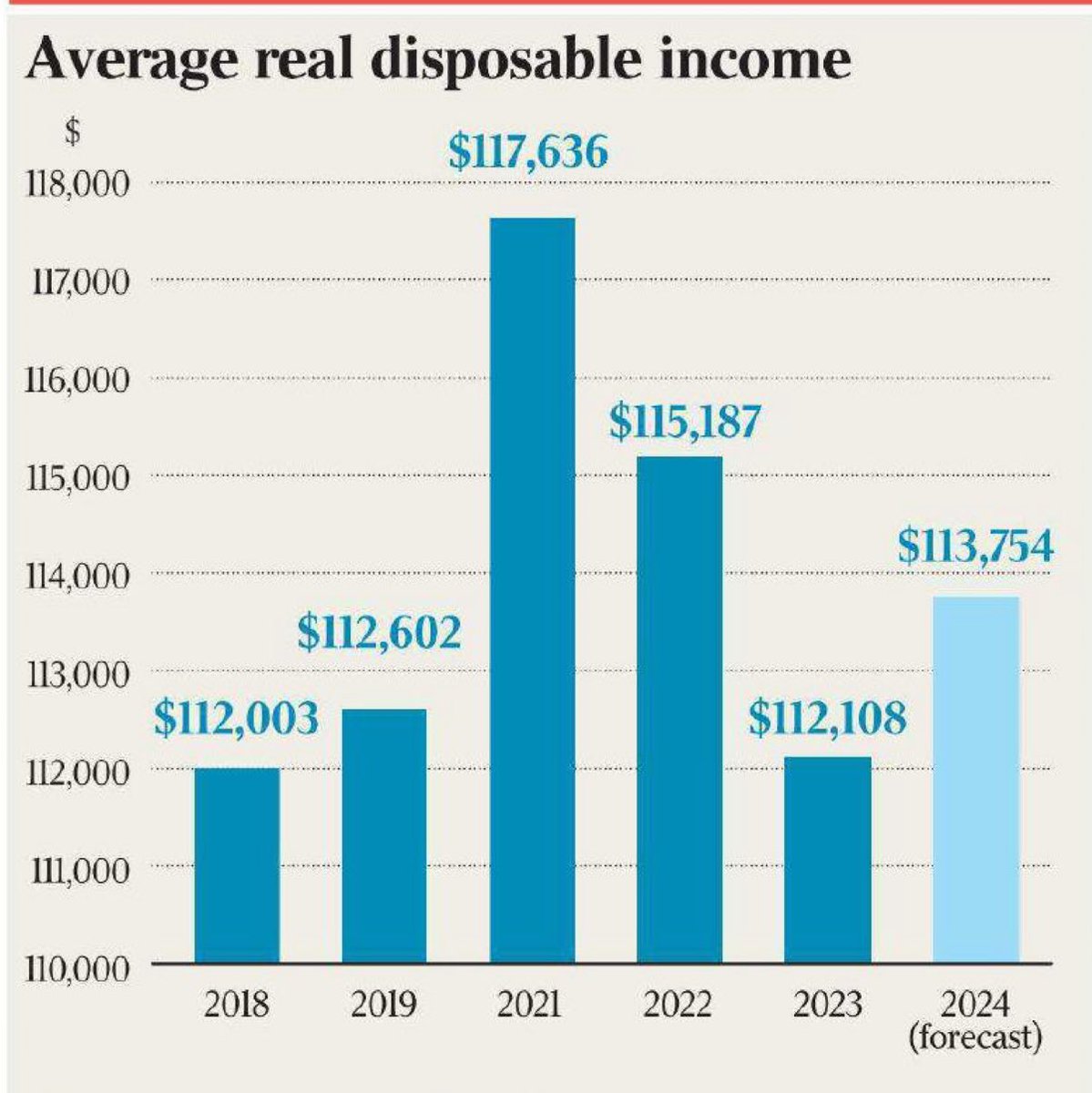
Here's an example of what not to do! #DataVizFail

This chart was in @australian newspaper today. 🙄. Seriously! In this case, the chart implies 2024 is half the 2021 number. A column chart encodes the value in the height of the column. Don’t be like The Australian; always set the axis to start at zero.

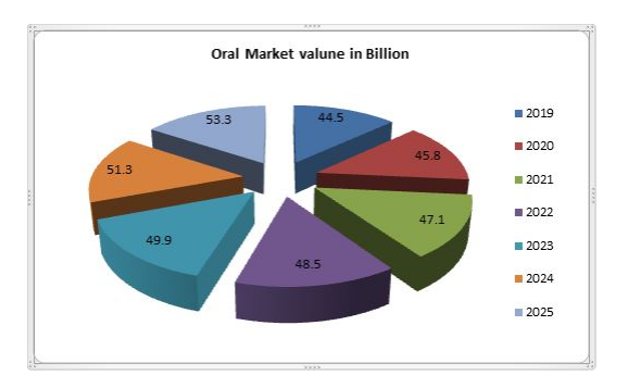
A shame UCU have opted to use pie charts though #datavizfail

Oh my! #datavizfail


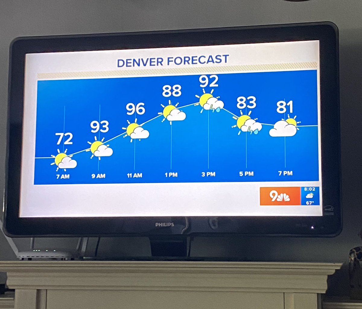
🤦🏼♀️🤦🏼♀️This is not how charts work! #DataVizFail

What a wonderfully misleading diagram in the Times today 📈

🤦🏼♀️#datavizfail
This is a real classic in the bad bar chart genre

Sadly, the "important disclosure" mentioned at the bottom here does not include the following:
(a) The displayed Y-axis starts at $1tn, not zero
(b) The heights of the two bars seem to have been calculated differently #DataVizFail


🤦🏼♀️🤦🏼♀️#datavizfail

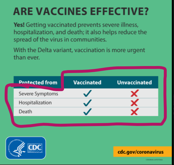
@CDCgov Good info. Terrible infographic.
LOTS of people who read this are going to see your infographic, and their brains are going to interpret it to mean the exact opposite of what it actually means.
#DataVizFail #InfoGraphicFail

#dataviz #protip: Simple charts can be a great way to convey info & promote audience comprehension...
But only if the chart author himself understands the info and makes good design choices.
Can you find the problem w/ this chart?🤦🏽♂️ #datavizfail


RT @SylvainLapoix
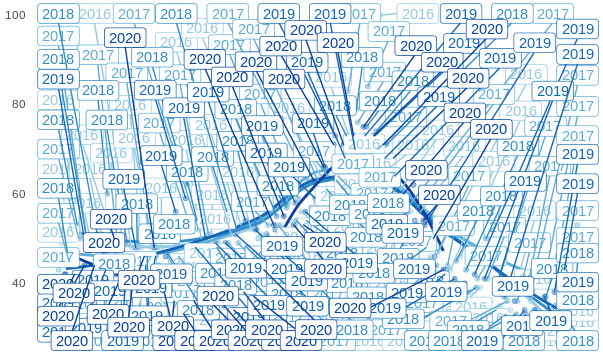
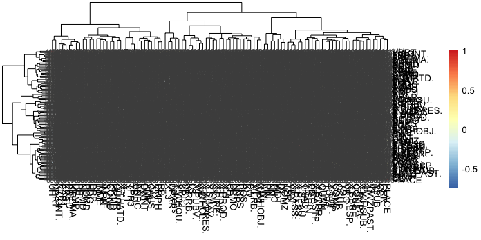
Parfois les #dataviz râtées sont presque plus belles que leur version "réussie".
Comme ce geom_smooth() qui se devine sous un amoncellement de geom_label_repel() mal paramétrées.
#datavizfail #ggplot2
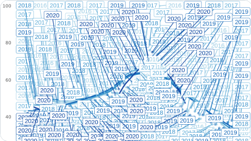

Parfois les #dataviz râtées sont presque plus belles que leur version "réussie".
Comme ce geom_smooth() qui se devine sous un amoncellement de geom_label_repel() mal paramétrées.
#datavizfail #ggplot2


As an Indian woman, I can confirm that too much of my time is spent hiding behind a rock praying the terrifying gang of international giant ladies and their Latvian general don't find me


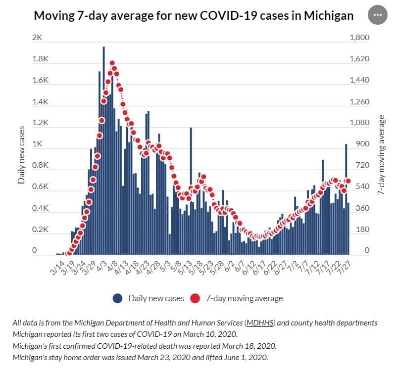
This may be the worst use of two y-axes I have ever seen.
- Both measure the same type of data
- One axis label is in thousands while the other is in single digits
- The two axes are NOT aligned, which creates an actively misleading representation of the data!
#DataVizFail

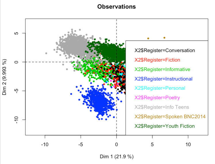
I feel it's important to have informative legends for all my plots. In this I have succeeded. Any clusters to the right of the plot, however, shall remain a mystery. #datavizfail

the difficulties of plotting time series... #datavizfail

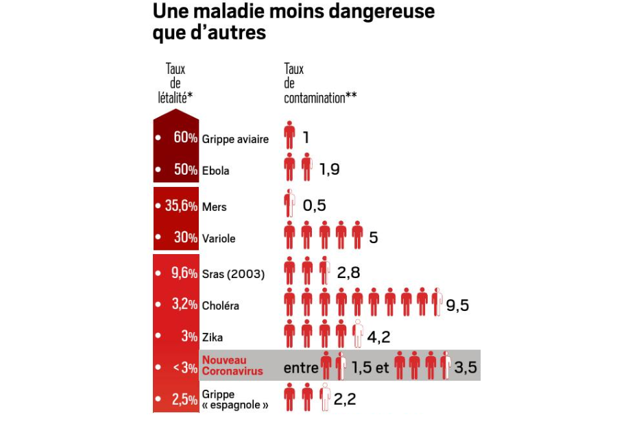
Rien qui vous choque dans cette infographie d'un célèbre hebdo du dimanche ?
#datavizfail #semiologie
Last Seen Hashtags on Sotwe
طيزها
Seen from Egypt
pregnant #birth
Seen from Brazil
minichatt()**************************************************filter:videos
Seen from Italy
minichat((((((()))))))*
Seen from Austria
minichatt()********************* ***filter:native_video()
Seen from Guatemala
ควยพม่า
Seen from Thailand
anxiouspanda
Seen from Australia
nolimit()************
Seen from United States
swingerçift
Seen from Turkey
MGAI((((((()))))))*
Seen from Turkey
Most Popular Users

Elon Musk 
@elonmusk
241.5M followers

Barack Obama
@barackobama
118.8M followers

Cristiano Ronaldo
@cristiano
114.5M followers

Donald J. Trump
@realdonaldtrump
111.9M followers

Narendra Modi
@narendramodi
107.1M followers

Rihanna
@rihanna
98.7M followers

NASA
@nasa
92.3M followers

Justin Bieber
@justinbieber
91.8M followers

KATY PERRY
@katyperry
90M followers

Taylor Swift
@taylorswift13
84M followers

Lady Gaga
@ladygaga
75.5M followers

Virat Kohli
@imvkohli
73.4M followers

Kim Kardashian
@kimkardashian
70.8M followers

YouTube
@youtube
68.7M followers

Neymar Jr
@neymarjr
66.4M followers

Bill Gates
@billgates
65.2M followers

Selena Gomez
@selenagomez
63.1M followers

The Ellen Show
@theellenshow
62.2M followers

CNN
@cnn
61.7M followers

X
@x
60.7M followers