

Top Tweets for #mapfacts


🌍 Can you tell these geographic features apart? From islands and straits to gulfs and peninsulas—geography gets easier when you know the difference!
Which one did you already know? 👇
#ExploreEarth #GeographyFacts #WorldGeography #MapFacts


India નો નકશો Sri Lanka વગર કેમ અધૂરો છે? જાણો તેની પાછળનો રસપ્રદ UN નો નિયમ | Map Secrets
#IndiaMap #SriLanka #UNCLOS #Geography #MapFacts #UnitedNations #MaritimeLaw #Knowledge #India #History

The World Is Not the Same Everywhere | Global Maps That Explain Culture, Economy & Life
#WorldMap
#GlobalFacts
#WorldComparison
#Geography
#WorldCulture
#GlobalEconomy
#MapFacts
#WorldExplained
#DataMaps
#InterestingMaps
https://t.co/hoh9QPkv4N

The Himalayas are tall.
#MapFacts

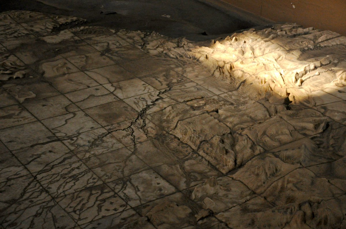
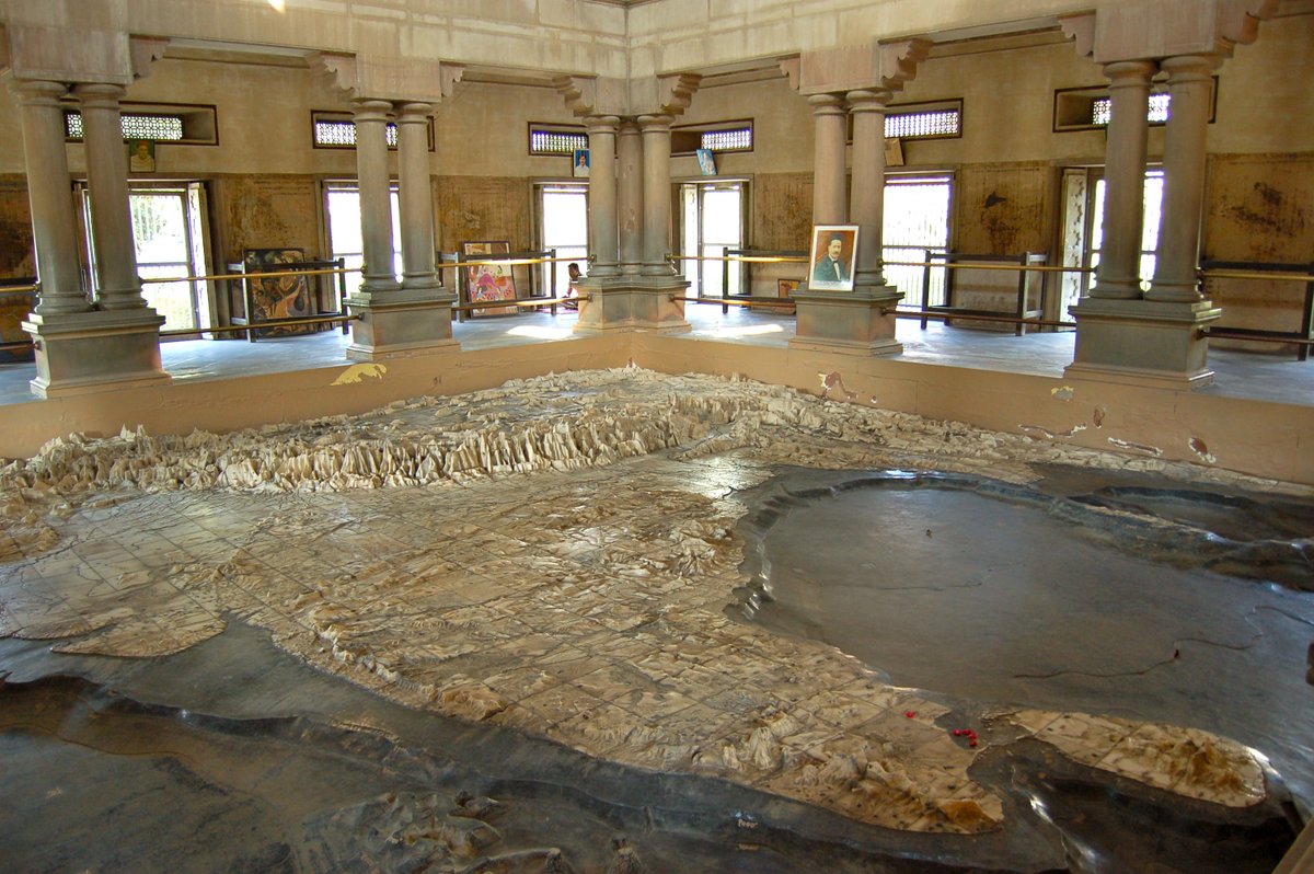
30x30 ft. marble map of the Subcontinent in Varanasi’s Bharat Mata Mandir temple




@BGatesIsaPyscho Because most maps use the Mercator projection — it stretches areas near the poles (like Russia) and shrinks those near the equator (like Africa). In reality, Africa is nearly twice the size of Russia! 🌍🗺️ #MapFacts #GeographyMatters


🌍 Ever wondered why Greenland looks as big as Africa on maps? Discover the surprising truth behind the Mercator projection and see the world’s countries as they really are. #Cartography #MapFacts #Geography
The True Size of Countries: Exposing the Mercator Projection's Distortions
This infographic illustrates the differences between the Mercator projection and the true size of countries on a map. Here's a detailed explanation:
Mercator Projection vs. True Size:
The Mercator projection is a type of map projection introduced by Gerardus Mercator in 1569. It is widely used for navigation because it preserves angles and directions in a small area, making it useful for maritime navigation. However, one significant drawback of the Mercator projection is that it distorts the size of landmasses as you move away from the equator[1][7].
Key Details in the Infographic:
- Color Coding:
- Dark Blue/Green: Countries shown in dark colors are significantly smaller on the Mercator projection than their actual size.
- Light Blue: Countries depicted in lighter shades are significantly larger on the Mercator projection than their actual size.
- Notable Examples of Distortion:
- Greenland: One of the most striking examples. In the Mercator projection, Greenland appears almost the same size as Africa. However, in reality, Africa is about 14 times larger than Greenland[2][3].
- Russia and Canada: Both appear much larger on the Mercator projection than they actually are. Russia, for instance, seems almost to dominate the Northern Hemisphere, but its true size is much smaller[1][4].
- Africa: Conversely, Africa is often depicted much smaller than it really is. This is a major misrepresentation, given that Africa is the second-largest continent in the world[3][4].
- Antarctica: It appears enormous in the Mercator projection, stretching across the bottom of the map. In reality, its size is much smaller than it appears[1][2].
- Purpose of the Infographic:
- The main purpose of this infographic is to visually demonstrate how much the Mercator projection distorts the sizes of countries, especially as they are located further from the equator. This distortion has implications for how people perceive the relative sizes of different parts of the world[2][5].
- Visual Representation:
- The infographic shows the world map with countries adjusted to reflect their true size relative to each other. This is in contrast to the distorted sizes commonly seen in the Mercator projection[3][4].
- Geopolitical Implications:
- This distortion has often led to misconceptions about the importance or dominance of certain countries, especially those in the Northern Hemisphere, over those in the Southern Hemisphere. For instance, countries in Africa and South America are often perceived as smaller and less significant than they are in reality[4][5][8].
Conclusion:
The infographic effectively highlights the inaccuracies in size representation caused by the Mercator projection. By adjusting the countries to their true sizes, it provides a more accurate understanding of the relative scale of the world's landmasses. This kind of visual correction helps to address some of the geographic misconceptions perpetuated by traditional map projections[3][5].
Citations:
[1] https://t.co/cbQCNDjXa7
[2] https://t.co/dBiid6Oe8i
[3] https://t.co/7TuKgXgn6E
[4] https://t.co/4PGR14bYsL
[5] https://t.co/ryh09ya1Mv
[6] https://t.co/pAL15Hhdko
[7] https://t.co/jbk7dcpvxh
[8] https://t.co/NueR42PMX4
![SkylineReport's tweet photo. The True Size of Countries: Exposing the Mercator Projection's Distortions
This infographic illustrates the differences between the Mercator projection and the true size of countries on a map. Here's a detailed explanation:
Mercator Projection vs. True Size:
The Mercator projection is a type of map projection introduced by Gerardus Mercator in 1569. It is widely used for navigation because it preserves angles and directions in a small area, making it useful for maritime navigation. However, one significant drawback of the Mercator projection is that it distorts the size of landmasses as you move away from the equator[1][7].
Key Details in the Infographic:
- Color Coding:
- Dark Blue/Green: Countries shown in dark colors are significantly smaller on the Mercator projection than their actual size.
- Light Blue: Countries depicted in lighter shades are significantly larger on the Mercator projection than their actual size.
- Notable Examples of Distortion:
- Greenland: One of the most striking examples. In the Mercator projection, Greenland appears almost the same size as Africa. However, in reality, Africa is about 14 times larger than Greenland[2][3].
- Russia and Canada: Both appear much larger on the Mercator projection than they actually are. Russia, for instance, seems almost to dominate the Northern Hemisphere, but its true size is much smaller[1][4].
- Africa: Conversely, Africa is often depicted much smaller than it really is. This is a major misrepresentation, given that Africa is the second-largest continent in the world[3][4].
- Antarctica: It appears enormous in the Mercator projection, stretching across the bottom of the map. In reality, its size is much smaller than it appears[1][2].
- Purpose of the Infographic:
- The main purpose of this infographic is to visually demonstrate how much the Mercator projection distorts the sizes of countries, especially as they are located further from the equator. This distortion has implications for how people perceive the relative sizes of different parts of the world[2][5].
- Visual Representation:
- The infographic shows the world map with countries adjusted to reflect their true size relative to each other. This is in contrast to the distorted sizes commonly seen in the Mercator projection[3][4].
- Geopolitical Implications:
- This distortion has often led to misconceptions about the importance or dominance of certain countries, especially those in the Northern Hemisphere, over those in the Southern Hemisphere. For instance, countries in Africa and South America are often perceived as smaller and less significant than they are in reality[4][5][8].
Conclusion:
The infographic effectively highlights the inaccuracies in size representation caused by the Mercator projection. By adjusting the countries to their true sizes, it provides a more accurate understanding of the relative scale of the world's landmasses. This kind of visual correction helps to address some of the geographic misconceptions perpetuated by traditional map projections[3][5].
Citations:
[1] https://t.co/cbQCNDjXa7
[2] https://t.co/dBiid6Oe8i
[3] https://t.co/7TuKgXgn6E
[4] https://t.co/4PGR14bYsL
[5] https://t.co/ryh09ya1Mv
[6] https://t.co/pAL15Hhdko
[7] https://t.co/jbk7dcpvxh
[8] https://t.co/NueR42PMX4](https://pbs.twimg.com/media/GUveRXTXAAAvpSn.jpg)


@HDruzin @NateBrownNews @RadioDawson @clarkcorbin @kmozymoz @island_francis PENNSYLVANIA IS THE PROBLEM: PHILLY IS NORTHEAST, https://t.co/mC882nA6gx IS MIDWEST (OR "GREAT LAKES" IF YOU WANT ANOTHER REGION), CENTRAL/SOUTHEAST PA IS MID ATLANTIC. #MapFacts

Reportedly, only one place on the planet exists where 4 countries meet at a single point. This #quadripoint is located in Africa whereby Botswana, Namibia, Zambia, and Zimbabwe all meet at a single point. Check it out on our maps. #TomTomMaps #MapFacts
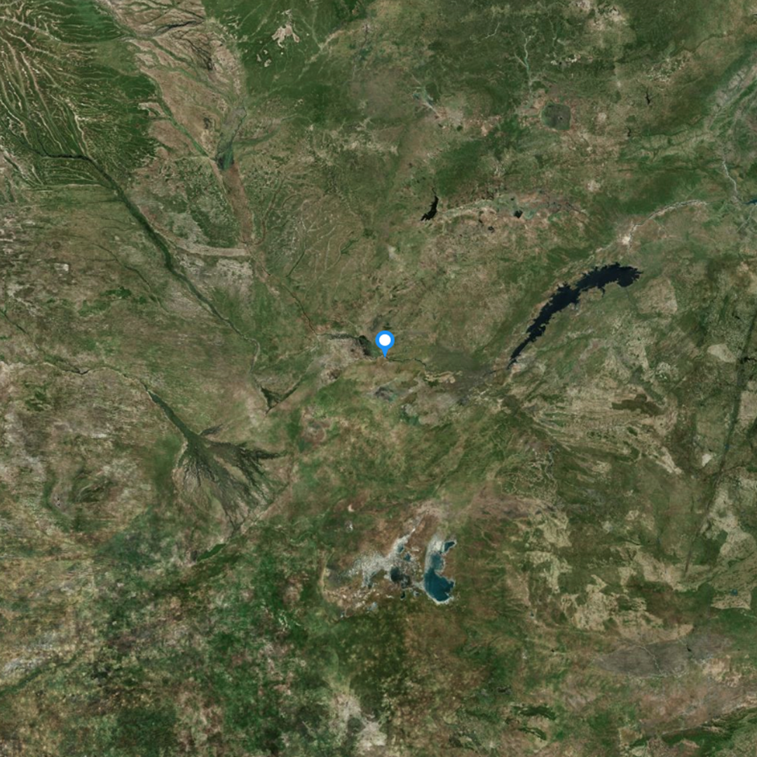
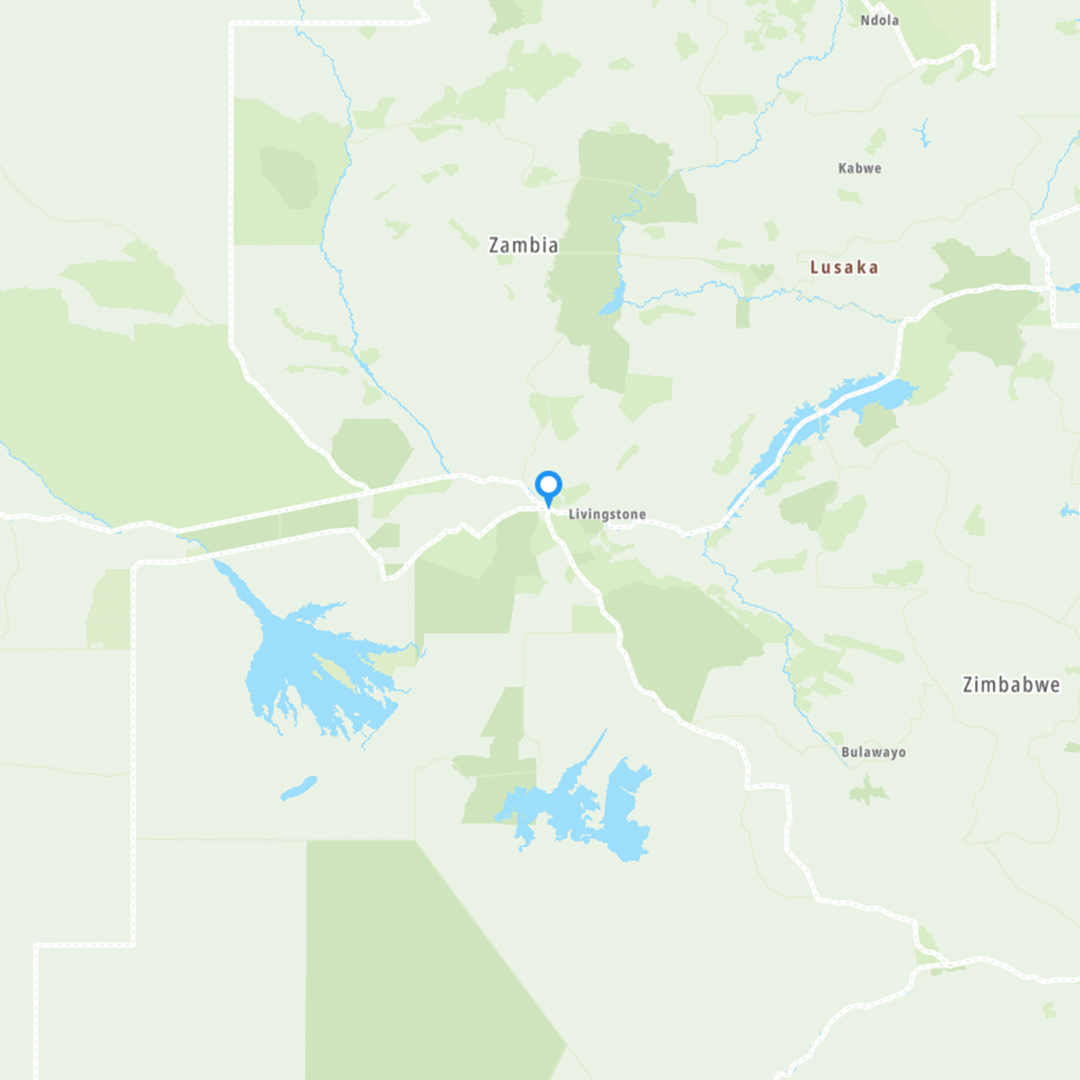

I'm sorry to deci-point, but technically the summit of Mt Etna in Sicily has elevenfold complexity and is thus the most complicated geopolitical multipoint anywhere on Earth, other than the South Pole.
#geopoliiticalfacts #mapfacts
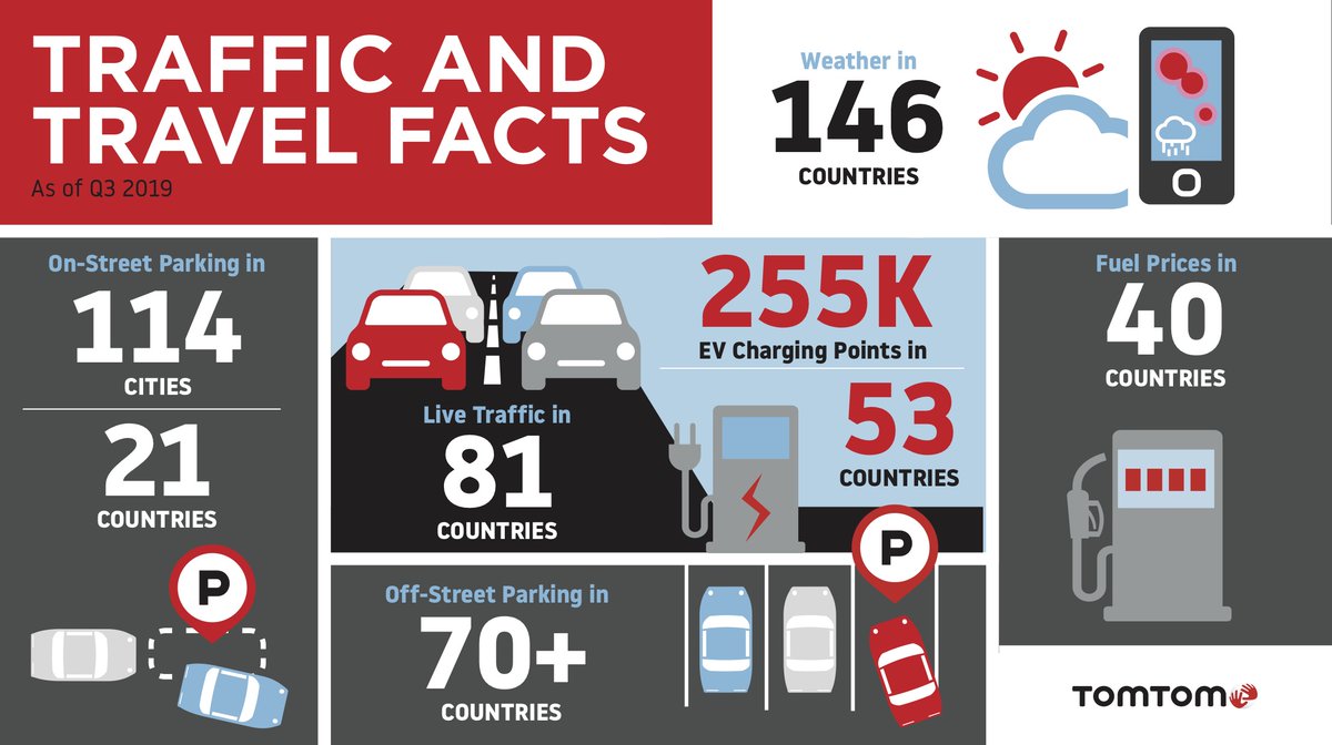
Did you know our maps have information about on-street parking in 21 countries and off-street parking in over 70 countries? On average it takes 6-14 minutes to find a spot. #MovingWorld #MapFacts

PE Maps looked at oil imports into Asia Pacific, now we have a graphic which illustrates LNG imports into the region. For full details visit: https://t.co/N7VAKPu1z8 #Knowledgeispower #mapfacts #Asia #LNG
PE Maps is looking at the #AsiaPacific region. To start, we take a look at #oil #consumption. Despite global trends to move to #gas and #alternatives, oil demand in still on the rise. For the full interactive graphic visit https://t.co/SKQrnVRPVE #mapfacts #KnowledgeIsPower
#FridayFunFact The region of #Mesopotamia has been regarded as the birth place of civilisation. Credited for inventing the sailboat, the wheel and religion. Today the modern area continues to be important with large oil and gas resources at the forefront. #mapfacts


Friday Fun Fact. The shortest trade route of #LNG is between the #Sonatrach #Arzew complex in #Algeria to the #Enagas regasification terminal in #Cartagena, Spain. This short 112nm sail across the Mediterranean takes a few hours. But what is the longest trade route? #mapfacts

Last Seen Hashtags on Sotwe
นวดแหลมฉบัง
Seen from Thailand
syrian girl
Seen from Turkey
sexwithsexdoll
Seen from France
cortisnsfw
Seen from United Kingdom
CaughtOnCamera
minichat filter:videos
Seen from Mexico
minichat()********* filter:videos
Seen from Netherlands
speedingbullet
Seen from United States
fullvideo
うるティ
Seen from United States
Most Popular Users

Elon Musk 
@elonmusk
241.5M followers

Barack Obama
@barackobama
118.9M followers

Cristiano Ronaldo
@cristiano
114.6M followers

Donald J. Trump
@realdonaldtrump
111.8M followers

Narendra Modi
@narendramodi
107.1M followers

Rihanna
@rihanna
98.7M followers

NASA
@nasa
92.3M followers

Justin Bieber
@justinbieber
91.8M followers

KATY PERRY
@katyperry
90.1M followers

Taylor Swift
@taylorswift13
84M followers

Lady Gaga
@ladygaga
75.5M followers

Virat Kohli
@imvkohli
73.5M followers

Kim Kardashian
@kimkardashian
70.9M followers

YouTube
@youtube
68.8M followers

Neymar Jr
@neymarjr
66.6M followers

Bill Gates
@billgates
65.3M followers

Selena Gomez
@selenagomez
63.1M followers

The Ellen Show
@theellenshow
62.2M followers

CNN
@cnn
61.8M followers

X
@x
60.7M followers