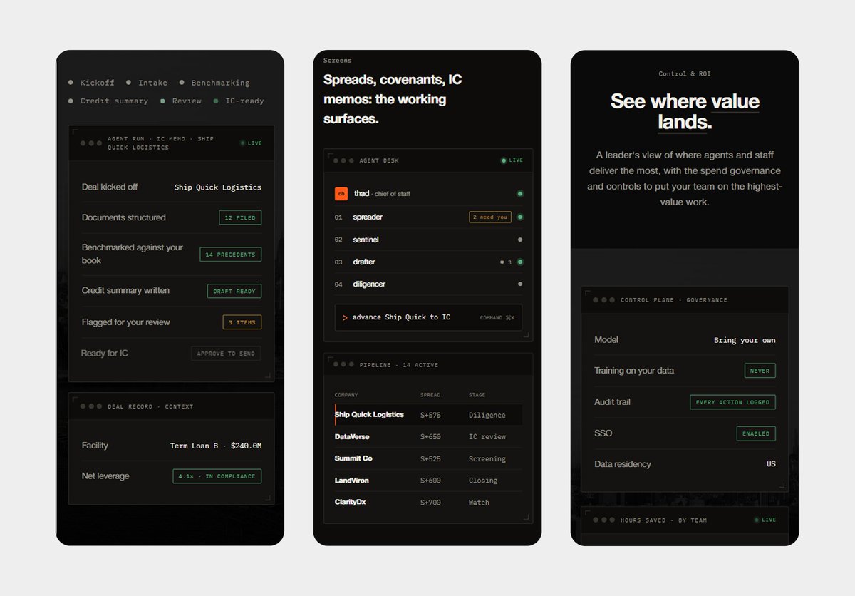
"Our site feels cheap."
I didn't touch the colors, layout, or copy.
Changed 3 things:
→ Heading font
→ Line height
→ Type scale
Result: "Now it looks like a real company."
Typography is the fastest premium upgrade.
The tool matters less than the first screen.
Beautiful Framer sites that don’t convert. Plain Webflow sites that do.
Pick the tool. Then fix the basics.
What’s the first thing you check on a website?
Great Design Review from @ycombinator with @MSchwaibold from @Shopify and @aaron_epstein
My 3 takeaways:
1. Designers are becoming editors.
2. Prototypes beat PRDs.
3. AI builds fast, taste decides what ships.
If you design sites for startups, worth the full watch.
Marvin Schwaibold leads the product design studio at Shopify, where his team is rethinking some of the company’s most important products for the AI era. Before Shopify, he co-founded the design studio Molly, working with companies including Apple and Google and building a reputation for highly crafted, interactive design.
In this episode of Design Review, Marvin joins YC’s Aaron Epstein to show how AI has changed his process, from using Figma as a scratchpad to building working prototypes directly with tools like Codex. He explains why designers are becoming more like editors, how AI is making them more full-stack, and why taste and judgment matter even more when the tools can build almost anything.
Then they review viewer-submitted websites and break down how hierarchy, motion, typography, and restraint can make a product feel more intentional.
00:00 — Inside Shopify’s Design Studio
00:30 — Designing With AI
01:44 — Designers Are Becoming Editors
03:25 — How Design Works at Shopify
05:58 — From Molly to Shopify
08:55 — Designing for Exploration
10:22 — Why the Details Matter
11:33 — Designing the Future at Shopify
13:24 — Prototypes Beat PRDs
15:29 — Rethinking Shopify With Sidekick
17:52 — Designers Are Becoming Builders
21:58 — Recreating Reality
24:33 — Dialing In AI-Generated Design
28:31 — Raising the Bar
31:04 — Website Review: Endstack
35:02 — SkillSync
40:49 — Instaplay
45:34 — Mintlify
51:42 — Knowlify
58:34 — Instinct Space
47 minutes of @ycombinator reviewing startup websites with @magicpatterns CEO @alexdanilowicz , and I paused it three times to take notes.
The pattern is obvious: founders keep adding polish when the page needs clarity.
Worth a watch if you build sites for startups 👇
@Abmankendrick I’d go with A because it’s more intuitive. The stepper makes it easy to adjust quantities, gives clear feedback, and requires less thought from the user.